If we had to choose an image to illustrate the importance of composition, we would liken it to the backbone of a design. Based on that backbone, the information will be deployed in an attractive, logical and scientific way or will be confused, superficial and ineffective. A good design is first and foremost a design with a perfect layout. The rules of layout will be the key to help you conquer the first threshold of a successful design. As we all know, layout occupies an important position to determine the success of a design. .So what exactly is layout?
Simply put, a layout is a part of a design in which all the separate elements are combined to form a cohesive whole. If you are a designer or want to become a designer, immediately pocket 10 rules of layout in the following design!
1. Find the focusA first important element of the layout is to find a focal point (focus) for your design. That will naturally draw the viewer’s eye to the important parts of your design.
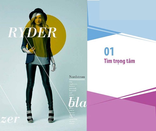
Some ways to find focus are through techniques like scale, contrast, and leading lines.
For example, the picture below is a design by Matthew Metz for fashion entrepreneur Nordstrom. Therefore, the focus of this design is on the model and her clothes. So this model was placed in the center of the picture. A block of color placed in the center highlights, drawing attention towards the girl’s face, then her outfit. An eye guide down the right corner of the frame provides additional information to the viewer. The image has a large focal point. Therefore, it attracts all eyes of the viewer following the lead of the designer.
2. Lead the eye with leading lines
Just like you point at something when you want people to look at it, the layout of some lines and shapes can in some way guide the viewer’s eye when looking at your design.
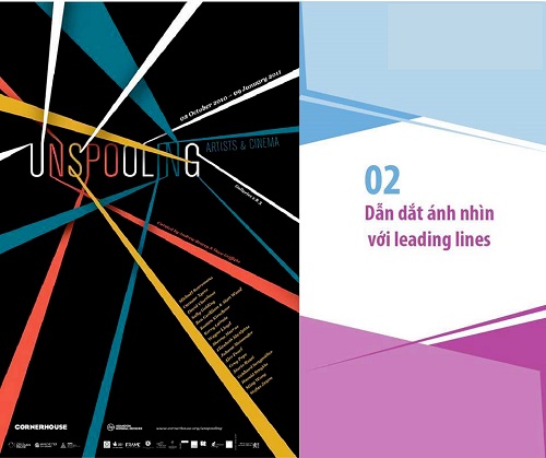
The most common is to use leading lines. Block diagrams use lines to clearly guide the viewer’s eye from one point on the design to the next.
For example, consider Design By Day’s design on the side. The design uses strong leading lines that lead the eye towards the main focal point (headline), and then to the different information levels.
3. Size and rank
Scale and visual hierarchy are among the fundamental principles of creativity. They can make your design successful and can also make your design break. Therefore, it is important to organize them well. Make sure you understand why every design needs three levels of typographic hierarchy.
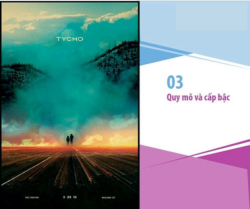
Scale is often used to help hierarchy communicate with each other. The near and far arrangement of the elements indicates their importance in communication.
For example, this poster designed by Scott Hansen uses a miniature image of two people to help focus the big scene in front of them. This immediately gives the viewer a sense of the overwhelming grandeur and vastness of the scene.
By contrasting a small-scale element next to a large-scale element in the composition, you can create a number of different effects.
4. Balancing factors
Balance is an important requirement for a design, but how to create the perfect balance in a redesign is not an easy thing. Well, let’s take a look at two common types of balance and learn how to master them!
The first is symmetrical balance. Symmetrical balancing is balancing your design using symmetry. By mirroring a few design elements from left to right or top to bottom, you can create a strong, crisp balance in your design.
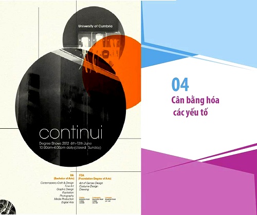
Another type of balance that is said to be more common is the asymmetrical balance. Asymmetrical balance is also a rather difficult term to explain because it still creates balance but the elements are not symmetrical with each other.
The figure below is a successful example of asymmetrical balance. In this poster, Munchy Potato has used asymmetrical balance by purposefully dispersing and scaling the elements.
In the design above, the three central circles are the biggest elements of the design, but they are balanced by types, lines, and small circles with intricate textures in the lower corners.
Another “pocket” technique for mastering asymmetrical balance is to understand that each element in the design has its own “weight”. Small objects may be “less heavy” than larger objects. Whatever the case with your design, remember that it is imperative to balance the elements until you reach an effective equilibrium.
5. Use elements that complement each other
You’ve probably heard of complementary colors, but what about additional elements in a design? An important requirement that contributes a significant part to the success and effectiveness of a design is to take the time to “deliberately” choose each element in the design so that each element complements the entire design. your design.
A common mistake in design is using images that do not complement each other. So when using more than one image in your design, try to make sure that they are all effective and cohesive when grouped together. There are many different ways to achieve this cohesion. Here are a few suggestions.
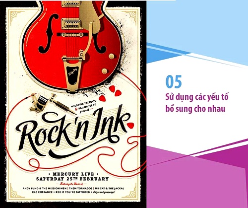
Color the pictures with similar colors. With the ubiquity of filters and image adjustment tools, you can color and adjust your images so that their palettes coherence and complement each other.
Select images taken in a similar way. Choose images that have a similar aesthetic and style, for example, if using a minimalist image, choose multiple other minimalist images for additional inspiration for that image.
6. Increase or decrease the contrast
![Learn about the rules of layout in design 6 [IMG]](http://www.dohoa360.com/wp-content/uploads/2016/08/quyluatbocuc7.jpg)
Shading should be a very useful tool to highlight or obscure certain elements in your design. By raising the contrast factor or using high color contrast, you can make an element stand out and capture the viewer’s attention. Likewise, by reducing contrast, you can make an element fade out so that the background of other objects has a “chance” to stand out.
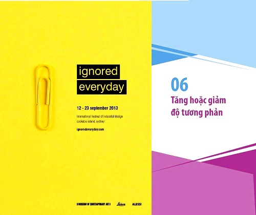
If the vibrant colors in the design above are used to highlight the design, the next example will use a vibrant color to fade part of the design, forming the background to make it stand out. enable other dark colored elements.
For example, this poster designed by Melanie Scott Vincent uses a yellow paperclip on a yellow background, creating a low contrast difference between the subjects and the background. While normally this is something to be avoided in design, in this case it reinforces and highlights the “ignored everyday” fact.
In this way, contrast can also be used to “hide” a certain element of the design as well as create a meaning within it. So always remember to use contrast based on the PURPOSE of your design.
7. Repeat elements in design
To maintain consistency and a logical layout for your design, try to take elements from one part of the design and apply it to other parts. A certain style can be repeated more than once in a design, or it can be said that “a graphic motif” can be used more than once. So try to use repeating elements intelligently for a good composition.
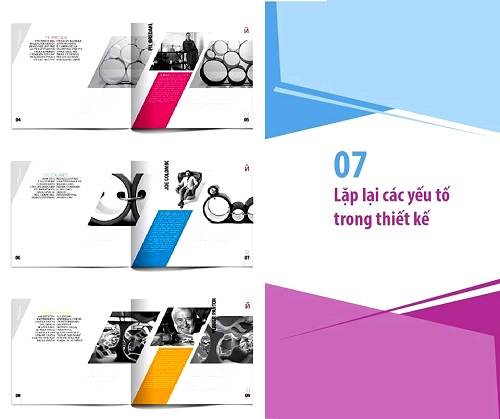
Repetition is an important factor when it comes to multi-page layouts in a design. Repetition of design elements helps each subsequent page line to follow the previous one, creating a seamless set of pages.
For example, check out the magazine designs by Mauro De Donatis and Elizaveta Ukhabina on the side. In this design, the composition in each layout is similar. The only difference is in the text content, colors and the use of images. These repetitive elements will help readers quickly identify and become familiar with the information in the design quickly.
8. Don’t forget the spaces
The easiest way to “offend” white spaces is to call them useless with the name “blank”.
White space, when used strategically, enhances design clarity. Overall, by balancing complex parts and white spaces in your design, your design will “breathe”.
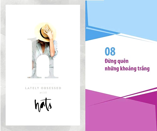
The design example by Cocorrina on the side used white spaces to balance the images, textures and types making the design feel airy, clean and sophisticated.
So how can we successfully use white space in our designs?
First, scale down the graphic elements of your design. By narrowing the images, types…you can create formal white spaces around the focal points within the confines of the original design frame.
Don’t fill every space with characters or words. As mentioned above, white space is not empty space, it is doing its own thing and serving its own purpose. Therefore, just don’t fill in any white space in your design. Let those letters and characters have space to “waggle”.
When designing parts of your work, ask yourself if each element of the work is 100% necessary. Do you need all the types, do you need bright blue headers, or do you need 3 different images? By gradually eliminating unnecessary elements in parts of the design, you can create a beautiful, airy design that doesn’t look empty.
9. Align elements in design
When doing a design with many elements in it, we can’t just “throw” them all onto the page. Why? Because arranging these elements is the quickest and easiest way to transform your design from a “bad mix” into a work of elegance and class.
Having trouble aligning those elements? You can turn to Canva to get rid of that hassle quickly with a super handy auto-align tool. Simply drag the elements of your design around the page and Canva arranges them in the most logical place. You will feel as magical as magic!
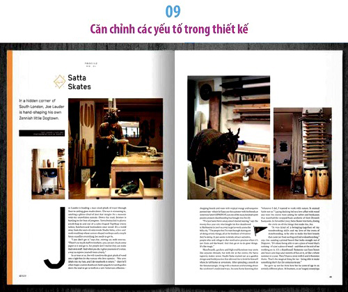
Consider this example – a magazine design by Huck. The strong association between its elements creates a crisp, clean and effective composition, creating a sense of “satisfaction” for the viewer.
Connecting design elements in a strong and logical way is also a great way to help you create a “certain order” in your design. So, if you’re using a lot of images, lots of type, or lots of graphic elements, then links are your best friend.
Alignment is also very important when you’re dealing with types. There are many ways to arrange types, but a good rule of thumb for longer pieces of design is to “stick” them to the left margin to create the most satisfying feeling for the viewer’s eye.
10. Divide the design into 3 parts
The rule of thirds is a simple technique that designers use to divide their designs into three rows and three columns. And at the points where the vertical and horizontal lines intersect are the places where focal points should be placed.
Using the rule of thirds is a great way to kickstart the layout of a design as it gives you a quick way, while also leading you to position and frame elements in your design. .

Design review on the side by Gajan Vamatheva for National Geographic. Take a moment to imagine where the one-third lines would intersect. You can see that the intersecting lines will pass through the focal point of each image – two pedestrians in the first image, and the largest bird in the second image. The lines will also intersect at points around the crosswords. Look closely and master the rules, you will see these points.
A great way to start your design is to use the rule of thirds to create a grid. Image grids can help you arrange graphic elements more logically. You need to focus on focal points for optimal design. You can also use Canva’s grid tool to create grids easily with more options.

![What is Infographic? How to design beautiful and attractive Infographic [Template] 27 infographic la gi](https://maludesign.vn/wp-content/uploads/2022/12/infographic-la-gi-500x500.webp)
