Is this the first bell to signal the “end of days” for sans-serif fonts?
The recent transformations of the Burberry brand have included the removal of the veteran “foot” (serif typeface is a serif font). Daniel Lee is showing great effort as the new Creative Director of Burberry, after representing the British fashion house to carry out a series of image campaigns, such as appointing new brand ambassadors, and important above all, launch a new logo.
Just four years ago, the predecessor logo was announced with a minimalist design, using a bold sans-serif font (with a hint of a technology start-up) by the hands of a famous graphic designer. Peter Saville. The introduction of an alternative logo not only meant to renew Burberry’s brand, but also signaled possible changes to the fundamental norms of luxury branding in the new age.
In the past, the logos of luxury fashion brands were often “nailed” with elaborate details and curving lines, to recall the inherited heritage and history of the brand. But in the last few years, a series of fashion houses have abandoned their old logos in favor of a more “lightweight” version. These include Berluti, Balenciaga, Celine, Saint Laurent, Balmain, Calvin Klein, Rimowa… and so on. It seems that luxury brands all follow design trends created by technology corporations like Microsoft, Google and Spotify. Everything is changing, but increasingly the same. Some call this the “Helvetica-ization” of fashion.
Talking about Burberry’s previous logo, Saville explained in interviews that he wanted to promote the optimization of the brand’s logo, following the direction of his predecessor, Riccardo Tisci. “The letters in the Burberry name itself were a gift to us,” Saville told Vogue Business. “It contains two Bs, three Rs and is very proportionate. The characters are spread out snugly in their place. So after we found a suitable typography, it was extremely smooth to finalize the logo into a unified whole.”
Tisci thinks the brand needs a logo suitable for embroidering on the collar of a chiffon shirt as well as when lining the inside of a trench coat. As a result, Burberry has joined the minimalist wave, to the point of almost “identifying” in the fashion industry. Logos, especially those of modern luxury brands, are often not fixed on a single product on a shelf. They’re on clothing, accessories, websites, home appliances and designer furniture, as well as on celebrity feeds on social media… so these logos need to be legible and legible. High visibility on all platforms. This also means as few details as possible.
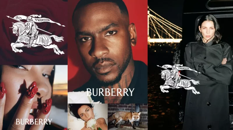
Lee and new Burberry CEO Jonathan Akeroyd decided to announce a logo with legs (though still very minimalist), while reusing the classic logo with the image of the equestrian “Prorsum” – which was released to the public for the first time. which began in 1901, now in royal blue, these are clear moves towards Burberry breaking away from modern-day “traditions” under the leadership of Daniel Lee.
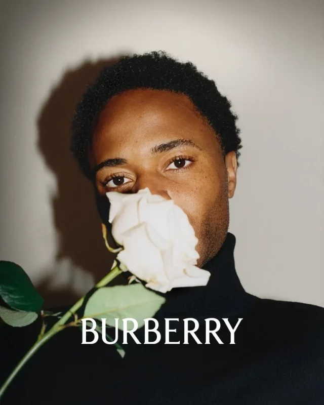
The public has yet to see the designs from Lee’s debut collection, but the designer has revealed his first creation for the brand through a promotional campaign in collaboration with photographer Tyrone. Lebon. The campaign, which brings together many famous British-born stars including Vanessa Redgrave, Raheem Sterling and Lennon Gallagher, predicts that honoring British heritage and bold British style will shape Burberry’s image under Daniel Lee.
