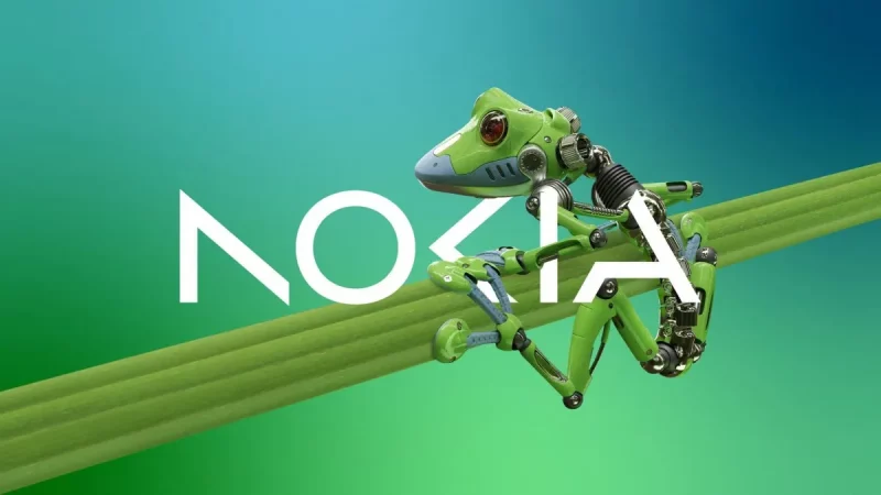
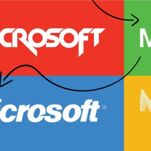
Recently, on February 26, Nokia announced a change to the logo that has been used on its products since the 1980s.
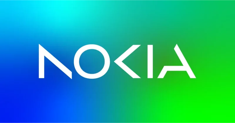
In an interview with Reuters, before the update business update for Nokia, CEO Pekka Lundmark explains: “There is an association with smartphones and today we are a business technology company”. Pekka continued outlines how the new logo builds on the “legacy” of the previous logo, making it “feel more modern and digital, to reflect our current identity”
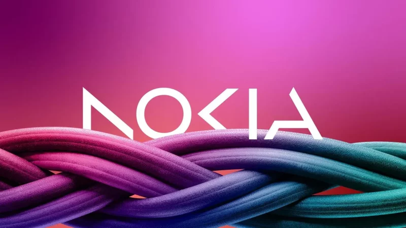
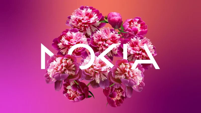
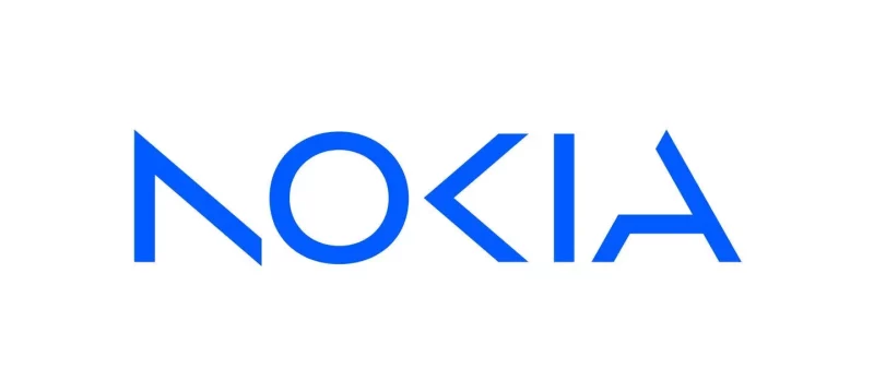
The dark blue color previously used for the logo has been dropped, as well as more blocky letterforms better suited to screens with limited pixel resolutions. The new logo introduces negative space and deconstructed forms to speak to its current identity as a technology company. It can be used on a wide range of interactive new content with background graphics. Accompanying the logo change, Pekka adds, is a new “skin” for the Nokia website.
The design update debuted at MWC Barcelona on February 26 before rolling out across websites and assets.
Before that, the Nokia logo was displayed in a minimalist sans font. The letters are bold enough to convey messages like “reliability” and “quality”. The letter “O” is a rectangle with rounded corners instead of the usual oval or circle.
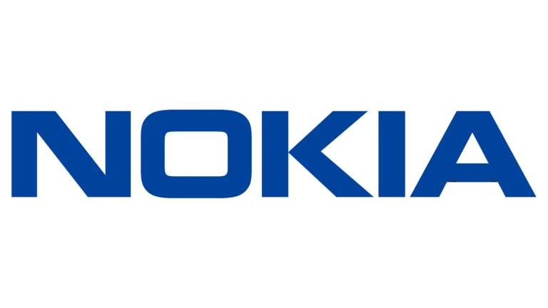
The highlight of the wordmark is the letter “K” which looks like an arrowhead. It resembles the “play” button, thus creating an association with the industry in which Nokia operates. And of course, they carry the meaning of the three arrows from the previous logo, symbolizing progress and advancement.

