There isn’t a single person who hasn’t seen a Disney movie (and if you haven’t, please watch after reading this). When you hear the opening song of a Disney movie, you hum along with “When you wish for a star”.
Disney has achieved what it is today thanks to the power of storytelling. The company has built a brand that captures common emotions for people around the world. The Disney brand is what makes it unique and special; The most recognizable brand element is the Disney logo.
If you’ve ever been curious about the incredible logo behind the brand that tells fairy tales and creates cinematic magic, you’re at the right place. This article will cover a brief history of Disney and how the Disney logo has changed over the years.
A Brief History of Disney
The Disney Brothers animation studio was founded in Hollywood, California on October 16, 1923 by Walt Disney and his brother Roy. While working for the Kansas City Cinema Advertising Company, Walt Disney became interested in cel animation, drawing cartoons for various publications.
With the release of “Steam Train Willie” in 1928, Mickey Mouse became one of the most recognizable cartoons in history. In 1934, Disney began producing feature films after the success of the short film Mickey Mouse.
Since then, hundreds of popular and groundbreaking films have been produced by The Walt Disney Company. As one of the largest media companies in the world, The Walt Disney Company has had a tremendous impact on the entertainment industry.
Disney Logo Evolution
Disney redesigned their logo 8 times to get the recognizable logo we all know and love today. Let’s take a look at Disney’s logo development.
1929 – 1937
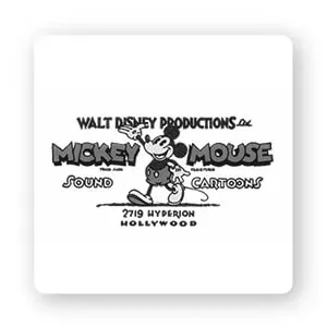
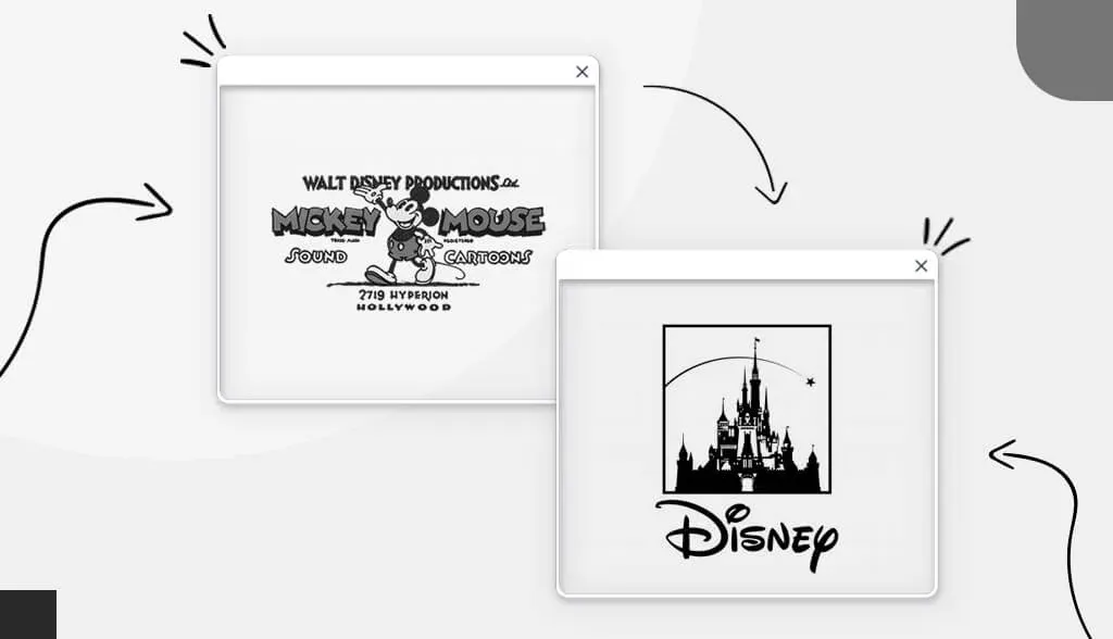
The first Disney logo with Mickey Mouse front and center. It’s by far their busiest, most crammed logo. There’s a lot going on. Their mascot’s name is written on either side of the drawing, while “Walt Disney Productions” and the address are framed at the top and bottom of the design.
1937 – 1948
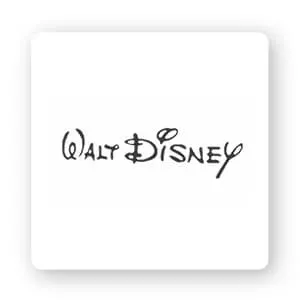
The second redesign looks almost nothing like the first logo. The beloved Mickey Mouse mascot is gone along with all the other inscriptions. Instead, the logo features only the founder’s name in a creatively written font. The script looks like it was hand-drawn, like the method used for animation back then.
1948 – 1979
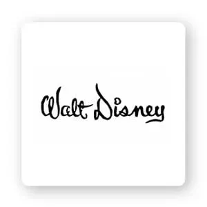
The third redesign didn’t change much, just the typography. The font of this version is harder to read, the lines are thicker and bolder, the wavy letters have no straight lines. All letters other than the first ‘W’ and ‘D’ are concatenated, which was not present in previous versions.
1972 – 1983
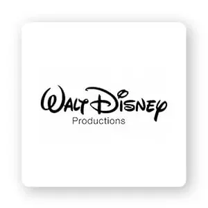
In 1972, they cleaned up the font to make word labels easier to read. Additionally, they added the word “Productions” with a simple sans-serif font that doesn’t quite match the familiar script label.
1983 – 1985
In 1983, the only change they made to the logo was that the word “Productions” was replaced with “Pictures”. They also changed the font from sans-serif to a serif font. This design is the basis for later versions.
1985 – 2006
Walt Disney’s world famous castle made its debut on the logo redesign in 1984. It is placed above the word label, unchanged from the previous design. The castle is cut into many horizontal lines. A thin dome over the castle left by the star appeared on screen in an old Disney intro.
2006 – 2011
The castle became more refined and detailed in 2006. It is less cartoonish and more like a real drawing. The arch is still there, but they also added the shooting star. The final change is that the word “Pictures” is fully capitalized.
2011 – now
Not many changes were made in 2011. The words “Walt” and “Pictures” were removed from the logo entirely, so the word “Disney” was the main focus. Otherwise, the font and castle remain the same as the 2006 design.
For you
Disney is a part of our lives. From our grandparents who grew up watching “Steamboat Willie” to millennials who loved Beauty and the Beast, everyone has a special Disney moment. Hopefully we’ve made your wishes come true by looking back at one of the most loved brands in the world.

