How do you know a design is good or bad? Is a good design a good design? How do you know that good design in your eyes is not bad in your boss’s eyes? Judging the quality of design can be quite subjective, and the evaluation criteria may change depending on the genre and purpose of the design itself. But in the end, design is created to convey a certain message and achieve a certain result. The appearance of a design is an important factor in judging its quality, but it is unique. Appearance will not indicate a design is effective or not.

To know if your design is effective, you need to understand the elements of effective visual communication and judge your design based on those elements rather than abstract, subjective feelings. mandarin. With that in mind, here are a few questions to consider when assessing the quality of graphic design.
1. Does the design achieve its goals?
Let’s start with the basics: what should the design be about? If it is a logo design, it needs to represent and convey the name of the brand. If it’s the homepage of a designer website, you’re probably trying to convince your audience to click the “Buy” button or sign up for promotional emails.
At the heart of design is solving problems with visual solutions – that’s why you need to make sure it represents all the right information to convey the message or motivate people. read something. Content is of course the most important thing, but you need to strike the right balance between educating your audience about your brand and not overwhelming them with too much information in the same design.
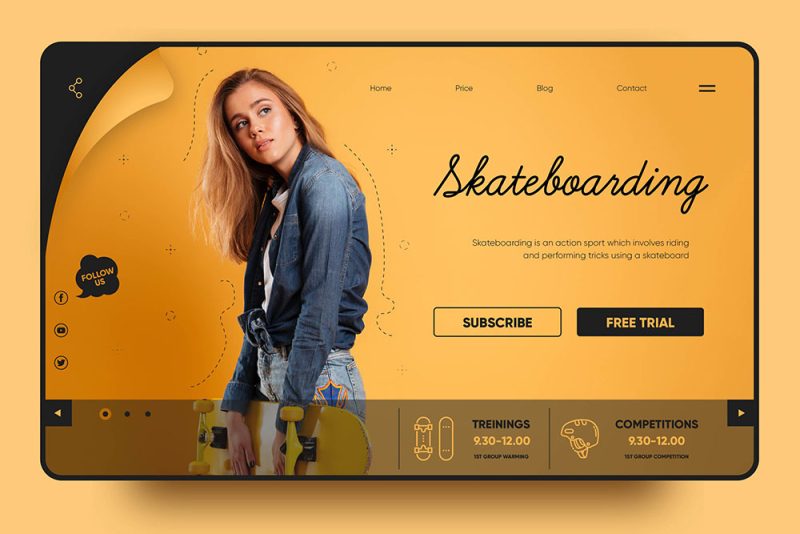
For example, the purpose of the above landing page design is to drive brand awareness and generation. It includes links to all relevant information about upcoming products, with the most intuitive focus on getting users to leave promotional emails. It’s simple, effective, and solves the user acquisition problem by capturing customer emails before the product launches. If a design achieves most of its basic goals, it is certainly an effective design.
2. Is the message conveyed through the design easy to understand?
A great design will ensure your message is instantly readable by directing the user’s eye through the content. Good designs have a focal point like a larger, bolder title (like the title on the cover here) – something that grabs the viewer’s eye and grabs attention.
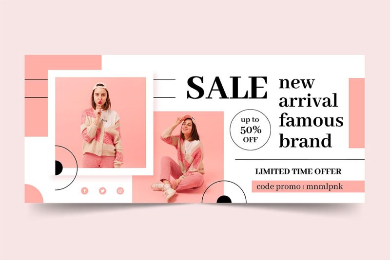
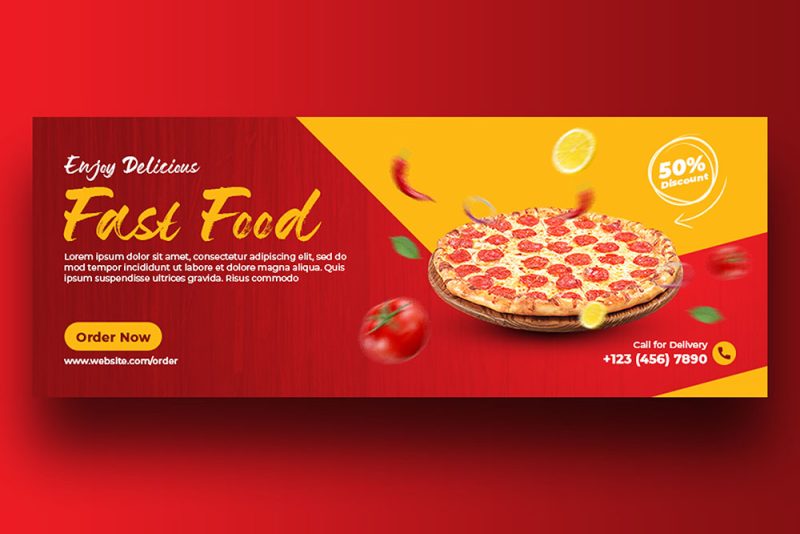
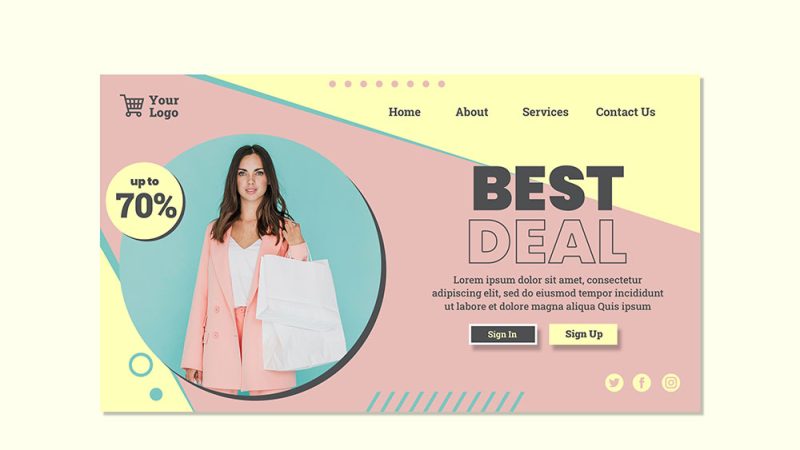
When determining whether your message is easy to understand, always keep in mind the need to balance form with function of a design. Yes, you want your design to be beautiful, but it won’t work if its good looks interfere with the delivery of your message.
Many great designs are not really striking and beautiful, but they are extremely effective designs. No one will say Craigslist is the most beautiful website in the world, but its design is really useful and easy to understand and as such it is an incredibly successful company.
3. Is the design aesthetically pleasing?
This is probably the most subjective part of judging a graphic design. Things that are attractive to one person may be ugly to another. However, in general you want your designs to look good as it will help them create a professional and trustworthy impression in the eyes of the viewer.
Aesthetically pleasing designs will always have a great composition, composition and color palette, just like vibrant, beautiful images that are eye-catching and easy to share. The artist’s paintings are placed in the center, the images are focused on personal statistics, the composition is clear, the color palette is bright and harmonious are the factors that make the design beautiful and aesthetically pleasing.


In the end, aesthetic trends will come and go no matter what you do, but don’t get so caught up in one trend that your focus is on setting the brand apart and delivering its message. row.
4. Does the design style suit your customers?
Most of the time, you’re not designing for yourself – you’re hoping to create a design that will appeal to a specific audience. They are rarely able to explain why a design resonates with them, but they will have certain expectations about how a design will look.
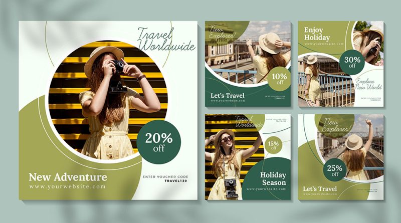
A vibrant rainbow-colored palette would not be suitable for a financial website as most clients are looking for timely, secure and reliable advice. Therefore, a conservative and conservative tone (like the design above) would be more appropriate.
In contrast, research shows that children prefer bright colors, so it makes more sense and effective to engage them with colorful designs.
5. Is the design original?
While nothing is completely original, it’s important to avoid piracy while at the same time being creative and making your brand stand out from the competition.
The meaning of the word “original” depends on the type of design you are dealing with. If it’s a logo design, it’s best to make sure it’s as unique as possible because you need this logo to be trademarkable and your trademark application will be rejected if you use another device. The design is copied or looks too similar to a design already on the market. Even big companies like Airbnb have to deal with such coincidental trademark similarities.

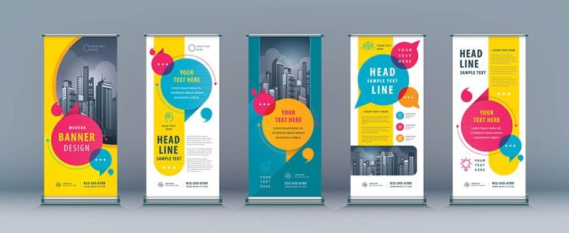
Other types of design such as banner ads or flyers may include photographs, and it is not always practical and cost-effective to hire a photographer to take your own pictures. . That’s when you can take advantage of existing photos – not original, but still improve the quality of your designs. You just need to make sure you pay royalties for the photos you’ll be using to avoid disputes over photo copyright.
It would be great to have the creative freedom and technical resources to create innovative and trendy web designs but it’s also important to remember that there are a whole host of important web design conventions. that users expect a visual experience with a web design.
Some will argue that true originality doesn’t exist and that everything is a mix of what’s already there, but it’s important to try to get a design as creative and original as possible. to make it easier for the design to stand out from the competition.
The success of a design depends on many factors
Great design can significantly help your business, but of course it doesn’t have to be a miracle. No matter how good or bad your design is, if you send emails with flyer designs to the wrong audience or don’t use the right message for your audience, you won’t get any results. efficiency in business. A good design won’t work if your product sucks or your message is flawed, and similarly poor sales by a salesperson don’t quite reflect the quality of your design. .
There are many ways to measure the effectiveness of a design in practice, like A/B testing for websites, product focus groups, media engagement, and sales. However, not everyone can afford the expense of testing a design before it hits the market.
This is where you should leverage the expertise of your designers, many of whom have diverse experience in both marketing and brand strategy along with design. A great designer will explain his design decisions and leverage his rich experience to complete a design. If you’ve come this far when working with a designer to create a beautiful, custom design then make the most of that collaboration to create the most efficient design possible!


