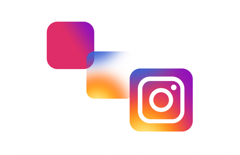
When you work for a user experience design company, you will notice the cyclical nature of industry trends. The study of design trends has become important work in the creative field. In the world of digital design, there is perhaps no better example of gradient rise and fall. This was a typical trend in the nineties. Today, design trends are taking a lot of inspiration from previous decades. Check out this iconic design:
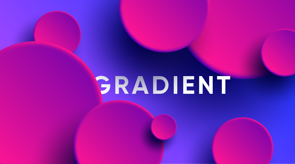
‘Back To The Future’ is a good example of a design trend that uses gradient colors, perhaps most notably the redesign of Instagram’s logo in 2016 and the music playlist icon that uses doutone as the Spotify posters and covers. Gradient has become increasingly popular in the world of user interface design.
Gradient is a powerful design technique with limitless creative possibilities because of its ability to transition colors. However, when used improperly, gradients become a design disaster. It can clutter the layout, distract the user, and ruin the entire aesthetic of the interface. In this article, we will reveal the secret to creating an amazing gradient that you most likely didn’t know
Start with the basics
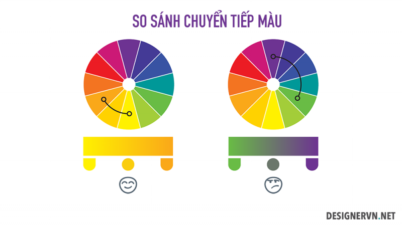
We can refer to the color wheel for suitable color guidelines. As a general rule, choosing colors that are close together will help the colors blend more naturally. Below is a diagram that shows how the seamless transition from yellow to orange is compared to green to purple.
Gradient in nature
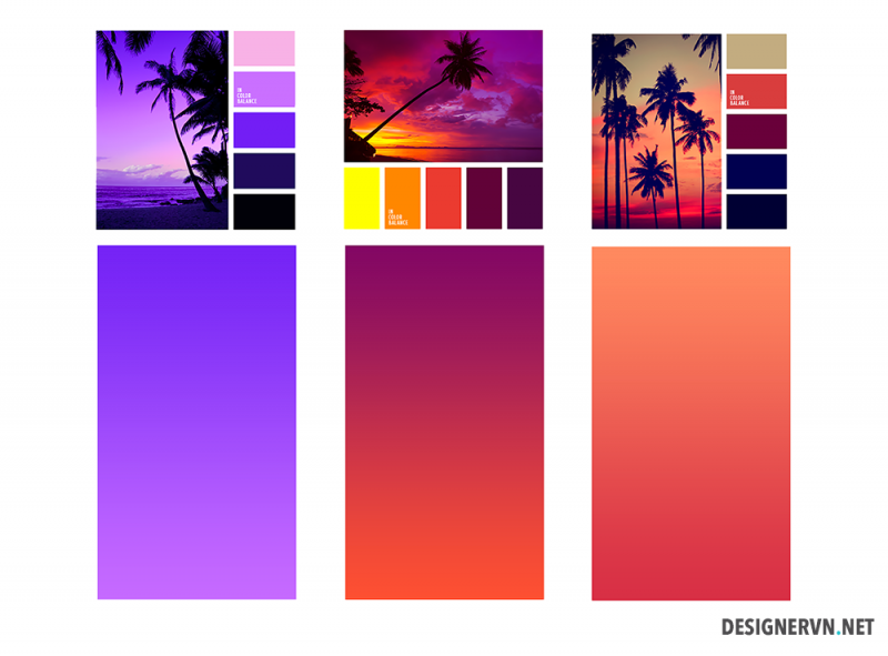
We constantly encounter gradients in everyday life such as: sky, sunset, water bodies. We can come across colors that blend together very harmoniously in nature.
Go to the next level
If the gradient containing only two tones is too monotonous and you want it to be more special? You can absolutely do that by combining multiple colors together. Just like combining two colors above, creating more than two gradients will require adding “complementary colors”. Complementary colors work best when they fall between the starting and ending colors on the color wheel. We also have a similar diagram:
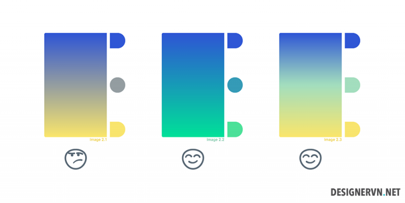
Take note: The more colors you add, the more complex the color mixing process and the more difficult the balancing act of the design. You can create multi-layered gradients like the Instagram logo, but overdoing it will create a huge effect like this MTV logo.
Light source & shape
Even after perfect color matching, there are still issues you need to take care of. First, some basics: Gradient must align with their container. For two-sided polygons (square, triangle, rectangle, pentagon, etc.), we need a linear gradient; The circular area calls for a radial gradient. You can find out here: all about gradients.
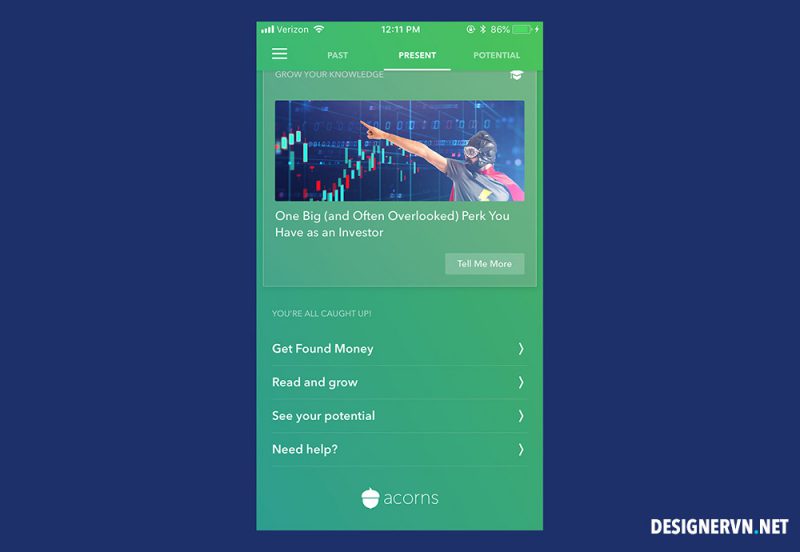
Some UI designers like to assign an imaginary ‘light source’ to the page they are working on, the same way an artist paints a landscape. This helps them decide how to orient the gradient—the lighter side should obviously be closer to the source, the darker side farther away.
When all the individual elements are selected properly, they combine into a beautiful eye-catching gradient. And that, in turn, serves as a huge boon to the interface as a whole.
Where does the Gradient come from?
Including a gradient in your UI is a great, easy way to modernize your platform. By following the tips discussed here, you can ensure you are using this powerful design tool correctly. Bottom Line: Choose the right base tone using a combination of your brand and the color wheel When you don’t know what color to choose, get inspired by nature Start by adding another color, but be careful Don’t overdo it
Choose the correct shape and position in your interface. Remember: The user’s eye will be on the gradient, where it has a transition! Like all user interface design trends, gradients are going to thrive, at least over the next few years.

