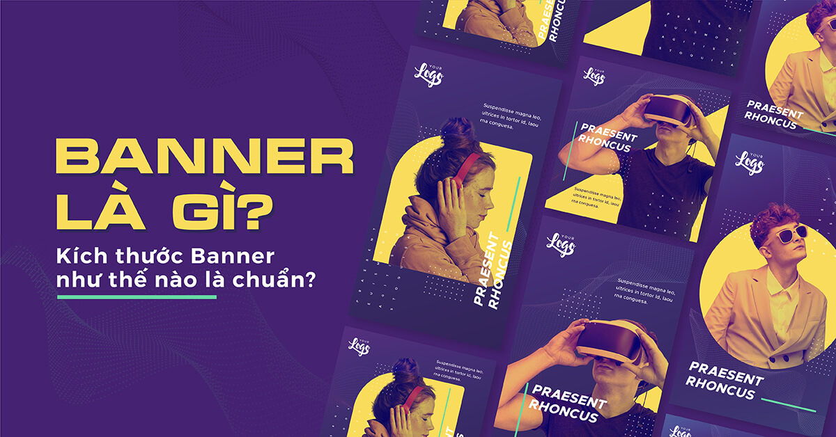
Have you heard of Banner – an extremely popular publication in design, advertising communication, branding,…? Using banners is an easy way to attract viewers’ attention, convey messages more easily and visually. Learn all about Banner with Malu and pocket useful Banner design tips.
What are banners?
Banner is a form of media publication for products, services, events, or communication for a brand. They have quite a variety of forms, however, the most popular are the following 3 types of banners:
– Banners for newspapers and magazines
– Street banners, shop signs: Very large size, placed at shop signs or large intersections, crowded with people
Online advertising banners: Placed on websites or search engines that have a lot of visitors
Tips for designing impressive Banners
Banner Size
Depending on the purpose of use, each type of banner needs a different size:
Newspaper and magazine banners: This is the type of publication commonly found in magazines and newspapers. Usually, this type of banner has a flexible form, it is important that you adjust their width to correspond to the width of the newspaper or magazine.
– Street banners: The size of street banners depends on their surrounding context, for example, the width of the store’s facade, the height where the banner is hung, the distance between two electric poles, etc. This form is usually:
+ Horizontal: 1 x 4 (m) or 0.8 x 3 (m)
+ Vertical: Take the size of Standee as 0.6 x 1.6 (m) – 0.8 x 1.8 (m) – 0.8 x 2 (m)
Image selection _
Images are an important highlight for your banner to become more vivid. Please refer to the following tips to apply them effectively in banner products:
– Choose images wisely
Images play an important role in every banner, because it helps to add context, nuance and emotion to your design, making it easier for the design to reach the reader’s heart.
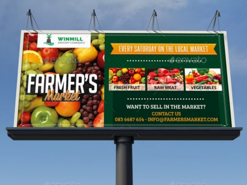
Let’s take a look at this example. To say that your produce is really fresh and healthy, what better way than to visually present authentic images of fresh vegetables? Moreover, the combination with typography according to concepts such as “fresh”, (farmers market), “seasonal change”… contributes to creating a really ‘clean and fresh’ whole!
– Do not use images if not necessary
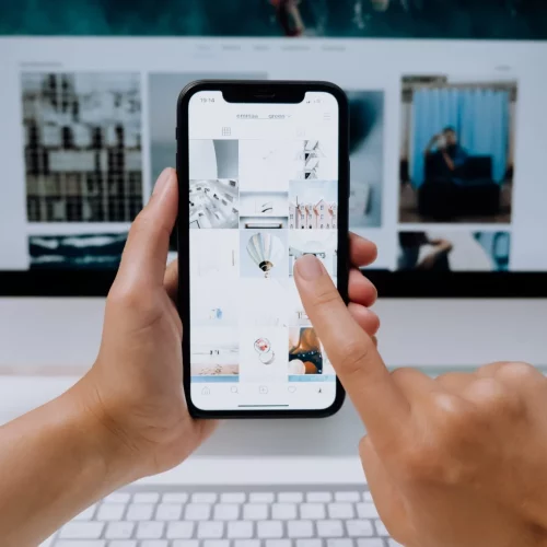
Graphic design is becoming more and more popular, however, not using images is always the best option. Sometimes, the selection or layout of images is not suitable, they easily distract the viewer, not paying attention to your call to action somewhere.
– Use filters and graphics for images
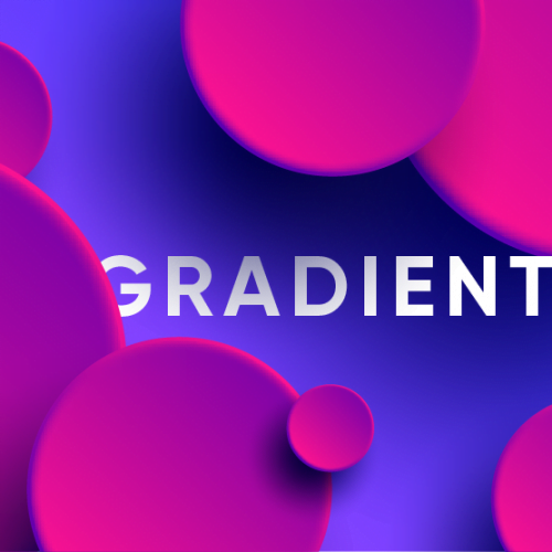
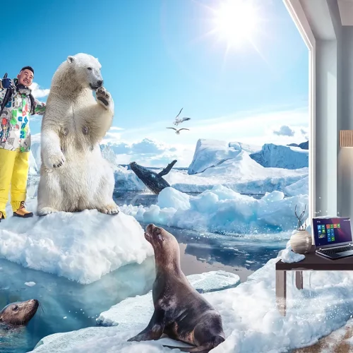
Filters of an image (e.g. repositioning, color balance and contrast) are a fun ‘stylized’ method to make your banner stand out. You can also combine graphic elements such as patterns and shapes to make the image less empty and more prominent.
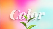
Color
The choice of color is the key thing in banner advertising design. Therefore, to have a unique and attractive banner, you must know how to combine colors that can express the emotions you want to evoke in viewers. Usually, young people are often attracted by bright colors, outstanding color schemes, and high saturation. However, if your audience is ‘older’ people, do not hesitate to choose deeper, stable and reliable colors. You can also choose colors based on specific product features. For example, green is a great choice for natural products, while purple is ‘heart’ for luxury items.
Reasonable layout
No matter how fancy and creative, each banner ad design still needs to ensure 3 main factors:
– Name/Logo of your company
– Image that represents your brand/service
– Call to action (call to action)
The overall layout is a key factor in determining whether your banner will be successful or not. Think about it, a banner with a font that is too small for the image, or an illustration that is out of place with the overall design style, will not bring the desired results, right?
– Create a focal point: One of the essential elements to have a good composition is the focus element – some kind of element that attracts the viewer’s eye, avoiding creating a feeling of ‘soft’, lacking emphasis. in design. You can intentionally highlight that element through size, use of color, or layout arrangement, for example.
– Balance: Aligning margins, arranging spacing between elements, .. or anything like that can disrupt the balance of the design. Therefore, pay more attention to whitespace, alignment and tracking and kerning elements to make your overall look more harmonious and reasonable.
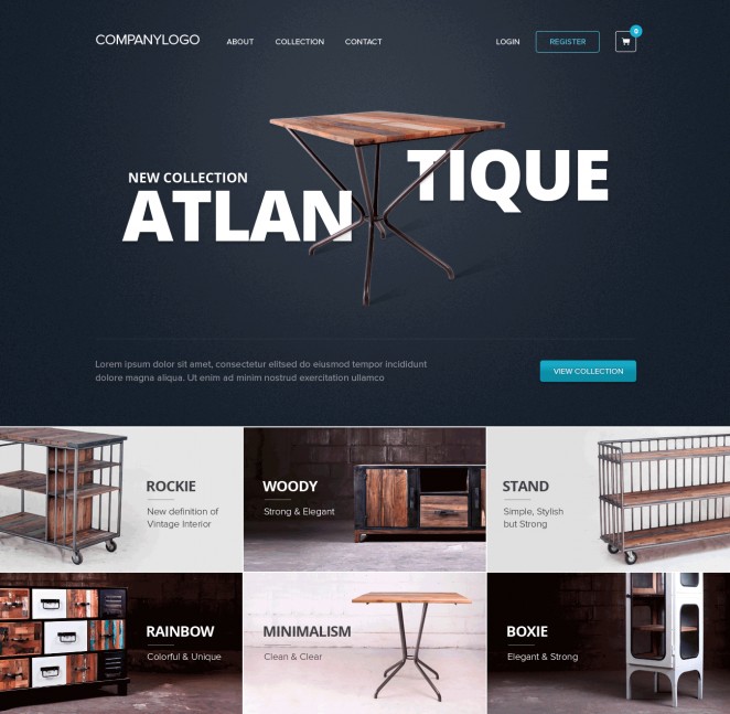
– Unique stylization: Sometimes, just a little ‘purposeful’ tweaking can make your design a lot more interesting. Notice the creative title layout of this website, just by adjusting the position of the text, the result is already breaking the mold, right?
Typography ‘correct’
Before ‘getting started’ on the design, make clear in your mind the personality, characteristics of the brand, or of the subject you are ‘targeting’. From there, you can choose the right font type . If the Serif font contains small strokes at the foot, which often gives a sleek, classic feel, the Sans Serif creates a more friendly, fresh feeling. Script fonts often have soaring curves, bringing a soft, liberal feeling. Don’t ignore a few common mistakes in this typography process:
– Using too many fonts
– poor kerning;
– Inappropriate spacing between characters;
– Inappropriate fonts used.
Negative space – The secret to ‘breathing’ design
Let the design ‘breathe’ a bit, by adding whitespace (negative space) to the logo. White space helps the design not to be dense with information, on the contrary, it creates a proper hierarchy, making it easier for readers to see and absorb the content. Besides, the white space also creates balance and minimalism for the design, which is very suitable for designers who prefer that minimal style.
Ending
Hope this article helps you get an overview of banner design.

