Designing a sales website everyone wants it to help boost sales. But how can a website do that?
In this article, we have not talked about doing Digital Marketing, SEO, Ads, Content … but merely designing that website to influence buying behavior.
Today, whatever you’re selling — whether it’s hair ties, fruit, or rockets — you can sell it through a website.
However, the shopping experience through the website is very different from shopping in the real world.
Customer behavior is different, product presentation is different… Therefore, you can only sell successfully when the sales website is properly designed.
Good web design is an art of using the right colors, fonts, images, words, and graphics to convince visitors to buy.
But how exactly?
How do you drive purchase behavior through your website’s design?
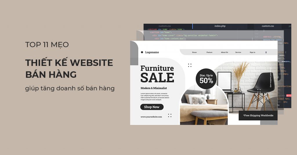
Here are 11 sales web design tips to help you increase sales effectively that have been applied by top website designers.
#1: Designing a sales website must be simple
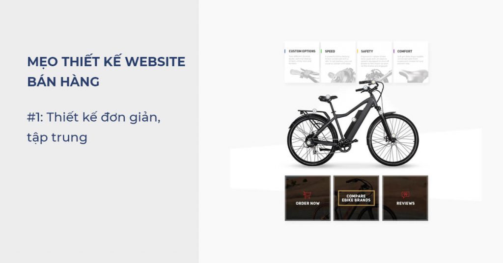
One of the top rules that you should keep in mind during the sales web design process is “KISS” — Keep it simple, sily!
When it comes to designing a sales website or any other website:
SIMPLE IS ALWAYS BETTER THAN COMPLEX
Rainbow web page, too many elements, cluttered banner ads, bluff pop-ups…. only make the site lose points.
Client exits immediately!
We are growing impatient, so are our customers.
So don’t distract your customers.
Stay focused, keep your design clear, clean and simple to hit your sales goals.
Tip: Only 1-2 goals should be on a page
#2: Prioritize branding
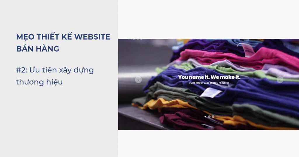
When it comes to buying online, everyone wants to buy from established brands — not anonymous, low-reputation e-commerce sites.
If you want to build trust to drive sales through your website, you need to think seriously about building your brand.
Brand is like the DNA of a business. Branding speaks to who you are, who you are, and how you are different from your competitors.
Good branding plays a huge part in building relationships with customers and driving sales.
Take the time to define your brand positioning first—and then infuse your brand into your design.
If you don’t have a clear idea of what your brand is, you can ask yourself questions like:
- If your brand were a person, who would it be?
- If I had to describe my brand in three words, what would it be?
- What makes my brand different from other e-commerce stores?
- What do we do better than anyone else in the market?
Once you know who you are, you can build it through website design.
It can be the overall colors, buttons, animation effects or testimonials about privacy, data collection and usage policies…
But in short, you need to try to help customers understand your brand, building trust first.
Starting in the right place, you will know how you should design a website.
> Read more: 5 Common Brand Personality Types that help build a natural bond with customers
#3: Think like a customer
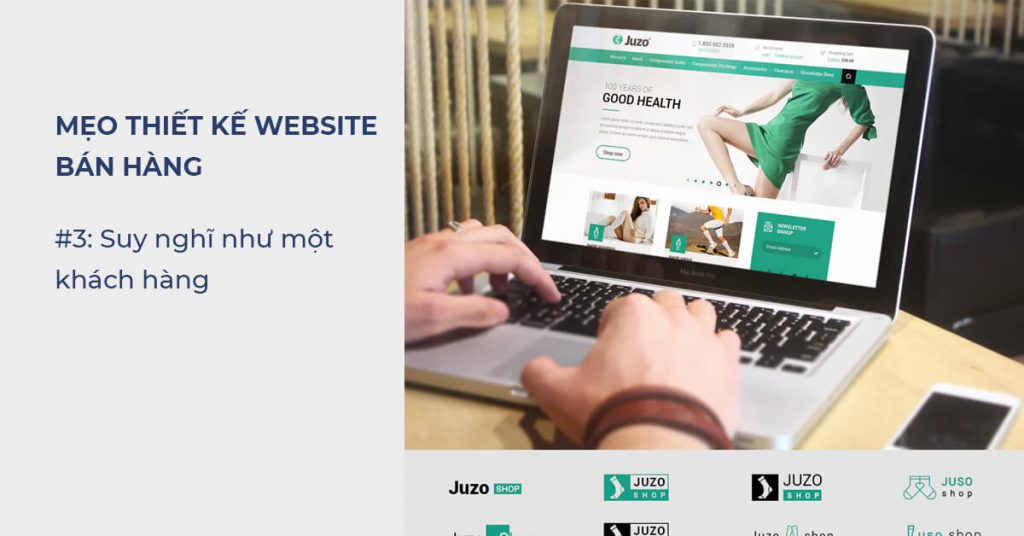
If you want your website to connect with customers, you need to think like your customers.
Your potential customers just want to experience a well-designed, easy-to-navigate website that makes the buying process easy, simple, and hassle-free.
So if you want your website to work, you’d better offer those things to your customers.
If you design a good return process, product warranty, and then integrate easy handling on your website, you can create more loyal customers.
During the design process, put yourself in the shoes of the customer, thinking about their wants rather than just doing what you feel like doing.
Ask what kind of site layout makes it easiest for them to navigate? How can you organize product listings that make sense to customers?
And, how can you simplify the checkout process?
Currently, there are many ways to pay online, but paying by QR code is the fastest way.
When you think like your customers, you can anticipate what they expect from your website — and then design it to meet those needs.
The important thing is: Thinking right, we will have the right way.
> Reference: 10 Website Layout Styles That Increase Conversion Rate
#4: Take advantage of color
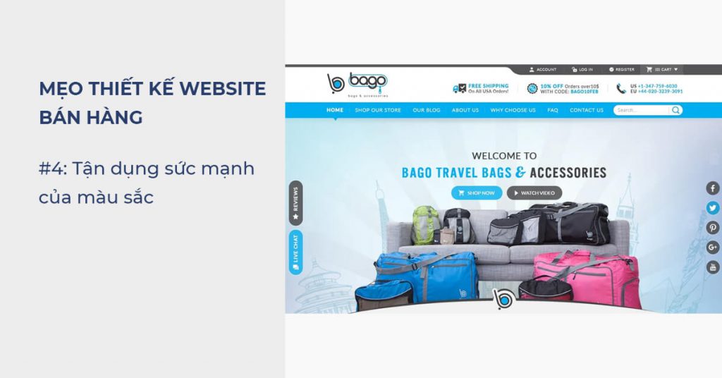
Do not choose the color for the website according to your taste.
Different colors can inspire different emotions and actions — so if you want your sales website to have a high conversion rate, you need to take advantage of color.
Example: If you want people to make a purchase, make the purchase button stand out in a bright color like red.
According to color psychology, red inspires feelings of excitement and passion, which drive spending — and CXL studies show that creating a red button can increase conversions. up to 34%.
Or, if you want to enhance your credibility, incorporate blue into your web design.
Blue is not only a favorite color around the world, but it has also been shown to increase feelings of trust.
Therefore, blue has become the most popular color in the business world.
That is also the reason why blue appears in more than 50% of logos ever designed in the world.
The point here is, color is one of the most powerful design tools — if you know how to use it, it can have a huge impact on the effectiveness of a sales website.
As mentioned above, think like a customer.
Who is the customer group that generates 80% of your sales? Which colors do they respond positively to?
If it’s blue, select it.
> Immediately refer to the article: How to choose a logo color to know more about the meaning of the color, how it affects customers.
#5: Use high quality images
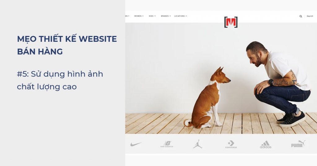
In the world of web design, everyone knows that good images increase conversions.
And a recent WWO study found that incorporating more relevant images into website design increased conversions by more than 40%.
That’s even more true when it comes to selling online.
Because no one buys a product without seeing it.
If you want people to buy a product, they’ll need to look at the image. And high quality images are always better than poor quality.
In addition, investing in professional photography and design is also a way to tell customers that:
“My product is well taken care of, it is worth the money you spend.”
And then, if they clearly see the product they are about to buy, believing that it is “product as shown”, then they are more likely to buy.
Otherwise, they will leave.
#6: Design a website for customers to read in scan style
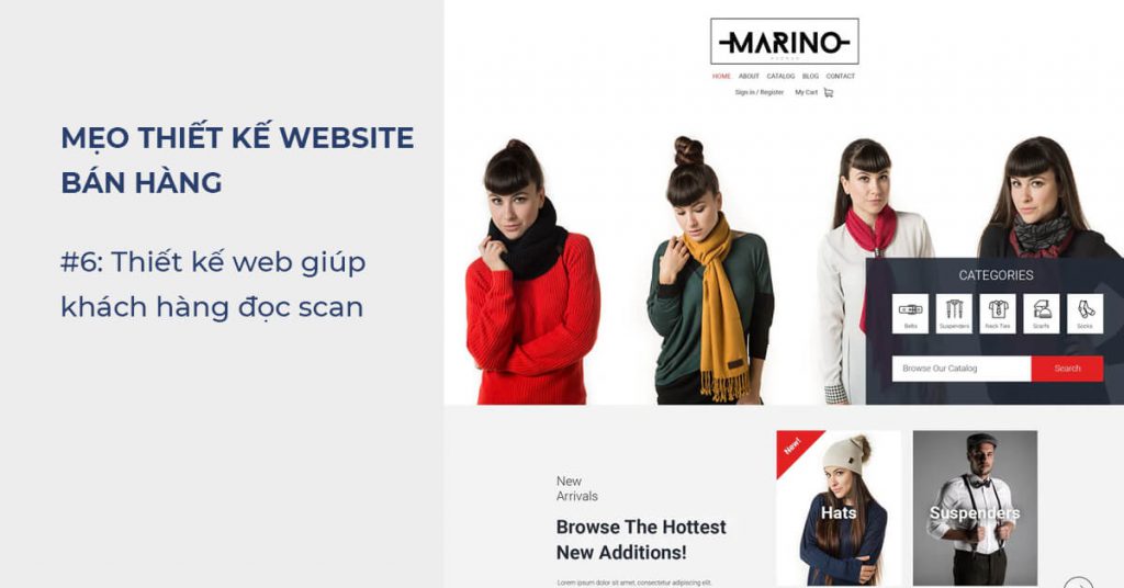
Even if you don’t design to help customers read “scan”, they still do.
So, help them read the magazine better instead of presenting too many things.
Don’t be tempted to cram content onto your website.
You can spend days writing long, emotional product descriptions for the products on your website. But believe me, no one will read it.
Most website visitors only read about 20% of the text on a website .
Instead of reading content word for word, they read by scanning text to find important information.
So, if you want to sell, you need to make your content scannable.
One effective way to do this is to break up your content.
Whether it’s a product description, a blog post, or an “About Us” page…. Please make it readable.
- Use short sentences and paragraphs.
- Use bold text to draw attention to key information.
- Use the list style to break up large blocks of text.
- Larger font
- Information Hierarchy Main – Secondary
- Shrink each row width
- …
That way, the easier it is to scan your content, the easier it is for customers to understand the message you convey.
And of course, the more likely you are to make a sale.
In this article I also try to make the text more readable using the techniques above.
#7: More professional design
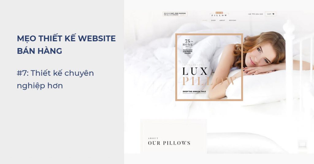
Your sales website is trying to drive customers to buy.
And as a result, you ask them to fill in personal information or even sensitive information, such as credit card information.
Faced with a request like this, anyone should turn on the “vigilance” mode.
Therefore, investing in a professional website is a must if you want to build trust with your customers
Especially e-commerce-style sales sites.
But what is a professional website?
- First, your site must not have any typos.
- Your fonts, color scheme, and footer design should be consistent from page to page.
- All your links and buttons should work properly.
- Your photo must be a quality, real photo
- Smooth, clutter-free mobile experience
- Design clear authentication information, policies and requirements when you want to save cookies.
The important thing is, if you want your customers to value you, you need to show them that you value them.
And the only way to do that is to design a professional website.
#8: Use social proof
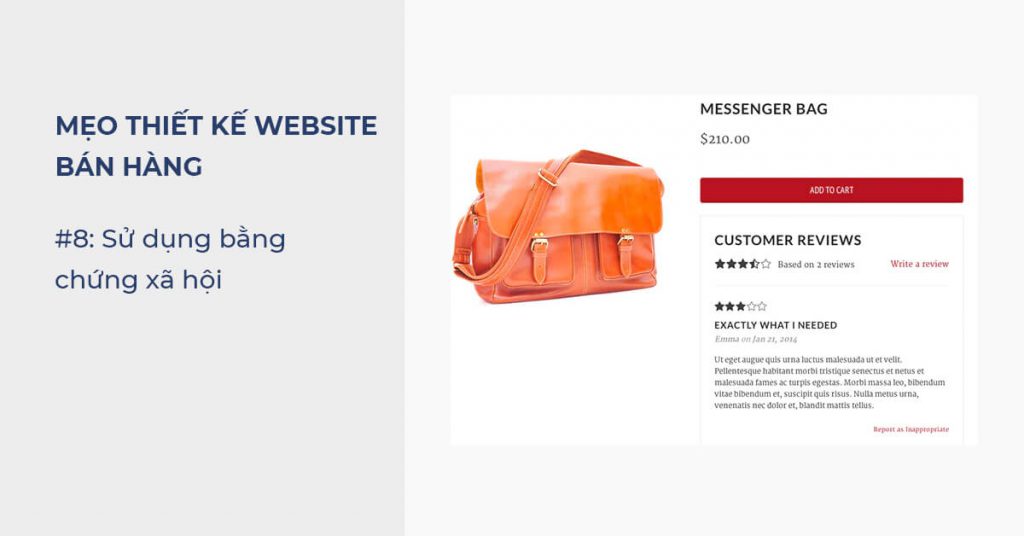
Another way to build that all-important trust?
“Social Proof”
As you design your sales website, look for ways to show potential customers the positive feedback you’ve received from past customers.
Add product ratings so people can easily rate your product (Find ways to get as many 5-star reviews as possible).
More customer testimonials section includes:
- Customer’s photo
- Positive feeback about your product
Then, when your website visitors see the positive feed back of other customers, it proves the product is good — and increases conversions as a result.
Tip: Adding multi-dimensional feed backs (both good and bad) and then handled skillfully will make the feed back more valuable
#9: Design categories that are easy to navigate
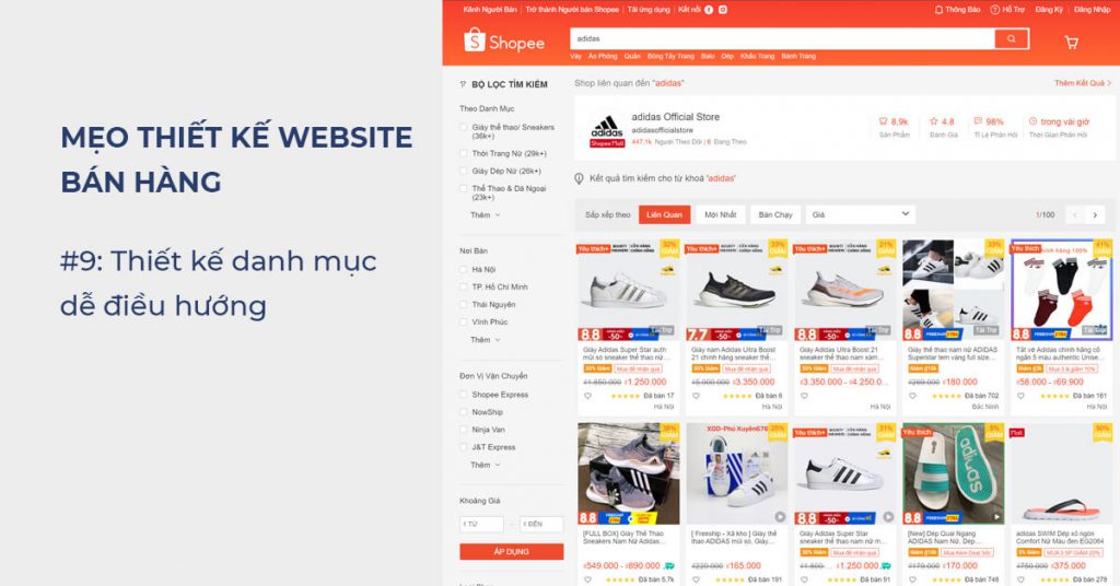
A cluttered, hard-to-navigate website will turn customers off in no time.
If your website’s visitors have to click through more than 10 different menus before they find the product they’re looking for, the site should be rebuilt.
You need to make your product categories and product pages as easy to navigate as possible.
Make it easy for your customers to search for products and filter products by the most popular attributes like “Price”, “Brand”, “Size”…
The easier it is to navigate, the easier it is for customers to find what they need — and the easier it is for them to make a purchase.
Tip: Design Menus up to 3 levels. For sales websites with many products, a menu on the left will help customers find products easier.
#10: Shorten the payment step
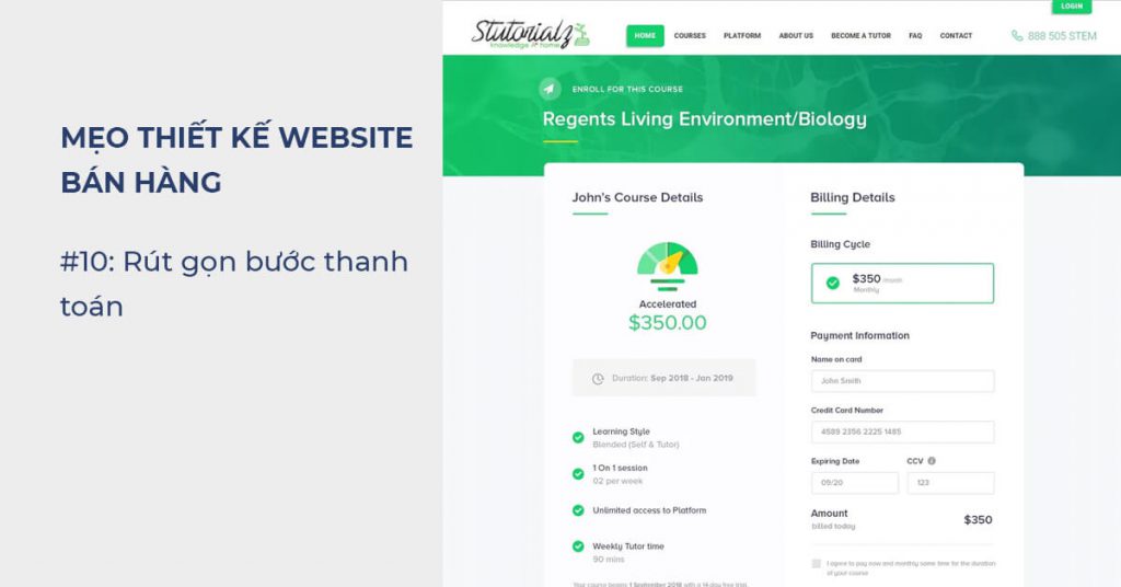
Clever payment steps will overturn all previous efforts.
This is already the most important step, so don’t make it more difficult.
If you want people to buy from you, you need to make the buying process as simple and straightforward as possible.
Make your checkout page clean, simple, and easy to navigate.
Give your customers the option to buy through an account or without an account.
Make things clear:
- What information do you need to process the transaction (and where they need it)
- Various shipping options available (with explicit costs)
- What should customers do in case they need to return the goods?
- Once the purchase is complete, direct your customers to the confirmation page so they know everything went through like the bill display page
- Design content on 1 column so that customers know how to complete it from top to bottom
- Design more progress bars so customers know how much time is left to complete
- …
In short, if you want people to buy from you, make the checkout process as easy as possible.
#11: Responsive web design
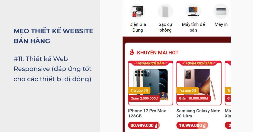
Responsive web design is a design that makes websites responsive to devices with different screen sizes such as smartphones, tablets, …
Simply the website will not break the layout, the information is displayed well, the buttons are easy, the size fits the viewport, supports swipes …
Nowadays, a lot of transactions are done via mobile devices (more than desktop) so Responsive is a must-have feature.
Otherwise, about more than 50% of your sales website traffic is being wasted.
Tip: Design for mobile designs before designing for Laptop, PC
In addition, Google also says that they use mobile pages for search ranking indexing ( Mobile-first Index ), so responsive design is even more important.
summary
Designing a sales website is technically complicated, but don’t worry, the technical and implementation details will always have someone ready to assist you.
It is important that you know how to navigate when implementing sales web design.
I hope you will know how to apply the above tips to work with stakeholders to design a sales website that drives better sales.


