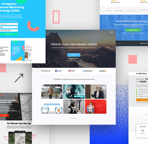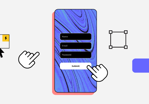
A product for users not only needs to be carefully cared for in terms of external aesthetics (UI—User Interface), but also a clever calculation in every smallest experience (UX—User Experience).
Only in the past 5 years, UI / UX is a very familiar and popular phrase that you will surely encounter when starting to learn in the field of interface design. Along with the miraculous development and speed in the field of information technology and electronics, people are now spending a lot of time communicating with mechanical devices such as phones (smartphones), tablets (smartphones, tablets, etc.) tablet), laptop, PC, smart TV (smart TV)… and coming soon, smart glasses (Google Glass), VR (Hololens), refrigerator, washing machine… So in the future, UI/UX It will be an industry with a lot of opportunities and potential for growth.
Since the main and only users here are humans, the best way to create a smooth experience is to deeply understand the user’s usage habits, preferences and behavioral trends. In other words, we must understand the psychology and desires of our customers, then we can help them solve the right problem.
Today, the article that Malu Design wants to introduce to you includes 19 principles of psychology, compiled by Jon Yablonski – the founder of the extremely popular Law of UX and Human by Design , plus a main reference sources such as: Nielsen Norman Group , Medium . Psychological principles (including Gestalt’s laws) will be dissected and analyzed from a professional perspective in the field of UI / UX, in addition to easy-to-understand visual illustrations, hoping to bring gives you the most fundamental and general knowledge values on the path of UI/UX career development.
Synthesis of psychological principles in UX UI design
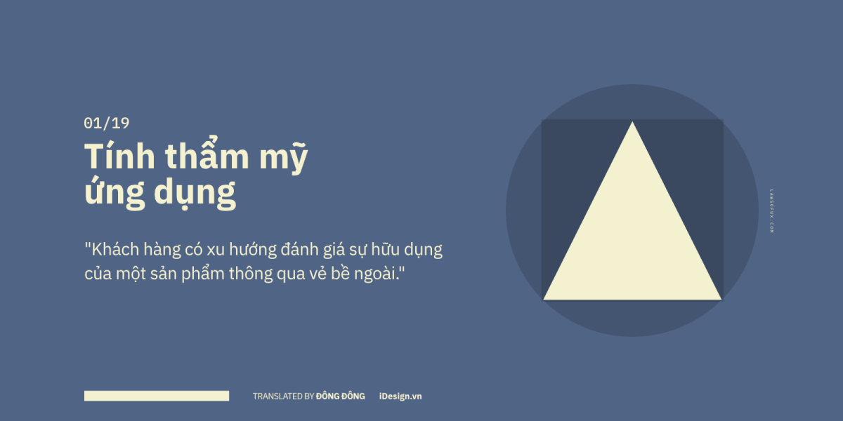
01/19 – Applied aesthetics
It is a clear fact that most of us judge the things around us by their appearance. This is considered a general psychological trend in most areas of life, not just design.
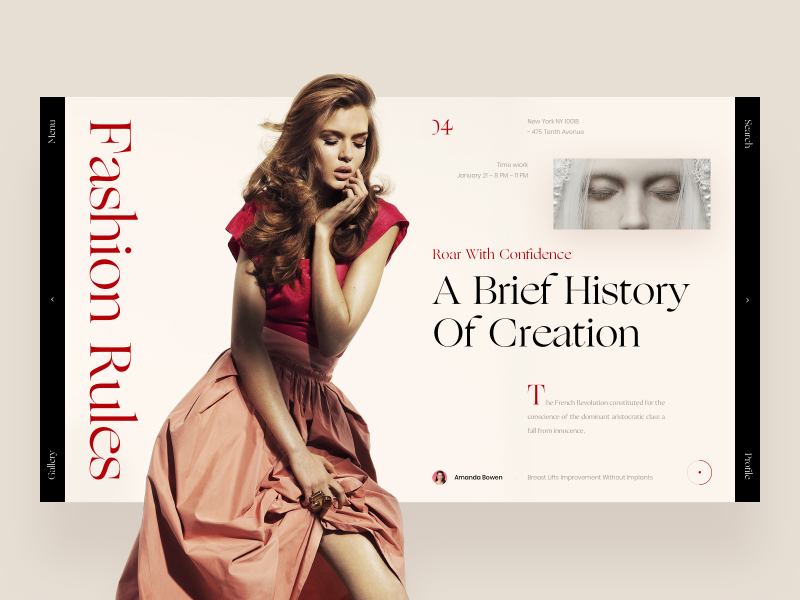
Let’s come to the first of the 19 principles of user psychology. Beautiful designs will make it easier for users to “forgive” when they encounter difficulties when using the product. In other words, once the design gives a strong visual impression, it will help us “hide” the minor errors in the experience.
Beautiful images always bring positive emotions to viewers. Most people believe that the more beautiful something is in their eyes, the more professional and trustworthy it will appear, when in reality this is not always the case.
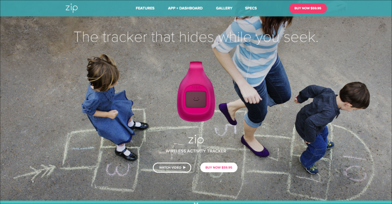
For designers, this research is extremely valuable, as they show that, at least, beautiful, slick designs still have a significant effect on user experience. A comprehensive user experience, always accompanied by high aesthetics.
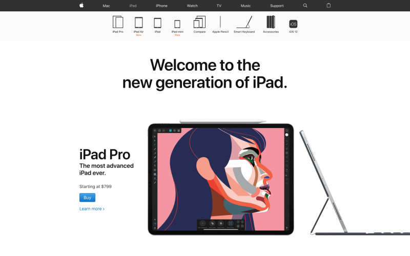
The studies by Masaaki Kurosu and Kaori Kashimura were first carried out in 1995, at the Hitachi Design Center. When conducting tests on 26 different ATM machine interfaces, they found a correlation between “aesthetics” and “useful functionality” , as 252 participants rated the convenience of the ATMs. ATM has a beautifully designed interface.
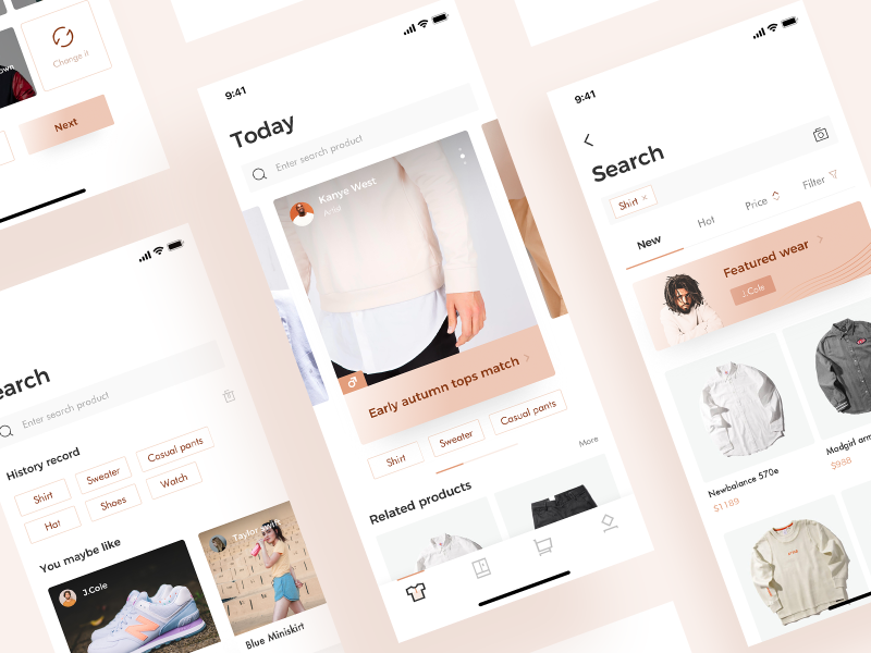
But one thing that you need to really pay attention to is that beautiful, sleek designs still have their own limits. It is agreed that when they feel satisfied with the appearance of the product, they will let go of minor annoyances, but if and only if the defect within the product is insignificant, and if it is a Serious inconvenience, no matter how beautiful the design, can’t save the situation.

Understanding this user psychology seems to be a key factor in making the product-planning phase. For example, when using it in practice, users feel interested in the product’s interface design, which is very good, proving that you have an effective design team, but in the process of testing experience, this easily causes confusion about product evaluation. Because it prevents you from getting focused and accurate feedback on the product’s features. When you receive comments like “looks beautiful”, “I like this color”, etc., you only know that your product has an attractive appearance, but does not show its real use .
In short, when developing a product, the external appearance is as important as the internal function.
02/19 – Doherty Threshold
Users tend to be “addicted” to the feeling of experiencing things quickly and smoothly, and it becomes a lot easier to call them to take an action later.
In the late 70s, the duration of 2s (ie 2000ms) was still a reasonable number that was widely applied in most computer systems, because it was assumed that users would need time to think before acting. show the next steps. But in a research paper published in 1982, Walter J. Doherty and Ahrvind J. Thadani found that the response time to a certain action or command from the user should be approximately 400ms.
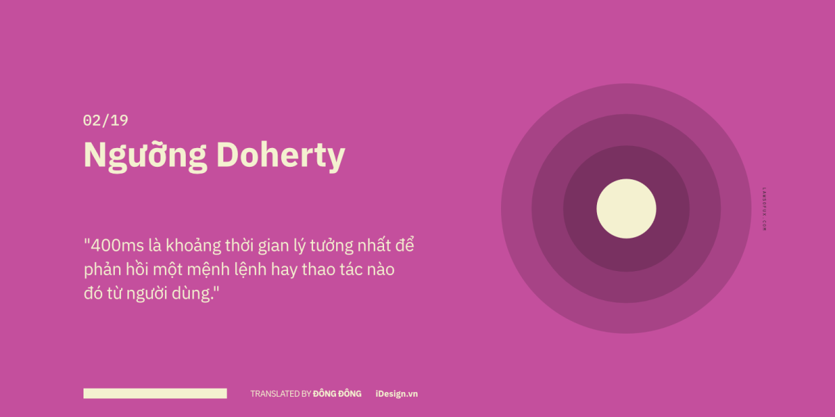
Doherty found that, usually people have already envisioned the steps to take, if the system responds too slowly, it creates interruptions and cuts off their train of thought, making it difficult for them to recapture. work rhythm, thereby reducing the user’s work efficiency.

To be more specific, the system response time (System Response Time) and the time the user starts performing the next operation (User Response Time) are closely related. If an app or website fulfills the above ideal response, users will tend to be “addicted” to the feeling of experiencing things quickly and smoothly and calling them to take an action. That will be much easier later on.
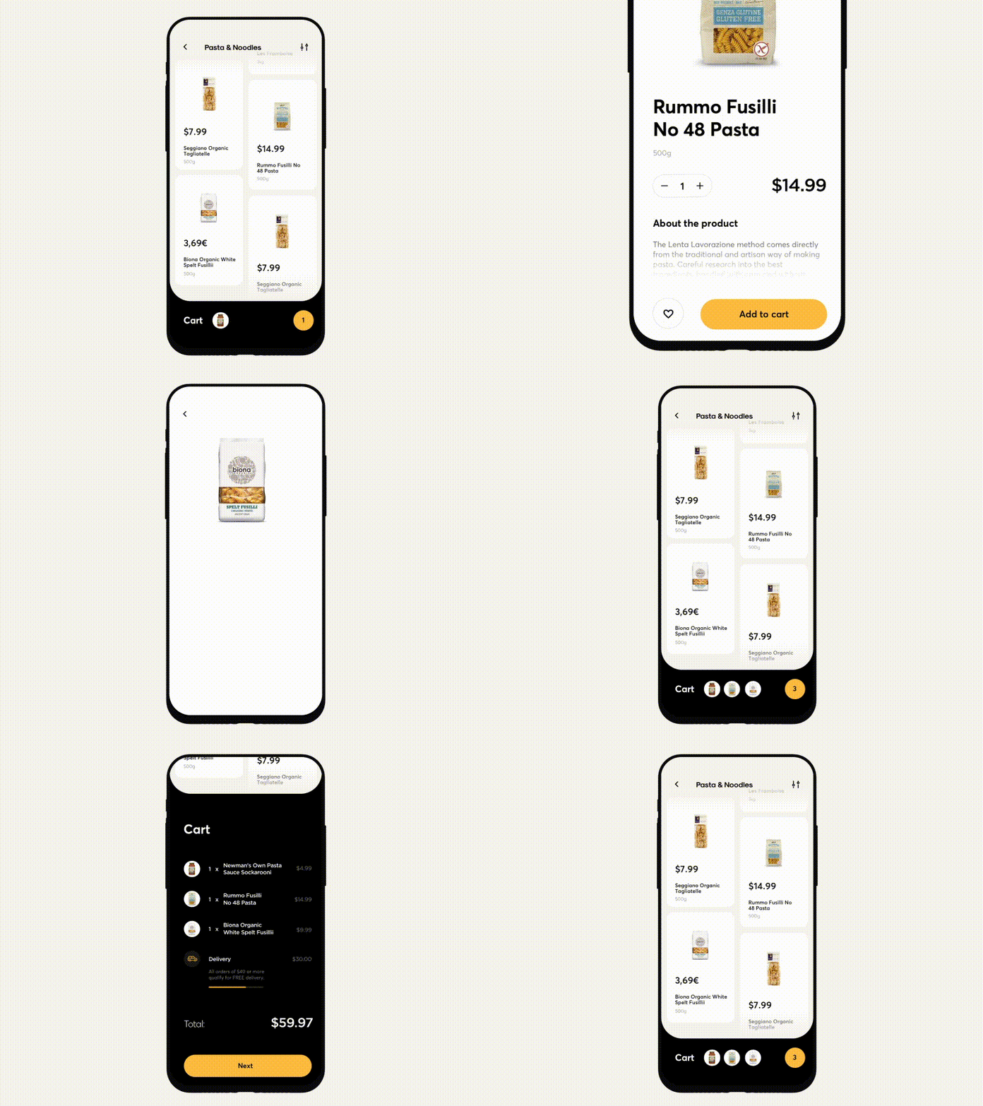
03/19 – Fitts .’s Law
Help users feel comfortable and easy when using their fingers or pointers to perform a certain operation.
Researched by psychologist Paul Fitts based on observations of human movement patterns when interacting with mechanical systems, Fitts’ law proves that, the time it takes for an object to move to a destination point desired depends on the distance and is inversely proportional to the size of the object. In other words, if the object is far away and small in size, it will take longer for it to reach the desired location. And conversely, if the object is small and moves quickly, there will be a higher error rate.
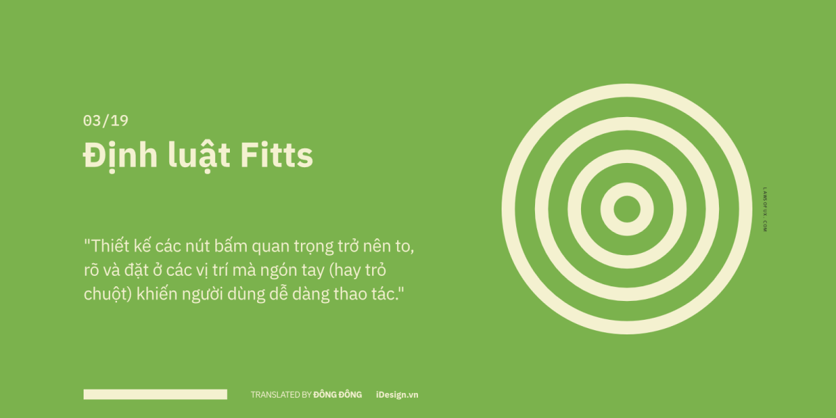
The law is very widely applied in user interface experience (UI / UX), the buttons on the mobile app interface will have a larger size than when designed on the desktop screen , because the Our finger (touch) is larger than the mouse pointer (click) .
As in the case of the macOS interface, although the buttons are quite small in size, most users do not find it difficult. As explained above, the mouse size has a very small area, we can completely click those buttons exactly, so until now you still do not dream that Macbook will be equipped with a touch screen if macOS user interface remains unchanged🙂
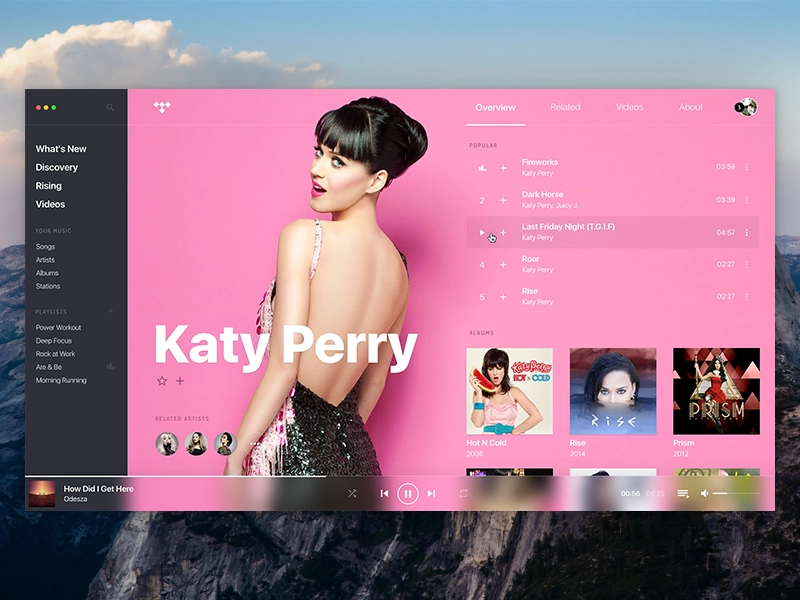
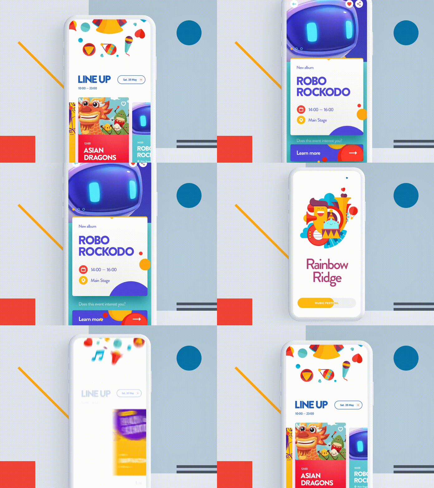
In the opposite case in mobile apps, the position of the CTA (call-to-action) buttons and the key interaction area should be as short as possible from the user’s finger, which will help them manipulate work in the most comfortable and fastest way.
As in the case of the button below, it can be seen that the user does not need to use the mouse to point exactly at the text on the button, but just be in that area. Make the interactive area very spacious, just like when experiencing on Youtube, you can click anywhere in the slideshow area to play or pause the video clip you are watching.

One more thing you need to note, the current electronic screens are all rectangular, which means the more towards the four corners, the narrower the range of the mouse pointer will be. So what does this mean in terms of user experience? Within the physical confines of a rectangle, moving the mouse pointer to the four corner points is faster than anywhere on the screen, so placing important buttons or operations in those locations will prompt users click on more. In the example below, the common point across all websites are the important interactive areas like login, shopping cart, notifications, search, etc. are all located in the right corner of the screen!
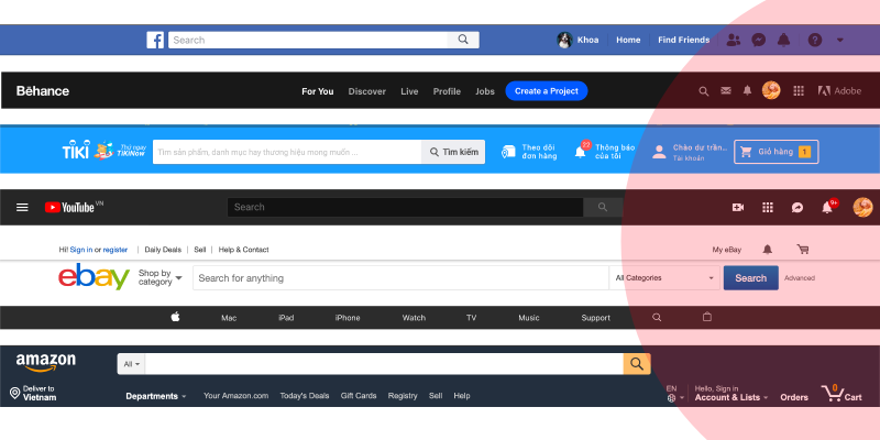
In short, the main purpose of Fitts’ law is to remind us to shorten the time and distance from the mouse pointer (or finger) to the lowest button positions. Some games also apply wheel chat to minimize moving the mouse pointer to options, when the player is in an urgent situation (such as needing help, increasing health …).

04/19 – Hick’s Law
The fewer choices, the less users think between decisions, thereby shortening the time to take action.
Giving too many suggestions only makes users more confused and takes more time to decide. In 1952, according to the results of a study on the correlation between choice quantity and user behavior psychology, from two scientists William Edmund Hick and Ray Hyman , discovered that people will become so they are very hesitant and indecisive if they are holding too many options in their hands.
Hick’s law is applied to cases when we want to shorten the customer’s hesitation time. Since there are fewer options, it means they will have less to think about between decisions, thereby shortening the time to take action.
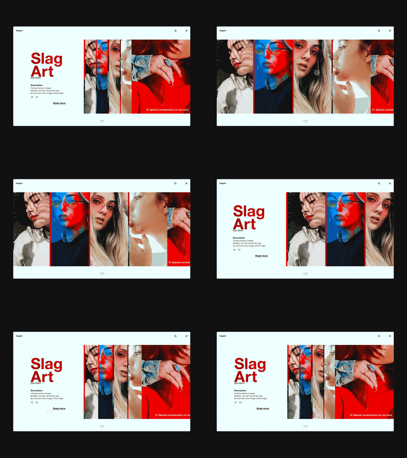
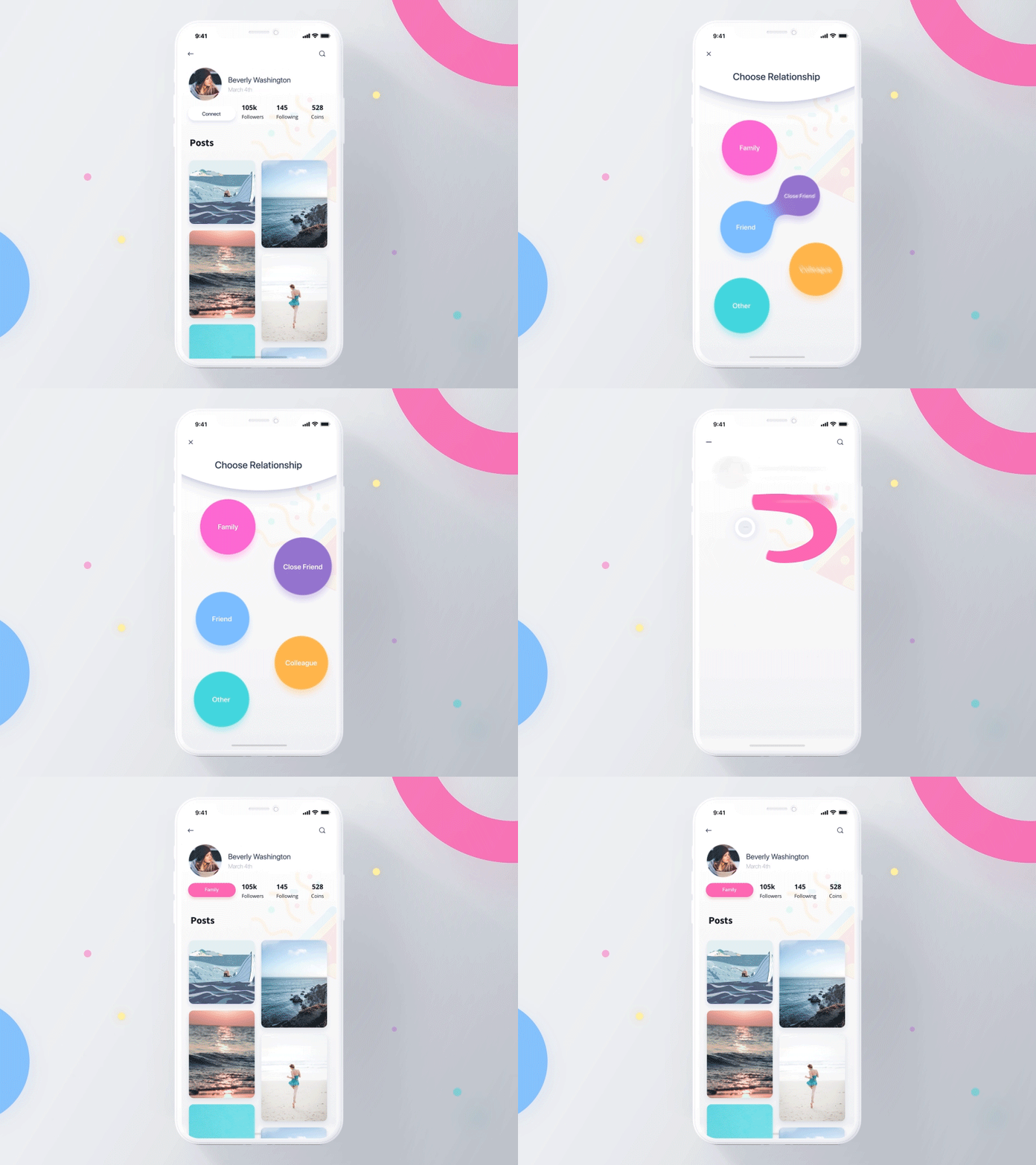
Try to minimize the options for users by suggesting them only a few important decisions, don’t overwhelm them and give them a headache when they have to choose between too many choices. In some cases, if it can’t be further simplified, find a way to break a complex process into many small steps, avoiding the case that the user is in a situation of having to think too many decisions at once.

Do you still remember the legendary Mario game more than 20 years ago? What makes it so popular? One of the important reasons is said to lie in the control buttons that only include going left, right and jumping up. Broadly speaking, not only in this game, most games on old consoles are said to be simple, fun, and bring real relaxation when the controllers have very few buttons. , players can easily get used to and manipulate. And if you look back at recent times, Flappy Bird, 2048, Temple run, Subway Surfers and many other games also follow the trend of minimizing controls for players.

On the contrary, there are some modern MMORPGs today that contain too many buttons and options, making it difficult to reach, and consuming a lot of time and effort to get used to.

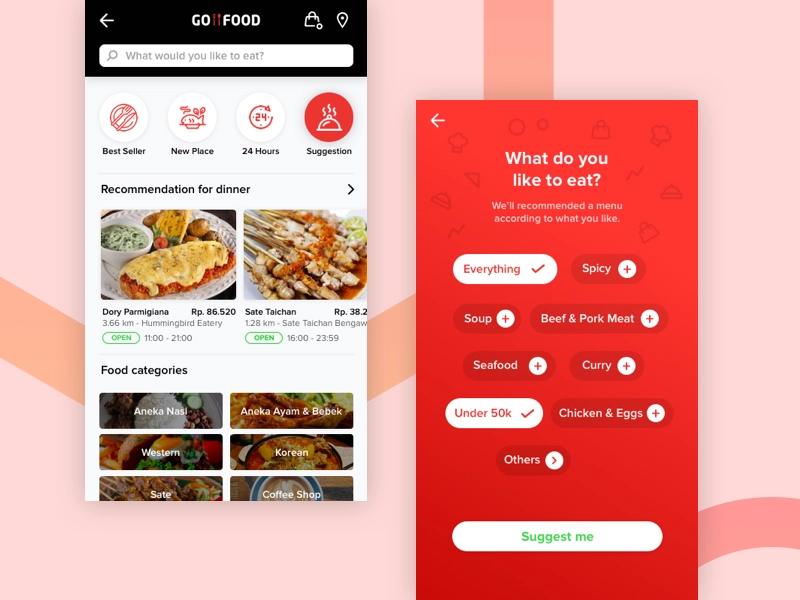
Not only does it limit the case where customers spend unnecessary hesitation, Hick’s law is also used to make product suggestions that the company wants to reach customers in the application or website . As in the two cases below, which one do you find more comfortable to choose?🙂

It’s very rare for Apple to compare their iPhones with other brands of Android phones . Apple doesn’t want the iPhones to be compared with phones from Samsung, Sony, LG, or any other phone company, because this comparison clearly does not exist for the company at all. Apple wants to minimize the customer’s selection, instead of leaving users wondering, “Which phone should I buy?” Apple will direct them to the question “Which iPhone should I buy?”
05/19 – Jakob .’s Law
You need to remember that customers’ perceptions and habits can’t be changed overnight, and sometimes it’s not really necessary.
Don’t surprise users with “breakthrough creative” ideas, because before they know about your website or app, they are used to using other websites or apps on the market. To reduce the learning curve between the customer and the product, the functions used should work in a way that is similar to what the customer has known before. Limit the creation of things that are confusing and strange, making users spend more time to learn and change habits.
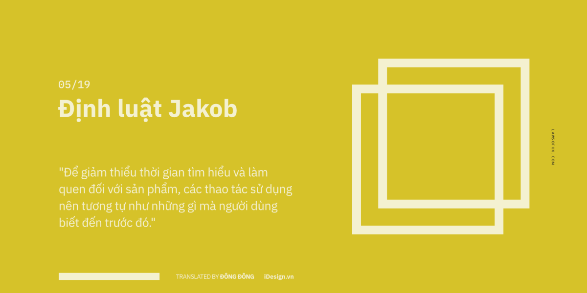
In other words, most people are afraid to approach things that are too new and different, people always seek stability and prefer to stay in the comfort zone. For example, customers are used to clicking on the logo on the top of the page to return to the homepage, using keywords to search, clicking the ‘X’ to close a window… Let everything happen naturally and easily . Understand, if users find it confusing or difficult to use, they simply press the exit button and go find other applications or websites that are easier to use.
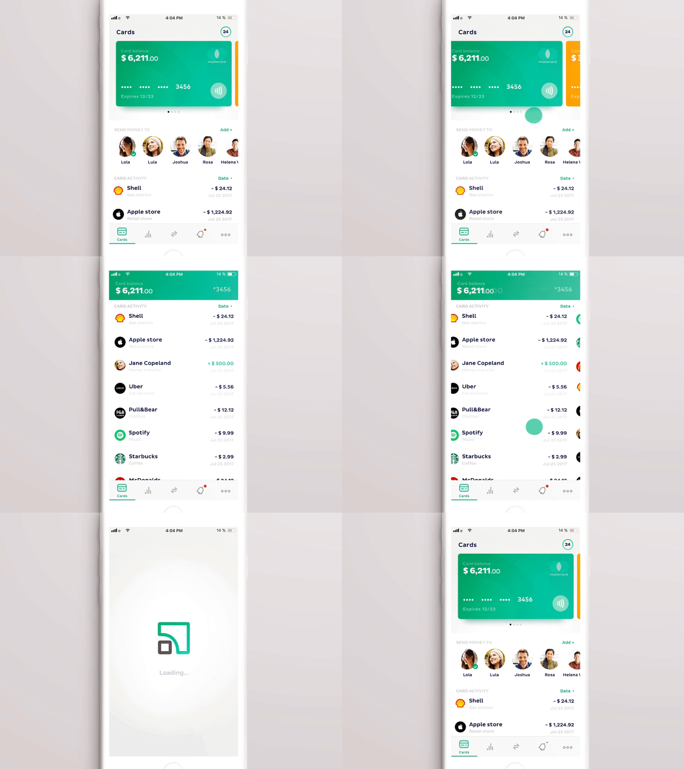
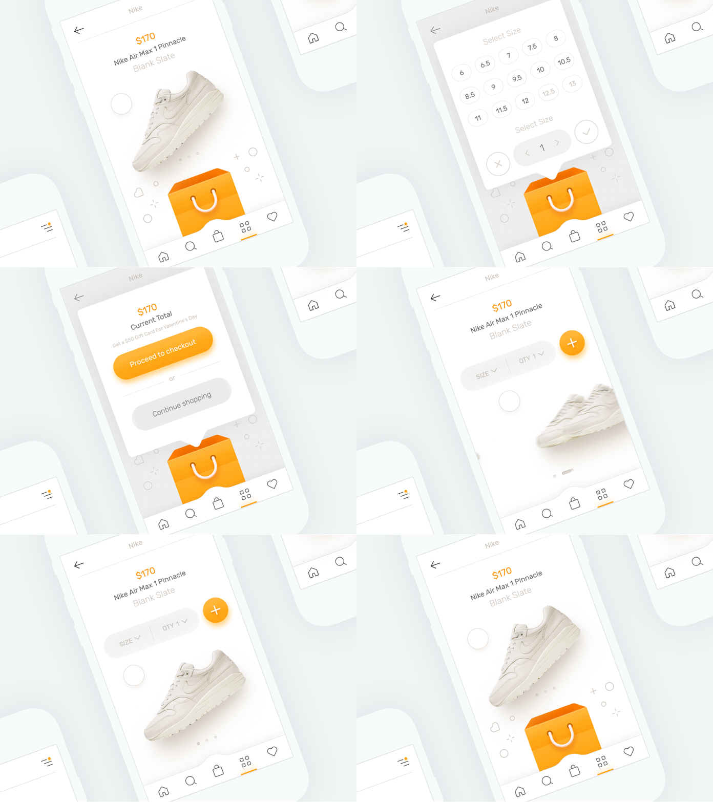
Of course, sometimes we still need to change some things and make a breakthrough in the user experience, but you also need to remember that customer perceptions and habits are not easy to change overnight. And sometimes that’s not really necessary. Instead of focusing your efforts on designing colorful effects that are only decorative, let the quality of the product attract the user’s attention, or the benefits that the company’s services bring. .
06/19 – Law of Common Region
Related components should be in the same space, which makes information blocks separate and easy to understand.
As one of the principles of Gestalt’s law , between pieces of information or images, if there is a clear separation, it will be very easy for us to recognize.
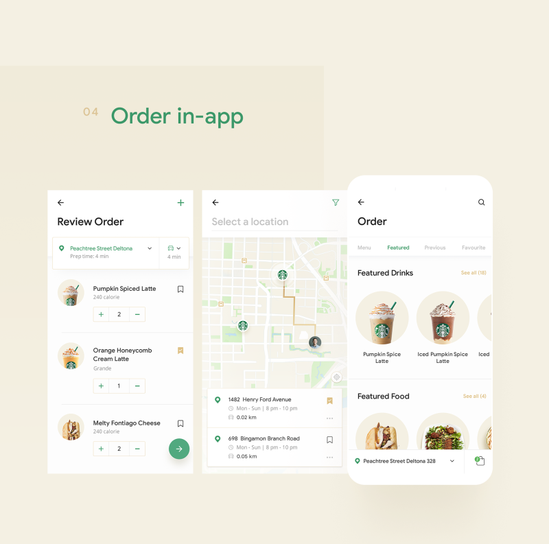
In the example of the Starbucks coffee application , information groups such as order management, location of each address, or drink menu are separated very intuitive and easy to understand.
Another interesting example, as you can see in the sign below, just by using borders, we can completely take the initiative and direct the viewer to grasp the information according to the wish.

As in the website below, the two spaces are divided, creating an interesting and unique visual effect. In summary, in this original, we should keep everything orderly and easy to understand, making users feel quickly aware of the areas of expertise related to each other.

07/19 – Prägnanz . Principle
It is not necessary to show all the details of an object’s shape to make it recognizable to the viewer.
Humans are born with a love of simplicity and clarity. The brain always tends to reduce complex blocks to the most familiar and core things. Thanks to this mechanism of action, the brain will spend less time being able to perceive and capture a complex image, and at the same time limit the feeling of shock and surprise when encountering anomalies.
As you look at the image on the left side, in this case we tend to see the 3 shapes (rectangle, circle and triangle) as a whole, rather than separating them and treating them as single components. as is the case on the right.

WWF ‘s logo is one of the popular examples of using negative space very effectively, as you can see the logo is not actually drawn in full and detail, it’s just the pieces connected together. But with the automatic mechanism of “filling the gap” and familiar body recognition, we easily recognize the shape of the panda.
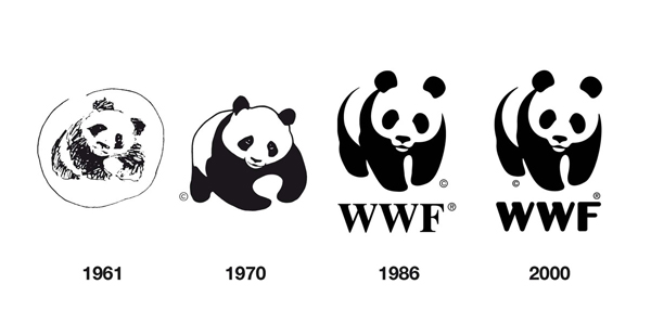
This Prägnanz principle is considered the basis of the entire Gestalt law , as they tell us that it is not necessary to show all the details about the shape of an object in order for the viewer to perceive it. . In other words, the brain will automatically bring complex images back to basic, understandable and close geometric shapes.

This principle is also one of the main techniques of illustrators . Most artists know that no matter how complex an object is, it is made up of basic blocks like cube, sphere, cylinder, cone, hexagon.


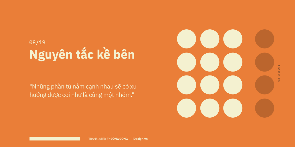
08/19 – Law of Proximity
If groups of elements are placed next to each other, the brain will tend to group them into a separate group.
When the distance between elements becomes close together, we will consider them to be in the same group. This principle is applied to help us read and understand information quickly.
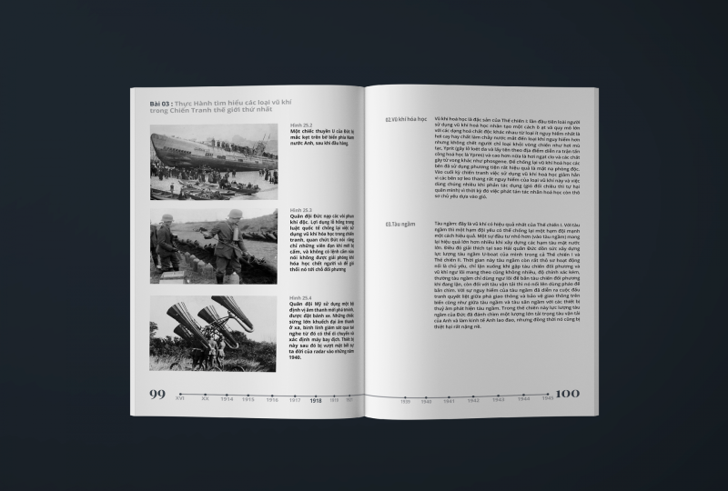
Text layout will be messed up if the lines don’t have prominent separation. That’s because each paragraph (paragraph) has the task of saying a certain content, topic or information, otherwise, the reader will feel very vague. They do not know if the information is related to each other, and whether they are writing about the same topic.
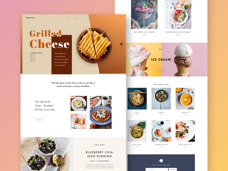
Design for users white spaces that not only act as eye stops, but also make pieces of information more intuitive and understandable.
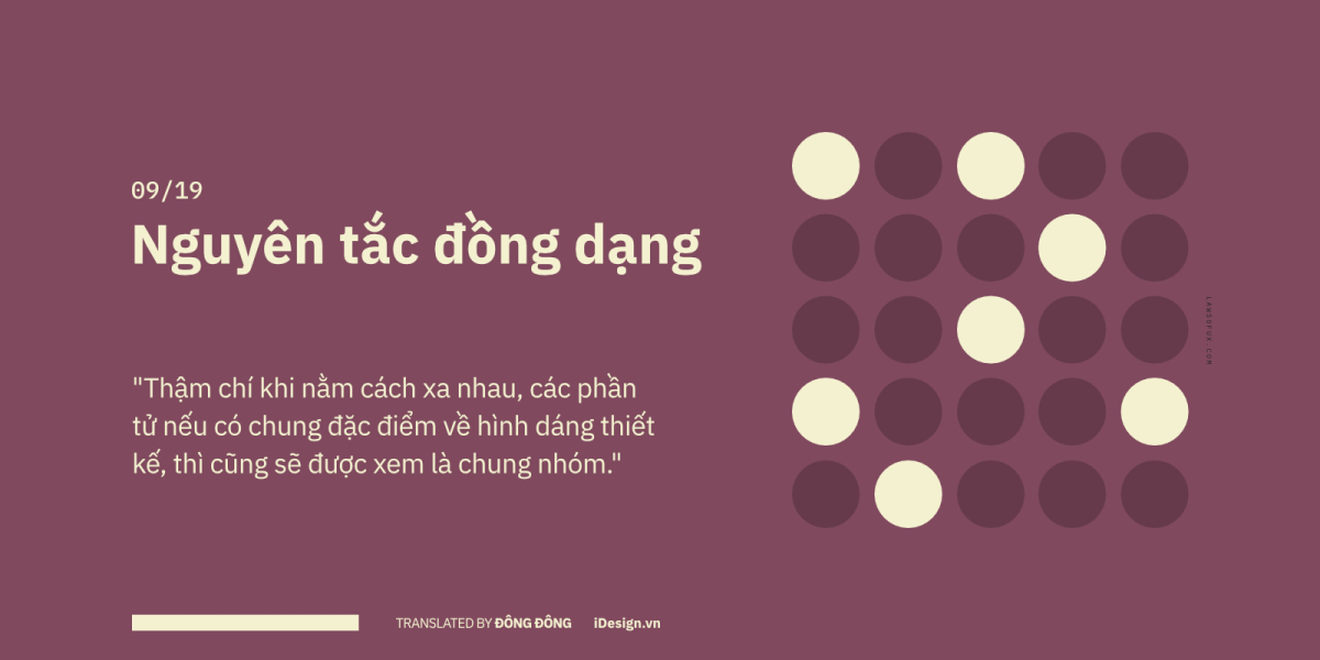
09/19 – Law of Similarity
Even when not lying next to each other, the brain still creates an invisible wire to connect similar objects together.
Have you noticed how our eyes tend to group similar objects together?
In the example of the MOCA Museum Logo , although the letter ‘C’ is the only letter in the logo, it is not out of place because it has all the characteristic properties of the rest of the geometry (square, round) , triangle).

Therefore, the brand identity system including elements such as name, logo, slogan, packaging, website interface… needs to be designed synchronously and consistently so that customers can easily recognize and remember the brand.

10/19 – Law of Uniform Connectedness
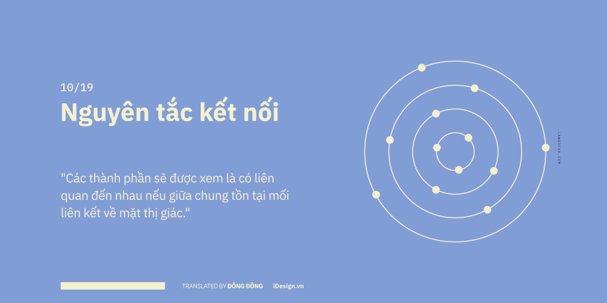
Elements that have any visual connection, the brain automatically “visualizes” an intimate connection for them.
In addition to similar patterns of shape, size, style, or color, the brain automatically builds intimate connections between visually connected components such as lines between them. term.
As in the example below, although the circle and the square are two shapes that do not match, but when there is a connection between them (the line connecting the shapes), we still consider them to be in a relationship. belong to the same group.
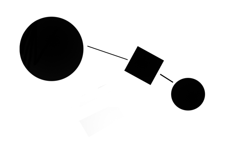
The principle of connection is most powerful when it comes to interactions between objects, sometimes even breaking other Gestalt principles . This principle is often used to connect elements that are located far apart, or are not related in shape, in a design work.
11/19 – Miller’s Law
An average person can only absorb 5 to 9 pieces of information at a time.
Cognitve load is a term used to refer to memory limitations when people have to absorb a large amount of information and need to process it in a short time. When a user visits a website or application, the brain must be constantly active and devote a large amount of cognitve load resources to process the necessary relevant information.
But the problem lies in the limited memory and processing capacity of humans, and if we “smash” the user’s face with too many images at the same time, it will make them not capable of handling and receiving information. information consciousness.
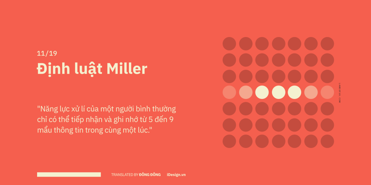
So how much information is reasonable? In 1956, George Armitage Miller came up with a number that works for most of us, who suggested that the average person’s memory limit can only take in 5 to 9 pieces of information at a time without having to wait. Stop.
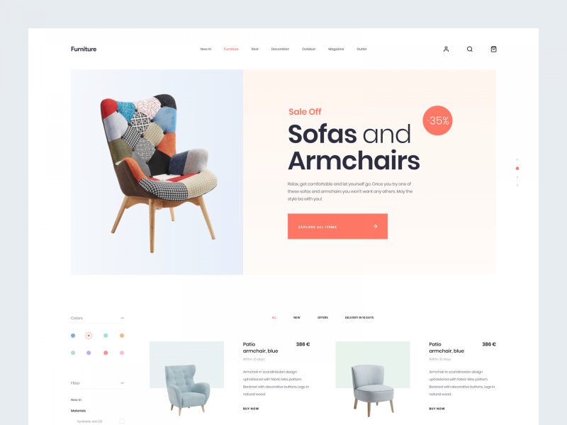
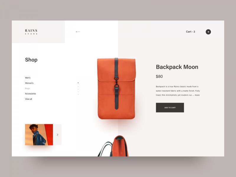
For those of you who follow the school of minimalism , rest assured, 5 pieces of information is the lowest level that users can receive gently , not necessarily more minimalist like that. And try not to exhaust the user by forcing them to take in more than the limit of 9 pieces of information in your website or app.
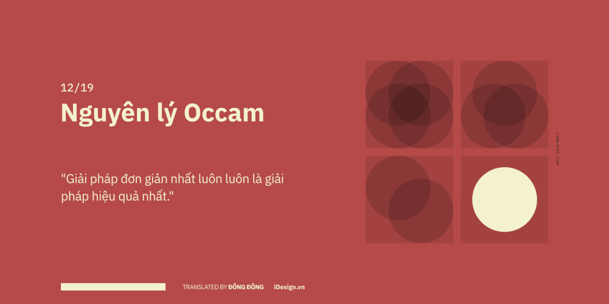
12/19 – Occam’s Razor Principle
Try to understand and prioritize what your customers need most, and focus on the best experience for it.
The Occam Principle is a very old and famous way of problem solving, named after an English monk and medieval philosopher – William of Ockham . The word Razor (razor blade) comes after Occam’s Razor name , meaning to cut out all unnecessary components, excluding similar hypotheses.
One of the common mistakes of designers is trying to cram too many features and effects into a product or application, resulting in the user interface, user operations become too cluttered and confusing. complex . Do users feel necessary with all the features you include?
Try to research, learn and prioritize what is most needed, and deliver the best customer experience.
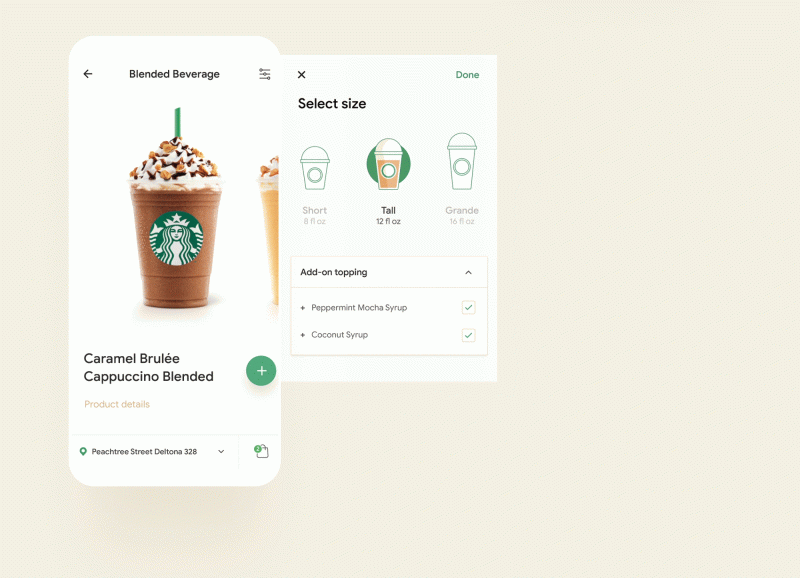
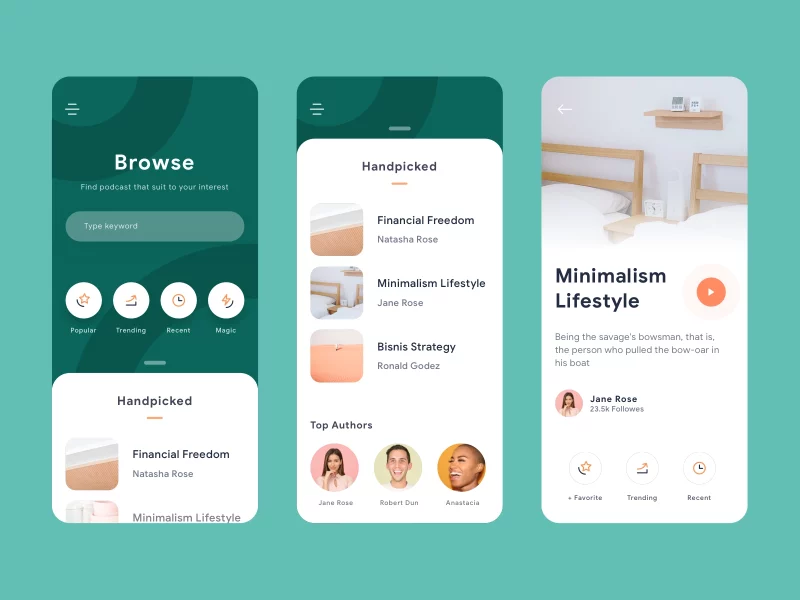
Boldly remove all the cumbersome, inefficient things, quality over quantity, look for simple solutions to solve problems.
More than 12 years ago, phones with many buttons were dominating the market…
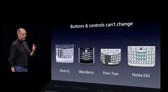
…then iPhone appears as the most optimal solution. There is only one physical button on the front.
And now there is no button left for product lines with facial recognition sensor (FaceID) like iPhone X, XS, XR & iPad Pro 2018.
13/19 – Pareto Principle
Focus all your energy on the areas of products or services that make sense to the vast majority of users.
Or better known by its more familiar and well-known name, the 80/20 rule. It originates from the Italian economist Vilfredo Pareto , who observed and found that 80% of the land in Italy is owned by 20% of the population. This is also a common rule in business such as 80% of revenue comes from 20% of customers.
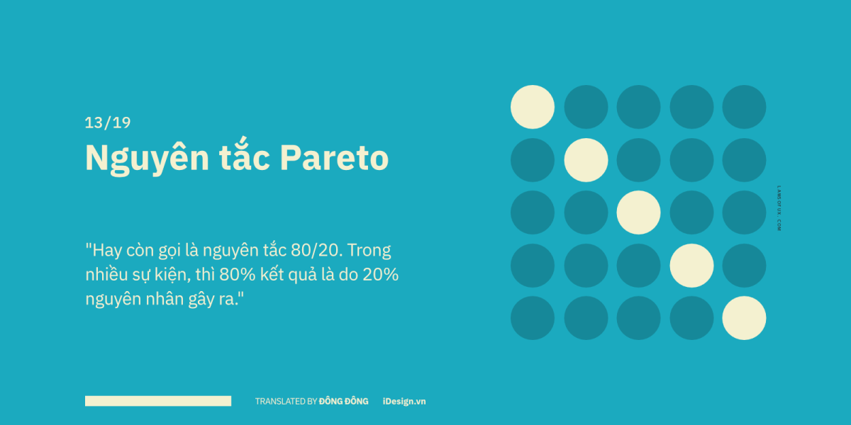
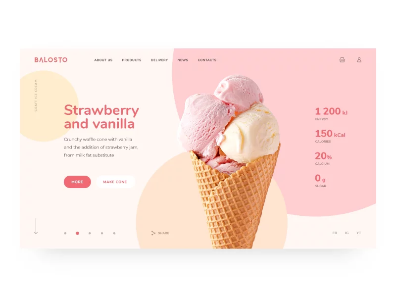
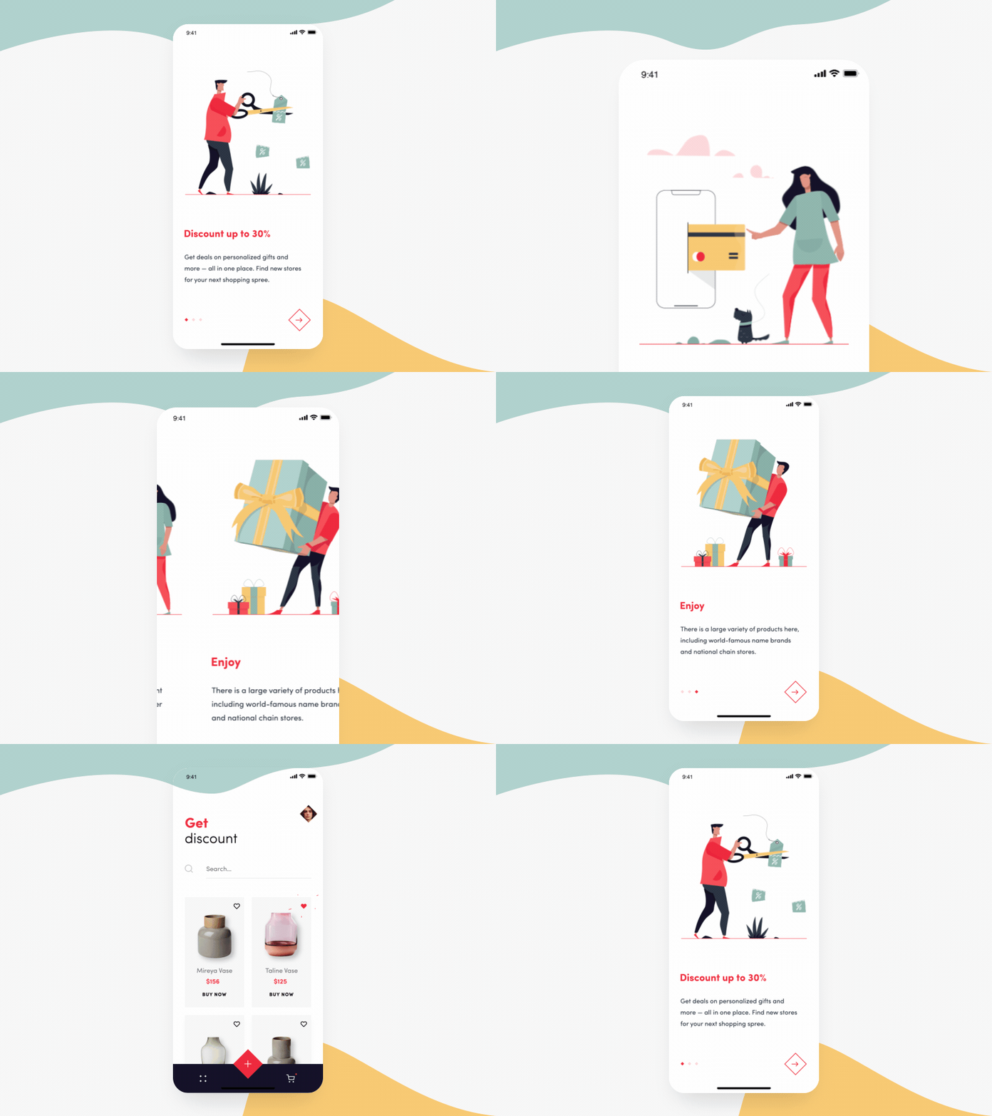
No matter how rich the content of your website or app is, almost of it only 20% actually contributes to 80% of positive and helpful customer experiences. This is important in helping you focus all your energy on the areas of your product or service that make sense to the vast majority of users.
14/19 – Parkinson’s Law
Simple tasks also increase in complexity to fill a given amount of time.
Anyone here is used to the “water to the feet” type of work. Especially for us designers, the level of muddiness is doubled. School days even though the time allotted to complete a project or assignment is a month before, but most people only really work at their full capacity in the last week of the deadline!
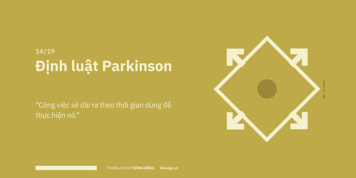
In 1955, Cyril Parkinson , a British historian, noticed this phenomenon while working in administrative units in England. He observed that as the bureaucracy expanded, employees became increasingly inefficient. And after continuing to observe with many different cases, he discovered that simple tasks also increase in complexity to fill a given time period. If the time spent on a task is shorter, they also become simpler and easier to solve.

This means, if we want the user to perform an action, try to break the process into small parts, this will make the user feel more comfortable and faster to complete.
15/19 – Postel’s Law
In order to provide a positive experience, we should provide users with the ability to customize, and be flexible in use.
Originated from an American computer scientist, Jon Postel , when the law was widely applied to the field of software programming, computer networks, in the early days of the Internet era.

In most programming languages, computers will identify the number ’19’ and the letter ‘nineteen’ as two very different data formats. But the reality is more complicated than that, users will enter into the keyboard anything habitual, ‘April 19, 2019′, or ‘April 19, 2018′, ‘hcm’ instead of ‘Ho Chi Minh’ Minh’, ‘1.00’ or ‘1,’.
So in other words, to bring a positive experience to users, we should give them the ability to customize, and be flexible in use. At the same time, you should also pay attention to the technical issues behind.
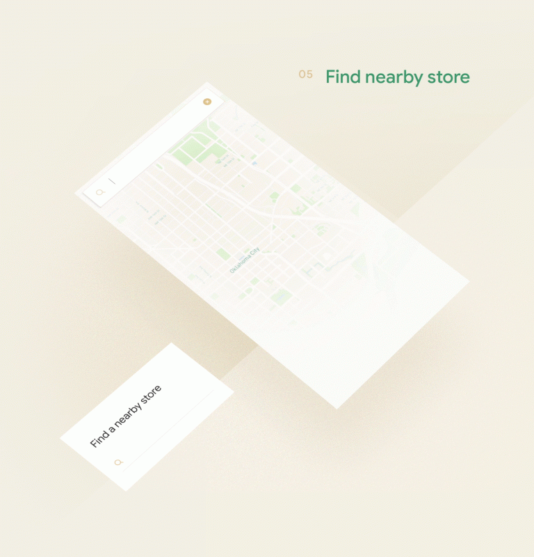

And it’s easy to understand why Google is the most popular search engine in the world. In many cases, Google is so understanding that when we type in search sentences that have no head, no tail, no grammar, or even misspellings… they still come up with completely suggested results. Fit.
16/19 – Serial Position Effect
The least important pieces of information should be placed in the middle, because in the first and last positions people tend to remember longer.
It is not natural that it is easy for us to memorize the sequence ABC, XYZ in the alphabet, and the sequence in the middle is almost impossible for many people to remember correctly. Hermann Ebbinghaus, a German physicist who pioneered the experimental study of memory, with his theory of serial position effect , he discovered that ordering information items also creates so it has a great influence on human memory ability.

To be more specific, in Hermann Ebbinghaus ‘s theory, there are also two accompanying concepts, one is the “bias effect” (also known as the ” primacy effect” ) , that is, the first impressions are easily It is easy for people to rely on it to remember, the second is the recency effect (roughly translated as “recent impact” ), only new things that happen immediately, also make people difficult to forget. In other words, the information space in the middle of the event seems to be easily forgotten.
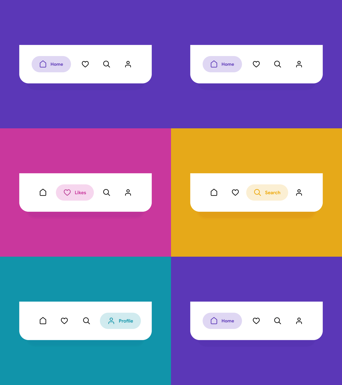
In interface design, pay attention to the left and right corner positions on the screen, because at these positions users are easy to remember the operation. Most apps place the ‘Home’ and ‘Profile’ items at the top and bottom of the list.
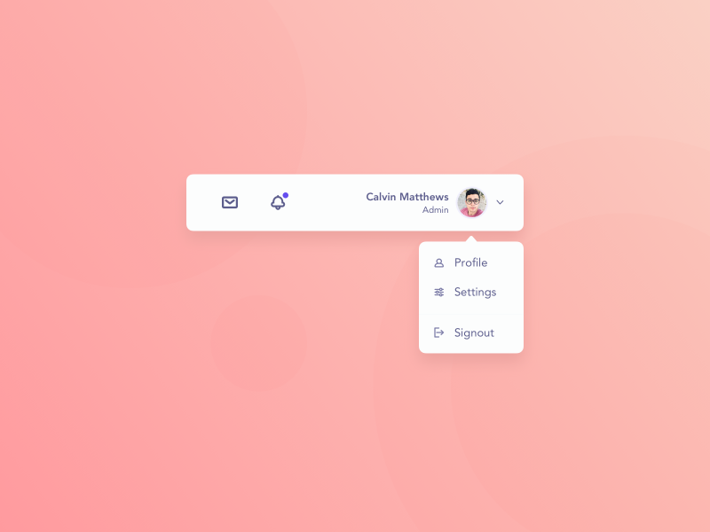
The ‘Signout’ option is also very common when placed at the bottom of the dropdown menu.
17/19 – Tesler’s Law
The complexity of the user will translate into the complexity of the development team, if we do not recognize the limits of the machine system.
During the mid-1980s, while working at Xerox PARC , Larry Tesler realized one thing, paying attention to the interaction between humans and machines is of course important, but the manner in which systems are interrelated. Interactions are equally important.
In a book called ‘ Designing for Interaction’ , there is an interview with Larry Tesler , when he first mentioned the Law of Conservation of Complexity ( Law of conservation of complexity) . For him, every mechanical system has a certain degree of complexity, and cannot be further reduced. In other words, the complexity of the user will turn into the complexity of the development team, if we do not recognize the limit of the machine system.
Focusing on user experience and cutting down on complexity is the right thing to do. But keep in mind that everything has certain barriers and takes a long time to develop in a more convenient direction. Right now, you can’t ask for an aircraft control system that makes you as easy to learn and get used to as driving a motorbike.

Let’s bring simplicity to both sides, the user side and the product development team. Sometimes in order for the system to work effectively and fully with the necessary functions, it is necessary to let the user suffer a little. So, if you’re a product developer, try to keep things in balance, and use minimalism where possible.
18/19 – The Von Restorff Effect
Let the important pieces of information attract the eyes and attention of customers.
In 1933, psychologist Hewig Von Restorff published a study that revealed that we are more likely to remember a piece of information in a list if it is distinct and outstanding. For example, if you have a list of sequences of numbers, and there’s a letter in the middle, there’s a good chance you’ll remember that letter – simply because it’s different from all the rest of the information on the list. . This phenomenon is known as the Von Restorff Effect .
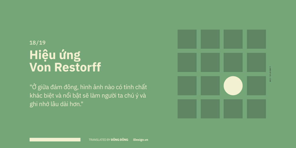
Also known as the isolation effect , in the crowd people will have a deep impression of eccentric, special or unusual images. What image do you want users to remember most when using your product? Simply put, make them stand out from the rest of the design.
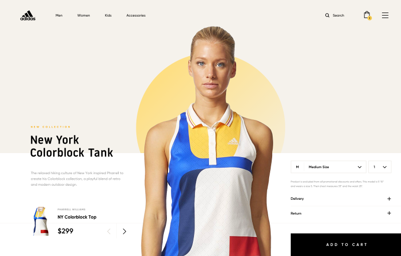
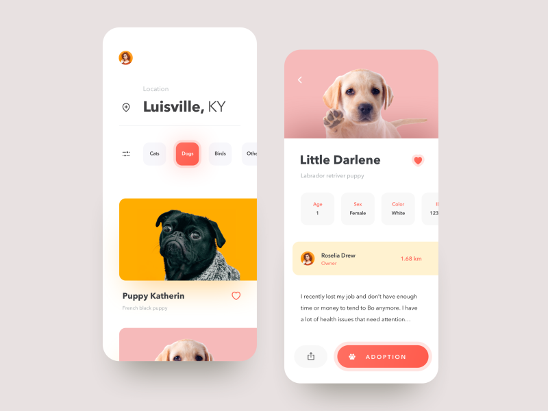
That’s why CTA (Call-to-action) buttons need to be designed to be instantly recognized by users, and not searchable. By applying this effect, we can let the most important pieces of information catch the eye and capture the attention of the customer.
19/19 – The Zeigarnik Effect
Tasks that are in progress will make them “stickier” in the head than after they are completed.
When people start anything, they tend to try to finish it. Once you have decided to take the first steps, something will push you to do it.
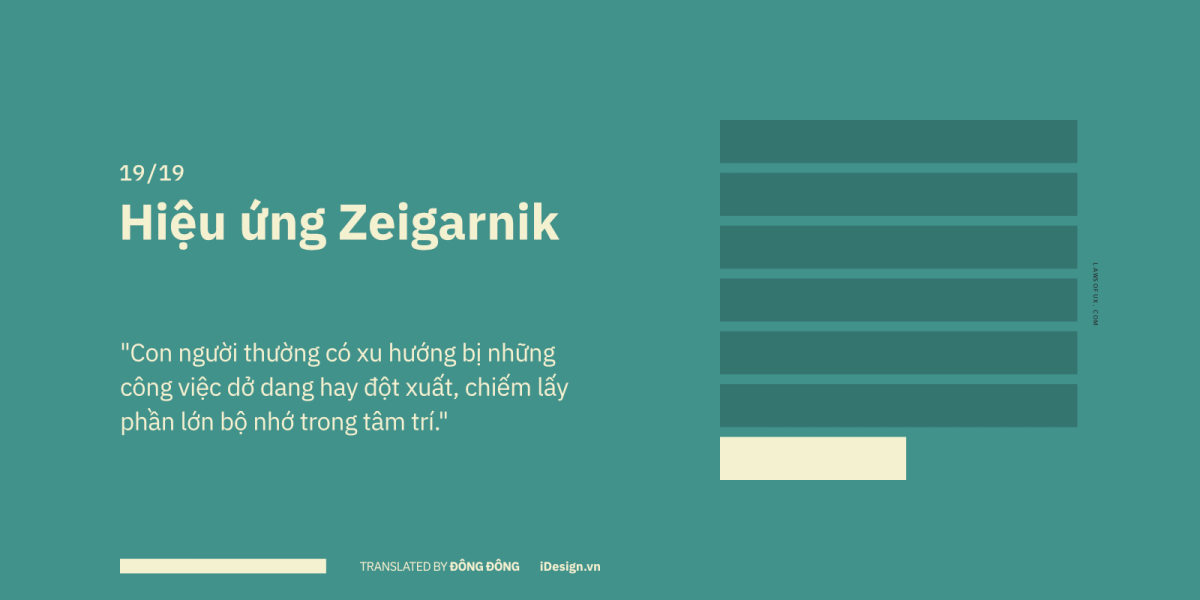
Bluma Wulfovna Zeigarnik (1900-1988) was a Soviet psychologist, in the 1920s, when she began to publish a theory describing the effect of memory by current tasks and after completing them. She found that work in progress makes them “stickier” in her head than when completed.

The story begins with the fact that while observing the waiters in a restaurant, Zeigarnik noticed something strange, seeing that most of them have the ability to remember long and complex orders for a long time. However, when they finished serving, they completely forgot about those requests. Unfinished orders seem to “stick” in waiters’ brains until they’re done.

This effect is seen as a very effective solution to reduce user procrastination. As you often see in online learning platforms like Duolingo, Udemy, Skillshare, Coursera …, they often encourage and motivate learners by giving progress bars, being users. feels like it has to be done.
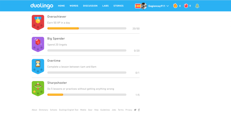

Not only in the field of design, but the Zeigarnik effect also appears everywhere in life, as soon as you step out of the exam room, the amount of knowledge also flies out of your head. Or for example, in a love story, people often remember an unfinished love in the past (“unforgettable old love”), or TV episodes often end at the climax to create viewers are psychologically waiting and eager to continue watching the next episodes.
Conclude
The success of a design depends on the user experience. After all, the most important element in UI/UX design is the experience and how the user interacts, if the design is confusing and makes the user feel uncomfortable, you need to immediately evaluate and modify it. And another very important purpose of design is to attract the target audience.
That’s why rely on psychology to better understand User Experience, increase engagement, and improve overall design perception.
As we strive to create a human-centered design, it is essential to develop a system of psychological principles and approaches to increase the effectiveness of apps and websites, help users achieve their goals quickly and efficiently.
Through the article on Malu, I hope you will gain new knowledge and apply it successfully in suitable projects. Good luck!


