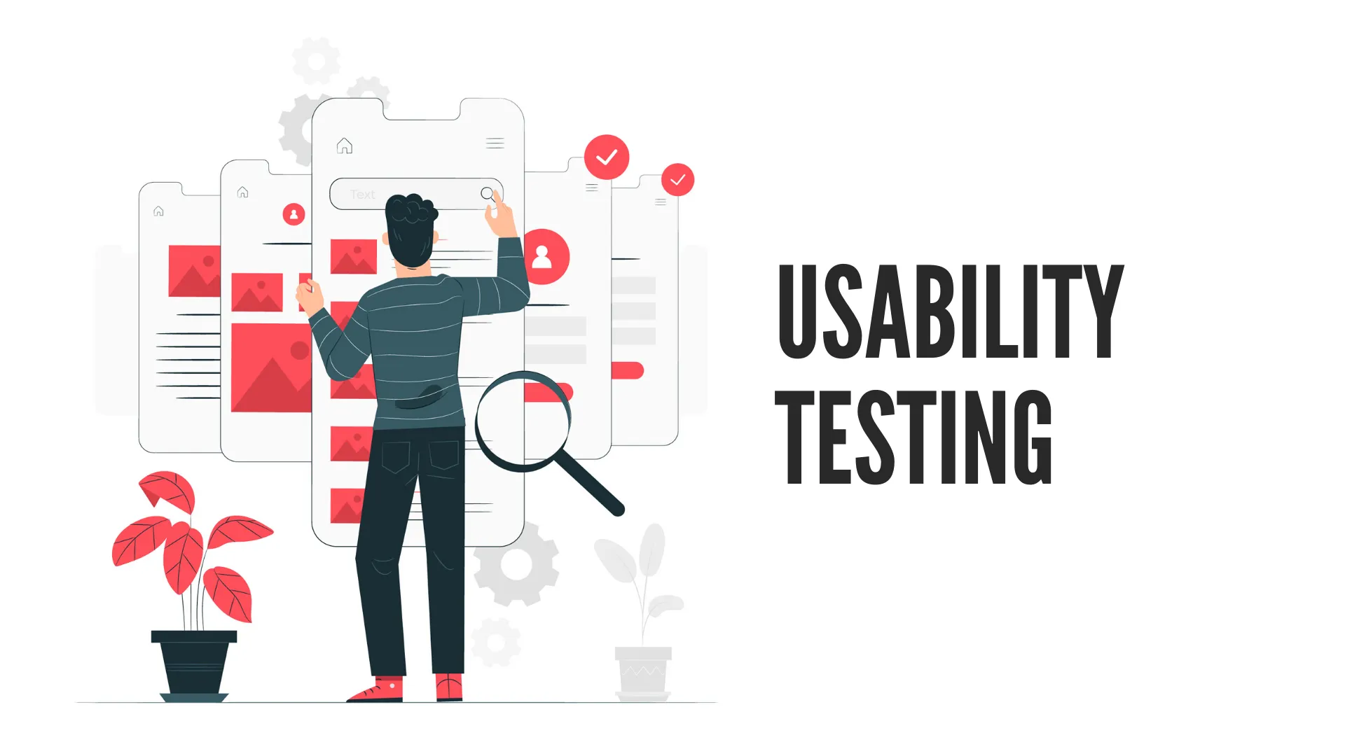
When learning about Website design, UX design, you may often encounter the term ” Usability “. So what is Usability and how to design responsive to Usability?
Usability is a fundamental concept in UX – But what it really is and how to design responsively Usability is a never-ending topic.
Usability is such a simple concept, yet so powerful that it can blow away color and trend design concepts in an instant.
To put it very simply, usability responsive design is design so that one person can easily use your product without a manual.
In this guide, Malu will help you better understand what Usability is, point out the difference between Usability and other important concepts ( UX and Accessibility ), and share more about how to design responsive Usability.
1. What is usability?
Usability is usability (aka Usability ) which is the ease with which a customer can complete a certain task with your product.
It is the result of purposeful, research-based, and user-tested design decisions made with one goal in mind:
Make it as easy as possible for users to do what they need to do with the product.
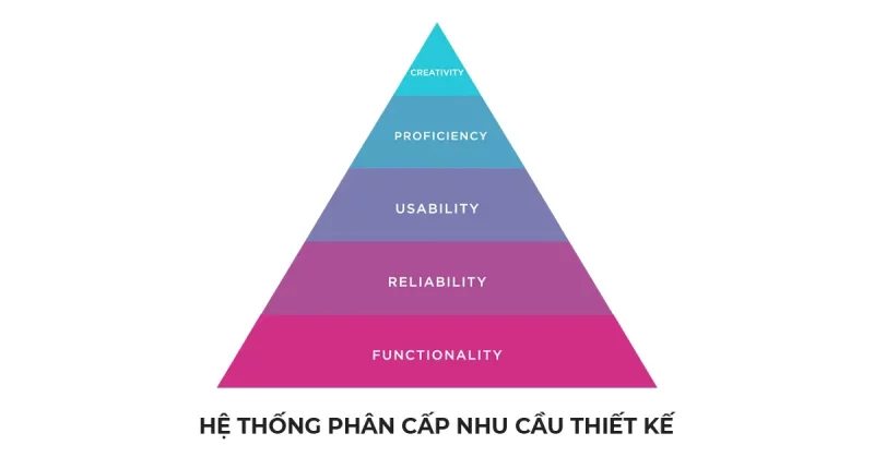
Usability is the key element in the design needs hierarchy:
And in the User Experience model:
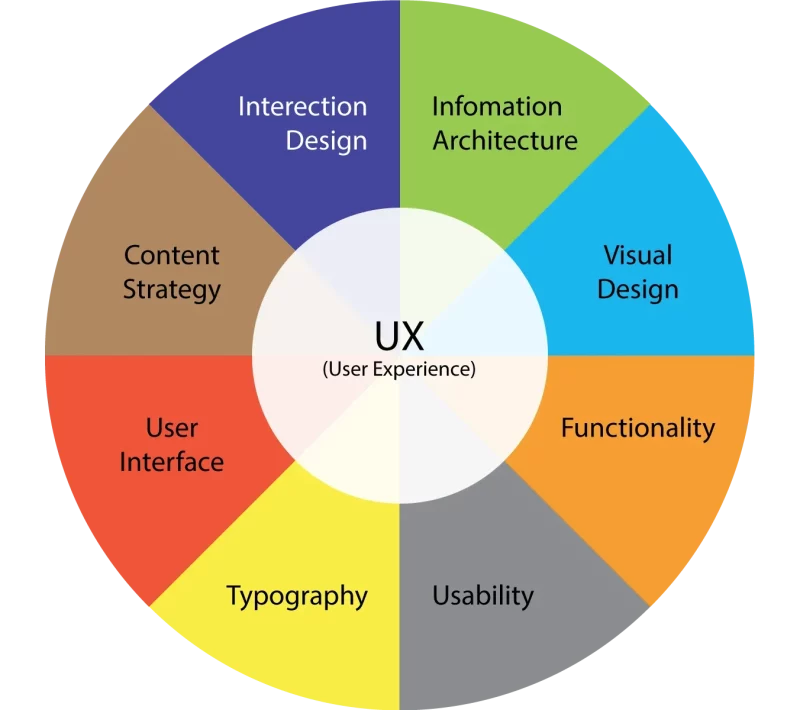
Both are models that help me analyze what can become a complex tangle.
These models visualize the essential components that good design products typically have (apply).
If you let go of usability, you may end up with a product that is great in theory, may even stand out visually, but ends up being ineffective or frustrating to use. use.
Rather, usability is the result of design after the designers have researched, tested on solid data.
For example:
- You have a Smartphone that you like to use. This most likely its designers did a great job of research and testing to come up with this final design.
Of course, you can still use a phone with poor usability.
But in that case you are either suffering or compensating by other factors (Cheap, given away, not prime phones).
At least in the short term this is not a big issue, but over time you will see how usability greatly influences your decision to buy a new phone.
2. What makes design easy to use?
Product usability is based on 5 core factors (which I will elaborate a bit more on in section 5 of this guide).
These 5 core elements make a huge difference in the overall quality and success of your design. That is:
- Ability to learn
- Effectiveness
- Ability to memorize
- Error
- And Satisfaction.
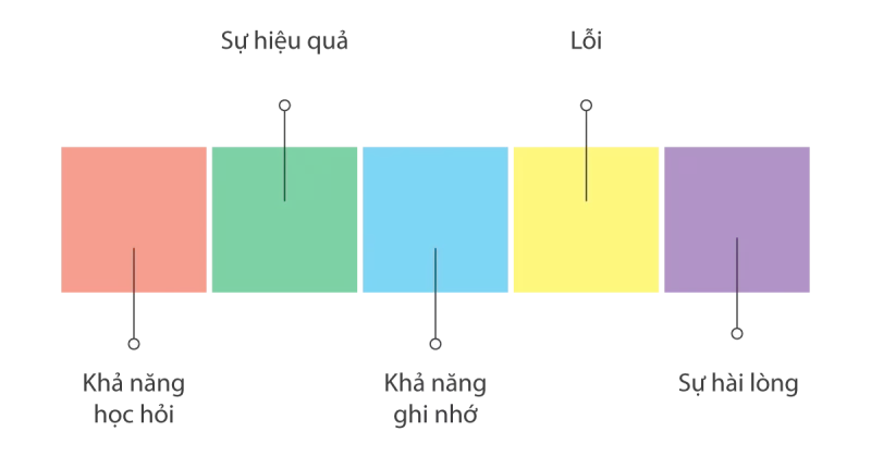
5 Core Elements of Easy-to-Use Design
- Learnability : How quickly can first-time users understand basic navigation and functions?
- Efficiency : Can users perform tasks relatively quickly?
- Memorability : When users leave for a while and come back, how quickly can they reinvent themselves with basic navigation and functions?
- Error : What error did the user make? What is the severity of the errors? How can users easily understand and recover from those errors?
- Satisfaction : How much do users like the interface and complete the tasks within it? (Both when they were using the product and how they reported satisfaction afterwards.)
> Immediately consult Malu’s WEBSITE DESIGN service to create an easy-to-use website for your business, good experience, and higher business and communication efficiency.
3. Incorporating Usability in UX
Usability and User Experience (UX) are not the same thing. Usability is an important part of good UX, but these are two different concepts that guide us in looking at different aspects of the design process.
- Usability refers to how easy a product is to use — how easily a user can complete a certain task with that product.
- UX refers to the overall experience a user has with a product, from start to finish.
Let’s see an example to see the difference.
You’re looking to buy an e-reader (Kindle, Nook, etc.), so you go to a website you’ve heard of and it’s easy to navigate through.
You find the reader you are looking for and browse the detailed product page. Here, it’s very easy to understand the specifics of each option — hardware, pricing, accessories, warranties, etc.
You find the most suitable one and you hit buy it.
The payment process is very simple and fast.
You wait for the seller to send the goods.
They don’t send you much notification about the status of your order, but you received the item 2 weeks after placing the order.
You are looking forward to receiving the perfect machine and eagerly waiting to experience it.
The end is that you get a faulty e-reader.
You can’t even turn it on.
Right now…
You return to our website to see the return instructions. You visit the website and wonder where their support contact information is listed.
It took a bit of research, but eventually you found a toll-free number for customer service.
You call and find it a bit uncomfortable to wait… the operator finally picks up the phone. You still do your best to keep the conversation friendly and calm.
However, the staff doesn’t seem to care much about this issue.
After a while of trying to exchange, you also understand clearly about the exchange process, but need you to send back the full product.
In the end, it takes you all day to make the exchange. A month later, you get a new machine (fortunately it works fine).
Do you feel this story is lengthy?
I have that feeling too.
But this is what I mean by giving this example.
Usability comes into play when you shop on the website.
You find the e-reader and you want and order. It is very simple, easy and fast.
However, the usability of the website is poor when you try to return the goods, there is only one thing: the switchboard number.
It took you all day to resolve the frustration. And wait a whole month to receive new goods.
This may be their intention – or it may not be. But at this point of contact is inefficient and not easy to use.
And the rest of that story is UX — your experience with the company and its product from start to finish.
Long delivery, slow exchange, unenthusiastic staff…. That’s all that’s left of you.
This is the UX.
However, it may depend on each point in your buying journey.
If given points. How many points would you give this seller?
Overall, this is a common procedure. But there are sellers who are improving this problem very well.
For example, Shopee has created a feature that allows tracking details of the order journey, and even includes the return/refund process in there. Very easy to understand and operate. Importantly, the process is integrated into the website, the application makes the website and application more available than ever.
A simple, easy error handling routine looks like:
“Bringing coal to warm on a snowy day”
Definitely more valuable than:
“Flower embroidery on brocade”
So Usability becomes really important, because it is one of the factors that determine how many loyal customers you have.
4. Each relationship between Usability and Accessibility
Now that you have seen the difference of Usability in UX, let’s move on to the comparison with an important factor of Accessibility : Accessibility.
Usability and Accessibility are related but considered separately.
Just as good UX includes usability, good usability includes accessibility…
Accessibility is usability that is applied radically and considers users who may not have the same cognitive or physical capabilities as your “normal” users.
For example:
- People with vision loss, severe nearsightedness, color blindness
- People with hearing loss
- People with hand disabilities who can’t type
- …
If your product is designed only for people who can hear and see everything, all the time, then these users definitely don’t have the full experience (or can’t even use it)
The reality is that if you don’t take accessibility into account, you’re actually creating a product that’s potentially unusable for a significant number of your users at any given time.
> NOTE: This group of subjects because of their limited ability, they are even more inclined to accept purchases than the average person (with many choices) .
The W3C Web Content Accessibility Guidelines provide a good standard for ensuring that digital products are fully accessible and do not exclude users by their physical or cognitive abilities.
5. Usable Design
The most important things to remember when designing usable, responsive usability are:
You can’t add “A little useful ability” anywhere you like. It must be the effort of the whole design process
You need to constantly:
Research and Experiment
If you embrace design solutions without researching and understanding where the real problem is, you’ll see your efforts as wasted.
A nice design but unusable
Might also work, but it’s not the best. There are even side effects.
Similarly, if you’ve done extensive user research and implemented well-designed solutions… but haven’t tested and evaluated them to be useful, you don’t know how to improve when problems arise. born.
Therefore, a good responsive design must always go hand in hand with research and testing.
As you begin to research and experiment, here are some questions to help you better shape:
- Who are the real users of this product and what brought them here?
- Who are the potential users and what keeps them from using the product?
- What are the relevant contextual factors for these users?
- How do environmental issues affect the usability of the product? (Now and future)
- Why do users want this product/experience? What do they want to achieve with it? What is the work to be done?
- What hinders when users use the product smoothly?
- How can you remove obstacles to create a more effective and enjoyable user experience?
The UX process, when implemented well, takes usability into account of course — and this holds true throughout the UX design process .
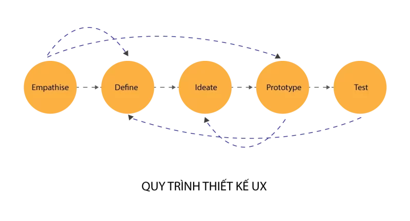
Initially, your focus should be on researching user needs and pain points. Your job is to listen and observe what your actual users (or potential users) want, need, and experience using your product.
You do this by conducting user experience research and representing the results with:
- Relationship chart
- Customer journey map
- Customer portrait (Persona)
- Any other way help visualize the needs that the solution.
During the Prototype and Test phases, it is important to constantly reference the products you created during the research phase.
And always put usability first when you’re testing — even (or especially) while you’re still working with Prototypes and Wireframes.
Usability Summary
Usability is an important component of a good product or experience . You can have fancy designs and attractive UX, but with poor usability, they will run to your competition.
Remember the story of buying an e-reader above.
Would you go back to that company/website and order again next time? Sure is not. Some difficult people even ask for a refund immediately.
Since customers have a hard time finding your website, don’t let them leave frustrated.
Don’t be afraid to ask your designer tough questions, because the design available really comes down to your pocket.
Call Malu immediately via Hotline 0988.622.991 for advice on designing a brand website that meets usability, experience … and supports strong branding.

