The following article introduces the basics of UX Writing, a very important factor in optimizing the user experience with the product that Product Managers must know.
1. What is UX Writing?
UX Writing is a piece of written content that appears in the user journey for the purpose of instructing, explaining and presenting to users about the product. For example, the body of the message entered the wrong password or the message completed the transaction.
2. Distinguish UX Writing and Copywriting
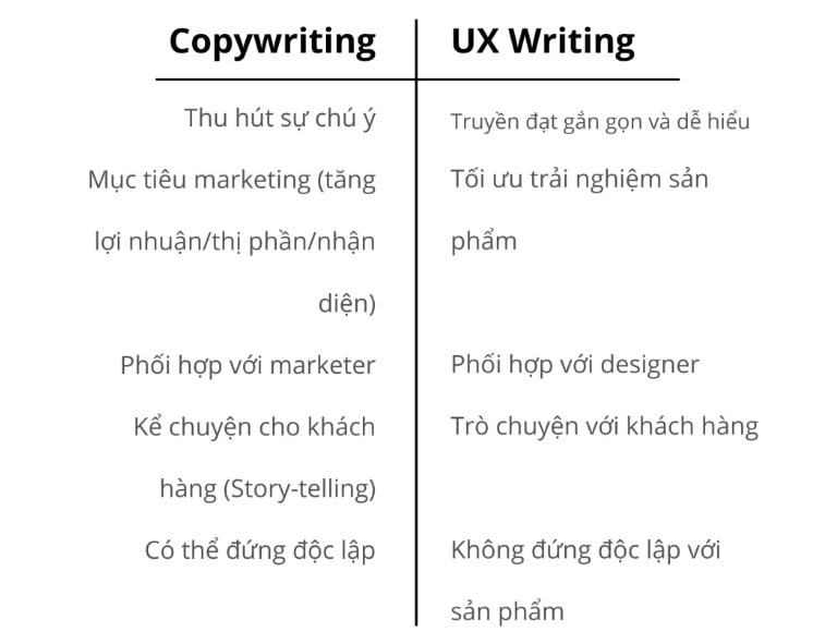
Copywriting often goes with marketing purposes such as increasing sales, increasing market share or increasing awareness. Copywriting can be sentences that appear on a billboard or an article introducing a product and have the ability to stand alone with the product without losing its meaning.

UX Writing appears on digital interfaces with the goal of optimizing the user experience with the product. If Copywriting aims to capture the reader’s attention in the shortest possible time, UX Writing aims to convey the clearest message possible.
3. How to write good UX Writing
At the <Google I/O> conference in 2017, Google’s UX writer Allison Vib proposed a rulebook for good UX Writing that includes the following elements.
3.1. Clarity
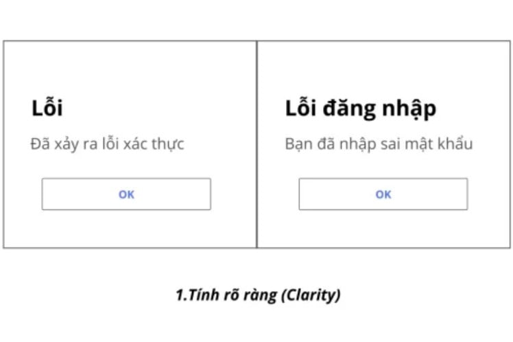
The illustration is the error message screen when the user enters the wrong password.

The screen on the left has not achieved clarity in two points: 1. The general “Error” message makes it difficult for users to fix the problem. 2. The phrase “authentic” can be confusing for readers unfamiliar with technology terms.
The screen on the right is a version that has improved clarity by showing the type of error and replacing the phrase “validate” with the specific action that led to the error. Presenting content in actionable form is one method to ensure clarity.
3.2. Conciseness
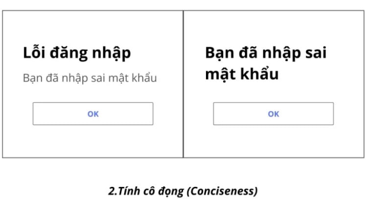
However, the announcement at this time still suffers from the problem of succinctness.
Condensation here is not simply short but must be effective in conveying the message. Every piece of content should play a specific and distinct role.

You can see that the heading “Login Error” shows the same message as “You have entered the wrong password”. You can remove the “Login error” section to make the message more concise.
3.3. Usability
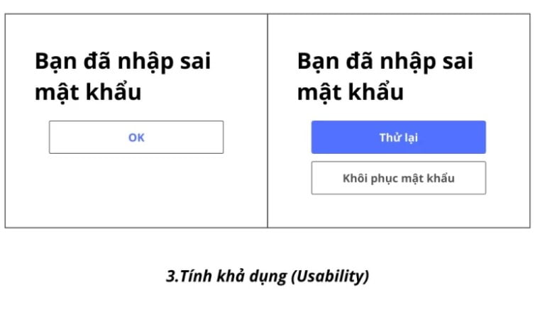
Currently the message shows that the user understands the problem, but does not provide any information on how to solve it – information that is more useful to the user.

Improve the availability of this message by changing the content of the “OK” button to give more useful information about actions the user can take.
The message on the left includes two actions that users can take to resolve the problem of entering the wrong password “Retry” and “Recover Password”. In addition, this message also places a visual hierarchy of simple actions rather than “Retry” higher.
Summary
Through the information about UX Writing above, you certainly understand what UX Writing is and what to do next for your website. Let’s create value from the smallest things so that customers always feel satisfied when visiting your website!


