Every day we easily pick up colors from everywhere. If you take a closer look at the things around, they might surprise you with some colors and shades.
You may not notice it, but color has a significant impact on our behavior and emotions. In today’s post, we’re going to study this issue called “color psychology”. Define what colors mean and review some tips on choosing the right colors for your design.
What is color psychology?
It is a type of psychology that studies the effect of color on people’s mood and behavior. The problem is that our mind reacts to color when we usually don’t notice it. The moment our eyes perceive a color, they connect to the brain that provides a signal to the endocrine system to release hormones responsible for changes in mood and emotions. These days a lot of research is conducted to study the peculiarities of these reactions and there have been many useful theories to learn from. Color psychology is useful in many industries including business, marketing, and design.
The success of the product depends largely on the colors chosen for the design. Properly chosen colors will help put the user in the frame that prompts them to take action. Studies powered by Colorcom show that it only takes 90 seconds for people to make a subconscious assessment of a product, and 62% of 90% of those reviews are color-based. So a basic knowledge of color psychology can be helpful on your way to improving conversions for your product. Furthermore, correctly selected colors can enhance the usability of the product.
The meaning of color
To convey the right message, the call to the user to take the desired action, the designer needs to understand the meaning of the colors and their reactions. In one of our previous articles, we demonstrated to you the list of colors with brief descriptions of their meanings. Today we have prepared a slightly more extensive list of color meanings in common use and in design.
Red
The color is often associated with passion, strong emotions or anger. It symbolizes both good and bad states of mind and soul including love, confidence, passion and anger. In design, the use of red is an effective way to attract the user’s attention. In addition, we should use red sparingly to avoid negative reactions.
Orange
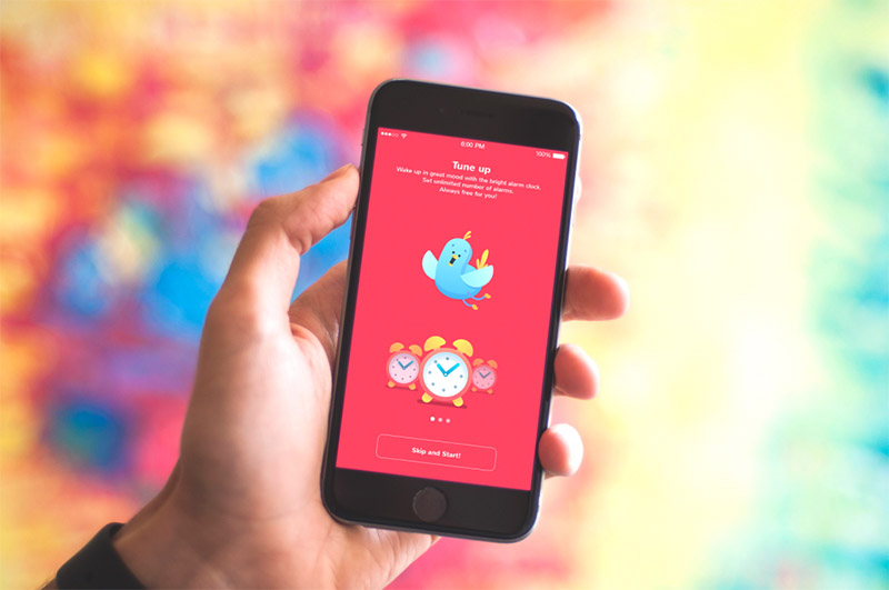
It is a dynamic and warm color that gives a feeling of excitement. Orange combines the power of red and friendliness with yellow, so it can bring feelings of motivation, enthusiasm, and love to life. Designers use color if they need to provide a creative spirit and a bit of risk.

Yellow
This is the color of happiness that symbolizes sunlight, joy and warmth. Yellow is arguably the most visible color. Moreover, it has one of the strongest psychological connotations. Users who see yellow in design can feel inspiration and confidence. Although, you need to remember that too much yellow can bring about negative reactions such as feelings of anxiety or fear.

Green
It is often called the color of nature, balance and harmony. Green gives a feeling of calm and renewal. Also, it is a sign of growth and inexperience. It has more positive energy than most other colors but it is sometimes associated with matter. The green design perfectly matches the products that are connected with nature.
Blue
It usually represents some sort of corporate image as blue is the color of trust. It often shows reliability, can provide users with a soothing feeling. However, as a cool color, it is also associated with distance and sadness, so designers need to keep it balanced.

Purple
Long is associated with wealth because many kings wear purple clothes, which is useful when designing for luxury products. It is also a color of mystery and magic. It combines the energies of red and blue to create balance. A large concentration of colors can distract the user’s mind.
Pink
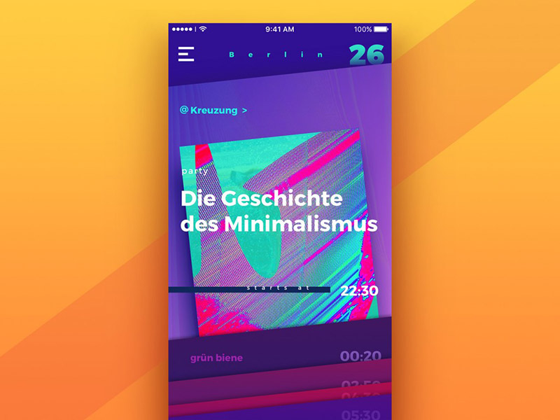
It is the color of hope, sensitivity and romance. Pink is much softer than red, so it creates a feeling of unconditional love. Pink is very strongly associated with youthful femininity, so it can be an effective color if the target audience is mostly girls and young women.
Brown
The color of security and safety. Designers often use brown as a background color in a variety of shades. It gives a warm and comfortable feel to the design. Alternatively, it can be used to signify experience and prestige.
Black
Colors have many meanings. It is associated with tragic situations and death. It signifies a mystery. Black goes well with any color, so it’s ideal for a background. Designers often use it to create contrast.
White
Color means purity and innocence, as well as integrity and clarity. The color white is often reminiscent of a white sheet of paper that motivates people to generate new ideas. However, too much white can cause feelings of isolation and emptiness. In design, white is often used as a background color especially for designs where readability is an important part.
Color meaning in branding
Color is an important factor not only for the visual appearance of a product, but also for brand recognition. In branding, however, colors tend to have a direct meaning rather than a common understanding. They can be briefly described in a few words, so here is the list for you:
- Red: Faith, Youth and Power.
- Orange: Friendly, warm and energetic.
- Yellow: Happy, optimistic and warm.
- Green: Peace, growth and health.
- Blue: Reliability, security and stability.
- Purple: Elegant, creative and wise.
- Black: Reliable, sophisticated and experienced.
- White: Simple, calm.
Color Options
As adults we tend to favor colors of shorter wavelengths (blue, green, purple) than colors of longer wavelengths (red, orange and yellow)
– Faber Birren
Visual perception is quite personal to everyone. Designers need to keep in mind that color effects can vary because of factors such as age, culture, and gender. First of all, people’s preferences can change in life no matter what the object is, let’s say, food, clothing, music, color and many other aspects. It is caused by both mental and physical changes that happen to us throughout life. For example, children like the color yellow quite a lot, but as we become adults, it often seems less attractive. Faber Birren explains it in his work Color Psychology and Color Therapy: “As adults we tend to favor colors of shorter wavelengths (blue, green, purple) than those of shorter wavelengths. with colors of long wavelengths (red, orange and yellow)”.
In addition, designers need to consider that there are many cultural differences and color perception is not an exception. Sometimes cultures define colors differently, for example, in Western countries, white means happiness and purity, while in some Asian countries it symbolizes death.
Another point about color preference is gender. Many color studies have been done over the years, and a lot of color studies in women and men differ significantly. The Color Assignment team has conducted an in-depth research on this topic and many designers have used the results in the creative process. We’ve identified the most notable takeaways from the research to share with you.
Blue is the top color. Both men and women of all ages think blue is the preferred color. Shades of blue such as blue, blue, beryl blue, cornflower blue, and sapphire are very popular among women.
Brown and orange are not preferred. Brown is not liked by men, and orange is for women.
Cool colors are preferred. Men and women favor blue, green and their colors in general.
Women like shades. When men like pure or matte colors, women like nuances.
Men prefer vibrant colors. White, black and gray are neutral colors and men love to choose them.
Colorsfavorite
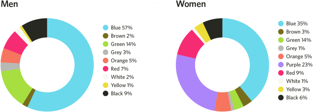
Favorite color
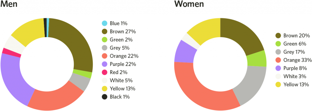
It is important to consider the color preferences of the target audience while creating user interfaces and UX designs as it helps to avoid negative reactions and create association.
Points to consider
Color psychology is quite complex to understand and learn. However, it can turn out to be an effective tool in the hands of designers to help understand users and their needs.

