Graphic design is a great job. Designers often use their creativity to create impressive products. As in any other field, there are some important design tips that every designer should know. You can use these tips to improve your designs. Of course you always have your own style and creativity, a good design or not is entirely up to you.
1. Limit the number of fonts you use
This is possibly the most frequent tip I get from designers I’ve met. They strongly encourage you to use different fonts in a design, but don’t overdo it and use it “passionately”. You need to make sure that your fonts work well together and try to limit the number of fonts you use to three or less in the same design. Experiment with the available fonts, or you can always download free fonts from the font library on the internet.
2. Change the size and height of the text to make it fit your design perfectly

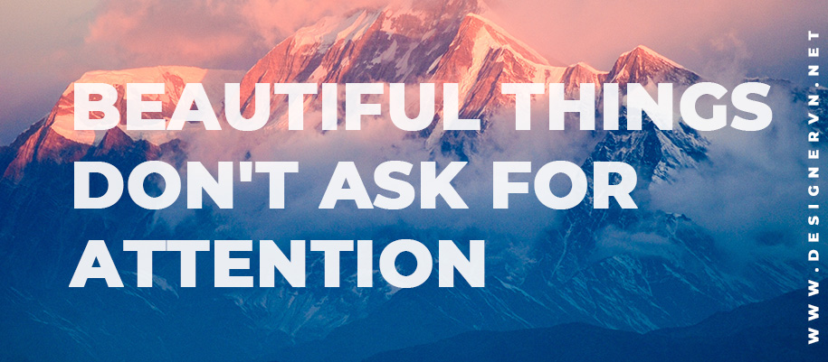
You can always customize the text added to an image. You can increase or decrease the line height and spacing between letters to create a box effect. In this image you can see that the line height has been greatly reduced and the size is brought up exponentially. Make sure the placement of your text is easy on the eyes and there is symmetry for this effect. The text’s opacity is also reduced so that the mountains appear translucent behind the text, giving it a more harmonious feel.
3. Use contrasting fonts to draw attention. They are a perfect couple

When designing, the goal is to grab someone’s attention and describe to them what you’re trying to say. You can create a big impact using little tricks, like this one. Use contrasting fonts. For example, you can use a bold sanserif font with a romantic script font to show people the emotion of the text.
4. The bigger it is, the more attention it attracts

When choosing elements for your design, remember: larger objects always attract more attention than smaller objects. If you’re using multiple elements, make sure your main subject is larger than the others, as your viewer’s eyes will automatically be drawn to the larger of the two. This is a mentality called visual hierarchy.
5. Use contrasting colors

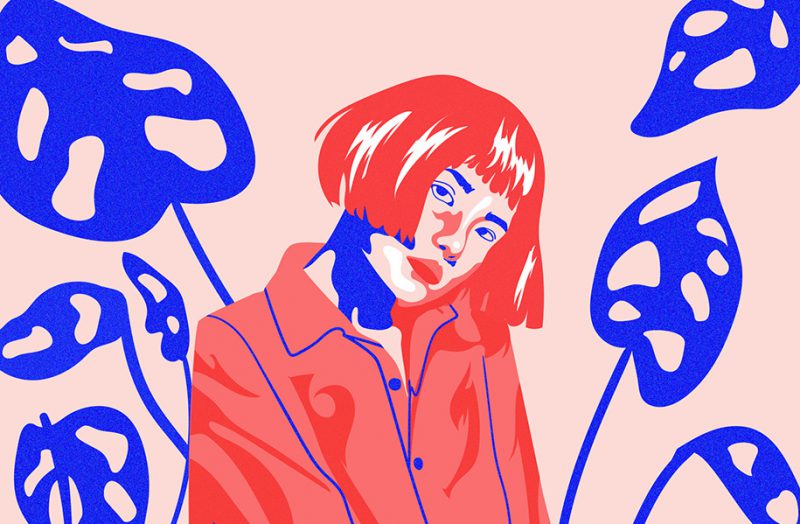
The more opposites attract, and that is a fact. It is our nature to be fascinated and fascinated by the unusual, and that is why using contrasting colors in graphic design is a must. It’s eye-catching, it’s attention-grabbing, and it’s great at graphic design.
6. Use spaces when you can

Sometimes you don’t need to add tons of colors, elements, fonts, etc. to convey your message. I spoke to one designer in particular and he said that you should use whitespace whenever you can. When you use whitespace, you avoid your message getting lost in the chaos of the design. Elegant white space, simple and beautiful.
7. Be consistent in your design

Consistency is key. Consistency is something that can take all the different elements of your design, and tie them all together and make them work. So be consistent when choosing colors. Use the same color scheme in your design and the design’s font size, spacing, and placement.
8. Use flat design to your advantage

Contrary to engravers, you don’t need to work many nights and hours to create a great design using complex 3d elements. Flat design is very trendy. And the great thing is that flat design has become more and more popular over the years, which is great news for beginners and professional designers.
9. Let’s learn how to use the grid

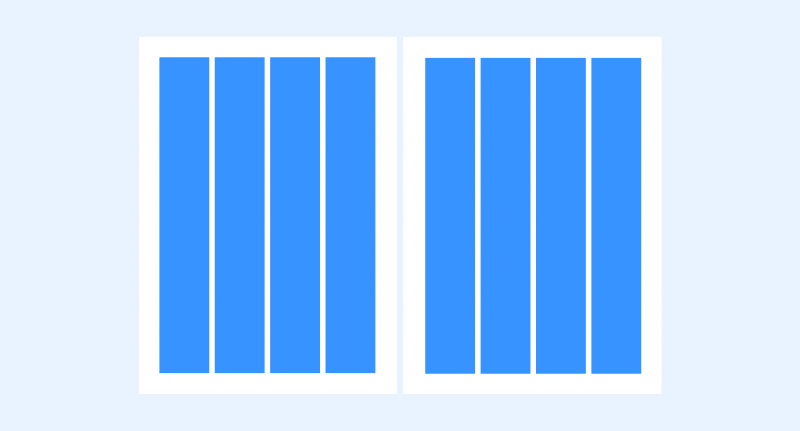
Grid is an important element in design. They demarcate the boundaries between the parts of the layout, contributing to a harmonious whole and a well-thought-out design. Grids make it easier to align layout elements to make them more logical. There are many types of grids you can use, it depends on the type of design, learn the types of grids before using.

![What is Infographic? How to design beautiful and attractive Infographic [Template] 21 infographic la gi](https://maludesign.vn/wp-content/uploads/2022/12/infographic-la-gi-500x500.webp)


