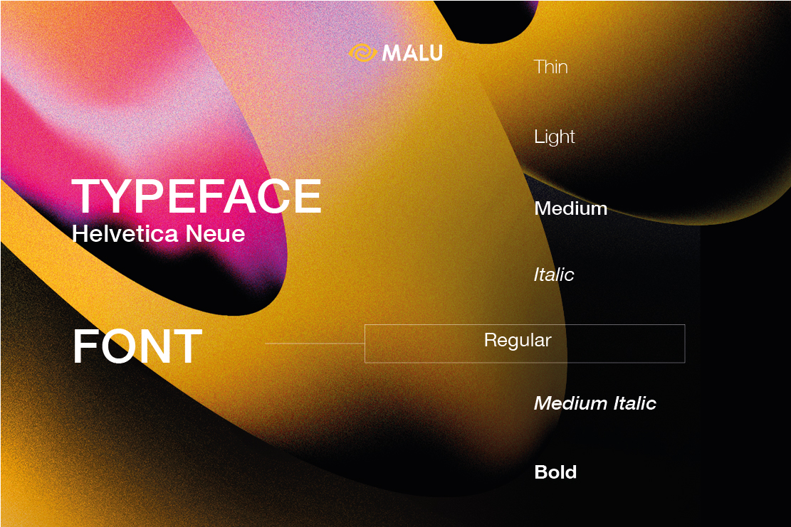
Most of the beginning designers are still quite confused about the concept of typeface. So what is typeface? Let’s find out with Malu!
What is Typeface?
Typeface, also known as Font family, or typeface, is a set of letters that have the same design in common. In other words, each typeface is a collection of characters, each representing a letter, number, punctuation, and other symbols…
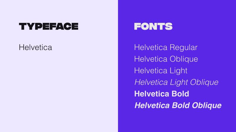
In general, typeface is a broad definition, covering the concept of font because it is not limited in size and format. For example, we can use Arial typeface 10pt size, Bold Italic format, but will use Arial Bold Italic font size 10pt.
Typeface classification
Serif font
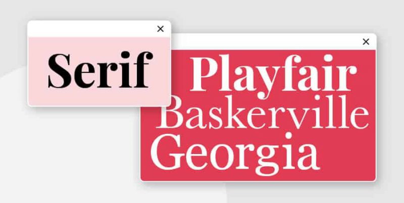
This is the oldest type of font, dating back to the 15th century. The word “serif” refers to the small “footer” at the beginning and end of each letter, inspired by the brushstrokes of ancient artists.
Font Serif can be subdivided into many other types such as: Old Style, Classical, Neo-Classical, Transitional, Clarendon, etc. Today, Fon Serif is still one of the most commonly used fonts, typically like “Times” New Roman”. San Serif appears densely in books, newspapers, documents and even logo designs. This is a classic font.
Some typical brands that use Serif fonts are: Zara, Tiffany & Co, Abercrombie & Fitch.
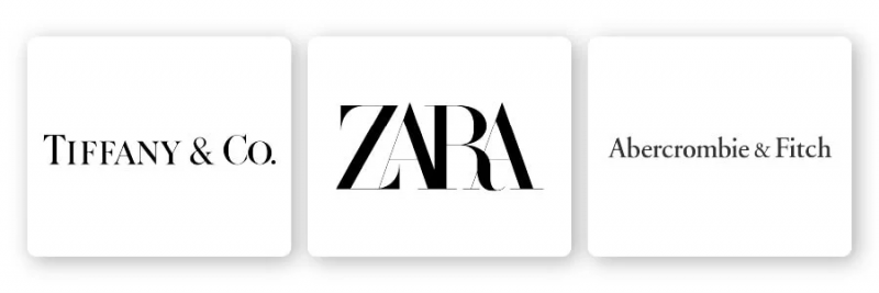
Decoding the psychology behind Font Serif:
Font Serif is used by businesses who want to show their elegance and sophistication. Logo using Font Serif feels:
- Faith
- Respect
- Authority
- Grave
A serif font is a good choice for more traditional brands and niches, including:
- Financial company
- Company of law
- Insurance company
- Advise
Sans serif font
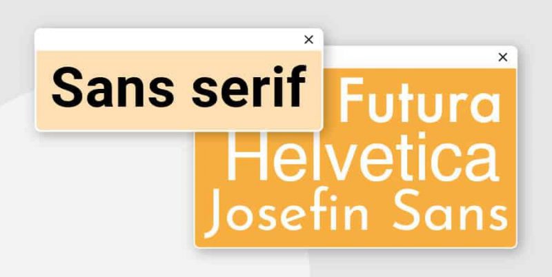
Font San Serif does not inherit its predecessors, but chooses a new and more modern approach. This also makes the serif – san serif duo very easy to combine. San Serif dates back to the 19th century and became extremely popular in the 20s and 30s. Around the middle of the 20th century, designers from Germany continued to develop this type of font. The result was a popular font set called Helvetica as it is today.
This type of font is made up of clean, simple lines. They do not have decorative details but focus on promoting legibility even in all sizes big and small.
San Serif also has sub-branches such as: Grotesque, Square, Geometric, and Humanistic, etc.
Brands that use San Serif Fonts include: LinkedIn, Calvin Klein and The Guardian.
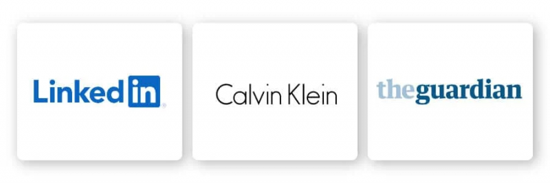
Decipher the psychology behind Font San Serif:
These fonts are often considered cool, smooth, and modern. Due to their overwhelming presence in the technology sector, sans serif fonts are also closely associated with cutting edge and related technology.
Some of the associations and emotional reactions you can have when using sans serif fonts in your designs include:
- Clear
- Modern
- Trust
- Delicate
- Focus on technology
- Advanced
A sans serif font is the right choice for any brand that wants to feel cutting-edge, personal, and sophisticated, including:
- Technology company
- Fashion brands
- Start-up company
Slab Serif Fonts
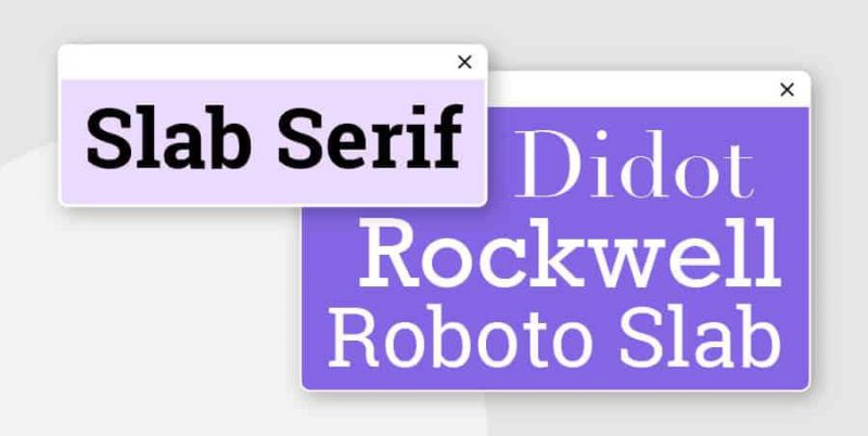
Slab Serif is a variation of the classic Serif font, which appeared around the 19th century. This type of font is usually quite bold and has a relatively large difference from the traditional style. The word “foot” is much bigger and bolder than the original Serif. (So the name “slab” – “board” was born.)
This type of font is recognized for its sturdy, strong appearance and is more suitable for modern brands than classic. Slab Serifs can be rounded or angled, and some even look like handwriting.
Brands that use Font Slab Serif include: Sony, Honda, and Volvo.
Decoding the psychology behind Font Slab Serif:
Slab Serif presents a bold image that exudes confidence, trustworthiness and creativity. Brands that want to create a big push or have a high spirit of improvement and innovation use Slab Serif font.
Script Fonts
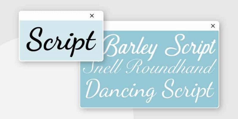
The common Script font became popular in the 20th century. This type of font reduces the block in print and emphasizes soft, natural lines. Scripts are separated into two smaller categories: formal and casual. This is a type of font that mimics the style of handwriting.
Formal script font – as the name implies, is the most flashy type of font, reminiscent of the beautiful handwriting of the masters of the 17th and 18th centuries. Basically, this font is recommended to use. should be used sparingly, because it affects the readability of the publication. The common script type feels closer, familiar and easier to apply.
Brands that use Script Fonts include: Coca-Cola, Instagram, and Cadillac
Decoding the psychology behind Script Font:
Some of the emotional connections and reactions you can have when using scripts in your design are:
- Exquisite
- Delicate
- Attractive
- Creative
- Happy
- Traditional
- Individual
- Weird
Fonts can be a great choice for a number of brands and sectors that emphasize subtlety, difference or individuality in their designs, including:
- Food and beverage brands
- Fashion brands
- Brands focused on children
Decorative Fonts
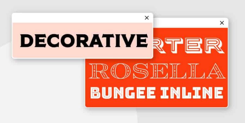
Decorative Fonts or Display Fonts are unique and eye-catching fonts. They are used in a variety of fields and needs. Decorative Fonts are rarely used in long documents but are preferable to lettermark or wordmark logos .
This type of font can sometimes be unsightly if placed on an overly intensive design. Even so, this is still a good choice when used as a logo design.
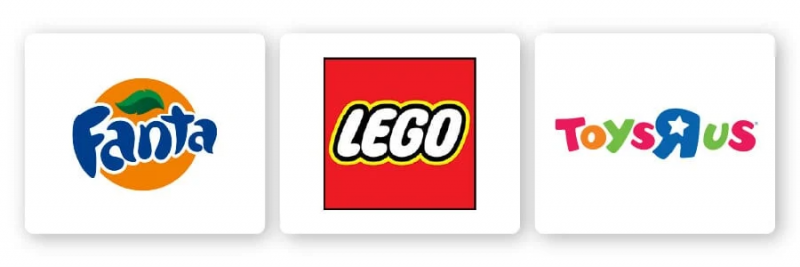
Brands that use Decorative Fonts include: Toys R’ Us, Lego, and Fanta
Decoding the psychology behind Decorative Font:
In general, this type of font emphasizes creativity and originality. Its versatility also helps the brand convey specific emotions by varying, combining different colors and designs. One of the common emotions is cheerfulness, mischievousness. It also shows the cultural characteristics, the mark of a certain polite period.
Monospaced
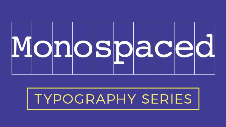
This is a type of font where the width of the letters is equal, we often feel round and even (monospace, lucida…).
Fantasy Decoration
This is a type of letter with a special shape, usually shapes such as objects, people, patterns, cartoon characters, etc. (windesign…)
Mimicry
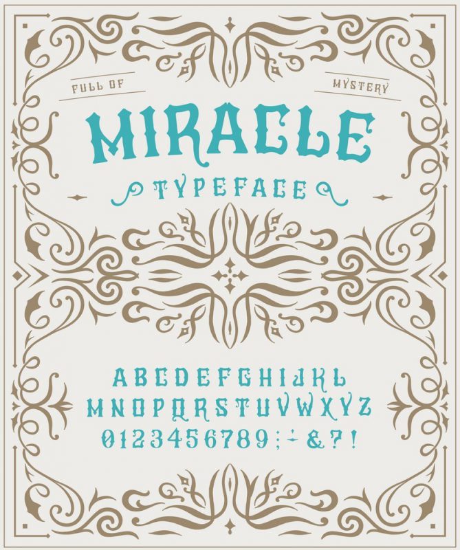
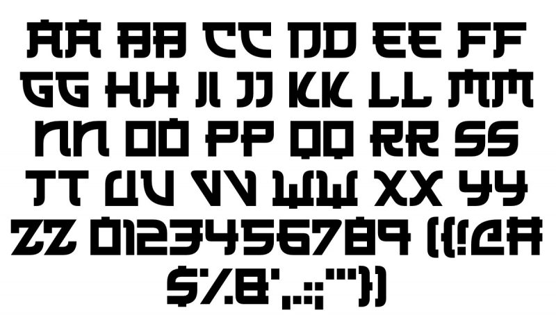
Mimicry is a decorative typeface with a style that mimics the typeface of another language, such as Chinese, Indian or Korean. These typefaces are often used to create a sense of “foreign language” in the design.
How to use typeface correctly?
Suitable choice
To customize and illustrate your ideas well, try out the many solutions for Weight (Regular, medium, bold, heavy), Width (narrow, condensed, extended), italics, outline stroke and color… Changing the above properties of the typeface also makes a marked change to the message you want to convey to the audience.
Avoid abuse
Be careful and thoughtful when using typefaces like Comic Sans, Curlz, Papyrus, and Times New Roman.
When looking at typefaces separately, each typeface has a different advantage. However, designers should pay attention to the significant influence of the above typefaces because they are being abused so much that a person who is not very observant can still recognize those typefaces.
Epilogue
Above are some basic features of typeface that beginner designers need to understand.

