Without Microsoft, the tech industry wouldn’t be where it is today. The company paved the way for personal use computers and consumer-based software. Along with Google, Apple and Amazon, Microsoft was part of the movement that launched the revolution and started the Information Age.
A Brief History of Microsoft
From the very beginning of the computer era, Microsoft was right there. Founded in 1975 – a year before Apple – Bill Gates and Paul Allen started developing their own computer software. Microsoft released the Altair BASIC and the MITS Altair 8800 pre-assembled computer suite. This iconic American company has since been a leader in the technology industry.
Microsoft now includes many other brands, including Linkedin, Skype, GitHub, and Xbox. It has grown to become a giant with the second largest technology market share of $1.6 trillion and annual revenue of $143 billion. The company employs more than 163,000 people. Apple holds a slightly larger market share with $2.17 trillion and $274 billion in annual revenue. Microsoft is the third company ever to reach a trillion-dollar market cap, behind only Apple and Amazon.
While Apple is better known for its brand, Microsoft is right there to offer more compatible systems, advanced features, and cheaper rates. Bill Gates became the “youngest billionaire” in the world at the age of 31 in 1987, just a year after the company went public.
The Evolution of the Microsoft Logo
It’s not surprising that a company that thrives and takes center stage in front of the world has some identity changes. We can learn a lot about branding and marketing by looking at the history of the Microsoft logo.
The company started with humble roots, some basic resources, and some available garage space. As the company has grown, its identity has also changed some.
1. 1975–1979
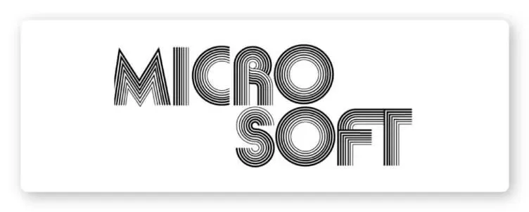
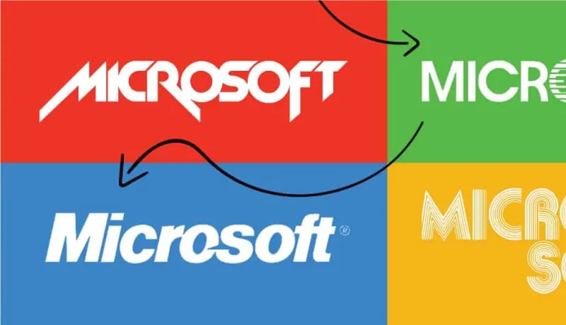
The original logo was created using an original programming language by founders Bill Gates and Paul Allen and designed by Simon Daniels. Originally, the company’s name, separated with a dash, was Micro-Soft, which is why the word had two levels in this original logo.
This old logo recalls the days when disco balls were in vogue and roller skates were the ultimate accessory. Back in the day, this logo gave off youthful vibes with its trendy style. Large, round letters create a sense of flexibility without sacrificing precision or technical detail. The logo is structured, but attractive.
The stacked “Os” are a bit distracting with no design intent, but have nice symmetry. The lines that make up the letters don’t have the same width, which gives it a lot of visual depth and dimension.
Kerning (space between letters) in this first version is a bit confusing around the letter “C.” The space before the letter “R” is much wider than the space between the letter “R” and the letter “O”.
2. 1980–1982
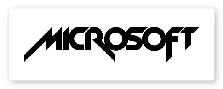
Hi 1980s, you can get your eyeliner back and wear a metal strap. As Microsoft entered the next decade, they swapped out the light disco logo with a vibration icon.
Text logos Microsoft’s sharpness for two years has an approach much more powerful, reminiscent of arcade games, hardcore music and sci-fi movies.
There’s only one thing that really extends from this logo: Microsoft switched to one word and one line of text.
The radical change includes slanting lines with sharp edges—no more smooth shapes and line details. Simon Daniels chuckles that that original logo tries to take a much more aggressive approach that looks undeniably similar to Metallica’s logo. Curiously, Metallica’s logo was created after Microsoft was done with their logo. So who has really set the trend who?
It’s easy to see that Microsoft has started to feel a little bit of itself during this time. The company has already begun to take off. By 1978, Micro-Soft had made its first $1 million.
In 1980, Get Report asked Bill Gates to create an operating system that would be introduced in their line of computers for consumers. Thus, MS-DOS was born and ushered in a new era. MS-DOS replaced IBM’s OS 2 and was the PC operating system’s leading competitor to LINUX and UNIX.
3. 1982–1986
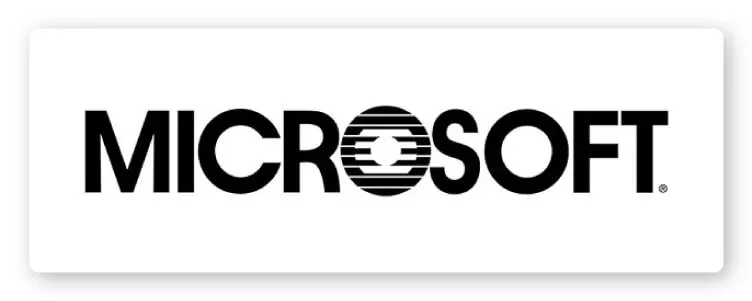
The sans serif typeface smooth and simple looks much more streamlined. It looks like Microsoft has finally stopped trying to make it big in the band wars and finally agreed to tie the knot and work for dad on a real job. Microsoft has become square.
The first two Microsoft logos should serve as a warning if you’re creating your own: trendy design choices are often not age-appropriate. If your brand is going to last, you need to have a design that stands the test of time. The fast fashion approach will be there for one year and four years later. Who wants to rebrand this often?
Samuel Daniels also created logo number 3. Obviously, he had to rethink his approach or the logo could have gone the way of Iron Maiden and KISS.
This time, he decided to take the brand in a much simpler direction. The lines are simple and easy to read.
The only unusual detail in the word is the letter “O” with lines and lines—almost like a sunrise on the horizon or a printer malfunction. It’s designed to look like a CD – albeit a scratched CD that a little rubbing and scrubbing with your shirt won’t fix. And, that “O” has become a beloved part of Microsoft’s brand history as “Blibbet”. In 1987, there were petitions asking the company to bring Blibbet back.
4. 1987–2011
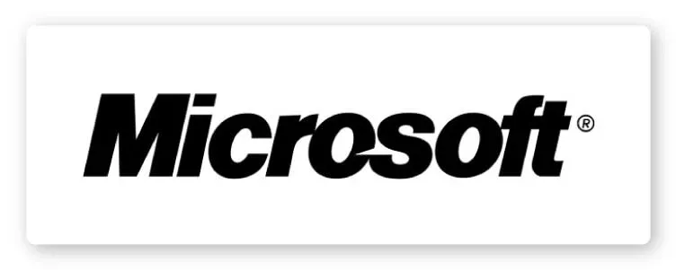
Finally, a Microsoft that most of us know and have a love-hate relationship with. Microsoft’s fourth logo has a slightly edgier look, but it’s still pretty safe. This version was created by designer Scott Baker of Microsoft.
It was introduced to mark a new era in computing. Microsoft has released OS/2 for OEMs. At the moment, the company is the world’s leading manufacturer of personal computer software.
Using the iconic Helvetica font, the logo features a small slash at the “O” to emphasize the “soft” part of the name. Baker went so far as to say that the slash stands for “motion and speed”. The staff called it the “Pac Man” logo.
The confident rebranding has found the perfect middle ground between the 1980s rock star era logo and the 1982 button logo. This logo is happening, but not going down any alley. any night. It has had a solid run for 24 years.
5. 2012-nay
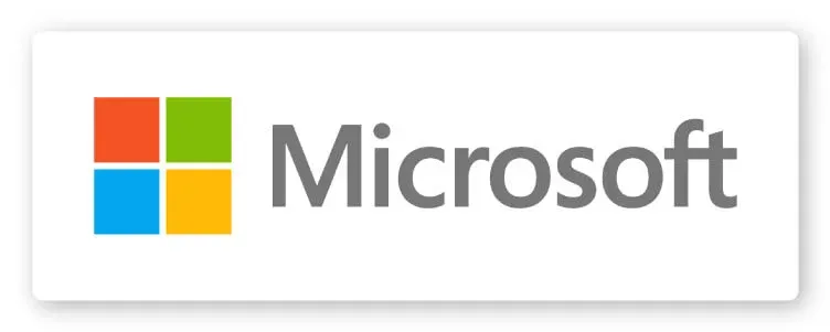
Microsoft switched back to a simpler sans serif font (still without Blibbet) and added an icon in the most recent changelog. The color combination brightness of the squares is the first time Microsoft is moving away from the black and white look—even the Segoe logo has a softer gray color.
Iconic squares represent all of Microsoft’s wide range of products. It provides a very direct callback to the Windows logo – which makes sense since it’s Microsoft’s biggest source of revenue and an important part of its history.
After 45 years of logo history, it looks like Microsoft’s latest logo will be around for a while.
For you
Do you need to create your own iconic logo or replace an outdated version with something more professional and relevant? Contact Malu Designn for a free consultation.

