The last days of 2021 have arrived. Some people use this time to look back on what they have done in the past year, drawing lessons for themselves. Others are ready for a fresh start, preparing to turn the page in 2022. The Pantone Color Institute is certainly in the second group. Because 2021 has not ended, Pantone has announced the color of 2022: Very Peri Blue.
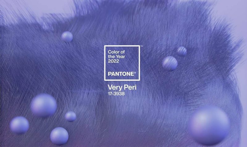
For the first time in Pantone’s Color Of The Year 22 year history, the Pantone Institute has created a brand new color for 2022: PANTONE® 17-3938 Very Peri – a combination of periwinkle blue. on red violet tones, evoking the luminous feel of touch screens, metaphors for the evolution of the digital world and future creativity.
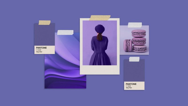
The color of the year 2022 reflects the change of times
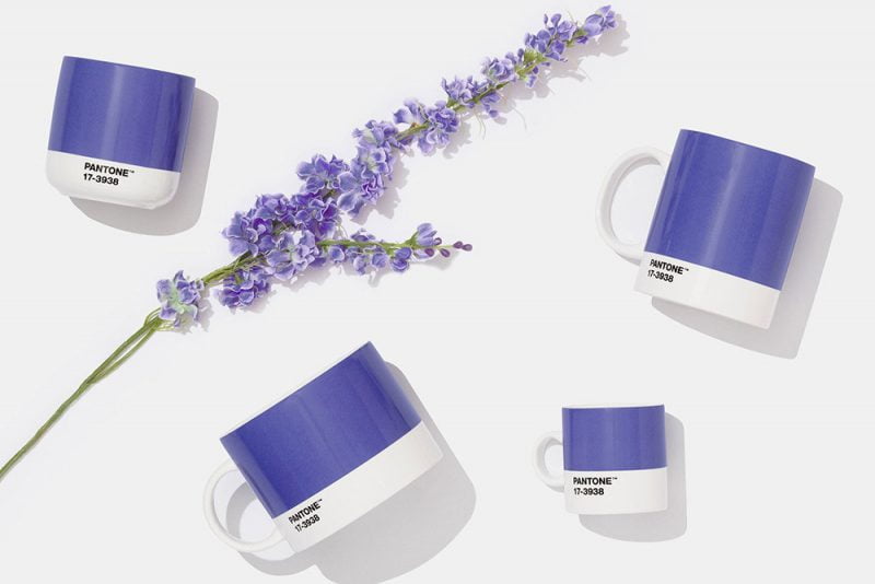
On Wednesday, December 8, the Pantone Institute of Color Science announced that 2022’s Color of the Year will be Very Peri Blue. It is a blue-violet reminiscent of lavender, specially blended by Pantone for 2022. This is the first time Pantone has formulated a new shade instead of choosing an existing color code.
Why didn’t Pantone choose an existing color tone when deciding on the color of the year 2022?
“The preparation of a new color gamut is very important. Designing a new color code in Pantone’s history reflects the rapidly changing global landscape,” said Pantone Color Institute Director Leatrice Eiseman. In 2021, the whole world survived the second year of the COVID-19 pandemic. People have a better understanding of this virus. Advanced technology allows rapid vaccine development. The whole world has a hope of returning to a new normal. In parallel are information technology innovations to overcome the geographical and physical barriers that the ban on the market creates because of the pandemic.
Blue is often equated with optimistic, peaceful emotions. But Very Peri blue is a purple-blue color, which means it contains a bit of red. “Very Peri is the warmest of all the blues. Due to being mixed with red pigment, it creates feelings of optimism, joy, and enthusiasm. But freshness is what we are all looking for in life today,” said Leatrice Eiseman.
About PANTONE Color of the Year
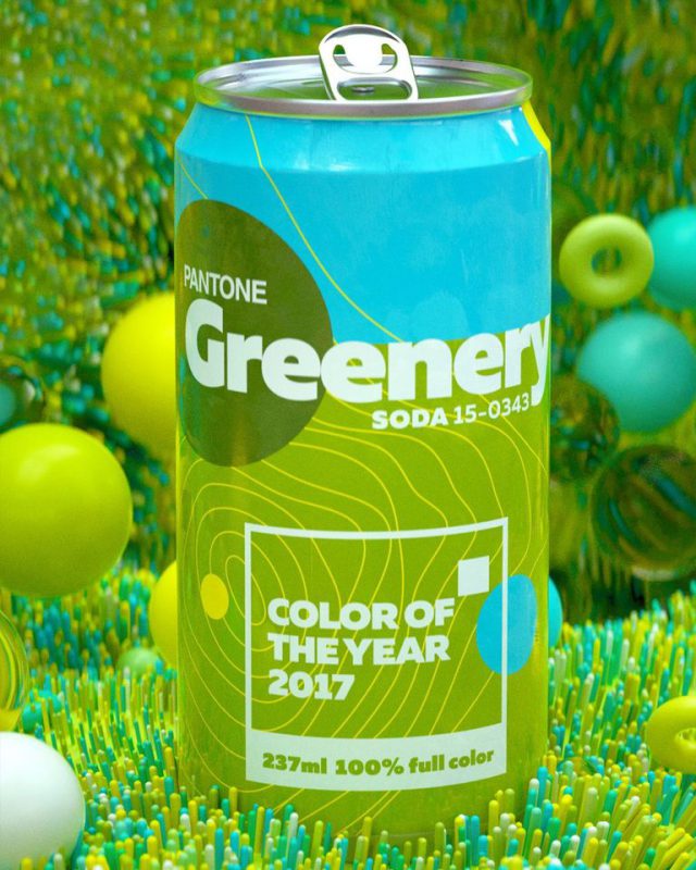
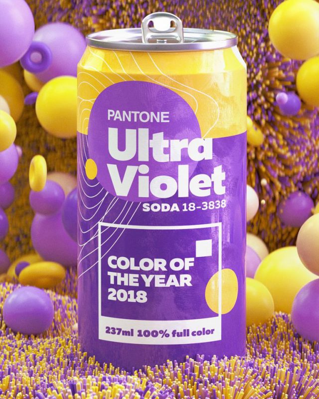
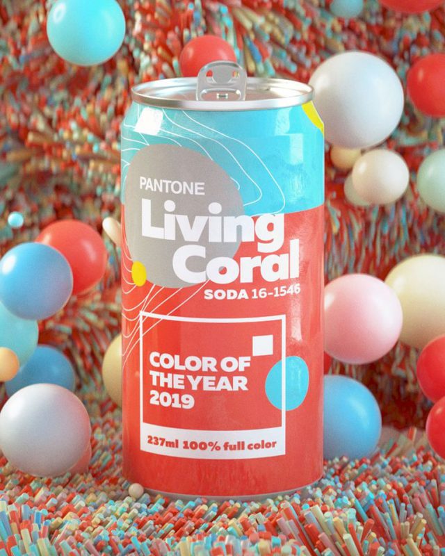
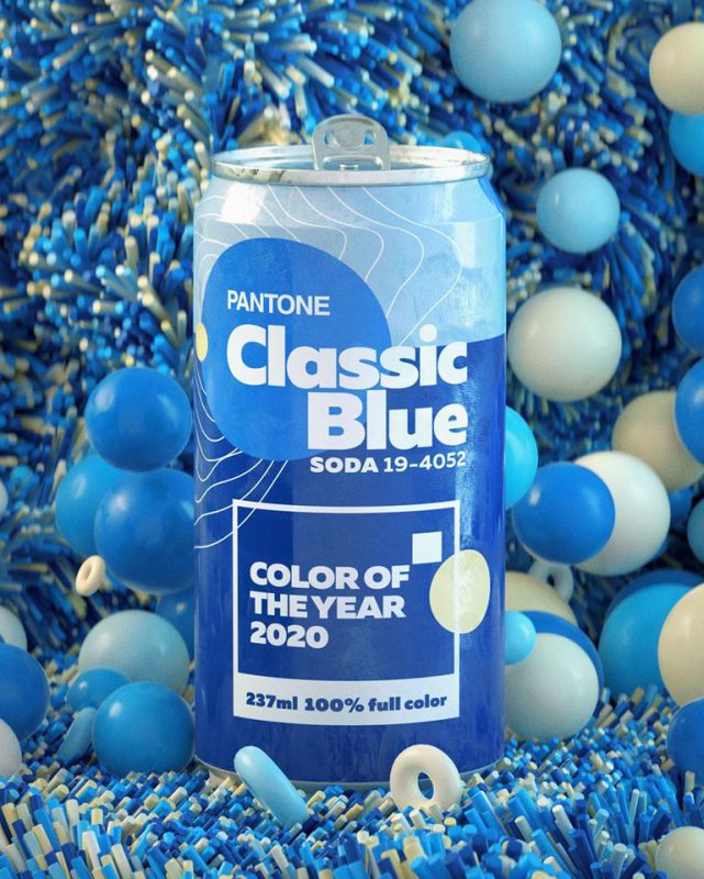
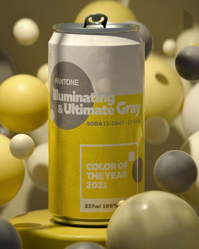
The process of choosing the Pantone Color of the Year requires thoughtful consideration and trend analysis. To arrive at their representative color choice every year, Pantone color experts at the Pantone Color Institute™ travel the world in search of new color influences. These can include the entertainment industry and produced films, travel art collections or new artists. It can also be fashion, all areas of design, popular tourist destinations, as well as new lifestyles, leisure styles and socioeconomic conditions. Influencing the decision to choose the color of the year can also stem from new technologies, materials, textures and effects that impact color, the relevant social media platforms and even the Upcoming sporting events attract worldwide attention. In 23 years,
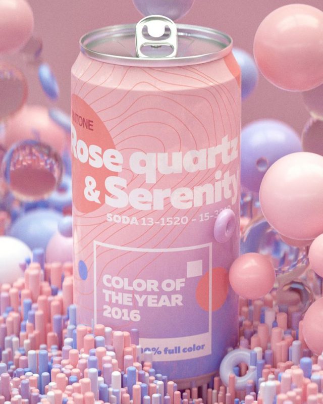
About PANTONE™ Color Institute
The Pantone Color Institute is Pantone’s business unit that highlights the top colors on the catwalk seasonally, selects the Pantone Color of the Year, forecasts global color trends, and advises companies on color for products and brand identity. Through seasonal trend forecasting, color psychology, and color consulting, the Pantone Color Institute works with global brands to effectively leverage the power, psychology and emotion of color in their strategy. their design.

