Have you ever been in an extremely pressing situation when there is only 1 hour left to the deadline for a project, but your boss still assigns you that new design project and forces you to repair and complete them? immediately?
Moreover, that design has too many different problems such as poor images or chaotic color schemes, the choice of fonts for the design is extremely messy and inappropriate. And in times like these, what should you do? And how to make the design more stable?
Step 1. Review the font style


Is the text printed on the material easily and neatly visible? How to create attraction? And how to create a typeface that is soft but still very natural? Maybe it won’t be too difficult for you to answer these questions in the early stages of designing a new product when creativity is still undefined and you still have the freedom to create projects. , but conversely at a time when you are reinventing on another designer’s product, this question becomes ever more difficult and sometimes even frustrating.
Step 2. Add spaces
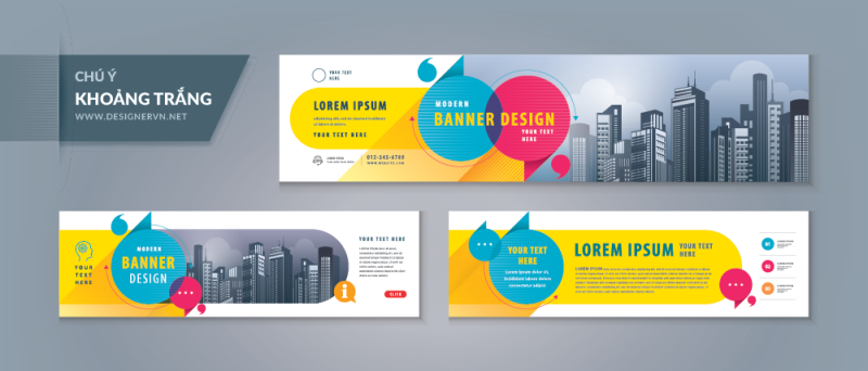
One of the biggest design issues you should pay attention to is design overload. When the greed for content and images makes the design look messy and messy like a jumble, too much information is crammed into the gaps or the images are flooded in. Not being selective is a common client-design challenge. Adding white spaces can help eliminate the feeling of clutter and help open up the design for a comfortable viewing experience without being visually cluttered. But you may have to remove some elements in the design to do that, the space may be little or a lot but not without.
What part of the design needs free space?
- You can start by removing redundant or error vectors from the array of shapes, such as cute icons or pieces of text unrelated to the main message.
- Resize or crop the image if possible.
- Think about the overall size and scale in terms of the length and width of the text clusters, or scale them down if possible.
What do you do with the newly created free space?
- Adding more space around the edges of the design makes the design brighter and more minimalistic.
- Increase spacing between design elements.
- Increase the spacing for the beginning of text or the space between text clusters.

These photos include photos with poor quality and resolution or bad composition, so don’t hesitate to remove them because keeping them will only get in your way. Trying to fix a bad image will only lead to a worse image. When quality isn’t there to begin with, you’re just wasting your time on work that doesn’t bring results.
Once you get rid of the bad old images from the old design, it will be great for the project to start making decisive changes. Let’s look at some simple visual styles with fun colors to better emphasize the design. You can also use a variety of different images or quality images that you have available. But please, don’t waste time trying to fix something that can’t be used anymore. It won’t help to hold onto anything in favor of that design. So, let go of the things that bother you too much – bring in new and better things instead.
Step 3. Place on a grid
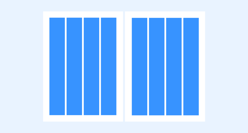
Grids can solve a lot of layout problems, and help create seamlessness and harmony between elements on the product.
For small products, such as business cards and wallpaper, start with a 3×3 grid (rule of thirds). With a small space and a few simple elements, this can be enough to create harmonious positions in the design.
For larger projects a column grid can be a useful solution. Using well-spaced columns and helping to create a logical and seamless placement for text makes it possible to resize visual elements within the same template.
In addition, for projects that require horizontal and vertical spacing in the design, the square grid is a necessary choice. Using a square grid can help create harmony in the movement of pages within a web page. Use it as a column grid to aid in the placement of different sections and spacing between design elements.
Step 4. Streamline color palettes
Check out the design colors
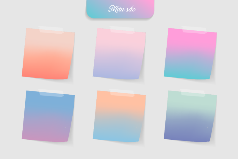
Color can make or break a design. Too much color is often the culprit that spoils the design. Streamline and control the palette by relying on only 2-3 colors and using a color wheel program to assist.
Use a primary color to dominate the project and use a secondary color for emphasis. Consider a third tone to highlight the text. Black and white or street with many neutral colors also create a modern and impressive element. (This is especially good in projects where you don’t have too many images to work with.)
Step 5. Remove the elements that deceive the eye

It sounds simple, but this is actually a difficult and deliberate process as you will have to remove tricks and overdesigned elements. (After you take everything out, consider whether you need to put something back in.)
Keep the design simple. It really is one of the best design advice you will ever receive. The truth is that when you’re creating something from scratch or rebuilding it, simplification always makes it easier to breathe.
Step 6. Be sincere
By the time you get to this step you’ve probably thought of all you can do to fix this project, clearly define what’s needed if it’s really salvageable and do the best you can. . (however, there are some design patterns that are hard to reform) For example, ask questions like: “How long can it take you to tweak and make changes to make the design usable? Can you do it in no time?…” (Or would it take less time if you started from scratch?)
Then communicate and communicate honestly. Sometimes time and cost are not the real values in the moment. Sometimes you can start from scratch and do it faster than trying to fix something. Explain logic and reasoning clearly so that you and your bosses or clients can understand and have a clear grasp of how you proceed, only then you won’t really make it difficult for yourself.
Conclusion
Typography or redesign is not a task that all designers do. Because, it is really a difficult experience to work on a bunch of troublesome work left by others. However, these projects are sometimes very successful and are completed more brilliantly than you would expect.
Ideally, you need to remember that cleaning up the design should take less time than starting a new project, otherwise it’s best to start from scratch. When fixing a bad design, take care to keep it simple, possible and more suitable for design effects, and work hard to ensure the final product is neat, clean and easy to read.


