Branded Interior – What is Interior Brand Identity?

Branding is more than just a logo and interior design is more than just a kitchen renovation. In this blog, we’ll explain what branding and interior design are all about and how they can work together to improve your business. Are you ready to become an expert in interior branding? Let’s start!
Branding
Brand is one of our favorite words. Your brand is what others say you are. It has the power to elicit emotions from your customers and it differentiates your product from your competitors. Logos , fonts, and color palettes are important aspects of your brand, but the most important factor of all is consistency .
Interior design
Interior design is definitely different from kitchen renovation. Interior designers work on everything from hotels to restaurants to offices. A good interior designer can create a space that reflects the overall look and feel of your business. A great interior designer can evoke emotions from anyone who steps inside. Sound familiar?
Furniture brand identity
Your business has an overall look and feel. Branding and interior design can pull emotions from consumers and visitors. Consistency is important. Do you see how branding and interior design come together to make a big picture?
Your interior design should reflect your brand and beyond the connection consumers feel with your business. If your space is unbranded, your whole image will fall apart. Inconclusive? Let’s take a look at some interior brand identity examples.
Plus Coffee
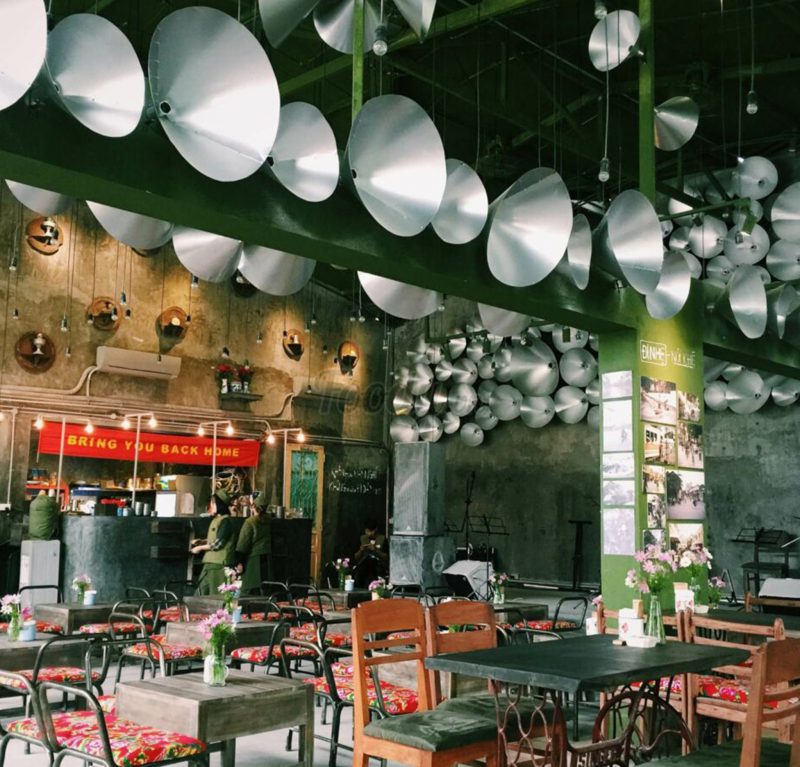
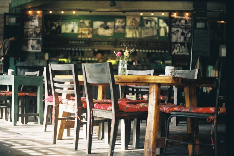
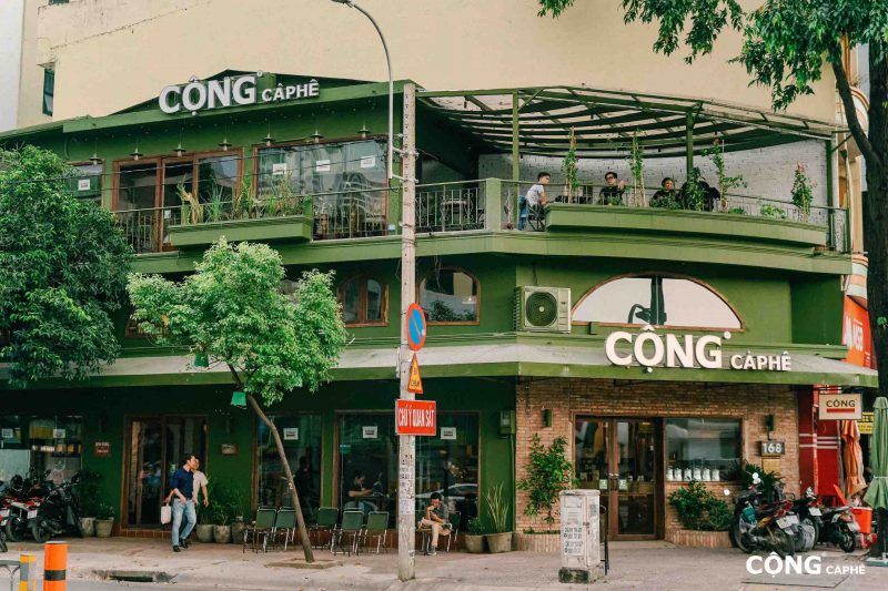
The name Cong in Cong Ca is simply taken from the first name in the National Title: Socialist Republic of Vietnam. Cong’s first store was established in 2007 on Trieu Viet Vuong street – an old coffee street in Hanoi.
With a bold vision and idea when designing and creating a cafe with the style of Hanoi in the subsidy period, the founder of Cong has succeeded in bringing the brand’s name to a new level. Up to now, this brand has opened and franchised dozens of stores from the South to the North, even having branches in both Korea and Malaysia.
One thing that everyone probably realizes when it comes to Cong coffee is that the dark moss green color is covered in the design of the shop, and is present in every branch. This blue color comes from the soldier’s blue shirt, a familiar feature of Hanoi many years ago. This dominant color tone accounts for most of the design and layout of the Cong chain of stores. From the walls, tables and chairs, decorative cups, coasters or hats, etc. are all in this lovely, nostalgic blue color. All combine to create a harmony of colors, making customers have a strong impression of Cong, when reminding Cong, they are reminded of the characteristic army green color.
Starbucks
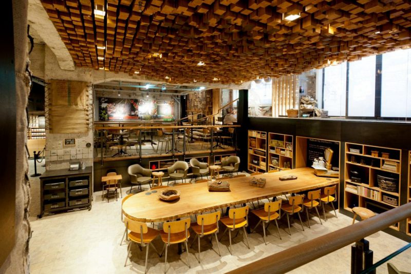
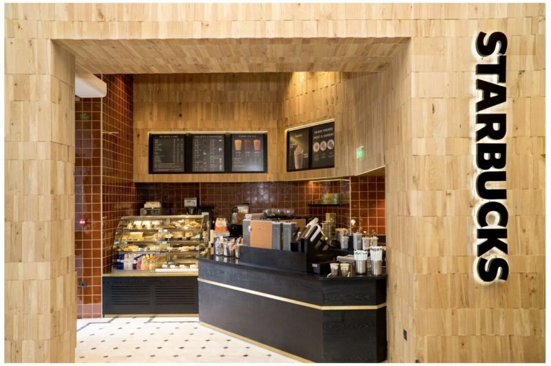
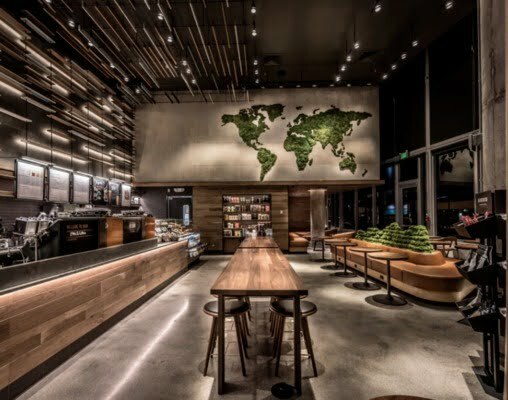
Starbucks has a different look and feel. NO brand ever reaches Starbucks level without a furniture brand identity. You can walk into a Starbucks anywhere in the world and there’s no doubt that you’re in a Starbucks.
Starbucks interior design is not just about sticking a logo on the wall. Use smart design to elicit emotions from visitors and consumers and these feelings are real. Starbucks wants customers to feel comfortable and warm, like they can stay awhile to sip a coffee or get work done. Starbucks wants to convey an image of luxury and make visitors feel part of an exclusive community. Starbucks uses chic interiors, comfortable seating and dim lighting to ensure each store evokes these feelings.
McDonald’s
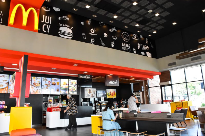
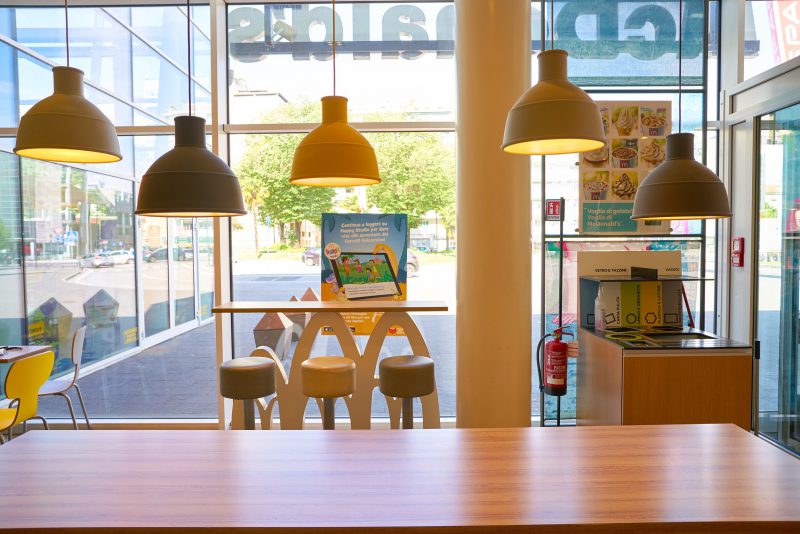
McDonald’s is another strong global brand. Again, there is no company as global as McDonald’s without a solid identity. That is the power of golden domes.
The McDonald’s brand aims to be fast, convenient and family-friendly. McDonald’s interior design uses bright colors that are both appealing to children and relatively uncomfortable for adults. The company doesn’t want you to stay for hours. It’s not part of the McDonald’s brand. These fast-food restaurants use harsh lighting and sharp angles to convey that they are accessible to everyone, but focus more on providing prompt service than they do. The dining experience extends into the evening.
Still not convinced?
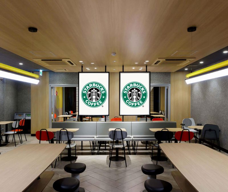
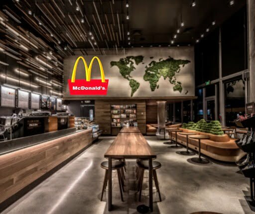
Okay, you’ll get the difference between McDonald’s and Starbucks. But maybe you still haven’t seen the full picture here. “Why can’t you just throw your logo on the wall and call it interior branding ?” you wonder. Here’s why.
Looks really annoying. If you stick the McDonald’s logo on a Starbucks wall, you’ll still feel like you’re in a Starbucks. If you walk into a McDonald’s and see the Starbucks logo, you’ll be confused because you’ll still feel like you’re in a McDonald’s.
Interior design and branding both aim to evoke emotions from customers. That’s why, when done right, a furniture brand identity builds trust with your customers and elevates your business . But when you think of it as simple, such as sticking your logo on the wall and calling it a brand, it creates boredom and presents an unprofessional business.

