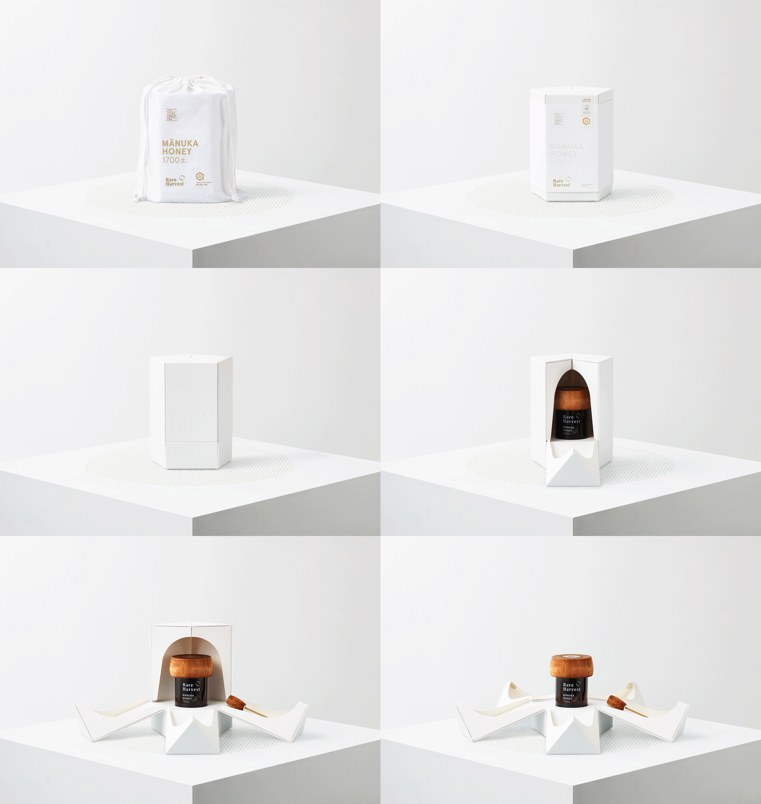
 As shapes, materials, and textures are gradually becoming essential elements for a brand to tell its own story, where the graphic part no longer plays the role of the main narrator.
The True Honey Company (TTHC) is a brand that specializes in the production of mānuka honey – a monoecious flower – this honey is widely produced in Australia and New Zealand from the nectar of the mānuka tree. They have a unique color and texture accompanied by a high dietary level of Methyglyoxal, and are also a highly antibacterial and antiviral organic compound.
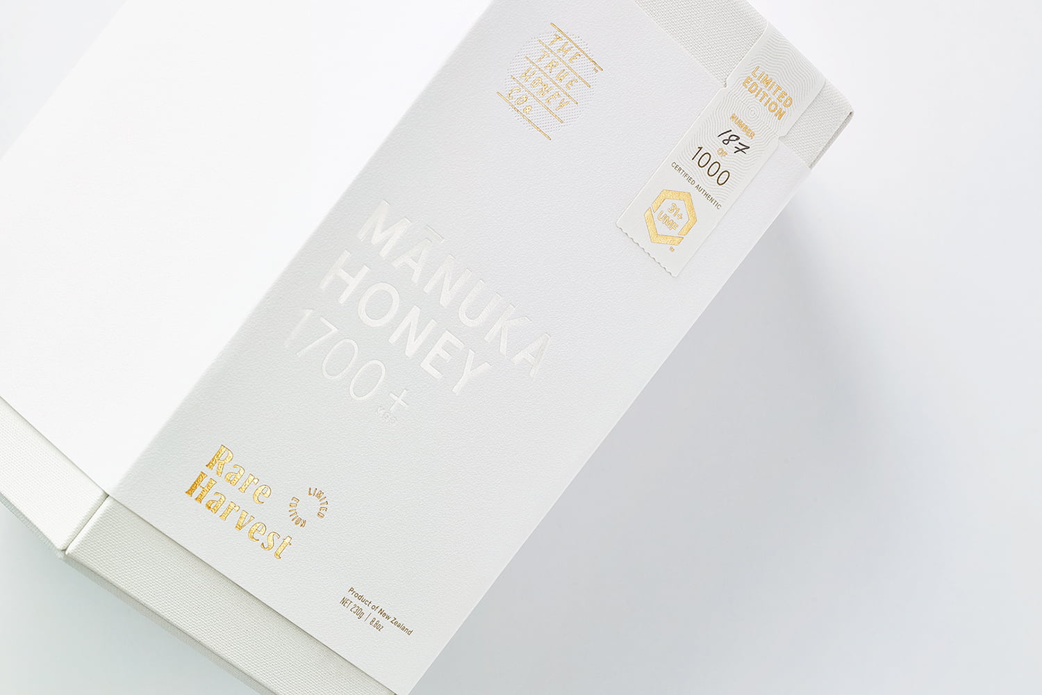
With prices ranging from 60.00AUD (equivalent to 960,000VND) to 230.00AUD (3,680,000VND) per jar, plus a market flooded with substandard honey and dishonest marketing, it conveys the value of the product. and TTHC’s commitment to quality and production ethics through the influence and appeal of its brand and packaging design is paramount . This work has been entrusted to Marx Design – a graphic and packaging design studio based in Auckland, which is known for designing various packaging materials and structures to represent rarity and value. high of similar products.
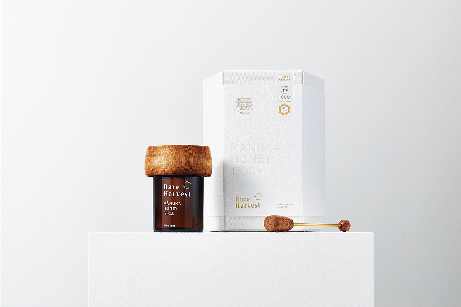
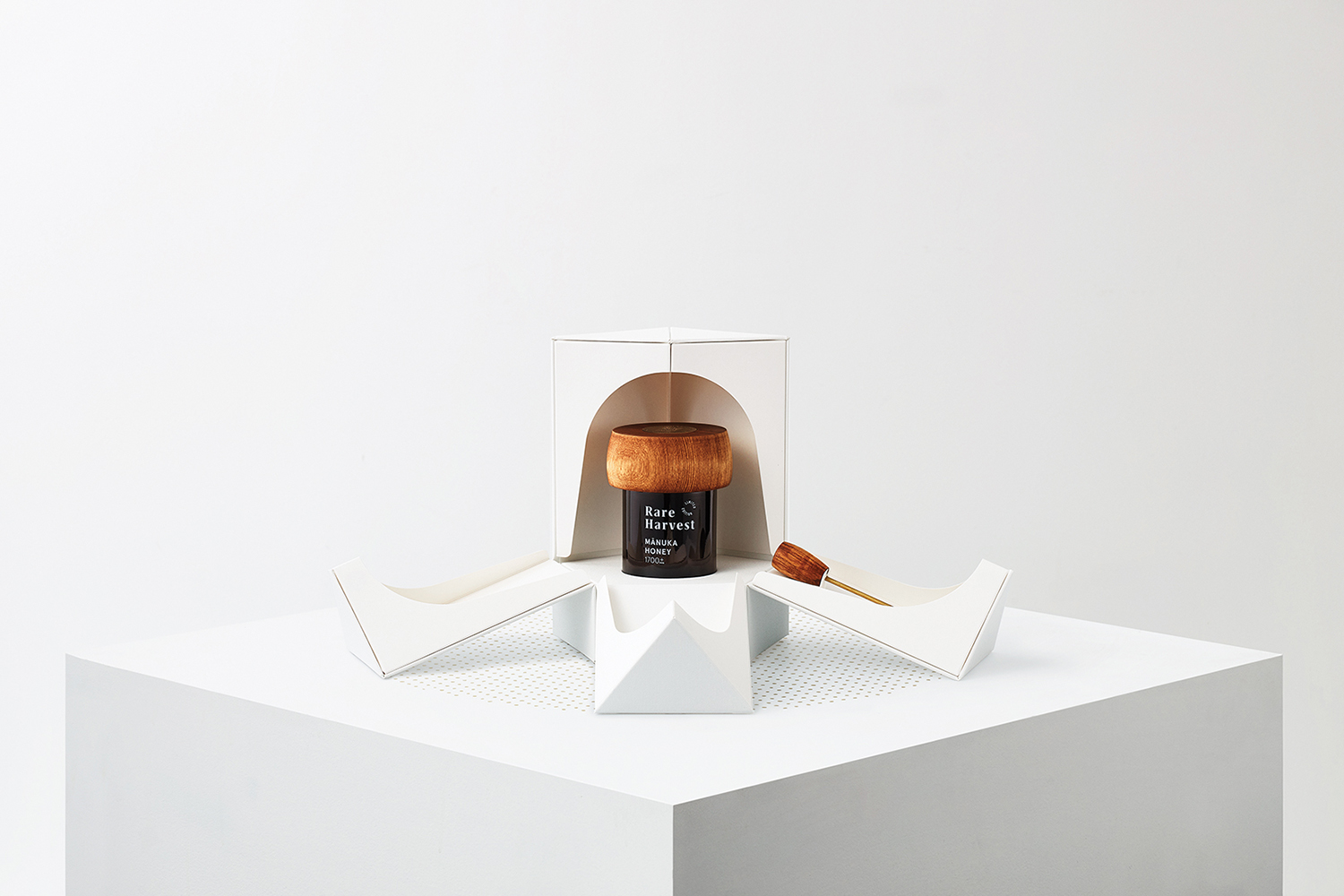
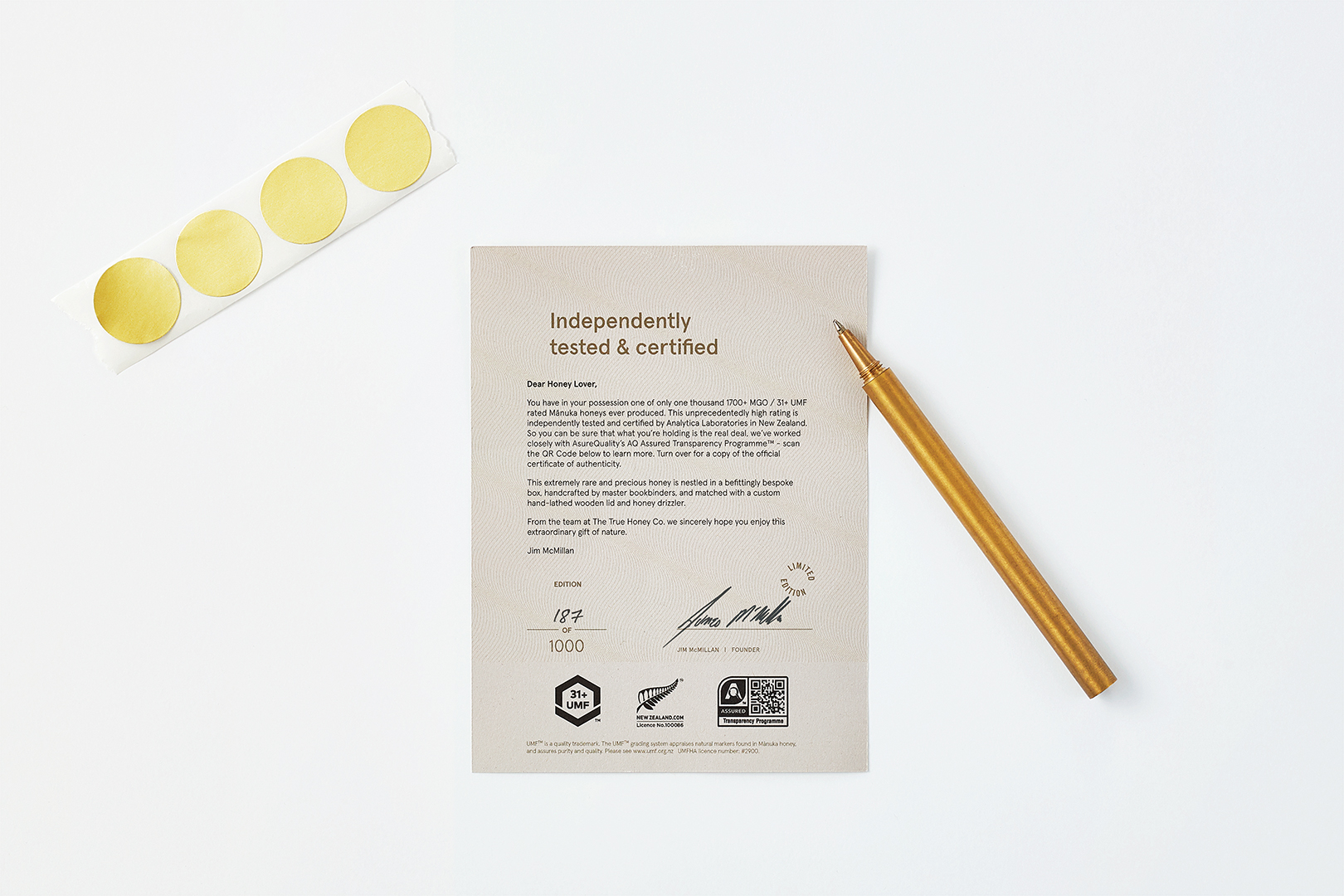
Marx Design returned to this project in 2019 to develop packaging for Rare Harvest, a limited edition of mānuka honey from TTHC certified 1,700+ MGO (31+UMF), an all-time high (these This measure represents the quality of honey). Marx Design collaborated with Think Packaging to use design language to promote the value and rarity of the Mānuka flower.
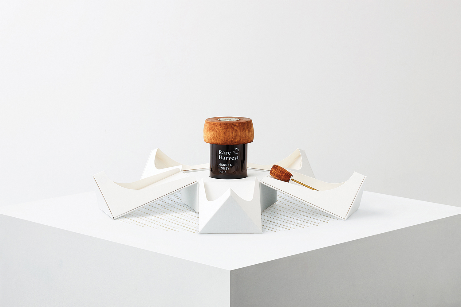
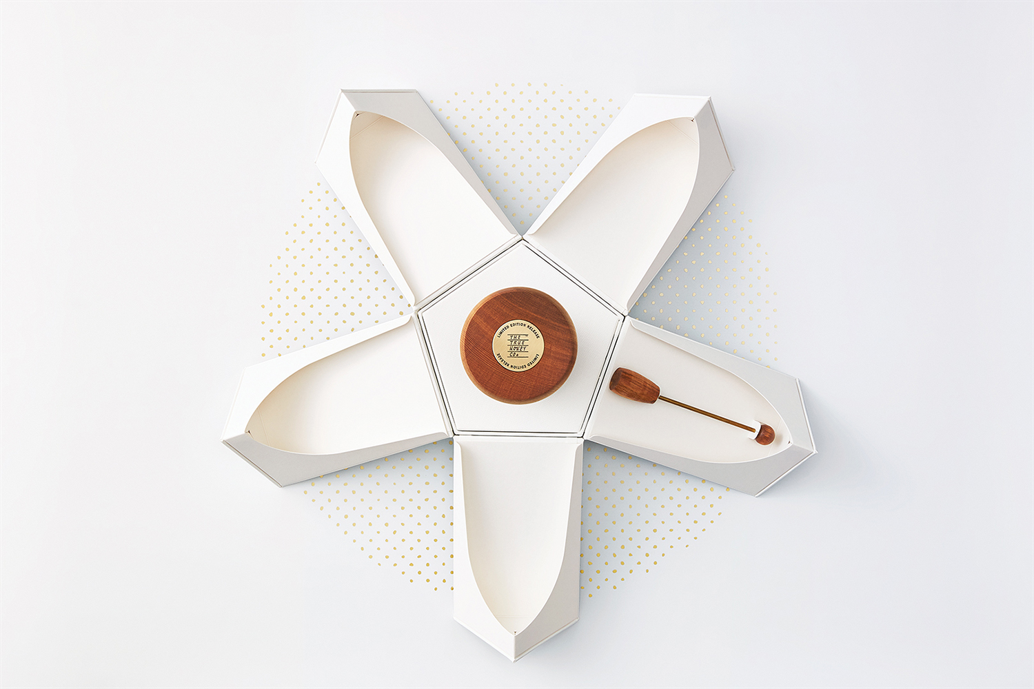
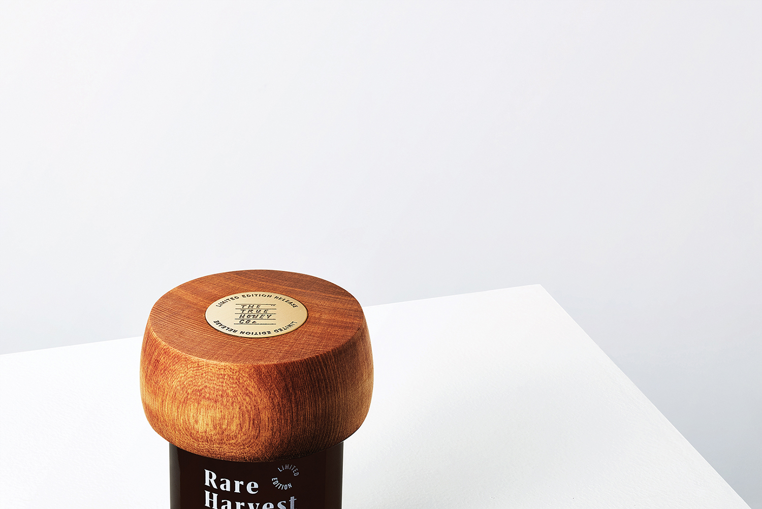
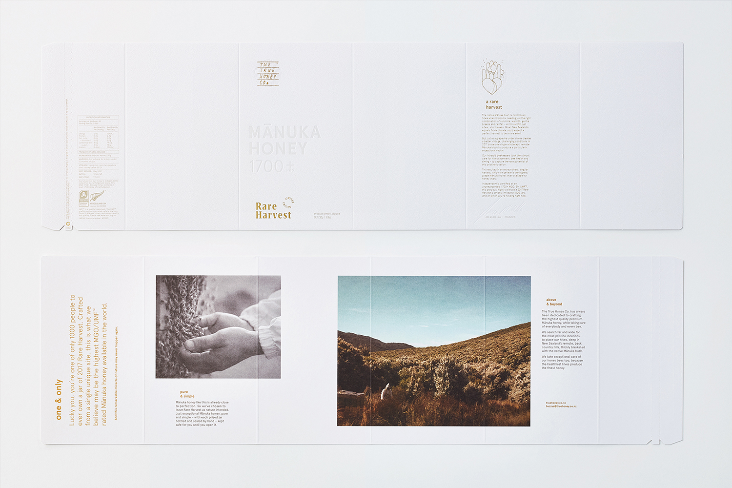
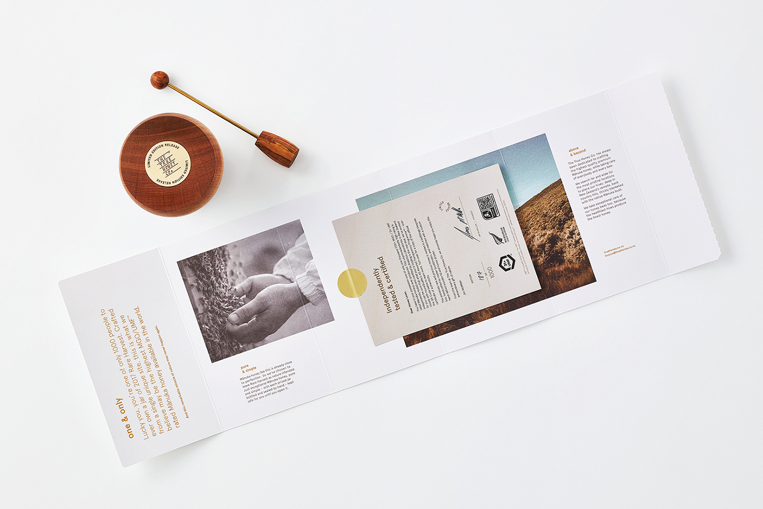
Inspired by the Mānuka tree with its five white petals, and through working with Think Packaging, Marx Design developed a new box structure, in keeping with the previously defined brand’s design language. This box will contain a unique honey jar with a hand-rotating lid and a wooden honey stirrer.
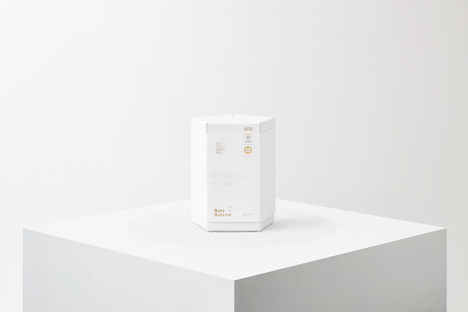
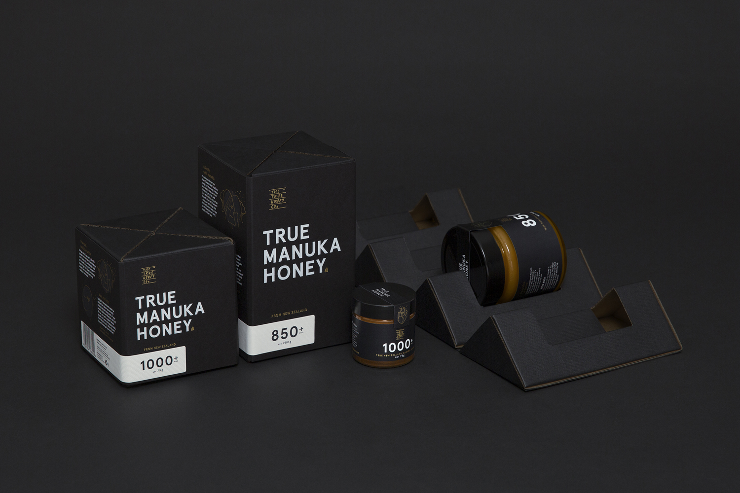
In BP&O’s review of The True Honey Company’s first packaging design (pictured below), we can see how their packaging approach not only functions to protect during shipping, but also creates differentiated from other types of packaging by the use of bubble wrap and polystyrene pellets. This packaging emphasizes the product’s value and humanity through the design with structures that have a lower ecological impact. These honey boxes have developed and introduced us to a completely new and unexpected way of folding packaging that captures the beauty of form structure and creativity.
And once again, Marx Design worked with Rare Harvest to create a box that mimics the shape and color of the Mānuka flower, creating a strong connection with nature, while also representing a Beautiful aesthetic thinking.
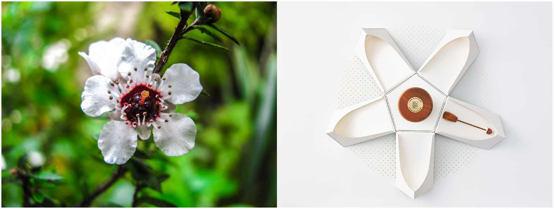
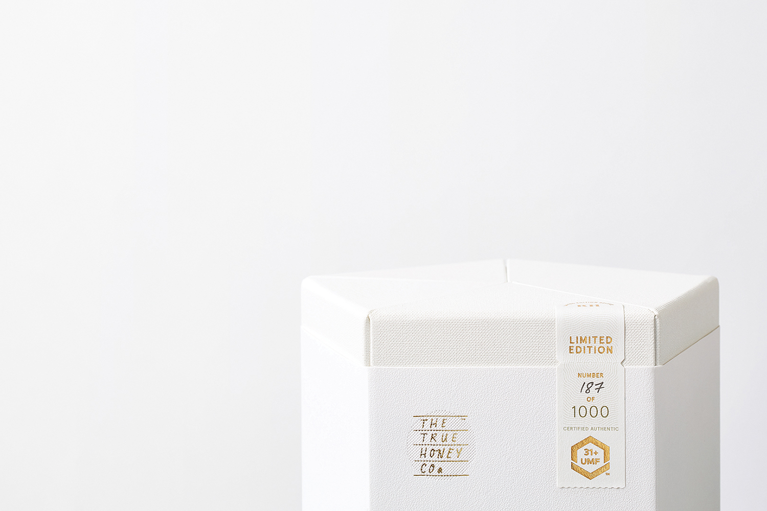
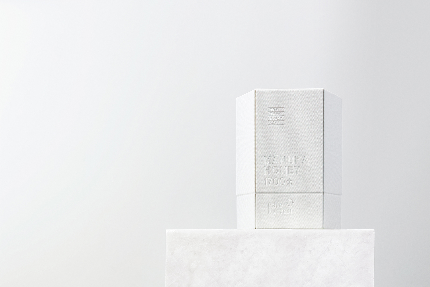
At first glance at the packaging, we can see that the graphics are a bit monotonous, the logo of TTHC currently plays only a small role in a much more complex packaging experience, and this succeeds in creating an impression. with customers and help them remember the Rare Harvest brand. Small details have contributed to making this brand so much more elegant, instead of relying solely on their graphics.
With the old packaging, the shape and material have been exalted more than the graphics. Both the completely black surface of the old packaging and the blossomed white of the recently released packaging represent the craftsmanship of the main product (both the packaging surface and the cuts) designed to create differentiating from competitor products and emphasizing the characteristics of the TTHC brand. Both are classified in the market for super-premium products as shape, material, texture are gradually becoming essential elements for a brand to tell its own story, where the The artist no longer acts as the main narrator.
Main design: Marx Design
Structural design: Think Packaging
Font used: Aperçu


![[UX Case Study] How addictive is TikTok? 7 tiktok addiction](https://maludesign.vn/wp-content/uploads/2022/11/tiktok-addiction-500x500.jpg)
![[UX Case study] The story of building Airbnb's design language 8 10airbnb 1600x1000 1](https://maludesign.vn/wp-content/uploads/2022/11/10airbnb-1600x1000-1-500x500.jpg)