User experience (UX) requires designers to have knowledge in many areas. Honestly, it would be difficult for us to list all the principles that designers can apply to their work to improve user experience.
However, the bullet points below by Malu are still the most important notes that any designer must follow in thinking as well as in work. Curious to know what those principles are? Let’s explore in the content of the following article:
> 10 tips for standard UI/UX website design
1. UX is more than just UI
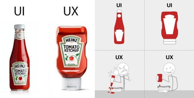
Many people still mistakenly believe: The concept of UX (User Experience) and UI (User Interface) is the same. Designers are forced to distinguish the difference between the two concepts mentioned above.

In short: UI simply shows the interaction between the user and the product; UX is broader, it also studies the emotions and reactions of users after interacting with the product.
2. Understanding users
It is also not surprising that the user (who directly interacts with your design) is one of the most important elements in UX Design. If you want to design a product with the expectation that users will love it, you must clearly understand what users like and want.
The above means: Customer research is an integral aspect of user experience design.
And don’t forget: New customers are a top priority when you design products. What they like or want is more important than the beauty of the design or the features contained in the product.
3. You are not a user
Many designers like to impose what they want with what the user wants. In fact, these two aspects are not always identical.
Your subjective thoughts are not always the same as the thoughts of hundreds or thousands of people with different personalities and behaviors.

Realizing this fact, businesses always conduct product experiences with actual users. The actual users here are not your colleagues or friends, relatives but must be the customers who will use your product.
This work can be time-consuming, but “slowly but surely”, this is the only way to ensure your design is in line with the psychology of actual users.
> App Design – Design software and application interfaces
4. Don’t overwhelm users with the “wall” of information
A study by Microsoft in 2015 showed: Currently, users only have about 8 seconds to pay attention to a specific content on the Internet. This means: Designers must design products to attract the eyes of Internet users from the first seconds of contact.
Information overload can make users feel frustrated with the “food” you present to them.
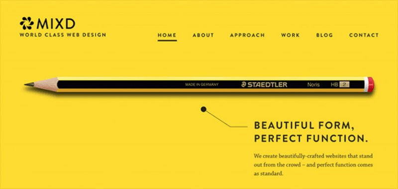
Nowadays, minimalism is the most important thing. The information you give to customers must be carefully distilled and minimalistic, but they must still fully convey what is considered the essence of the product.
5. Set up the UX Design process
UX Design is not an impromptu work, it must progress according to a specific process with scientific data.
Groping in the dark or pursuing an artistic process is not something designers should do.
Many designers believe that: One standard design process can be applied to all cases. This is not necessarily wrong, but you should stick to the requirements of the topic, the characteristics of the user to build the most accurate implementation process.
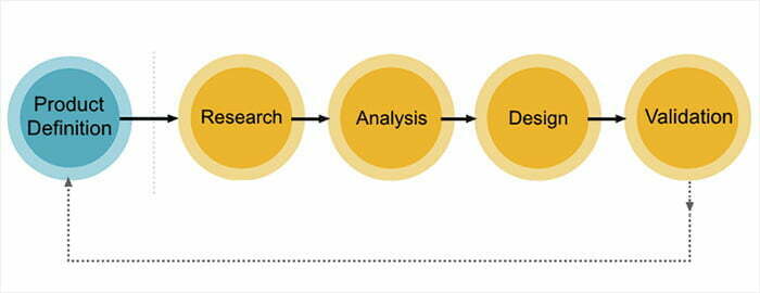
For example: You don’t have a lot of customer-related information in your hands (such as information about demographics, interests, behaviors, …), you should spend a lot of time doing customer survey work. row.
If you are still wondering about product versions, performing A/B testing is necessary at this point.
6. Create demos first
Many designers choose to skip the test versions and rush into designing the final product to hit the market. This can be considered a wrong move but is relatively common among designers.
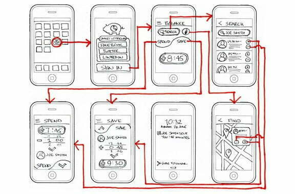
Once you try to design something that you think is great, and then the public reacts badly to the product you create, you not only feel frustrated, but you also inadvertently waste a lot of resources. force like time or money.
Creating prototypes is an opportunity for you to recognize the points that need to be fixed or developed, from there, building a final version that can conquer the requirements of demanding users.
7. Apply content to the design
Every design must rely on content (such as text, images, videos) to guide the style. Instead of using sample lines of Lorem Ipsum-style text, why not apply the actual content directly to your design to make the necessary adjustments?
Your goal is to conquer the difficult customers out there. Designing based on real content will help you a lot in shaping the style of your design.
> Use 60-30-10 color rule in UI design
8. Keep design content simple and consistent
In the production of digital content, simplicity means ease of understanding and interaction with users. The success of UX designers is how users do not need to see manuals and still master the features in the product.

In addition, the design content also needs to be uniform. This will make users feel familiar with your content (especially if they spend a lot of time working on your business product).
Therefore, you should remember two important factors when designing a digital product: Simplicity and consistency.
9. Limit users having to perform operations from the beginning
Because of the limitation of memory ability, people are afraid to redo operations in a mobile application many times.
Instead of letting them have to do everything from A to Z, why don’t designers incorporate features that help users continue their work from the last time?

Take YouTube for example: Have you ever come across a YouTube content section that allows you to continue watching the part of the video you were watching?
That’s how YouTube enhances the user experience of their online video platform.
10. Design should focus on features instead of looks
When focusing on design, designers are often “obsessed” about the aesthetic element of the product. “Does it look good to the user?”, “Is this part a bit unsightly?” These are questions that designers are very interested in.
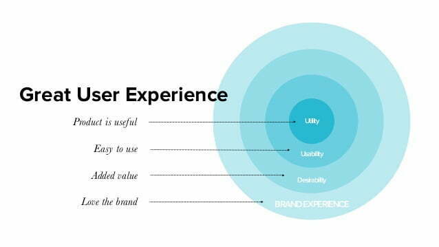
While, the product feature factor, that “is it good?”, “does it meet the needs of the user?” often overlooked by designers.
In fact, the factor that makes users feel satisfied with the experience of a product lies in the feature aspect, instead of the aesthetic factor in the appearance, therefore, the designer’s thinking needs to focus more on this factor.
11. Don’t solve all problems by yourself
You should not try to solve all UX Design problems on your own. Don’t forget, standing behind you is a team of professional, enthusiastic and resourceful engineers and designers.
You can completely consult their opinions, views and contributions to make the product more perfect.
12. Don’t solve all problems at once
There is a truth: UX Design is not a linear process. There will be problems that happen again and again, without any rules or order. Therefore, you must be prepared: Will have to solve each problem in a certain period of time.
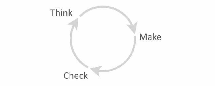
And don’t forget to apply the principle: Find out the cause – Solve the problem – Check the solution to solve the problems you face thoroughly.
13. Prevention is better than cure
Once your product has an error, users often have extremely negative thoughts.
Most likely, they will never go back to using your product. That’s why you should “prevent” instead of “sick” to rush to find a way to handle it.
14. Use Interactive Icons
In UX design, the user plays the central role of all activities. When interacting with your content, users don’t want them to be “ignored”. Users demand that every action they take must be responded to immediately by you.

That’s why you should consider installing a few signs to tell your users: “What’s going on with them”.
An interesting example that you may notice in some websites is the “loading circle” icon when the user’s actions are in standby mode.
15. Don’t make sudden changes to users
A study has shown: Users are very dissatisfied when an application changes so suddenly its internal components. eBay is the business most profound lesson from this problem.
Just because they changed the background color of the website from yellow to white, a lot of customers of the business filed complaints to the customer service department.
Therefore, if your business intends to make any major changes to its products, do them slowly.
Failure is part of the customer experience optimization process. If you are afraid of making mistakes, you will never be a good manager. Hopefully, the above suggestions of Malu will be of great help to you UI/UX designers in the process of building and optimizing the user experience for your business’ products in the future. Good luck!

![[App Design] How to Design Software Interfaces, Professional Mobile Applications 6 thiet ke app](https://maludesign.vn/wp-content/uploads/2022/03/thiet-ke-app-500x500.jpg)

