Color plays a very important role in the interface design (UI Design) for websites, mobile apps or any digital platform. Mastering the basic rules of color schemes will help your design products become more balanced, harmonious and professional.
The following article by Malu will send you the principles you need to master to use color effectively in UI Design.
> 10 tips for website interface design ; App Design – Designing software and application interfaces
Rule 60 – 30 – 10
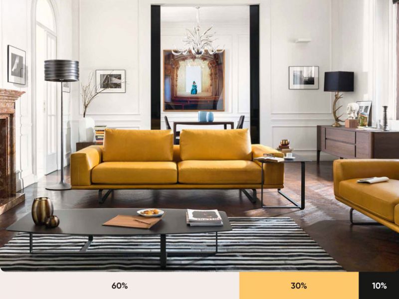
The 60 – 30 – 10 rule is the golden rule in color scheme that any graphic designer, whether new to the profession or has been in business for a long time, must take it to heart. Specifically, in the design space: 60% of the space belongs to the main color, 30% of the space is for secondary colors, and 10% of the space belongs to the prominent tones, emphasizing the object.
This rule is very popular in the field of interior design, you can look at the illustration image below to get a more specific picture.
Meaning of each color
Many studies by psychologists have confirmed: Each color can bring different emotional states to the viewer. Even the meaning of colors can vary from culture to culture.
Therefore, when designing interfaces for digital platforms, you should carefully understand the meaning of each color in the culture of your target audience and make appropriate choices.
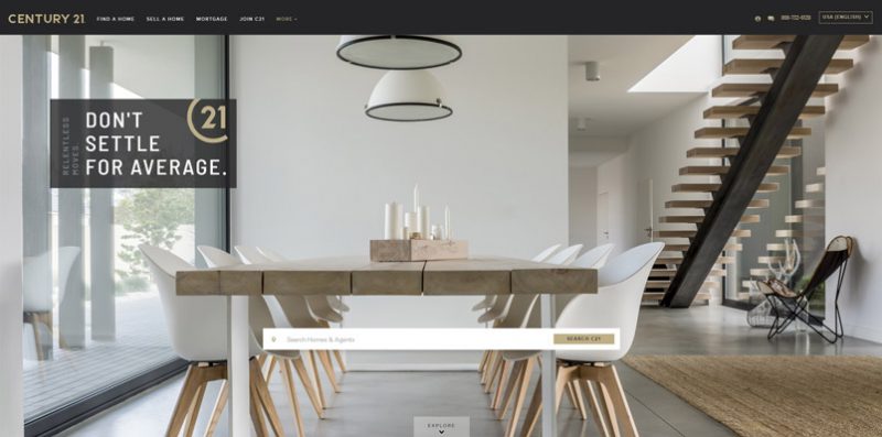
Across cultures, the meaning of each color can be:
- Red: Enthusiasm, love, danger.
- Blue: Calmness, sense of security, responsibility.
- Black: Mystery, elegance, darkness.
- White: Purity, cleanliness, stillness.
- Green: Freshness, freshness, nature.
Some notes when using color in UI design
Here are some notes in the UI design process:
Design Grayscale first
Before pouring different colors into a design product, you should consider shifting the color tones from light to dark for the elements in the product. People often use the Grayscale tool (roughly translated in Vietnamese as gray scale) to set the color gradation in the design product.
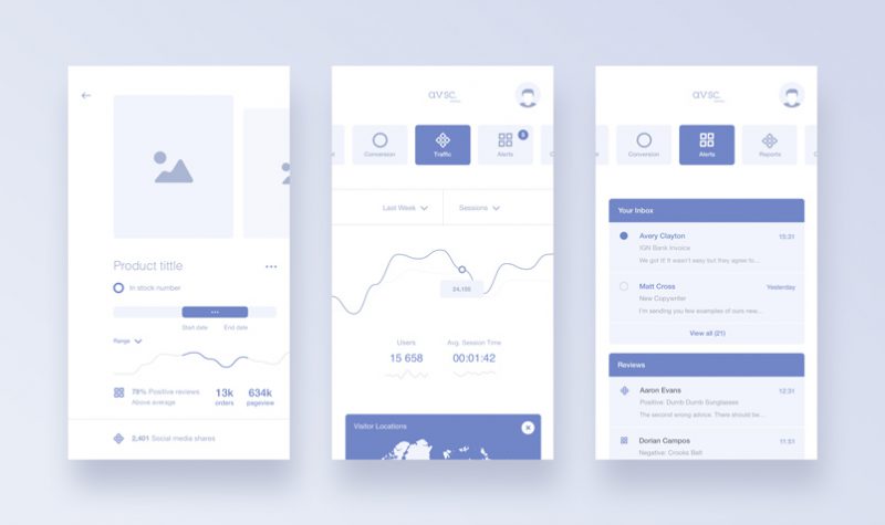
In Grayscale design, the colors of all elements are converted to white and some kind of color (be it black or blue).
Through this version of the color scheme, you can completely control the light and dark levels for your design products easily, choosing exactly which areas to use warm colors, which areas to use cool colors, Don’t get confused and get lost in a forest of different colors.
Use natural colors
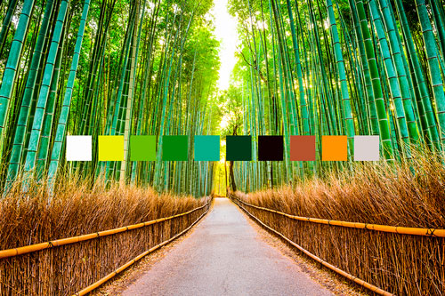
The best color combination is the combination of colors from nature. Our eyes tend to be attracted to familiar colors, which we come into contact with every day with the naked eye.
Don’t forget the contrast
There are colors that go well together, there are colors that stand next to each other and become a mess. Mastering the rules of contrast can help you discern what colors can be used together.

The color wheel (also known as the color wheel) will be a useful tool for you to choose and colorize elements in design products.
Looking for inspiration
Coloring inspirations in videos, print ads or fashion styles will help you get the answer in choosing and combining colors for your design products.
>>>Refer to practical examples in the article Basic color schemes
Useful color matching tools
Here are a few suggestions of our add-ons to make your color matching work easier and more efficient:
Coolors.co
This is really the most useful tool in selecting the design colors that you want to extract.
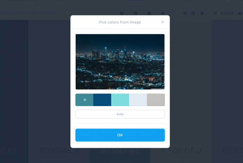
You simply upload the image you see with the color you want to extract. The rest let this tool handle it for you.
Bullets
This tool from Adobe itself can help you choose colors based on the Color Wheel.
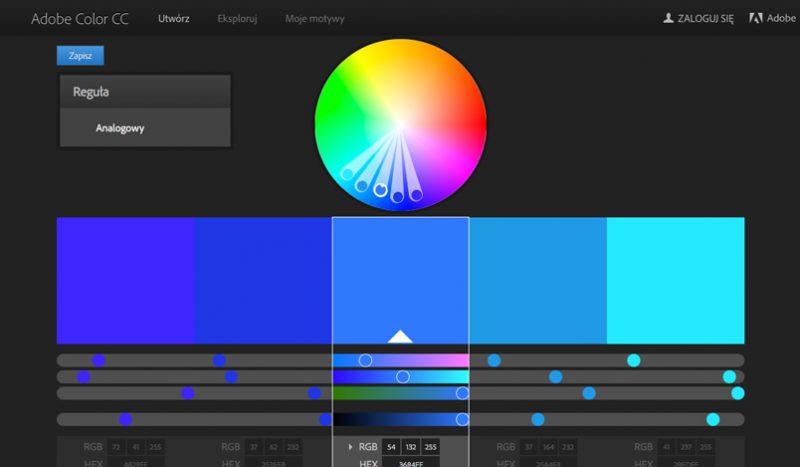
Kuler also allows you to extract colors based on the basic principles of dithering operations (like choosing 3 colors according to a triangle, choosing 2 opposite colors in a circle, choosing 4 colors according to the square rule, etc.) ).
Paletton
This tool is functionally equivalent to Kuler. What’s different here is this: Instead of being limited to just five distinct colors, Paletton allows you to choose from a whole range of colors with tones that run from light to dark.
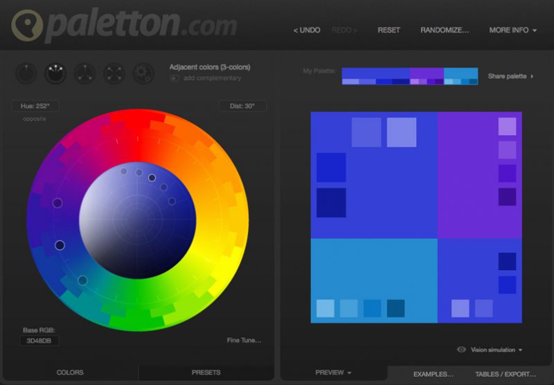
This is extremely useful for you in designing products with relatively large color complexity.
Designspiration.net
In case you have 5 colors and want to check if there is a design that contains all of these colors, Designspiration is the solution for you.

This tool is extremely suitable for designers who are out of ideas and need to find their creative inspiration.
Shutterstock Lab Spectrum
Is there a tool that allows users to search for images within a certain color spectrum? You seem to be referring to the Shutterstock Lab Spectrum, where you can find all the tonal images you’re looking for.
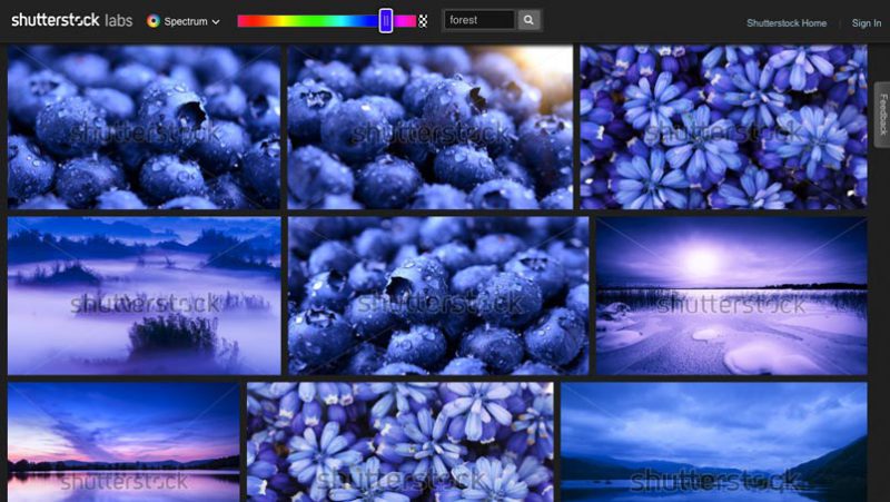
The biggest limitation of this tool is that the images are all watermarked.
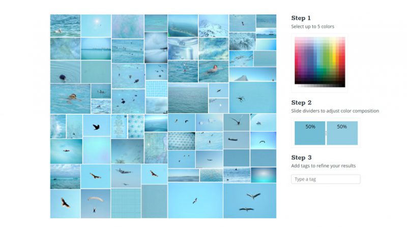
Has Multicolr
When using this tool, a whole store of images is waiting for you to explore. Tineye Multicolr boasts a database of more than 10 million images with color mixing and matching from simple to complex.
> 15 Golden Rules UX Designers Need to Know
Color seems to be something very complicated in the eyes of the “newbies” in the design village. However, if you master the basic rules of color mixing and matching, your design work will become much simpler and lighter. Who knows, you may find yourself some inspiration to create works of a lifetime. Thank you for following the article. Good luck!


