Determining the right website layout is one of the first and very important steps in website design . Website layout serves as the foundation for your design, which can greatly affect the visual feel, user experience, and conversion rates.
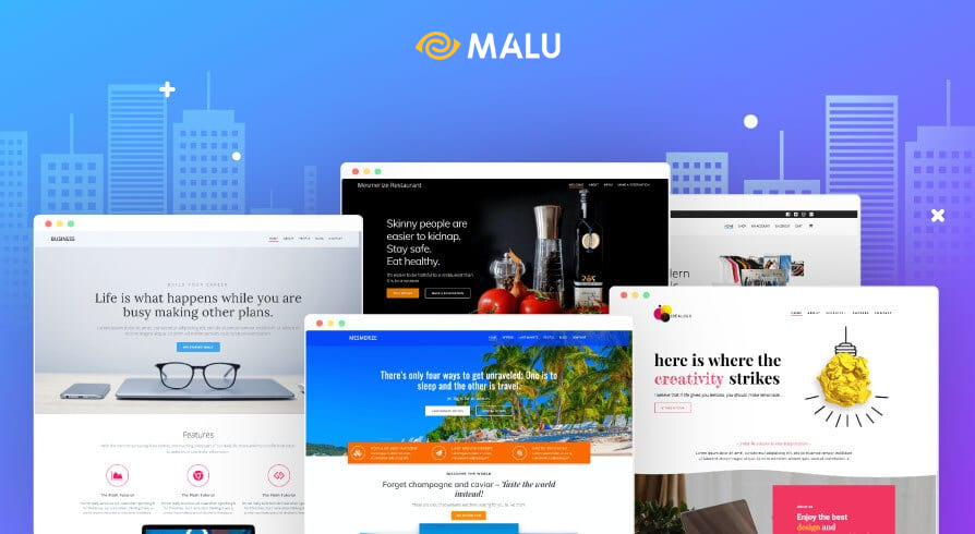
Today, Malu will share with you 10 Effective Website Layouts that have been widely adopted.
1. What is website layout (Website layout)?
Website layout (Website layout or website layout) is the arrangement of all visual elements on a web page and the relationships between them.
Through the purposeful positioning of page elements, web page layout can improve a website’s message delivery as well as its usability.
Website layout is an important component of web design. It determines the order in which website elements are presented to visitors, which elements attract the most attention, and the overall balance of the design.
In a word, good website layout design can grab the user’s attention and lead them on purpose.
It can help webstie owners navigate users to the most important things first, and then move on to the next sections in the pre-built script.
2. How to choose a website layout?
When starting to design a website, deciding how to choose a website layout should pay attention to 2 main points:
2.1. Match the website content
The website layout should support promoting the message, participating in telling the story you want to convey.
Some website layouts are best used to showcase products/services, while others help convey factual information, quickly suitable for news sites, blogs.
Therefore, the website layout you choose should match your content type.
2.2. Use popular layouts
While you can experiment with something new creatively, popular, well-known website layouts that have been tried and tested are often the best choices.
These popular layouts make your website user-friendly, as they build on their expectations or previous experiences of other websites.
A familiar layout results in a more intuitive, easy-to-use interface.
Below, Malu introduces the 10 most popular and effective website layouts with an explanation of why it works and what type of content it is best suited for.
3. 10 Most Effective Website Layout Ways
- Z-pattern . layout
- F-pattern . layout
- Full screen image layout
- Split screen layout
- Asymmetrical layout
- One-column layout
- Box-based layout
- Card layout
- Magazine layout
- Horizontal strip layout
Layout #1: Z
When we come across a new web page, our eyes immediately scan that web page to get the gist of everything.
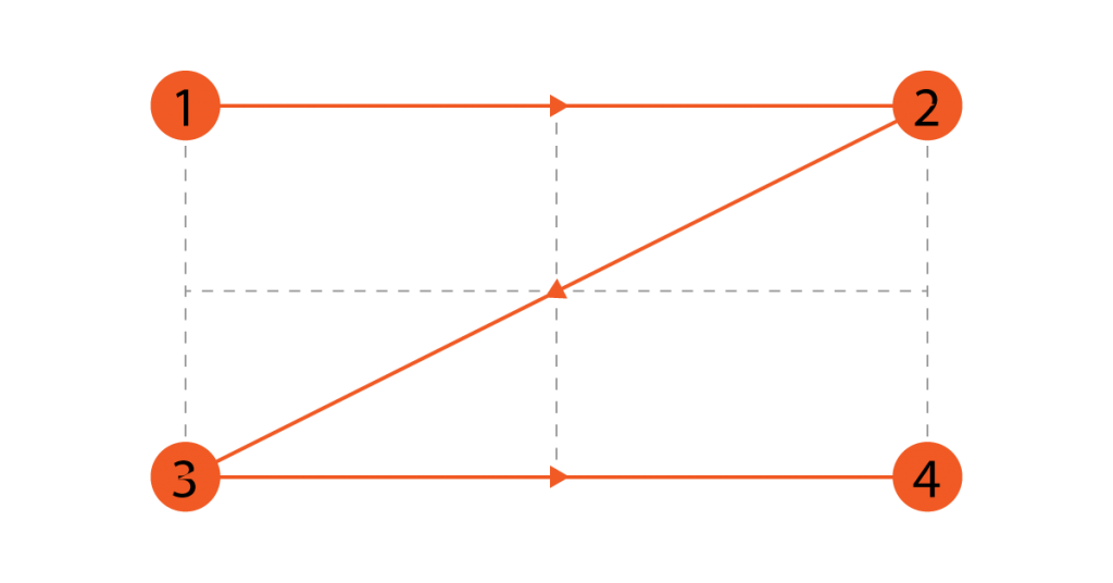
This quick scan, called skimming, is usually done in the shape of the letter Z or in a zig-zag form.
Our eyes move from the top left corner to the top right corner, then to the bottom left, and finally back to the right.
This is the habit of reading books, writing articles we have been taught since childhood.
As a result, when surfing the web, we use this habit to read / scan website content.
Taking advantage of this reading habit, web designers have deployed all the important content on the Z shape. Thus, we have a Z-shaped website layout.
This layout often places the company Logo in the upper left corner, to create a first impression.
Besides, in the rightmost corner, you can place the navigation menu with a prominent call-to-Action.
The diagonal part of the Z shape, which extends across the page from top to bottom, is where the information attracts the most attention.
You can put attractive images and text that briefly introduce the content of the website.
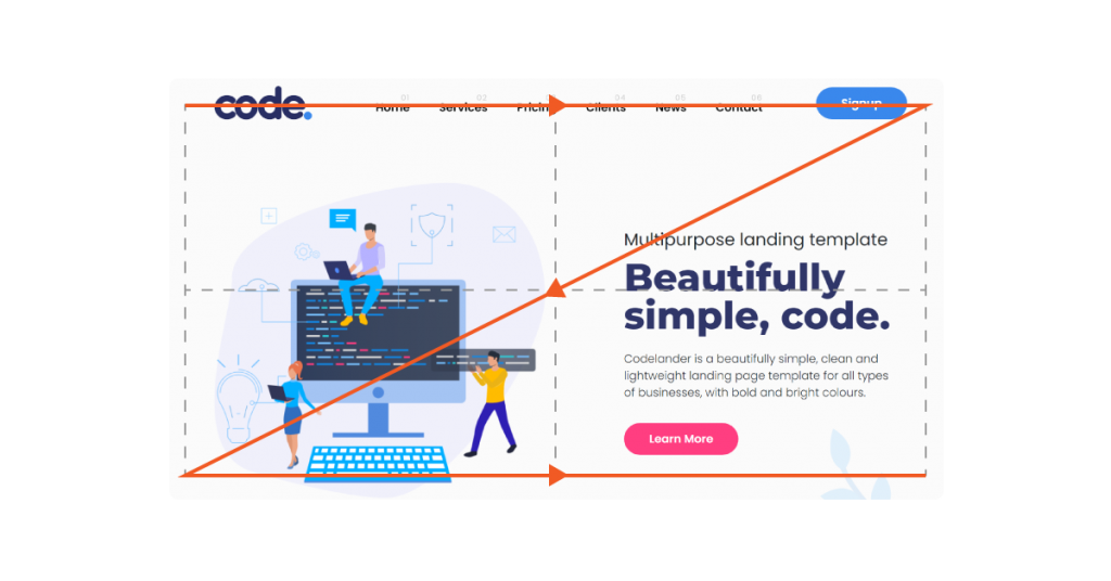
The bottom of the Z should be the culmination of everything leading up to it. Now it’s time to place your most important call-to-action (CTA) button, calling the user to do something.
The Z site layout is ideal for : Pages that are highly visual and contain little text like landing pages that target a specific conversion target.
Layout #2: F
Like the Z-pattern layout, this F-site layout is also based on a common page scraping behavior. In sites with more textual content, we tend to skim or read information in an F-shape.
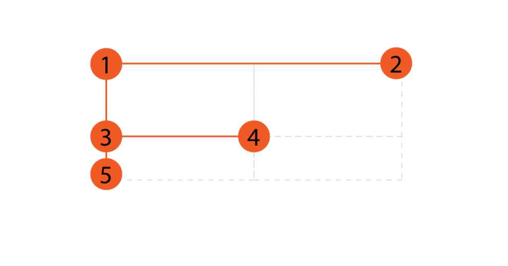
This means that the top horizontal portion of the page captures our attention and from there their eyes move vertically downwards, with the focus on the left side.
When using an F-page layout, make sure to invest resources in the top part of the page, as this area users often linger longer.
TIP: The top part of the F-shape usually includes the title, subtitle, and featured image.
The next section below should write a more detailed title description and introduce the rest of the page.
The vertical line of the F pattern on the left side of the page helps to make the text more attractive.
TIP: You can also use images, icons or with formats like lists, numbering
The F-site layout is ideal for : Sites with more important text content than other elements. The F-site layout is applicable to both the homepage and individual blog post pages.
Layout #3: Big Image
This website layout includes a short piece of text at the top of a large or full-screen featured image.
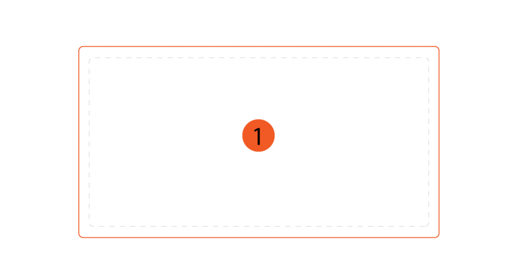
A single centered visualization can create an eye-catching design. It helps to communicate the message effectively and instantly.
Large media formats can convey a lot about who your brand is and what it does – in seconds.
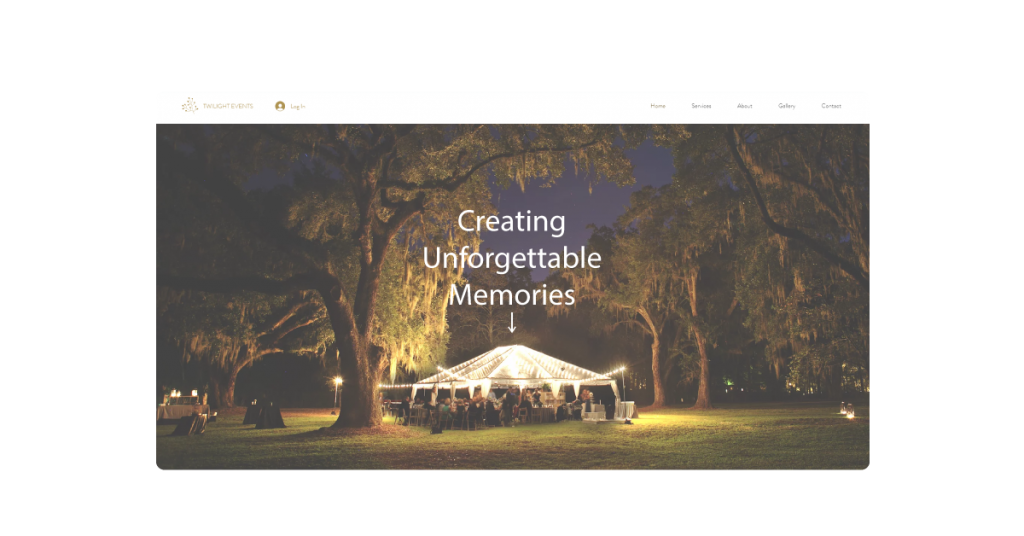
The media itself can be anything from an image, illustration or video. Either way, it should be of high quality and match your service, product, or overall feel of your brand.
In this type of website layout, the large image is accompanied by a short line of text to further explain what you want to convey.
So, create a strong title or a catchy slogan to introduce the service you offer that makes users excited to learn more.
One more note, this layout should be impressive on both PC and Mobile versions.
Website layouts with large images are ideal for : Businesses that want to highlight a specific product or niche. For example, a restaurant website that showcases outstanding dishes, or a wedding website that shows a photo of a happy couple on their wedding day.
Layout #4: Split screen
Split-screen website layouts (aka 2-column layouts) are a very popular web design trend.
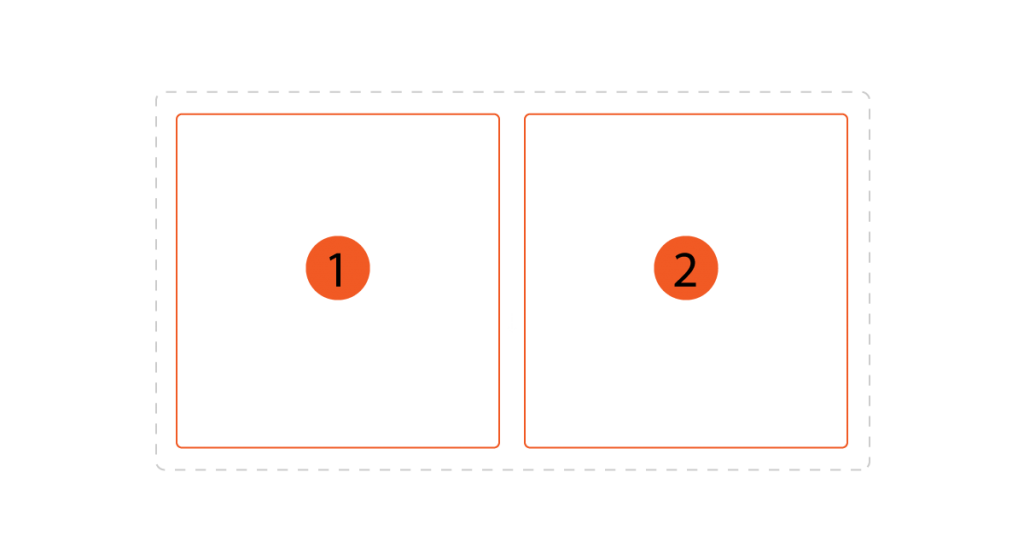
By subdividing the screen down the middle vertically, it creates a perfect symmetrical balance.
This is an important principle of design.
This neat division into two sections allows each to express a completely different idea, or to combine text and images that complement each other.
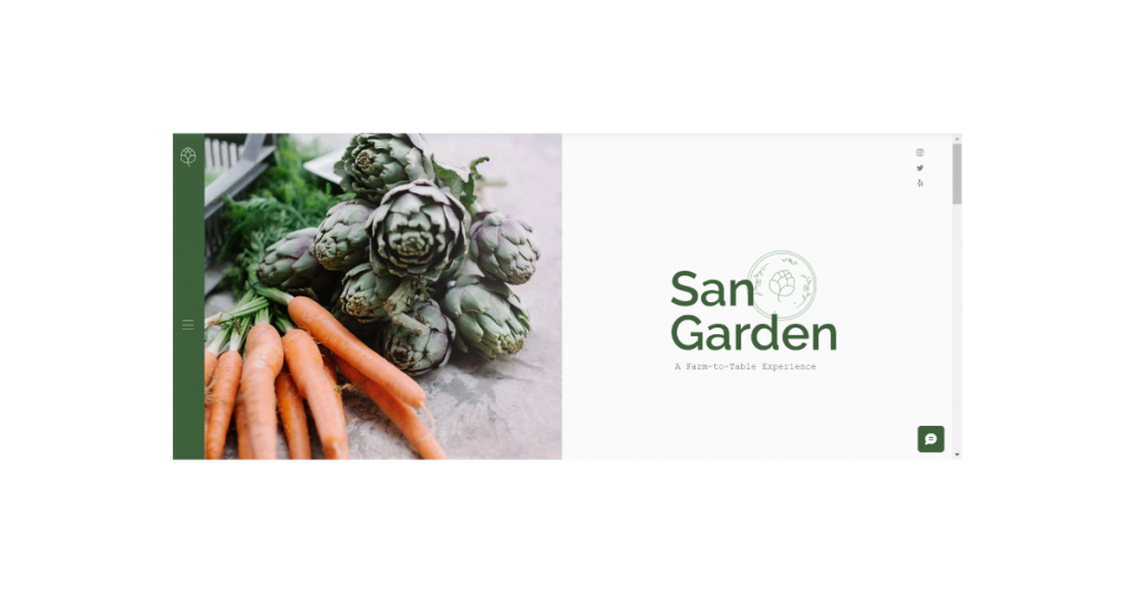
The website layout template shown here demonstrates the dining experience with eye-catching images on the left, and illustrated text and icons on the right.
The layout allows both sides to fully complement each other, rather than compete with each other.
This same design can also work well in cases where website visitors are asked to choose between two opposing options, such as the ‘Men’s’ and ‘Women’s’ categories in the sales site.
To get the most out of the split-screen layout, consider incorporating some movement by making each half of the screen behave a little differently.
Example: You can use the Prallax scrolling effect on one side, not on the other. Another way is to duplicate this layout below, but swap the content on either side.
The split-screen website layout is ideal for : Sites (or sections of a web page) that offer two significantly different types of content or want a complementary mix of text and illustrations.
Layout #5: Asymmetrical
Similar to the split screen layout, the asymmetrical website layout also splits the screen, only this time the two sides are deliberately designed to be asymmetrical.
This change creates visual stimulation and makes the site feel more dynamic.
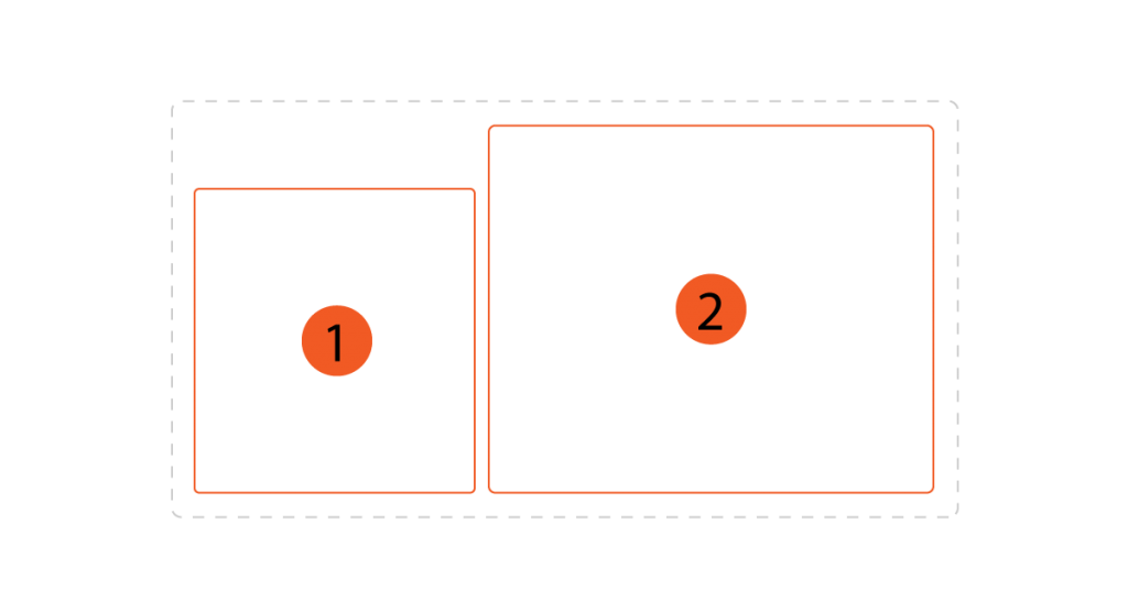
It’s a bold design that serves as a powerful tool for Create – and Maintain User Engagement.
Through the uneven distribution of scale, color, and page width, website visitors can focus on specific elements more than others.
To achieve this, consider designing certain components larger to act as focal points.
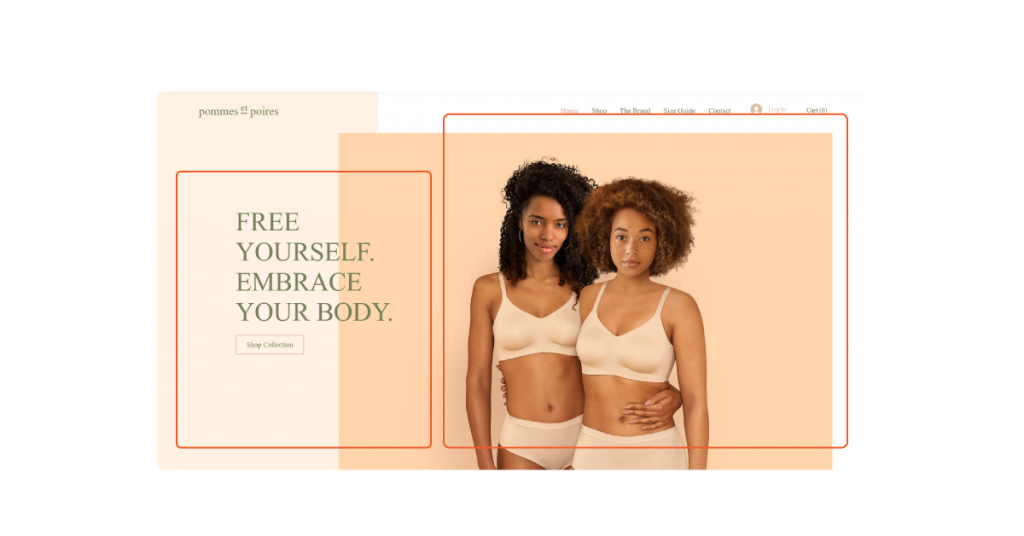
This highlight can be anything from a product photo to a form you want users to fill out.
Then make it stand out by using high-contrast colors, expanding and adding other types of visual accents.
The asymmetrical website layout is ideal for : Websites that aim for a modern and dynamic look and feel and are interested in promoting user interaction.
Layout #6: 1 Column
This 1-column style website layout includes all of its content in 1 vertical column. This is a simple, easy-to-understand design.
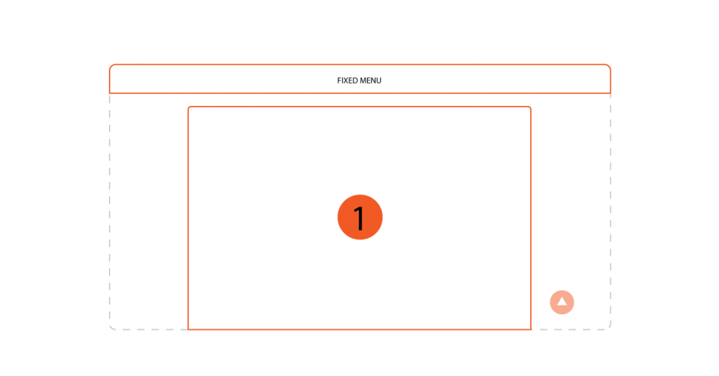
The navigation here is easy to understand – visitors immediately know to scroll down the page for more information.
However, there is one important site navigation tip to keep in mind for this layout. Make sure to add a “Back top” button or a permanent menu on top to make it easier for users to navigate.
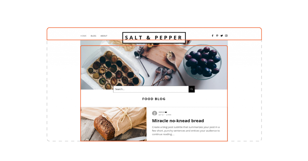
When using 1-column layouts for web pages with lots of text, remember to break up the text frequently with images, headings, or subheadings.
This is also a tip for writing articles to increase readability.
The 1-column site layout is ideal for : Web pages (or sections) with long content, or sites that display content in chronological order. This can be anything from a blog post to a social network (like Facebook).
The 1-column layout is also often used to ensure that the content is presented well on the PC, when switching to a laptop, it still has a good experience.
Layout #7: Boxy
The site layout is based on boxes that combine multiple pieces of content into one geometric design. With each piece of content neatly bound in a box and creating a unified whole.
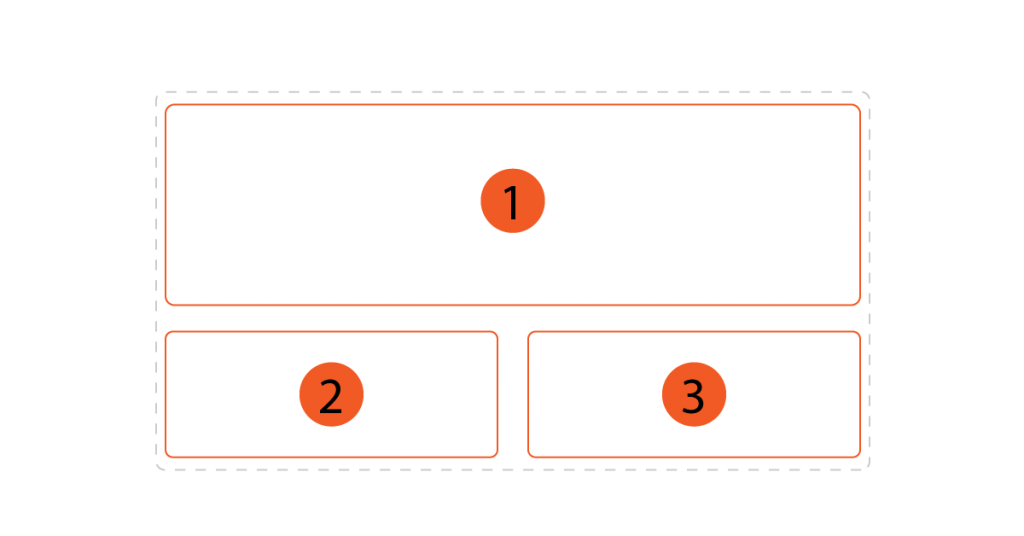
Each box can lead to a category, a different page so users can find details about the topic they are interested in.
A common design method that is often adopted is to design a large highlight box to serve as the focal point and tie up the boxes below.
The highlight box can include the title of the page and a brief explanation of its contents.
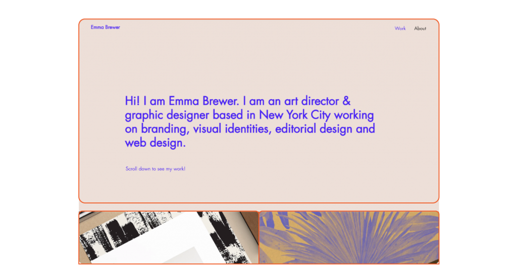
Another tip is to arrange the images in each box so that they blend well together, creating a cohesive brand identity.
The box based website layout is ideal for : Complex site structure with many pages.
Layout #8: Cards
Like box-based layouts, card layouts use boxes or other rectangular containers to display rich content.
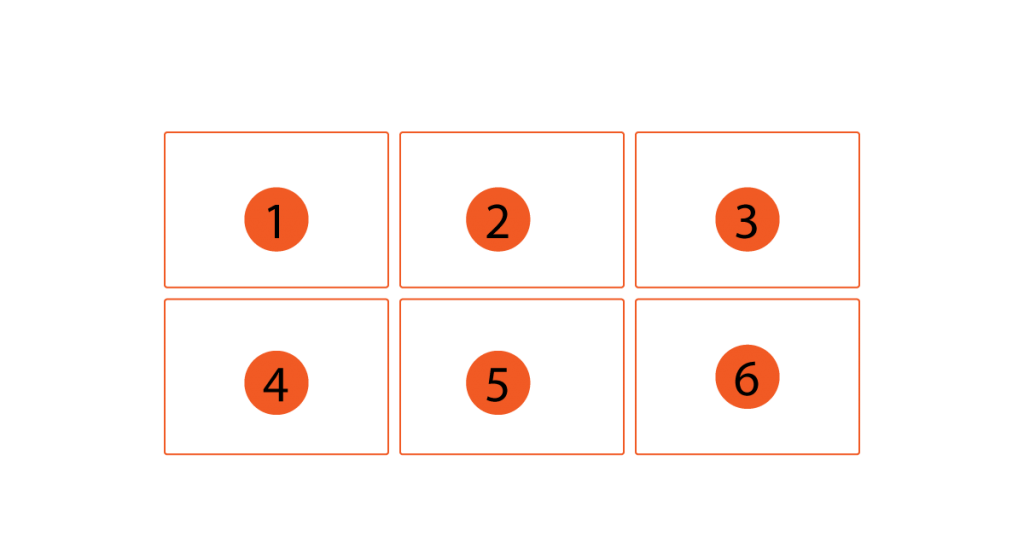
This site layout is not hierarchical, which means that no item stands out above the others and all information is treated equally.
All cards have identical features (in terms of size, font, etc.)
This design solution makes it easy to layout pages for mobile devices (Mobile, Tablet). It also allows for intuitive and accessible browsing despite the large amount of information, improving the user experience.
The tag site layout is ideal for : Content-rich websites. This website layout is perfect for a blog or a sales website with many products or services.
Layout #9: Press
Inspired by print journalism, the e-press website layout is based on a multi-column grid to create a complex visual hierarchy.
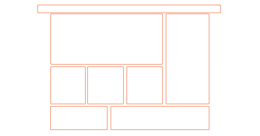
By implementing containers that can be individually modified, journal layouts allow you to prioritize major titles over smaller articles.
In general, this style is often very complex, applying multiple layouts to try to include as much information as possible while keeping the reader engaged.
Typical for this example are newspaper sites such as: Vnexpress…
Note that magazine layouts can also adopt an F-shaped skimming pattern in response to the reader’s diminishing attention span.
Combining the F-pattern with a more complex grid allows large amounts of information to be broken down into easy-to-read reads, while preserving order and a clean, neat design.
The magazine-style website layout is ideal for : Content-rich websites such as news sections, newspaper websites.
Layout #10: Horizontal strip
This website layout divides the website into horizontal bands. These horizontal bands can be as long as the screen (or near the maximum).
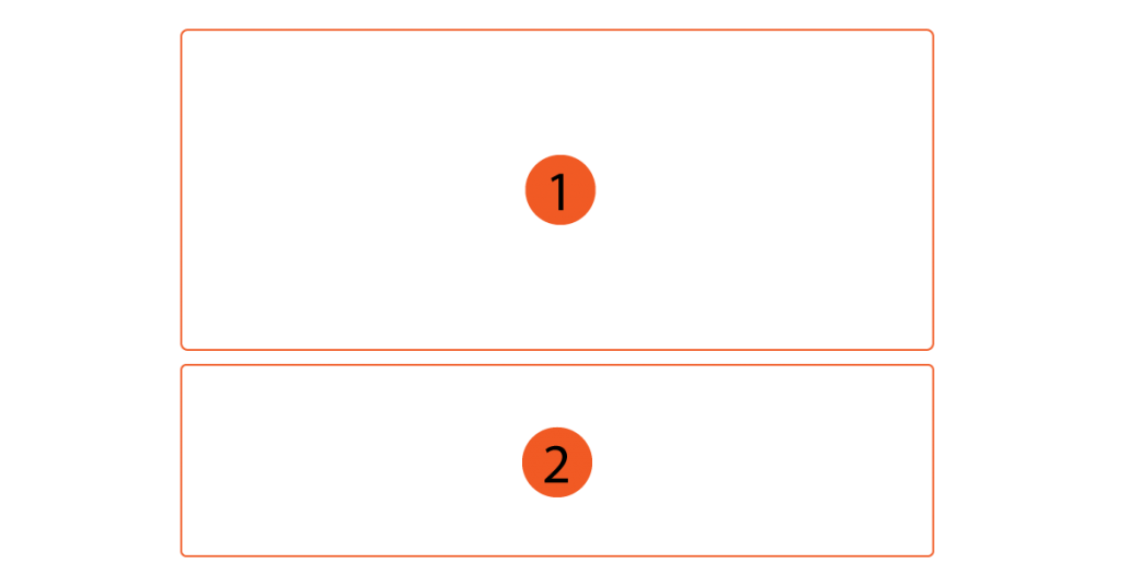
This varied layout helps build user expectations, helping to take them through one surprise after another as they scroll down.
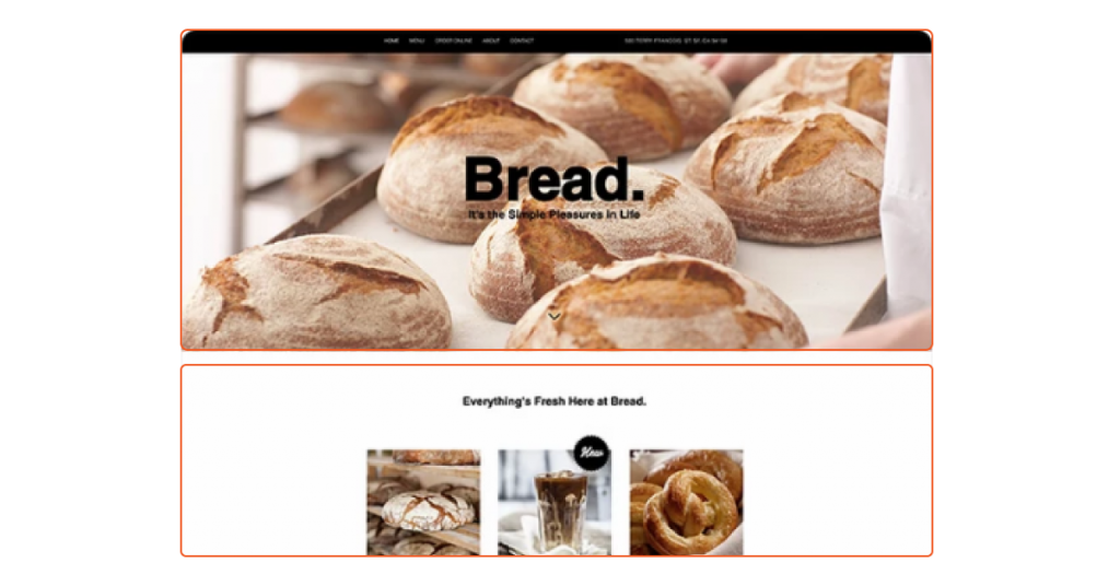
To make each strip different from the previous one, try:
- Use different colors (in your website’s color palette) in adjacent bands
- Use images in one strip and text in the other
- In addition, incorporating scrolling effects, you will be able to give this composition a sense of movement and depth.
The horizontal strip website layout is ideal for: Long scrolling websites. This layout is especially beneficial when it comes to designing a page that clearly divides sections from top to bottom.
4. How to apply popular website layout to web design?
As you can see, we have 10 website layouts and they are suitable for different types of content and goals.
If you have learned about webstie design then you are thinking right.
We can apply different layouts to different pieces of content to deliver the most effective web design.
For example:
- The layout of the letter F or Z is suitable for the design of the first introduction of the product or service.
- Split-screen or asymmetrical layouts are suitable for content types that describe services and showcase information.
- The boxy layout is suitable for designing primary and secondary services
- Card layout suitable for e-commerce store design
- Magazine layout suitable for Blog category design
- Horizontal or 1-column layouts are also commonly used to group sections of a website together.
- …
Despite the type of purpose towards which we choose different layouts for the best effect.
Above are 10 of the most effective website layouts adopted by top web designers.
These website layouts are built based on user experience research and optimization over the years.
Therefore, currently, if you have a website design need, consider the partial (and overall) design goal to apply popular website layouts to achieve the highest efficiency.


