Coca-Cola’s New Coke project is one of the prime examples of brand failure (due to ineffective market research), and there are certainly many lessons to be learned from it. In fact, many famous brands have made big mistakes in their branding process.
Here are the lessons learned from some of these branding failures.
Zara’s controversial t-shirt design
Zara’s Biggie clothing product, when it launched a new line of t-shirts for children, received mixed reviews from the public. T-shirts with horizontal stripes in blue and white with a six-pointed yellow star, which bear a strong resemblance to the uniforms worn by Jewish prisoners in concentration camps during the Nazi Holocaust. .
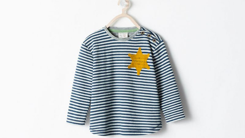
Naturally for that, Zara faced the wrath of social media, but soon after, Zara was quick to speak up and apologise. It is also recalling the shirt from all of its stores – both online and in stores.
Lesson learned : Never shy away from admitting your mistake or turning your back on comments coming from customers . Zara apologized and admitted the mistake, that’s the most important thing.
GAP redesigned its Logo
Logo can be said to be the foundation of any successful brand. It represents the brand and helps businesses build connections with target customers. This is why logo design is especially important in marketing.
But what happens when brands decide to change their Logos and how does it affect customers? Let’s see the below example of GAP’s Logo change.

About six years ago, GAP decided to change the Logo. The new logo gives the brand a more modern feel and look. However, customers thought the exact opposite and were not impressed with the new design. GAP received heavy criticism and feedback from its loyal customers, including comments on Facebook and Twitter protesting this Logo change.
>>> What is brand loyalty? Build brand loyalty
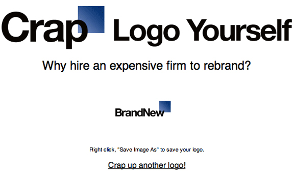
A website that quickly went viral called “Make Your Own GAP Logo” also appeared, where users could create their own GAP Logo.
Basically, GAP has made it difficult for itself by losing its inherent brand identity value. They forgot about customer behavior and the old Logo was deeply ingrained in the subconscious. The redesign of the Logo has lost all the good features that the old Logo shows: style, comfort, etc., which represent the customer community of GAP.
Lesson learned : Logo redesign is a risky and risky move but at the same time, at a certain point, it is also necessary.
But instead of completely redesigning the Logo right away, make sure it is researched and developed over time, without taking away the essence of the inherent brand. GAP has made almost 100% of the changes, not inheriting the legacy from the old Logo. That’s something a big brand shouldn’t do.
>>> 4 Common myths about rebrand
Tropicana’s failed packaging redesign
In 2009, Tropicana decided to redesign packaging for their consumers in North America. Unfortunately, it was not well received by consumers. Although it looks more modern, consumers are not sympathetic to this change.
This is what happens when customers have been used to a certain brand for a long time, they find it difficult to accept such a sudden and complete change.
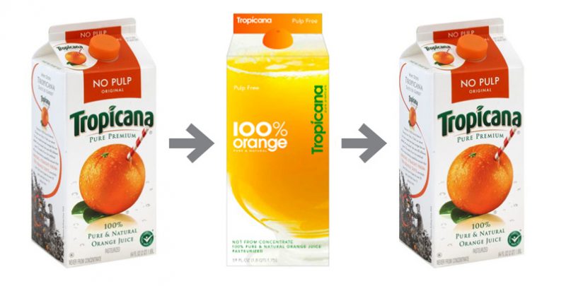
In the case of Tropicana, consumers were so used to the original packaging design that the new packaging made them uncomfortable. For example, it not only replaced the image of an orange on the package with a glass full of orange juice, but also changed the shape of the bottle cap.
And unfortunately for Tropicana, the audience couldn’t relate to the brand and they wanted the old packaging and Logo back. This leads to heavy losses for the company and in the end, they have to return to the original packaging.
Lesson learned : Consumers often form an emotional relationship with brands. This needs to be scrutinized before making any significant changes.
>>> 5 Factors to consider before redesigning packaging ; 5 Tips for Product Design, Impressive Packaging for Brands
Loss of original meaning when translated into many languages
A common mistake many well-known brands make when launching campaigns or products globally is translating into local languages. Here are some examples:
1. Ford launched an advertising campaign in Belgium with the slogan: “Every car has a high quality bodywork”. When translated, this turns out to be: “Every car has a high-quality corpse”.
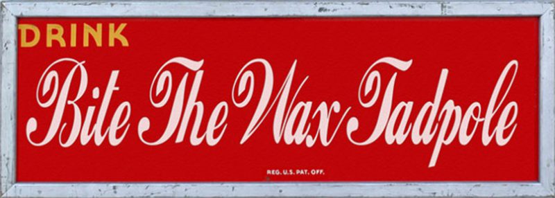
2. Coca-Cola is translated as: “Bite The Wax Tadpole”, when doing marketing campaign in China for the first time. Rival Pepsi also shared their embarrassment when they released the slogan: “Pepsi brings you back to life” but it was translated: “Pepsi brought you back from the grave.”
3. The hugely popular “Got Milk” campaign? of the American Dairy Association has been translated into Spanish as “Are you breastfeeding?”
Lesson learned : When you want to explore new markets, keep in mind that being properly interpreted is key.
Hope the above examples of great brand failures will help in your branding process. Refer to Malu ‘s brand identity design service

