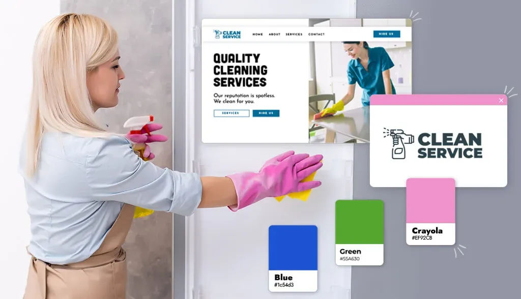
Those are all the details when it comes to the cleaning services industry and the same is true for your cleaning brand logo. A powerful logo says a lot about your business before you even have a chance to show off your crafting skills.
Before jumping right into this, it’s important to keep in mind some best practices when it comes to hygiene logos. The first is scalability: You need to make sure that your logo will look good no matter where it is used (spray bottles, signs, business cards, etc.).
Next, keep it simple. If your logo is too colorful, it will be difficult for your target customers to analyze what your business is. And finally, keep your target audience in mind when designing your logo so that it impresses them.
Whether you’re just starting your own cleaning service or looking to polish your existing brand, check out the designs below for inspiration. After this article, you will be ready to outshine the competition!
Factors to consider depending on your niche
Here are examples of cleaning logos for different cleaning services. We will see how they use colors, icons, fonts and styles depending on their niche.
House cleaning service
When you hire a house cleaning service, you are placing a great deal of trust in complete strangers entering your home.
Attributes that your target audience is looking for in your home cleaning services include reliability, safety, and quality. Your logo should represent those characteristics so that your target audience feels comfortable choosing your cleaning service.
Do you notice what each of these logos has in common? Each of them has a blue palette. Color holds meaning; Blue is often associated with loyalty, respect, and a sense of calm. That’s why blue is a great choice for residential cleaning services.
Darker blues bring confidence and professionalism to large businesses, while lighter blues bring calm and fun. For example, the logos of both Home Clean and Cleany use a light blue color to represent a sense of well-being. Maid Pro and Maid Brigade use deep blue tones to let the target audience know they are a professional company.
Commercial cleaning service
As a commercial cleaning service, you are catering to businesses, not individuals – which means you may want to emphasize your professionalism before anything else.
Did you notice that these logos look a lot more luxurious and polished than the ones for residential cleaning services? That’s largely thanks to the black, silver, and gray color combinations spread between them, all of which exude sophistication and authority.
The fonts used support that message, with the slim, modern sans-serif type looking clean and to the point (Sterling) and the sans-serif providing a sleek look.
However, commerce is not necessarily simple. Notice how Gleem uses electric blue and a round, playful font to grab their attention right away? As a reminder that when you choose your commercial hygiene logo, you should design it based on the group of customers you want to attract – whether it is a luxury fashion building or corporate offices. newly established.
Tree cleaning service

If you believe that a clean planet is as important as a clean home, you would probably hire an environmentally conscious cleaning service. These businesses often cater to those looking for green products that are free of harmful chemicals and wasteful practices.
All 3 logo examples shown above use green in their designs for obvious reasons. Green is the color most found in nature and nowadays green lifestyle has become extremely popular. Go Green and Midtown Green Cleaning both use orange because it evokes feelings of vitality and happiness.
In addition, each logo uses a green leaf symbol. The leaf highlights the nature-centered values of these businesses.
Organize home and wardrobe
If you need a professional wardrobe and home organizer, you’ll be drawn to a symbol that conveys trust (after all, they’ll come into your home and sort out all your personal belongings. yours) and professionalism.
Fonts are a design element that you’ll want to get right. The font you use in your logo tells potential customers a lot about your business. Lisa Jacob’s Imagine it Done logo uses a serif typeface and script font. Sans serif fonts with straight lines are obviously a good choice for extensibility. Script fonts evoke creativity, sophistication and friendliness.
Laundry and dry cleaning services
What do all 3 logos above have in common? Round shapes. The circles involve laundry and dry cleaning services because, well, soap bubbles. When used in logo design, the circle represents stability and a sense of friendliness. These are the things customers will look for when deciding who to trust to do their laundry.
Another thing that you might notice about these logos is the layout. For example, Brown Bag Laundry is structured in such a way that words have the shape of a bag. Bubbles & Suds Laundromat puts their text around the circle in a way that reminds you of how a washing machine spins around.
Carpet cleaning
As a carpet cleaning business, you offer very specific services. That means your target audience is looking for quick and easy, reliable and fast service. Your logo must convey that to your target audience.
First of all, you’ll want your logo to clearly explain what your business is all about. It needs to be specific so people don’t think you’re just a generic cleaning service. That’s why I love the 212 Rug Cleaner’s logo—if the name doesn’t say it, the vacuuming man logo certainly does. Similarly, Flat Rate Carpet’s logo uses an icon to spell out their particular service. As I said earlier, keep it simple.
For you
You want your logo to do a lot of the heavy lifting: Communicate your brand’s message, connect with your audience, and set you apart from your competitors. Hopefully this article has helped spark inspiration so that you can create your own toilet brand logo.
When you are in the design process, keep in mind the best practices I mentioned and you will have a stunning logo. When you’re ready, contact Malu Design to get started.


