Don’t be evil and abuse psychology to manipulate your end users .
Maybe because the user experience is not good.

When looking at this amusing meme, have you wondered why cats behave the way they do and what their owners can do to solve this funny mess? Same case: a simple, clear user interface that everyone can understand how to use; but the experience and usage from users are not appreciated.
Problem: Each bowl looks exactly the same and all three bowls are housed in the same wooden stand with three holes of the same size. So how do the three cats know which bowl to get?
The solutions to this problem are: (i) place two small dividers between the two bowls to create cubic space as this will give the cat a subconscious sense of space. A better solution is to: (ii) guide cats to their designated bowl, which requires practice and training. In the end, the most ideal solution would be: (iii) find out the preferences of the three cats and make sure each is unique, then place each bowl with its favorite food inside.
(i) is interventional design: We erect walls and barriers to isolate a user experience. This is applied in many places such as: ATMs, bathrooms, phone booths, bedrooms, etc
(ii) directional design : This design uses directional markings and highlights to help users navigate and locate . Manifest characters such as train stations, city maps, and stairs guide the user through complex systems to reach their destination.
(iii) proactive design : Instead of suggesting all information to users, we should sift through data through user behavior and use that information to serve them . That’s why we’re starting to see Netflix have a “Because you watched…” feature that recommends the right movies for users.
This is a prime example
From (i) to (iii) , it can be seen that the solution becomes more and more personalized and optimized. We are sentient and social beings, and we cannot separate our emotions from our behaviour. The joy of success, the disappointment of failure, they are the driving force for our growth. Imagine if the company’s product designers didn’t pay attention to user behavior, perception and interaction, would we be like the three cats above?
User Experience and Psychology
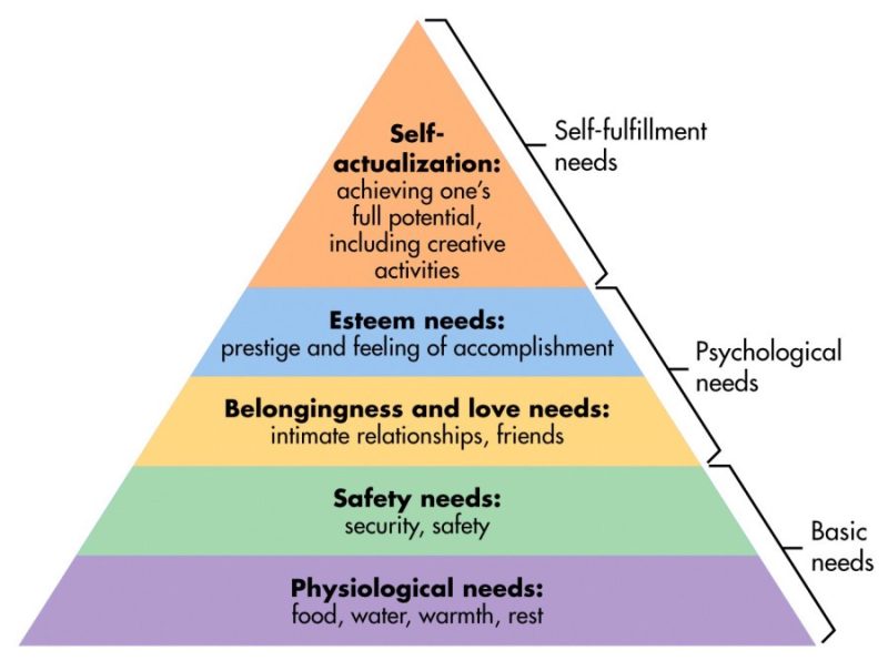
UX design has a strong relationship with psychology – specifically, social, behavioral, and cognitive psychology. As mentioned above, humans are motivated/competitive creatures. When we want something, we don’t want to get it too easily, we like a challenge and also want a worthy reward. Maslow’s hierarchy of needs states that right above the basic needs are psychological needs. This is what makes us crave, makes us want to collaborate, compete, create, and disrupt.
A designer who doesn’t understand human psychology will not succeed as well as an architect who doesn’t understand physics.
– Joe Leech
To understand user actions and psychological reactions, we first need to observe. Many common psychological phenomena have been widely advocated, just understand them and find ways to apply them to UX design thinking.
1. Psychological phenomenon: Conditioned reflexes (Pavlovian Conditioning)
This psychological term refers to the learning process in which biological stimuli are paired with a previously neutral stimulus. Many scientists suggest that the concept of neuroplasticity may be responsible for this form of associative learning.
Therefore, once we get used to performing a certain action or response based on a memorized pattern, we will perform the same action or response if the pattern reappears.
In a well-documented design system, all key CTA buttons should have the same vibrant color. Designers should place a CTA button when requesting a certain action to increase conversion rates, and should always use it to ask users to take actions. Users will eventually get used to the colors and shapes and will assume that whenever they click on a similar button brings up the previous action they wanted. But what will happen to the case below?

Especially product design using Dark Pattern . This brutal design manipulates users’ expectations and tricks them into doing actions they didn’t intend to do. It’s not surprising that our brains can fall into this state unconsciously, but it can happen to us at any time. Be careful with this power if you don’t want to end up with the product.
2. Psychological phenomenon: Placebo Effect
This psychological term says that giving a patient a substance that has no therapeutic value but helps the patient feel that they are receiving clinical benefit and even believe they are getting better. Some studies have found no evidence of a placebo effect, and this treatment is often seen as dishonest and misleading. Despite all the controversy, this psychological phenomenon still appears in everyday life.
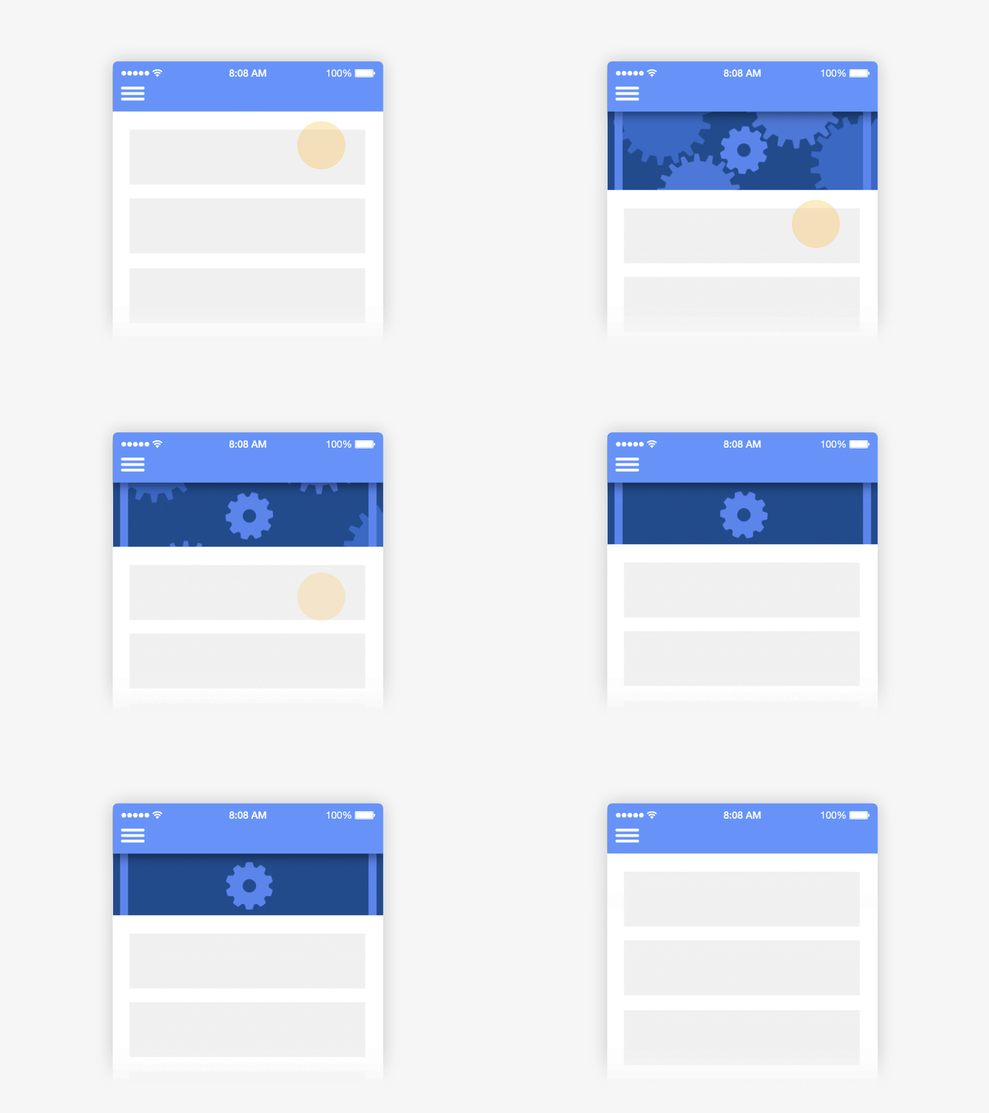
One of the most iconic examples is the animation for the Pull – to -Refresh function . Anyone who has owned a smartphone for more than three days knows how to use this activity, but do they know the placebo effect that applies here? Because users expect the refresh to work, but they have no control over the page reload time. So instead of doing nothing, designers create Pull-to-Refresh animationsto fool the user that loading is actually taking place and that the page will render immediately. The page will, in fact, refresh when there is real new information, regardless of whether the user drags it or not, but the animation distracts the user from the technical limitations of processing large data streams in the system section. . While it may sound like cheating, there’s no harm in it.
3. Psychological phenomenon: Chameleon Effect
This psychological term refers to the phenomenon of mimicking the mannerisms, gestures, behaviors and expressions of those with whom we are most frequently exposed. Have you ever imitated a friend’s words and told them back?
This imitation is a way of showing connection with others, especially close people like family or friends. We do this to show them that we are paying attention, empathizing with them.
In our personal experience with products, every interaction is intimate and immediate. With visual guidance, emotions can change the way the product wants us to feel. That’s why since last year, Emotional Design has become a buzzword in the design community as designers have always wanted to find a connection between users and products through communication. through psychological familiarity.
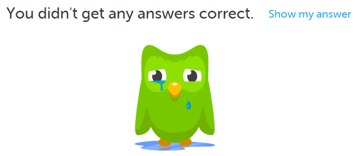
4. Psychological phenomenon: Aesthetics – Usability Effect (Aesthetic – Usability Effect)
This psychological term says that people with less technical background tend to believe that aesthetically appealing designs are more intuitive. However, when aesthetic designs fall short, users tend to blame themselves instead of inefficient functions. Maybe an impressive photo captures your attention, the product can use a variety of colors you love, or maybe those fancy animations take your breath away. However, those positive emotional reactions only reinforce your interaction with the products, they offset the drawbacks in terms of usability and make you more comfortable.
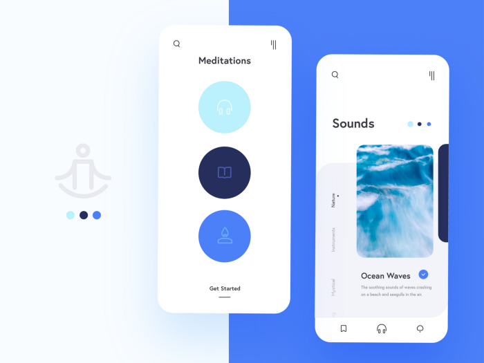
Let’s use this photo as an example. On the left screen, the three icons are too dim to see clearly, the accessibility is poor for people with color blindness and low contrast perception; it’s not easy to see what that symbol means; we shouldn’t trade usability for negative space in this case. On the right screen, the scrollable vertical tab design in mobile is probably one of the worst ideas, it’s not only unworkable, but it detracts from the overall scrolling experience on mobile.
5. Psychological Phenomenon: The Von Restorff Effect
This psychological term is called the isolation effect, which predicts that people are more likely to remember elements that stand out because of their color or shape compared to other elements.
Memory works in groups and classifications, and people organize their memories based on the shape, size, weight, color, smell, or sound of the substance. If this attribute is unique, it allows everyone to make its own category.
Notification design is a very good example of this effect. We look at the home screen of our smartphones every day, hardly any changes take place unless a notification pops up. Whether it’s just a badge or a beep, it draws our attention towards it.

6. Psychological phenomenon: Serial Position Effect
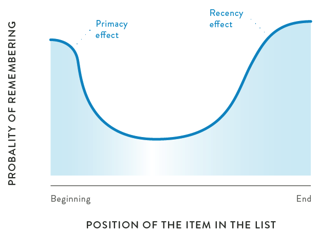
This psychological term demonstrates that people tend to remember the first and last items in a sequence, while the items in the middle are often forgotten.
It is better to put less important items in the middle if you want to design a list. But sometimes it is quite difficult to decide which one outperforms the other, in this case it is possible to do some traffic studies, which are insights into the most visited content /at least and we’ll know exactly what to put in the middle.
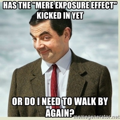
7. Psychological phenomenon: Mere exposure effect
This psychological term suggests that people tend to develop a preference for something that is already familiar to them. This psychosocial thing happens to everyone, and the more often we see someone at intermittent intervals, the more we find that person likable or attractive. And SEO work often adopts this mentality, which is why things like banner ads on the web exist. Because advertising companies believe that simply flashing their ads can leave a memory trail in the user’s brain.
In UX design, it is important to emulate this feeling of familiarity for the user.
Smart designers came up with this strategy where they would place a “Next” button in the top right corner of the Onboarding screen and when the user reaches the actual home screen of the app; there is also a button in the top right corner, it can be the user’s profile icon, settings, notification or any CTA button you want the user to press. This is a nice little touch, but it makes a huge difference in your app’s conversion rate. Users who have experienced this before will feel more natural and fluent.
This article only deals with the psychology of UX design. Through the studies of UX design, only when we observe and understand the end user’s behavior and emotions can we really create a real product. However, we designers also need to be wary of their emotional impact. Without proper research and careful execution, our ideas can lead to the worst manipulation.


