
Whether you agree or not, building and maintaining a dynamic brand is still very important. In the past year, many famous brands in the world have made major changes, restructured the entire brand.
Together with Malu, let’s take a look at 13 brands that have attracted a lot of public attention by the process of rebranding – rebranding. From a chain of fast food restaurants or a business rebuilding itself from the ‘rubble’, each business has a big mission behind the curtain. So what is the story behind each business?
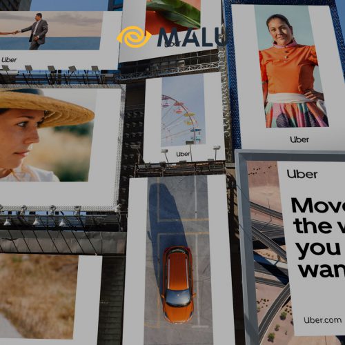
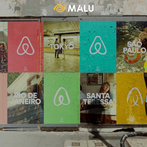
>>> Refer to 2 Case Study rebrands of Uber and Airbnb
Mục lục bài viết
Toggle1. Taco Bell
After a long time using the dog Gidget, with the slogan “Yo Quiero”, Taco Bell gradually encountered many difficulties from new competitors, such as Chipotle. They know that: It’s time to restructure their brand. For the first time in 20 years, Taco Bell is releasing a new logo to the public, as part of its $15 billion plan by 2022. Taco’s goal is to open 2,000 more restaurants globally.
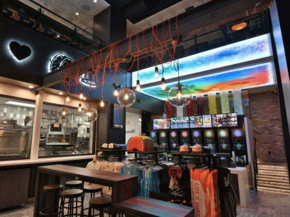
The rebranding phase began with a complete change in the design of the Cantina restaurant in Las Vegas. Customers to the Cantina can enjoy alcoholic beverages, select items on an electronic menu screen, purchase Taco Bell souvenirs, as well as relax in the VIP area that no other restaurant in Vegas can compete with. floating.
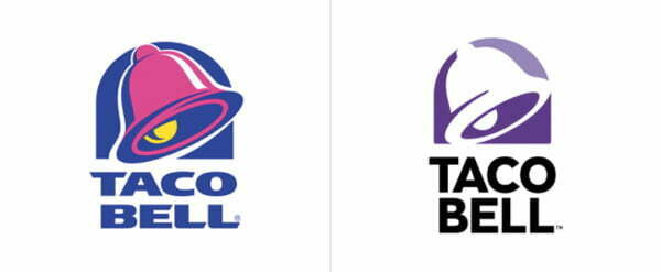
The new logo, designed by the company’s TBD team, in conjunction with the consultant Lippincott, together came up with the latest logo version, in line with the restaurant chain’s criteria: One size doesn’t fit all. Translation:One size does not fit everyone, meaning Taco Bell has the ability to meet the needs of each person, depending on individual preferences).
Since the 1995 logo, Taco has introduced a more modern new version of the logo design , while allowing the company to customize the brand identity for special events. The public response to this rebrand has been overwhelmingly positive, a key factor in making Taco Bell one of the healthiest fast food chains in the United States.
>>> Learn about Brand Structure
2. McDonald’s
In early 2016, McDonald’s announced its latest rebrand strategy. This is not the first time McDonald’s has rebranded, but it is the most significant rebranding of the business. The public sees a brand new McDonald’s, something they’ve never seen before. The giant of the fast food industry kicks off the campaign with brand new packaging , designed by agency Boxer.
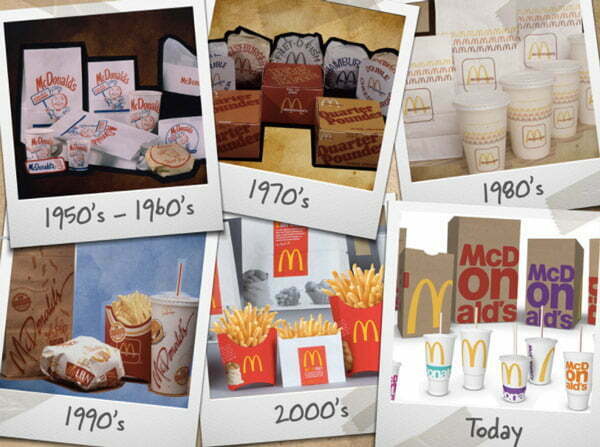
The interesting thing about this design is this: If you put the packages together properly, they will become a literal “mobile billboard”.
Even the design of the stores in the chain was carefully redesigned by McDonald’s. “Simply Modern”, “Living Room”, and “Fresh + Vibrant” (roughly translated as “Simple Modern”, “Living Room” and “Fresh + Vibrant”) are just a few of the themes. of restaurants at McDonald’s.

The question here is: How can the design team convince their superiors to allow them to redesign the restaurant amid declining revenue? Max Carmona, senior director of restaurant design in the US region explains: “The leadership of the company began to realize that the problem was not only the quality of the food, the interior design of each house. The product is also very important.”
Only time will judge the effectiveness of these new moves, but what could be more exciting than witnessing those bold moves?
>>> 10 factors to know for successful Rebrand brand
3. Huffpost
12 years ago, The Huffington Post was born as the only newspaper that only existed under the digital platform. But the departure of founder Arianna Huffington signaled the change needed for an aging news agency.
Simple with the Huffpost brand, immediately striking the reader’s eyes is the bold, airy logo font that retains Huffpost’s trademark blue color, but is presented with a completely new perspective. In addition, the diagonal stripe symbol at the end of the logo is stylized as the letter “H”, giving Huffpost a bold modern logo, instead of conveying the message of the newspaper: “bringing people close to you” stories are shared”.
Huffpost’s rebranding this time is considered to make the newspaper more “tabloid”. However, Sam Becker, shared that: “The history and influence of the Huffington Post helps the newspaper completely shape its real value on readers.”
4. Instagram
When Instagram quietly announced their rebrand campaign in May 2016, there were mixed opinions. Some people like it, some people criticize it, some people think a new application has just been released. But no matter what, it is still a topic of discussion in every village and alley in this “Internet village”. And here is the story behind:

Going back in history 6 years ago, a photo-sharing application called Instagram was born, attracting more than 400 million users and 80 million photos per day. As the numbers say, Instagram is growing like a hurricane. Instagram is not just a photo sharing application anymore, it has evolved into a new social network.
With useful ancillary features such as Layout, Boomerang, and a focus on video platforms, Instagram has made strategic changes: tweaking the interface to increase user experience satisfaction .
The new brand logo immediately catches the trend of flat, monochrome, focusing on users and advertisers. More intuitive, more vivid, closer is what Instagram is trying to transform itself.
5. MasterCard
MasterCard can be considered an old brand, where the brand identity has not changed after two decades. Agency Pentagram has given MasterCard a whole new look: modern website interface, innovative logo design, and much more.
The familiar “red and yellow circle” has been associated with the company since its inception, in 1966. And that legendary circle seems to be wearing a new coat in the digital technology era, which is dominating the business finance world. . As Pentagram partner representative Michael Bierut shared: MasterCard’s rebrand campaign this time has caught up with the trend of flat design.
“We relied entirely on [MasterCard’s] core values to help complete this brand transformation. The simplification of the brand design makes the logo more flexible, more modern.”
6. Guinness
How to rebrand a 200 year old brand? London-based agency Design Bridge didn’t hesitate to do just that in 2016. In the wake of the flat design wave, they made Guinness’ brand identity more detailed and in-depth.
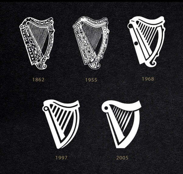
The Guinness logo is a stylized harp. Interestingly, Design Bridge actually contacted the makers of the harp to give the legendary logo a breath of fresh air. As a matter of fact, the design of the peg is a model of a harp, and is completely playable.
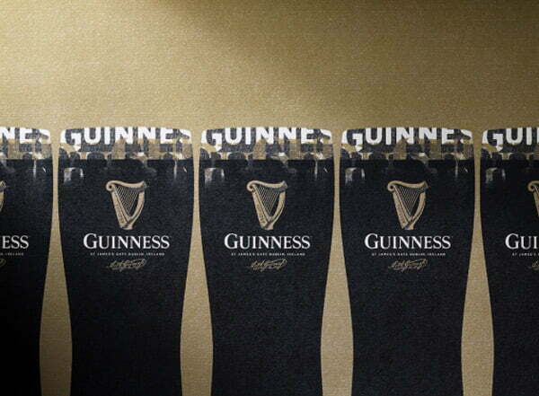
Every customer who buys a bottle of Guinness can understand the history, time and meaning attached to this age-old symbol. Guinness definitely has to be on the list of one of the brands with the most spectacular transformation.
7. Subway
In an unexpected turn of events, veteran Subway spokesman Jared Fogle was arrested. Apparently, Subway’s worst brand crisis is coming. Previously, Subway also suffered the consequences of a wave of customers shifting, from choosing fast food to healthier food, causing the company’s revenue to decrease by 3.4% (in 2015). . With Subway, there is no better time to rebrand than now.
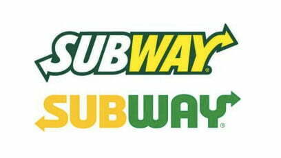
The new logo inherits the spirit and look of the old logo, but removes the “slanted” element in the old identity. This makes the new identity “stronger”, while keeping the essence and spirit of what made this cult brand. The arrow in the old logo is simplified, which is the premise for the birth of a new unit specializing in the digital segment Subway-Digital.

On top of that, Subway announced its rebranding at the time of the 2016 Olympics. This is an extremely wise step, to lead public opinion away from the sensitive issue businesses are facing.
According to Subway President and Senior Executive Suzanne Greco, “Subway is a globally recognized brand, and this rebranding represents our commitment: young, always looking to the future. , without losing the identity that made Subway what it is today.”
Having said that, it takes more work to remove the stain that Fogle has attached to the brand. But apparently, rebranding is a clever strategy for Subway.
8. Pandora
The online music streaming service Pandora has been around since 2000. Under great pressure from Spotify and other big competitors, Pandora has just made a transformation and made a big reorganization in 2016. The rebrand campaign and the launch of a new paid service bring Pandora’s high expectations in the industry.
Try to guess Pandora’s new logo? Flat design again! And… nothing more! Our experts are not very optimistic about this change of Pandora. “Generic”, “single color”, “boring” are their words when looking at Pandora’s new identity.
While the monochrome design gives the brand some new life, something is still missing behind Pandora’s rebranding campaign. Looking at it, we only see Pandora’s desperate struggle against the suffocating attacks from Spotify, Tidal or iTunes Radio.

Although there are mixed opinions surrounding Pandora’s success or failure, we can’t deny that its rebrand campaign has attracted a lot of attention. That’s why Pandora is on our list.
9. Mozilla
In 2017, Mozilla made the first moves in its rebranding campaign. Whether trying their best to avoid criticism, or re-examining the philosophy that has followed them since the dawn of time, that “the Internet is a global resource for humanity, which must be expanded and easily accessible to anyone”, the Mozilla rebranding campaign has attracted much public attention.
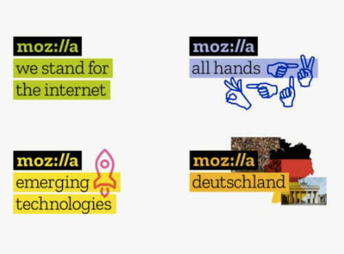
From the very beginning of the reconstruction, Mozilla quickly picked up the latest logo designs from agency Johnson Banks. They “referendum”, leaving nearly 3,000 comments for five months to evaluate the designs, before choosing the best one.
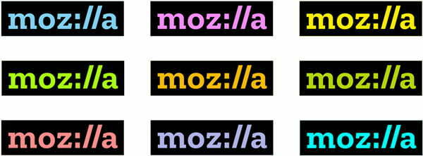
About the new brand identity, Mozilla’s creative director Tim Murray said: In our logo there are characters that are typical for a common Website address, so I’m sure you will know right away that this is a company. some Internet company.
The interaction with users makes it possible for Mozilla to allow them to attach images, or gifs to the business logo, helping to breathe new life into it. The user is like a “co-designer” for this brand identity.
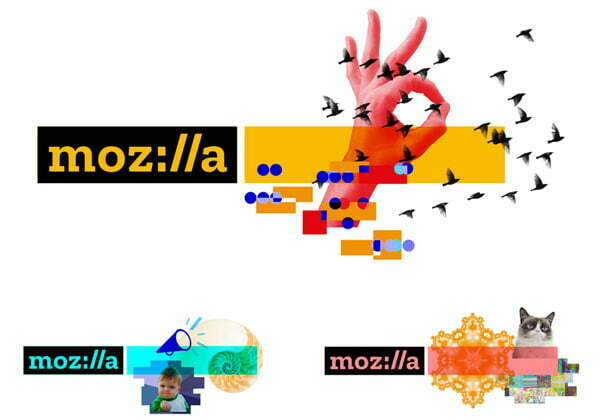
How does this new experiment get feedback? Overall pretty good! Most commentators in the industry say that this new move by Mozilla has brought new life to an aging brand. Surely all of us would love to be consulted, right?
10. Johnnie Walker
If you want to find a globally famous Whiskey brand, you can’t help but mention Johnnie Walker. What started out as a well-known wine producer in the region, Johnnie Walker has become one of the icons in the world wine industry.
In a recent media campaign, Johnnie Walker especially focused on the new core value of the brand: Joy . The campaign is called “Joy Will Take You Further “ .
The campaign features the participation of famous figures in the world, such as actor Jude Law, F1 athlete Jenson Button. The message that this winery wants to convey is: Although hard work can help you reach your destination, it is joy that makes you reach further.
This can be considered as a spectacular transformation in Johnnie Walker’s global brand positioning, from a slightly serious and relatively “old” image to a fresh and youthful image. Johnnie Walker hopes to reach out to a group of potential new customers.
11. Coke
The Coca-Cola brand has existed for more than 100 years, it has experienced many ups and downs and changes. The most recent story related to Coca, is its system of sub-brands: Diet Coke, Coca-Cola Zero and Coca-Cola Life. Each brand has a separate client file, a separate communication campaign.
Realizing that the separation of sub-brands is unnecessary, and has not maximized the value of the strength of the parent brand (Coca-Cola), the company decided to reposition the entire group of brands. branch, to a common identity.
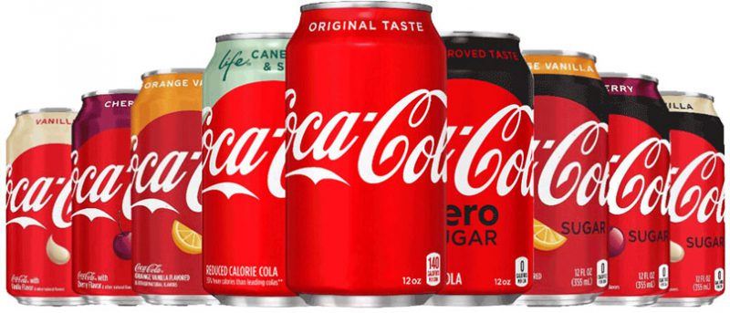
Taking the distinctive red color of Coca as the main theme, now, the distinct characteristics of the sub-brands only play a secondary role in the identity of the packaging. This makes it easier for customers to identify products manufactured by Coca, making the most of the power of the brand’s iconic image: the red color and the traditional white Coca-Cola lettering.
12.Reeboks
In 2014, Reebok launched a new brand identity. In the context of the increasingly competitive sports fashion market, Reebok decided to revamp its image, making it more “thorny”, more authentic.
Reebok’s new logo image represents the delta symbol, representing human change in three aspects: physical, mental, and social. This is the change when people try to push themselves to break all barriers. This message complements Reebok’s new slogan, “Be More Human”.
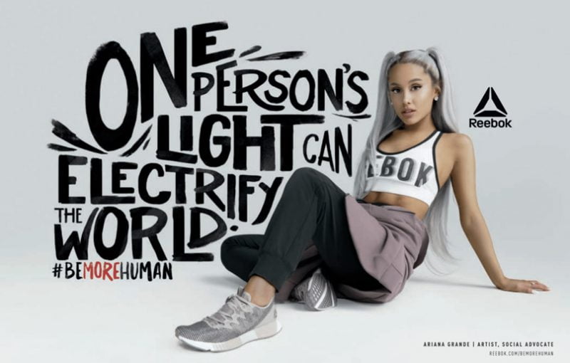
Through this, it can be seen that Reebok is making a big transformation, making its brand not only a supplier of sports fashion products, but furthermore, associated with physical activities that children people we do every day to improve our health and mental well-being.
13. Mercedes-Benz
Mercedes has always been a proven brand for excellent car quality, luxurious design and class in every detail. These are core values that businesses never want to change.
What the brand changes, is the target audience that this trendy car company is targeting. Recently, Mercedes has launched product lines with more youthful and modern designs. The company is also a brand with a strong level of activity on social networks, creating many impressive and unique digital content (such as allowing users to design their own GLA on Instagram, for example).
Why is Rebrand so important?
In today’s fierce competition, brand innovation is paramount. But how to properly restructure the brand is an even more convoluted question.
The lesson we can take here is this: There should be user/customer interaction in the first steps of a rebrand and make sure your tangible brand assets are used appropriately. reasonable and not wasteful.
Refer to Malu’s brand identity design service


![[Case Study] – Nike's Branding Strategy 8 chien luoc xay dung thuong hieu cua nike](https://maludesign.vn/wp-content/uploads/2021/03/chien-luoc-xay-dung-thuong-hieu-cua-nike-500x500.jpg)