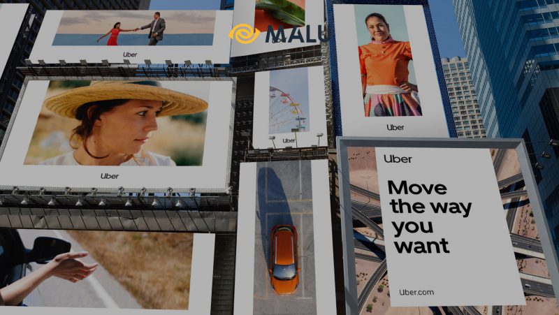
Start-up Uber recently launched a new brand identity designed by Wolff Olins, exactly one year after the company was embroiled in a scandal and two years after the old brand came into existence. This article will learn about Uber’s new brand structure, encapsulated in two words “accessibility” and “safety”.
The Uber brand has made extremely strong decisions when it comes to rebranding, changing the icon shape of a square inside a circle to a simpler wordmark.

>>> Case study: Airbnb rebranding
Founded in 2010, Uber revolutionized the taxi and ride-sharing industry by allowing users to book a ride with just a few simple clicks. What’s more is the ability to track the route as well as the driver’s information for convenience and safety purposes.
Then in 2014, Uber decided to enter the food delivery market, launching the Uber Eats brand, allowing users to order takeout with ease.
In its 8-year history, Uber has rebranded twice. The old identity from 2016 is considered a bit modern but quite vague.

This logo was developed and designed by Uber’s own in-house design team in 2016, with the goal of representing “bit” – short for binary digit, the smallest unit of data on a computer.
During this rebrand, Uber received a lot of skepticism and criticism. Uber has partnered with global design consultancy Wolff Olins – San Francisco to be able to bring a new look to this start-up. Combined with Uber’s in-house design team, this project took up to 10 months to complete.
One of the directors of Wolff Olins, Molly Watson, commented that this new rebrand of Uber is focused on showing the strong growth of the business, rather than completely changing the image of the company.
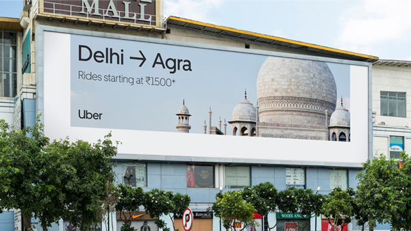
Uber has grown from a technology start-up to a global company. And so it needs a simple brand identity system that works anywhere. This system can be localized by country, with specific content, making it easier for customers in each market in the world to identify and create better relevance.
Black and white are the two main colors of the brand image, but other colors like navy blue, green, purple, orange, yellow and brown can all be noticeable accents.
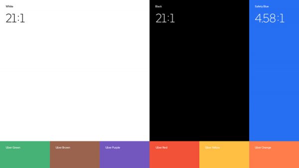
Uber’s team emphasizes that there are three principles behind this new brand: black, investing in wordmarks instead of logos, and the letter U.
There’s no denying that Uber’s new logo offers better recognition. It is this simplicity that makes the entire brand system more scientific and can operate more consistently. Website layouts, images or text are created based on the U-shaped symbol taken from the logo. This U-shaped system brings out the sophistication that lies in the simplest of things, says Watson.
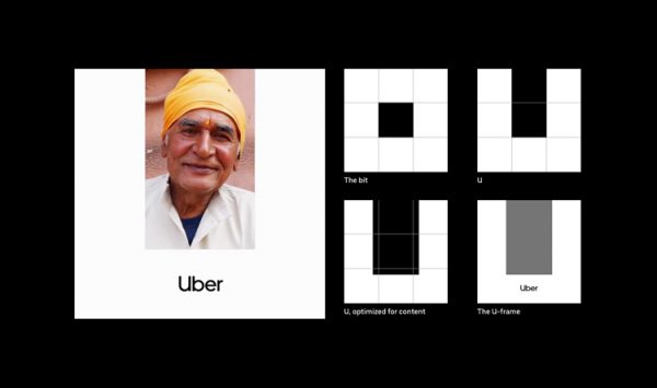
The branding system is very flexible and easy to apply. U can be created anywhere, over time Uber hopes this layout can appear without the logo anymore but people still easily recognize it as “Uber”.
>>> 10 factors to know for successful Rebrand brand
Uber’s typeface is also inspired by the typography used in transportation systems around the world, according to Uber – from the London National Underground to airports, this simple, soft font type are all easy to read.
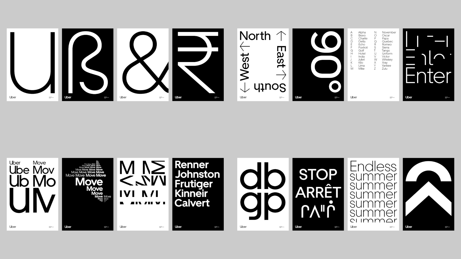
Uber’s icon sets are also newly developed, and like the typeface they are inspired by the icons of the transportation industry.
Motion effects are also added to the brand identity, used in media and digital advertising, in order to optimize the U-shape, standardizing the expression of video or text.

The image standards also aim to represent the “young and old” element around the world, representing Uber’s global market. Finally, a refined tone of voice, easy to understand and straight to the point, is the highlight of this restructuring.
This restructuring takes place 1 year after Dara Khosrowshahi was appointed CEO of Uber, also marking a time of strong transformation of this start-up. Uber rebrand’s goal is to guide customers towards safety and ease of use.
Uber has been changing the way people move around the world – and the company needs to move along to meet this demand. Uber’s leadership team wanted to ensure that the new brand image reflected the elements and represented the values that Uber was providing.
![]()
Rebranding Uber is currently running on all marketing publications from print to digital, advertising publications, website and app systems, social networks, goods, employee uniforms and vehicles, …
>>> Refer to Case Study: Google Ads rebranding ; Case Study: How Apple Brands ; Nike – Branding Strategy
Check out some of Malu’s typical design projects


![[Case Study] – Nike's Branding Strategy 6 chien luoc xay dung thuong hieu cua nike](https://maludesign.vn/wp-content/uploads/2021/03/chien-luoc-xay-dung-thuong-hieu-cua-nike-500x500.jpg)
