 “Sorry, but you don’t understand me.”
1. A logo should reflect what the company does
A logo isn’t a storytelling tool – it’s a form of identity. Countries have flags, royal families have their hats and companies have logos. They all serve a single purpose – to identify and distinguish their owners from everyone else in the crowd. No more no less.
When you try to tell a story about a company purely through logos, you are bound to fail – there simply isn’t enough room or an appropriate way to tell everything that needs to be said. It’s like asking a CD cover to sing you a song, it simply doesn’t work.
A logo is an expression of a company’s identity – the things that are important and meaningful to the company. As such, it is perhaps the only commercial device intended to increase sales, but provides a form of identification and a source of pride for company owners and employees.
2. A logo must include an icon
Not really. Some of the most famous logos have no symbols at all, just well-crafted ones.
However, this does not mean that logos should not carry symbols. Sometimes a logo can become more memorable and popular than a company name, as is the case with Apple, Nike or Pepsi. Other times, a symbol is just a hindrance, an unnecessary decoration that doesn’t really add value or meaning – like the blue square in the GAP logo.
Lesson: use a logo if you need to represent something important to the company. Otherwise, it’s best to look at more typed solutions.
3. If a logo is big enough, you can become an icon
Recognition comes from repetition.
Recognition comes from repetition.
Recognition comes from repetition.
Repetition is a learning tool – so powerful that you should be able to spot a grain of sand in the Sahara, as long as you look at it every day, for years. But to do it for the logo, that means millions and millions of dollars invested in advertising and promotion.
This is why it’s important to understand that the Nike and Apple logos don’t have magical powers – they’re just symbols repeated enough times in mainstream media that simply don’t. may not associate them with these companies.
Unfortunately, not many companies enjoy the benefits of an unlimited advertising budget. This is exactly why they should never use their logo without the company name: no matter how good the logo is, no one will know what it stands for and no one will care. .
4. A logo should follow the established style in the industry
There is a certain sense of dread and boredom associated with most real estate logos. There is a house, and a tree, and sometimes a sunset or a hill. Many imaginative designers will throw in a key to make the story more complete.
Similarly, 9 out of 10 fashion logos are pretentious and stylish – black and white, elegant type, very few symbols or graphics. All seem to be saving color for clothes.
Every industry has unwritten rules and expectations about how a logo should look, and we can all be at fault for following these rules from time to time. But for companies just starting out, there is nothing worse than having a logo that looks nothing short of innovative and like any other business.
Snooze the voice telling you what the logo needs to look like. Be bold, surprise and break the rules. That’s how new rules are created.
5. A logo must be eternal
I’ve heard this so many times that I’ve started to wonder if someone invented a time machine.
You can’t intentionally create a timeless logo – you can just make sure it’s not completely fad-based, so that it lasts longer than usual.
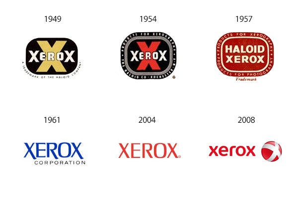
Like everything else, logos also age. Occasionally, they need to undergo plastic surgery to make them look less old-fashioned and more in line with current trends. Companies like Shell, IBM, Xerox, Volkswagen and Coca Cola have changed their logos nearly a dozen times to date, improving their look and feel with each “renovation:.
So don’t worry about having to create a timeless logo. Create something that works now and there will be plenty of time to improve it later.
6. A logo must be liked
“I love it, but my wife just hates this brown.”
Sound familiar?
The purpose of a logo is not to give the eye, but rather to provide a unique signature that will be associated with the qualities of the company. Whether people like or dislike logo designs has nothing to do with what they think of the companies and organizations that those logos represent.
Consider this:
– The London Olympics is arguably one of the ugliest logos in history, but everyone associates it with its flagship sporting event.
– Bacardi rum has a big black bat on each bottle, but everyone knows it’s one of the best candies in the world.
– The Google logo is basically a tribute to Photoshop effects, but everyone thinks it’s the best search engine in the world.
The list goes on and on.
Customers don’t care about logos – they care about what the company can or can’t do for them. So while your logo needs to use some fundamentals of good design, you don’t need the approval of your friends, aunties, or next-door neighbors before you put it out there.
Just do it!
So what should a logo look like?
You may not be satisfied with the answer, but here it is: it depends.
It depends on who the customer is, what their history is and where they are trying to go. Are they a newcomer to the market trying to get attention? Are they an established business looking to showcase some tradition? Or maybe they’ve been out there for decades and just need a quick identification.
Like a signature, a logo belongs entirely to the person behind the signature and very little about the person receiving it. Keep that in mind and you’ll do just fine.


