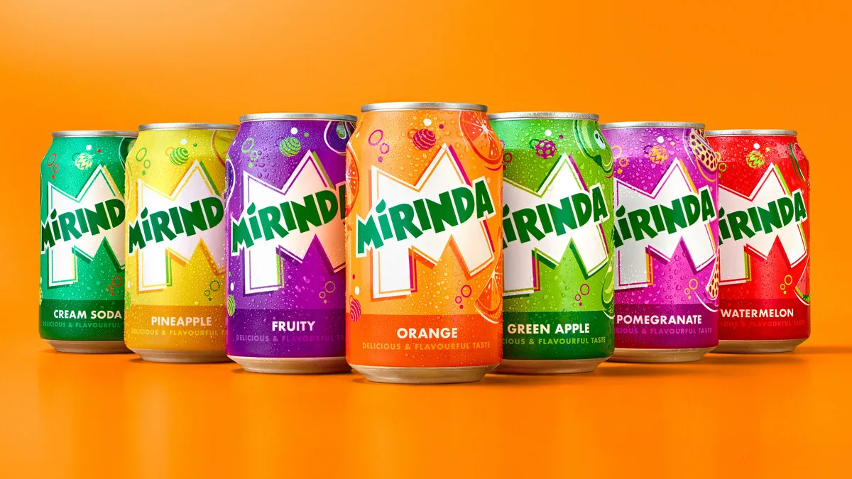
Pepsi is back again with a new, more dynamic design: Mirinda, a beverage created in Spain in 1959, is now distributed globally. Along with the relaunch of the identity, the beverage brand said it will launch a new branding platform based on the tagline “No Flavor LikeYou Flavor”.
Mirinda’s new direction and global brand slogan reinforces the brand as representing the next generation, honoring and welcoming vibrant innovators who courageously demonstrate creativity and authenticity their reality both in real life and online
Coinciding with the launch of #NoFlavourLikeYourFlavour, Mirinda received an impressive new visual identity called “Making an M-pact”, developed by PepsiCo Design and Innovation to stimulate creativity. The Mirinda logo has been refreshed with a brighter green color, with sharper corners and sharper lines for added distinction. The iconic Mirinda ‘M’ serves as the creative canvas that breathes life into the brand. The new visual identity features playful color palettes for a refreshing feel, while illustrations like spinning globes, bubbling bubbles, and fun fruit convey a sense of playfulness and fulness. transparent energy.
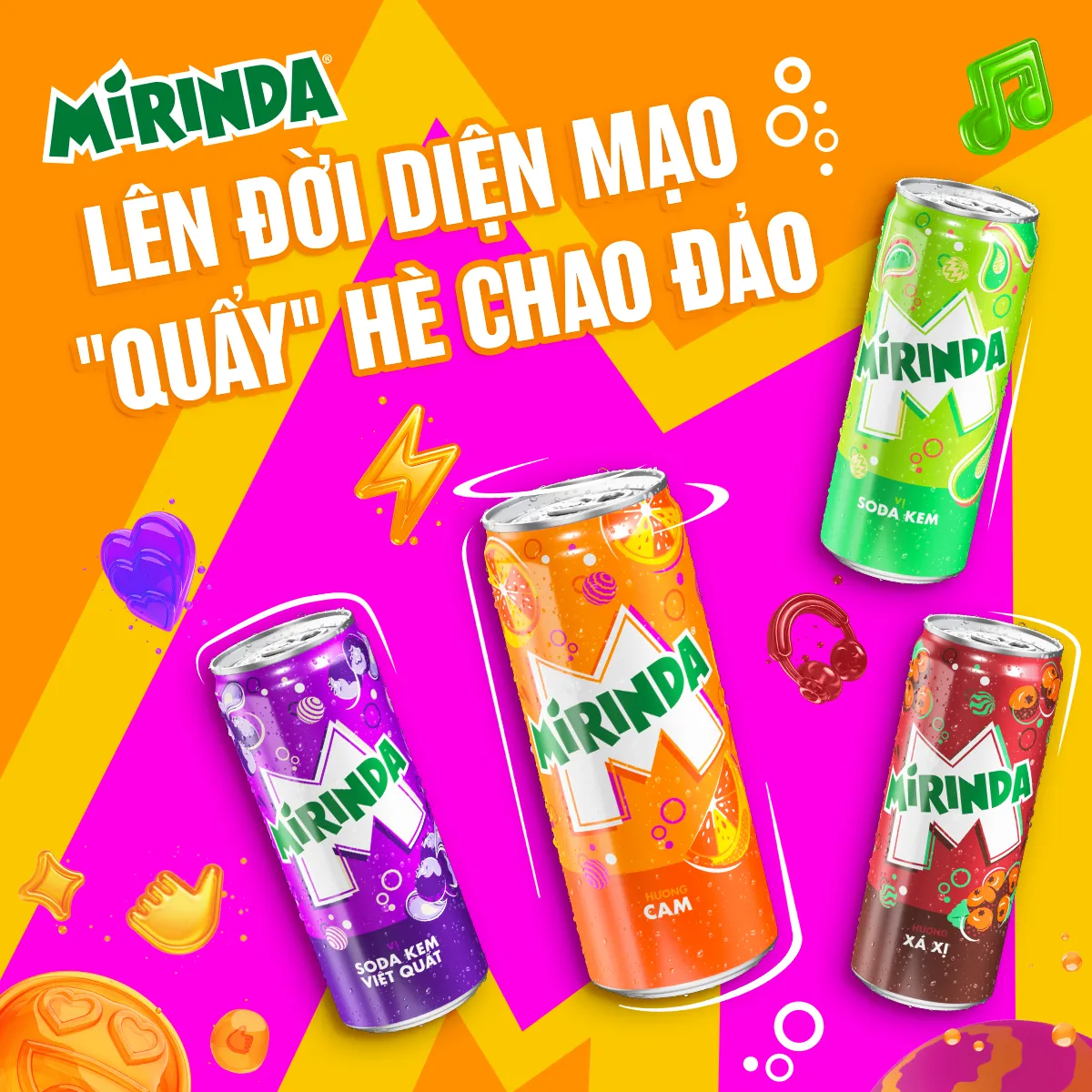
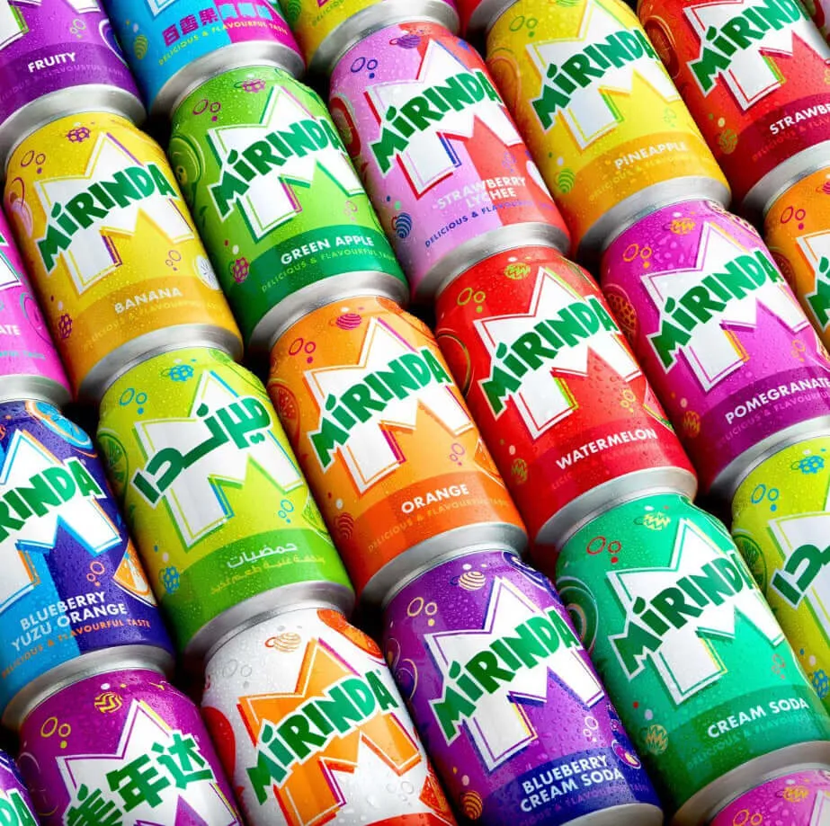
Each of the brand ‘s more than 50 irresistible fruit flavors , including fan-favorite Green Apple, Orange, Pineapple, Strawberry and Watermelon, will have a corresponding palette, each has its own vivid, contrasting color scheme. Mirinda’s innovative flavored products are tailored to the unique tastes of communities around the world, including Green Cream Soda and Tamarind Orange in Vietnam, and Acai Berry in Poland. The new visual identity will be available on all Mirinda cans, merchandise, advertising, retail outlets, digital media and anywhere else Mirinda has a presence in its 200 markets. .
Eric Melis, PepsiCo’s Vice President of Global Brand Marketing commented: “We are excited to launch Mirinda’s new global brand platform that inspires innovation. exciting, encouraging Gen Z to explore their unique creativity. Through #NoFlavourLikeYourFlavour, we’ve developed a fresh visual identity and platform that Mirinda fans can recognize – one that empowers this generation to fight conservative entrenched instead. In that is the freedom to express yourself. This is a turning point marking the first step for the brand on the path to continue to grow and develop to be relevant to today’s youth. We look forward to implementing exciting plans in our development roadmap.”
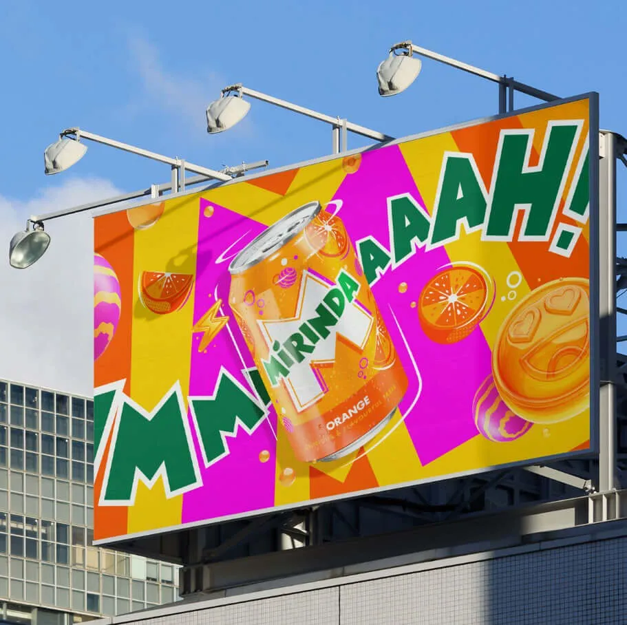
Mauro Porcini, Senior Vice President and Chief Design Officer, PepsiCo, said: “Mirinda’s 50+ flavors awaken all the senses, and we wanted the brand’s visual identity to look and feel good. same. PepsiCo Design and Innovation brought Mirinda to life with vibrant, contrasting colors and unique illustrations that felt dynamic and playful. We know Mirinda fans interact with the brand digitally as much as they do in real life, so we created a visual identity that keeps the excitement and differentiation going across all platforms. foundation.”
Mirinda’s new visual identity will be rolled out in the top 20 international markets from May 2023, with multiple local languages printed on the cans. Starting with Vietnam and Thailand, the new image recognition will then appear in Poland, Romania, Czechia, Ukraine, Hungary, Croatia, Gaza/Palestine, Mexico, Argentina, Egypt, Iraq, Uganda , Ethiopia, China, Pakistan, Kuwait, Qatar, Oman, Bahrain and United Arab Emirates and many more coming soon.
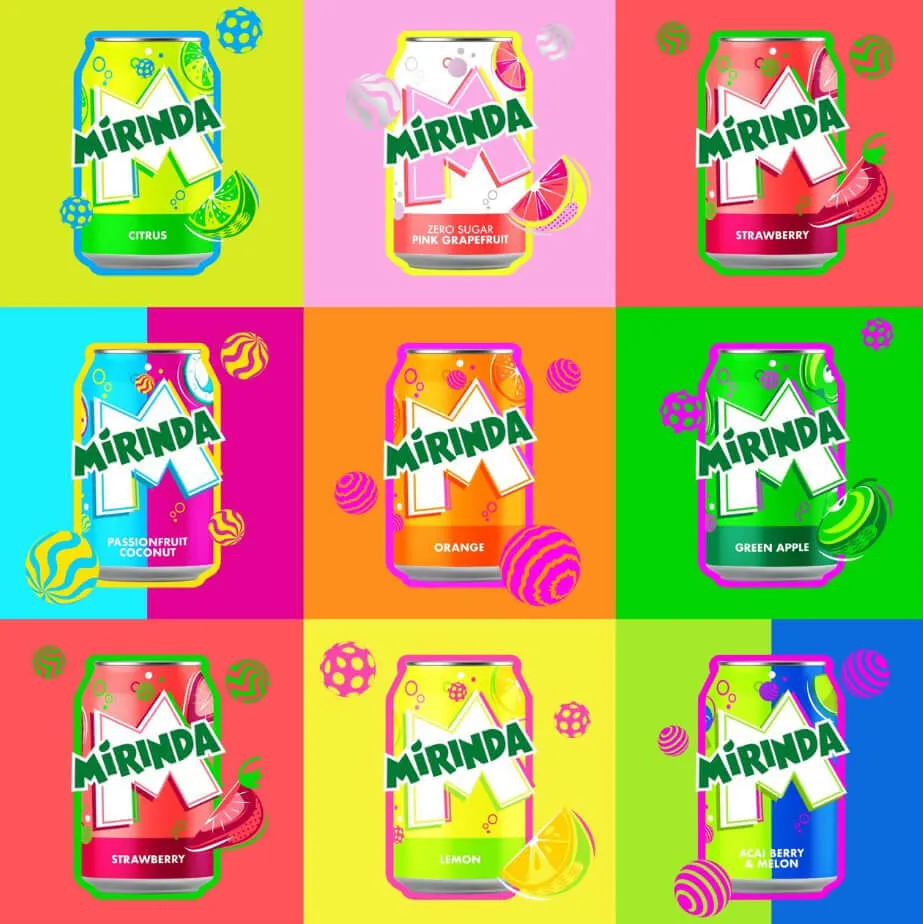
Along with the new brand platform and visual identity system, Mirinda is committed to bringing better choices to consumers by providing low-sugar alternatives. As part of this commitment and to support PepsiCo’s pep+ initiative to accelerate the reduction of added sugars in its broader product portfolio, the brand has successfully launched Sugar Free Orange flavors in both Poland and Nigeria, and will continue to expand its portfolio of low-sugar and no-sugar products internationally.


