![What is Infographic? How to design beautiful and attractive Infographic [Template] 1 infographic la gi](https://maludesign.vn/wp-content/uploads/2022/12/infographic-la-gi-800x373.webp)
If you are just starting to enter the world of design, the term infographic is still quite unfamiliar to you. You may be asking yourself questions like what is an infographic or the steps to create a beautiful infographic design? Let’s follow the article below of Malu Design to get the most detailed answer!
What is an infographic?
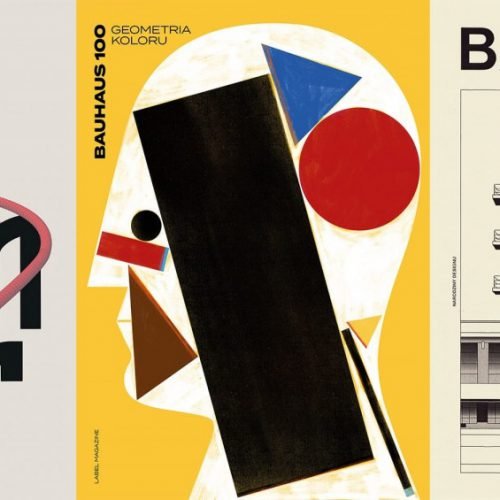
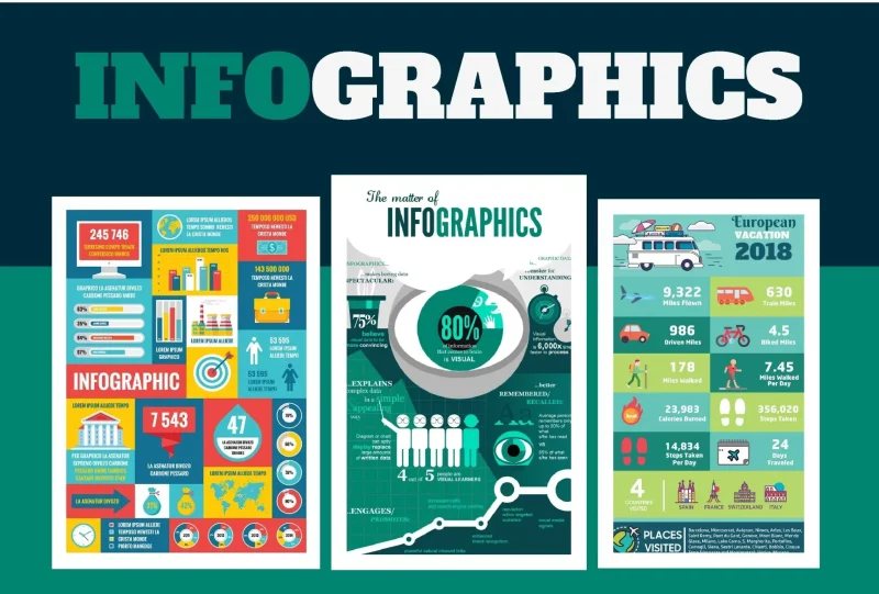
Infographic is a compound word of Information and Graphic, meaning infographic. This is a concise combination of information with illustrations with vivid and eye-catching colors. From there, information can be communicated more quickly and clearly to the reader.
With such designs, complex information is transformed into concise, concise symbols, maps, and icons. By this method, researchers, scientists or statisticians can convey concepts and ideas in the most complete and effective way.
Infographics have become more and more explosive in the graphic design world since about 10 years ago. They have gradually become one of the key factors for better communication in the classroom, in the workplace, especially on website.
The role of Infographics in Marketing
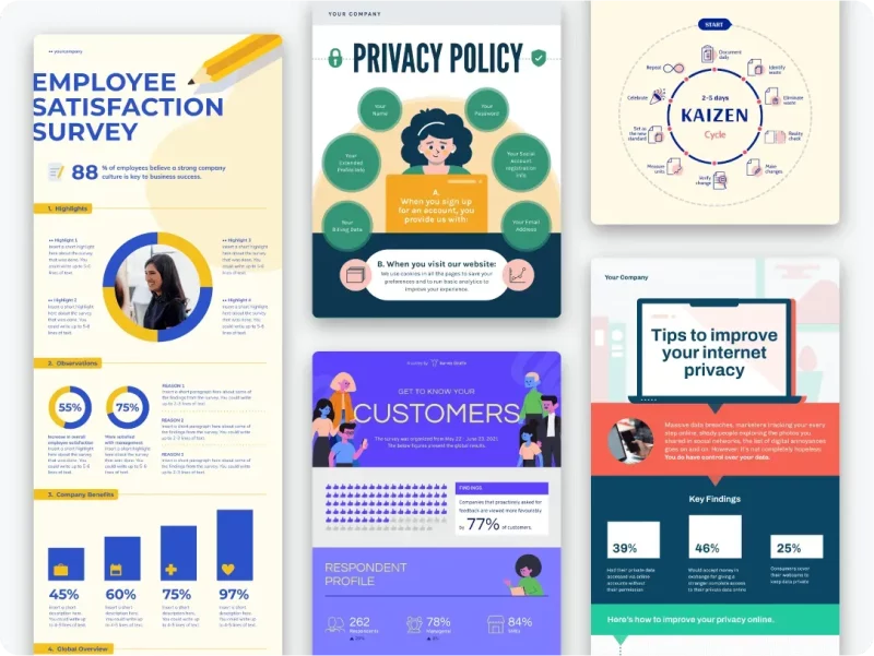
Currently, Infographic is being evaluated as a trend of Content Marketing. Because, users are becoming more and more interested, preferring concise content, containing many new elements, such as short messages that create attractiveness with interesting images and videos. extremely lively.
Users can completely observe an image from the Infographic containing all the information instead of having to read a lengthy product advertisement. Compared to spending a lot of time learning the process of using products/goods from videos, it is much more convenient to view the content on an Infographic design.
Infographic benefits
Infographic is more than just a work of art. Thanks to the simplification in the way information is presented, users when looking at Infographic will not feel bored but extremely convincing. The information will now be arranged in an extremely scientific way, so it is highly coherent, with less misunderstandings with users.
Why use Infographics?
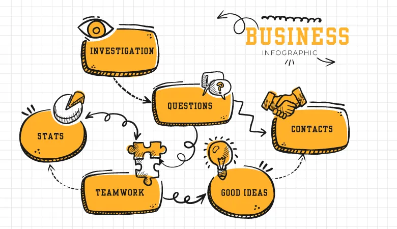
There’s a reason infographics are so popular because they’re fun, engaging, and extremely shareable. Additionally, Infographics offer numerous benefits to content creators of all types, including businesses, educators, and nonprofits.
- Marketers can use Infographics to increase website traffic, increase brand awareness and awareness, and increase engagement.
- Educators and trainers can use infographics to explain difficult concepts or break down complex information to make it easier to understand.
- Non-profit organizations can use infographics to spread awareness about a social cause or problem.
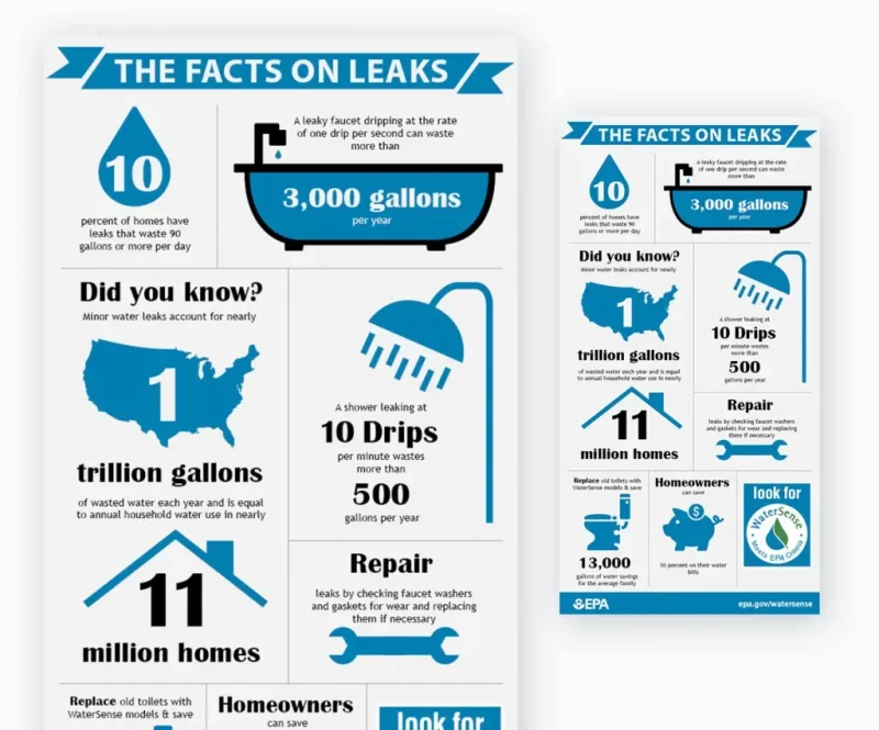
This is an example of how the Environmental Protection Agency (EPA) has used infographics to raise awareness about oil spills.
Important elements that make up Infographic
Want to own an impressive Infographic design, you need to understand the important factors to create it, specifically as follows:
- Skipping: Infographic’s job is to make complex information easier to understand with graphics. Therefore, creating a simple Infographic is the task that the designer needs to perform. With text information, you can skim it but only grasp a small part of the content, but with Infographic, just skim. Through you can capture more than 90% of the message you want to convey.
- Using metaphor: Sometimes the content on the Infographic design makes the viewer quite confused in understanding all the published data. But knowing how to use metaphors will make it easier for viewers to grasp.
- Creating Slides: Infographic using data can use 3D illustrations will be the best way to explain, add necessary information to the reader.< /li>
- Beautiful data: Depending on each specific case, Infographic will process information and data to help users read faster. But that’s why it’s not easy to do. Present all the data as a piece of art so that it is easy for people to follow and just look at the graphs to get the gist.
- Using Bar Graph: Almost every infographic concept is a Bar Graph, but from a creative perspective, it’s very generic and doesn’t make an impression. Before you start designing, think about creating a unique Bar Chart.
- Use copy: Copy is very important in design. This tool is extremely useful and suitable for infographics to display a lot of data in different situations.
- Tell a visual story: When creating an Infographic, you have to do it to convey the content in the most understandable and intuitive way. Instead of using files that are thousands of pages long, with software like After Effects, Illustrator…designers can create a clear infographic.
- Caution when using comparative images: Not only represent data information, but infographics are also very important when comparing data with each other. Because of this reason, designers often use Graphs, charts or something to convey content.
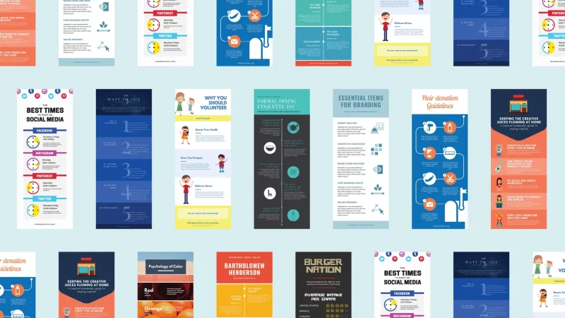
Steps to design an impressive Infographic
Step 1: Define Infographic Theme
The first step in the process of designing an impressive Infographic, you need to clearly define what content and topic you want to convey to the reader. From there, it becomes easier to visualize elements such as design style, color, and content.
Step 2: Brainstorm ideas for implementation
Stepping up ideas will make it easier for you to select the right data, images and words for the Infographic. You can also sketch out the layout of the presentation. In case you want to build an Infographic in the form Landing Page or video, Malu Design recommends that you have a detailed script in advance so that you won’t be surprised when doing it!
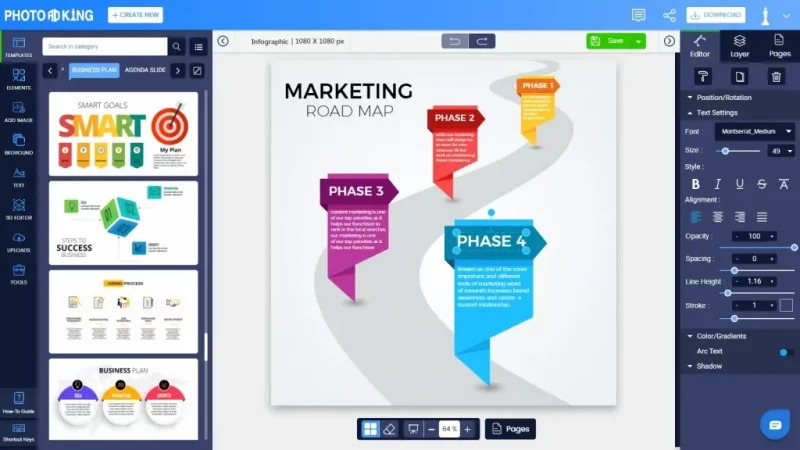
Step 3: Collect and filter information
After you have determined the topic to work on, proceed to search for relevant information from sources such as books, newspapers, internet, etc. Based on the ideas and arrangements that you have built in advance, make your choice. The materials needed to create an infographic design stand out from the crowd.
Step 4: Tell a powerful story
Finding content for infographics is extremely important when starting a design work. To do well, you need to visualize an interesting story and retell it powerfully on your design. Similar to the article, this story will need to include all 3 parts: Introduction, body and conclusion. In particular, an attractive opening will keep the reader and finally close everything neatly at the conclusion!
Step 5: Design Infographic
Once you have prepared everything you need to be able to create an attractive infographic, your job is to proceed with the design. One of the most important factors is color. Especially when you use numbers on a chart, consider carefully which one to use is most appropriate.
In case you want to design in the form of video clips, you need to pay attention to the sound, layout, images, resolution and accompanying effects. No matter how elaborate your design is, if the output quality is low, it will still make users feel uncomfortable.
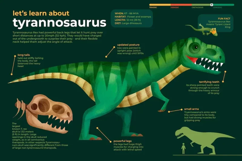
To understand what the Dinosaurs Infographic topic is, let’s refer to the example below:
Step 6: Present data visually
Most people focus mainly on the graphic part. However, do not be too subjective about the information because its role is equally important. Get information first and then start designing to increase relevance. If the data is wrong, your reputation will also suffer. Therefore, make sure that the data presented must be really accurate, stimulating the user’s understanding.
Step 7: Consult people
If you do not have too much time, resources or ideas to create a quality infographic, you can completely ask for the help of experts, or your friends. However, make sure that they are people who have a basic understanding of graphics!
Step 8: Promote and share
Once you’ve completed the infographic, it’s time to bring your content marketing plan to market. Instead of relying too much on search engines to attract users, make the most of the prevailing trends to save more time and effort.
Accordingly, in addition to some social networking channels such as Twitter, Facebook, etc., Pinterest is your perfect choice. Sharing the Infographic on this platform with an interesting caption and the right hashtag will help you get a huge amount of website traffic!
Tips to make your Infographic stand out
Now that you know how to create your own infographic, here are some tips to help you take your visuals to the next level.
Unique and creative
There are millions of infographics and images floating around on the Internet. If you want to get noticed, create something unique and different.
Do some research before creating an infographic. Find out what topics appeal to your audience and what questions they may not have answered. Look to see if there are any interesting images or infographics on the topic.
If there is a topic that has been discussed before but you still want to create an infographic on that topic, make sure you create the topic with a fresh perspective.
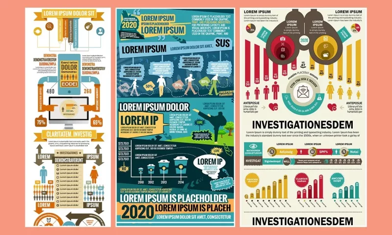
Know your audience
The most important thing you need to do before creating an infographic is to determine if it really fits the audience you want to target.
Find out what themes they like and what designs appeal to them. You’ll also need to know the type of tone that’s right for your audience, as you’ll be using it to create compelling copy for your infographic.
You also need to know which social channels your audience uses the most so you can create optimized infographics to work best on those specific platforms.
Use attractive colors and fonts
Marketers around the world rely on it to create effective designs that actually deliver results.
If your infographic doesn’t use colors and fonts that are appropriate for your audience or bring your content to life, chances are that the infographic template might not stand out.
Illustration text with icons and graphics
If an Infographic template has too much text, it can make readers and viewers feel boring and uninteresting.
To make your infographic template appealing, make sure to use as many images and as little text as possible. One approach is to replace or supplement captions, labels, descriptions, and other text in infographics with icons, illustrations, or images.
Build visual hierarchy
Visual hierarchy is all about arranging design information in order of importance or order so that the reader’s eyes move naturally from one section to the next.
Building visual hierarchy makes your infographic design look cleaner, more attractive, and more professional instead of cluttered with information.
Infographic template for professions
– Statistical Infographic: mainly focuses on numbers, charts and indicators. It often uses big numbers as a way to grab the viewer’s attention as well as charts in a number of different formats and colors.
Statistical infographics are most commonly used to display survey results, market research results, and corroborate arguments with raw data. The main idea is to tell a story through statistical data presented in an infographic, with a coherent opening and ending.
![What is Infographic? How to design beautiful and attractive Infographic [Template] 2 canva hồng phấn xanh lá nhạt vàn](https://maludesign.vn/wp-content/uploads/2022/12/canva-hồng-phấn-xanh-lá-nhạt-vàn-320x800.webp)
Infographics: usually have more text than other types of infographics, they work best as stand-alone, summaries that provide a superior interpretation of a topic.
![What is Infographic? How to design beautiful and attractive Infographic [Template] 3 640w TRMuVTHsOpk](https://maludesign.vn/wp-content/uploads/2022/12/640w-TRMuVTHsOpk-320x800.webp)
– Timeline Infographic: is the best type of infographic for visualizing the history of something, highlighting important dates, or providing an overview of events (e.g. a line). project duration).
An image like a timeline infographic can help create a clearer picture of the timeframe. Visual aids such as lines, icons, photos, and labels all help to highlight and interpret points in a timely manner.
![What is Infographic? How to design beautiful and attractive Infographic [Template] 4 xam và xanh lá vẽ tat dồ h](https://maludesign.vn/wp-content/uploads/2022/12/xam-và-xanh-lá-vẽ-tat-dồ-h-320x800.webp)
Process Infographic: is the best infographic to provide a summary or overview of the steps in a process.
The process infographic will allow you to simplify and clarify each step. Most process infographics follow a simple top-to-bottom or left-to-right process. Numbering the steps will make your process easy to follow.
![What is Infographic? How to design beautiful and attractive Infographic [Template] 5 xanh dương nhạt mềm và tròn dược minh họa dồ họa thông tin về dòng thời gian bAlTGfo p Y](https://maludesign.vn/wp-content/uploads/2022/12/xanh-dương-nhạt-mềm-và-tròn-dược-minh-họa-dồ-họa-thông-tin-về-dòng-thời-gian-bAlTGfo_p-Y-320x800.webp)
– Geographical infographic: Geographic infographics use charts and maps as focal images. Different types of map charts work better for different types of data.
Geographic infographic templates can also be used to compare data by region. You can do this by placing multiple maps side by side.
![What is Infographic? How to design beautiful and attractive Infographic [Template] 6 xanh dương xanh lá và nâu](https://maludesign.vn/wp-content/uploads/2022/12/xanh-dương-xanh-lá-và-nâu-320x800.webp)
– Comparison infographic: A lot of people have trouble choosing between many options, comparison infographic is the best solution to do it. Typically, the comparison infographic is broken down in the middle vertically or horizontally, with one option on each side.
![What is Infographic? How to design beautiful and attractive Infographic [Template] 7 vàng cam và den vẽ tay](https://maludesign.vn/wp-content/uploads/2022/12/vàng-cam-và-den-vẽ-tay-320x800.webp)
– Hierarchical Infographic: helps you sort information from largest to least.
A famous example of this is Maslow’s Hierarchy of Needs pyramid. Humanity’s most important needs lie at the bottom of the pyramid, rising to the least important human needs at the bottom at the top.
![What is Infographic? How to design beautiful and attractive Infographic [Template] 8 xanh lá dường kẻ biến dổi](https://maludesign.vn/wp-content/uploads/2022/12/xanh-lá-dường-kẻ-biến-dổi-320x800.webp)
List Infographic: If you want to share a list of tips, resources, or a list of examples, the list infographic is the way to go.
Infographic lists are often simple, the purpose is to make them more eye-catching than a basic list. Images such as icons can replace bullet points, and creative fonts and colors can make each item stand out.
![What is Infographic? How to design beautiful and attractive Infographic [Template] 9 màu tím hoa cà xanh dương](https://maludesign.vn/wp-content/uploads/2022/12/màu-tím-hoa-cà-xanh-dương-600x800.webp)
– Summary Infographic: A good example of a summary infographic is your CV. A CV will not be able to completely replace a traditional resume in most cases. But they are a great summary visual document when it comes to an interview, to publish on your portfolio site, or to attach to a job application email.
![What is Infographic? How to design beautiful and attractive Infographic [Template] 10 xanh lá dậm xanh lá nhạt](https://maludesign.vn/wp-content/uploads/2022/12/xanh-lá-dậm-xanh-lá-nhạt-600x800.webp)
Conclusion
Thus, Infographic is one of the ways to help convey Content Marketing to users quickly and concisely, thereby helping them to grasp all information even in a short time. Hopefully, through the above article of Malu Design, you have gained knowledge with Infographic as well as the steps of attractive Infographic design. Please share this article if you find it useful to everyone!


