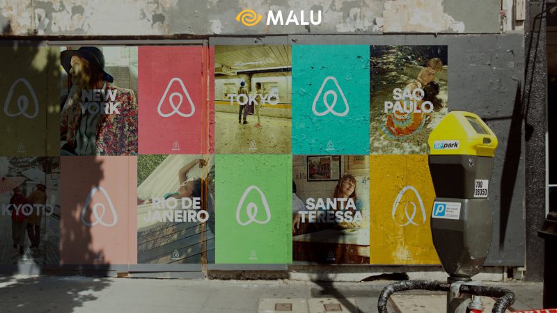
The purpose of Airbnb in rebranding is to create an image of a “warm” and “friendly” business in the eyes of people, making customers feel that Airbnb can “belong” anywhere, any destination on the planet. this world. From a redesigned logo for rebranding, to a fresh new look, all the major shifts that have contributed to the Airbnb brand we know today.
Founded in August 2008 in San Francisco, California, Airbnb is known as a platform and ecosystem for users to discover, book and rent accommodation locations in more than 34,000 cities and 190 countries around the world. It is also an opportunity for room owners to reach out to their potential customers.
Branding Strategy – The Basics of Brand by Philip Kotler ; Nike – Branding Strategy
#first. Brand Feature: Airbnb, “Belong Anywhere”
It wasn’t until the community of Airbnb users got really big and evolved that it deviated from the original Airbnb branding strategies, that the management really asked the questions: “What is our vision? What is that? What is the definition of Airbnb?”
“The answer is right there on the table. During a long time of development, people when mentioning Airbnb just thought of a simple room rental unit. But the truth is that Airbnb is a “home”. A home is just a place, but “home” is where you belong” – explains Airbnb CEO Brian Chesky – “and what makes this Airbnb community so special is that you can belong anywhere. where”
#2. Challenge: Locating the element “Belonging – belongs”
“The idea of ’Belonging’ is very true for Airbnb, but the way we’ve presented it to Airbnb so far hasn’t fully captured what it means,” Brian Chesky said.
After achieving incredible growth, Founder Airbnb realized that the important thing to do now is to push the brand image of Airbnb to the next level.

Collaborate with the extremely famous design agency – DesignStudio to rebrand the whole thing with the idea of “belonging”. A new strategy, positioning with and a new brand identity ready to create new values for customers.
>>> Refer to Case Study: Google Ads rebranding
#3. Airbnb rebranding strategy:
Old and new logo images

The “Bélo”
The big change in Airbnb’s rebranding is a new icon called “Bélo”. Bélo is designed in the shape of an upside-down heart, many people think it resembles a paper clip, and at the same time is a stylized letter A. This logo design is designed to represent four things. : People, places, love, and the letter A of Airbnb.
“The element of belonging is always the source of humanity. So to show this, we designed a community icon,” CEO Brian Chesky wrote in a blog post. “A unique symbol, representing the values we want to share with everyone. It could belong wherever the head it should be.”
DesignStudio explains that this idea was inspired by German designer – Kurt Wiederman that the logo is something “you can draw in the sand with just your toes”.
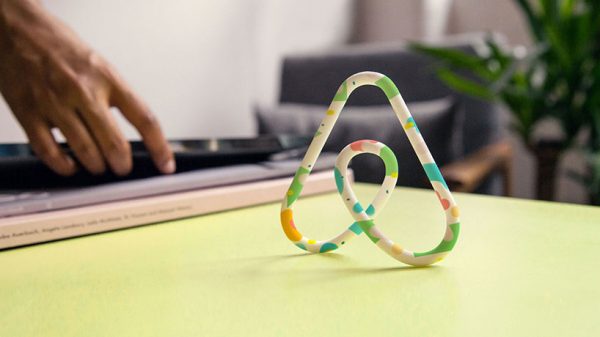
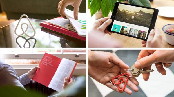
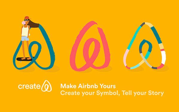
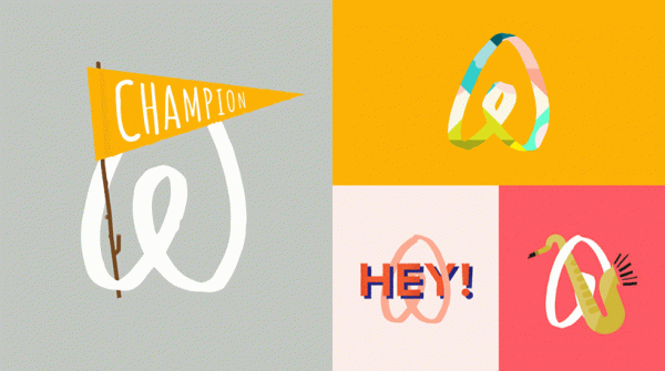
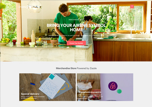
Interact with customers : Create your own “Bélo”
What is impressive about this logo and symbol is that Airbnb has developed different applications for tenants such as thank you cards, mugs, t-shirts, etc.
“Creating recognition for the Airbnb brand is about stimulating sharing. Identity does not only belong to the business, it also belongs to everyone. It’s a move no other brand has taken yet,” explained the co-founder of Airbnb.
New colors
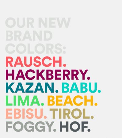
Airbnb removed the dreamy blue color with the white border of the logo, which represents passion, emotion and love, and replaced it with an eye-catching bright red. This bright red represents the brand’s values, supported by secondary color palettes plus bold shades of purple and teal.
New font
Airbnb selected a custom font based on the “circular” font, which is used for the logo and all print and digital media.
>>> 10 factors to know for successful Rebrand brand
New photo guide
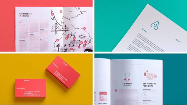
DesignStudio also featured a short film, working with Airbnb’s creative director to create a complete guidebook and photo gallery.
New website, IOS app, Android app.
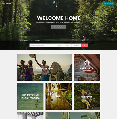
Because the logo alone is not enough to bring a complete identity, DesignStudio also redesigned the entire website and app system to increase brand recognition.
Airbnb’s online interface brings in more emotional elements with large arrays of images, colors, and minimal, clear information.
The “discovery” category comes to life with a list of photos representing locations and rentals, designed to showcase the most potential tourist attractions.
> Case Study: How Apple builds a brand
#4. Controversies
Airbnb describes the new logo as representing people, places, love, and Airbnb itself. But some “experts” were quick to point out some controversial points about this “belo” symbol being similar to a part that is not convenient to name more, and also a copy of ideas from brands. other.
This controversy appeared on Tumblr within 24 hours of the new brand being introduced. Jokes were shared all over social media, and also left a negative impact on the brand.
Some users even named some of the logos similar to Airbnb and thought that this brand copied the idea.
More images of Airbnb’s brand identity:
What’s your opinion? Let Malu know. Explore Malu .’s iconic brand design projects



![[Case Study] – Nike's Branding Strategy 7 chien luoc xay dung thuong hieu cua nike](https://maludesign.vn/wp-content/uploads/2021/03/chien-luoc-xay-dung-thuong-hieu-cua-nike-500x500.jpg)
