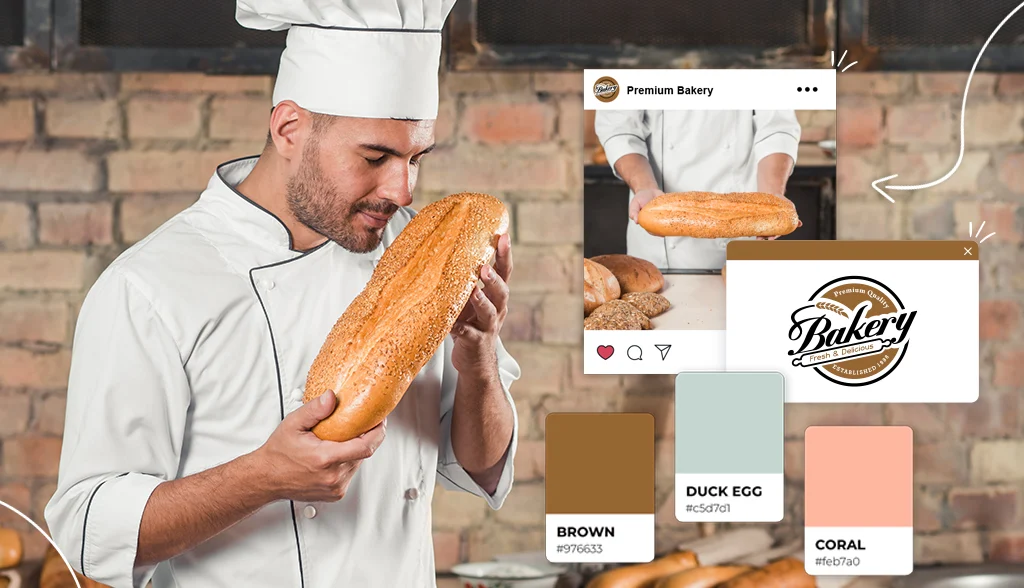
You want the best bread in town (who doesn’t?), but we all know what draws you to a bakery – it’s a logo. You’ll notice the breadcrumbs in the window, but usually, the first thing we see is the logo.
But is the logo important? Everyone knows what a bakery has to offer, right? But who says your bakery has to be like all the others? That’s where a logo comes into play.
A strong logo not only sets your bakery apart from the rest, but it also has the power to help us check what’s inside. Your logo tells people what you have to offer inside. And that’s why having a unique logo is so important for your bakery business.
Whether you’ve just opened your own bakery or want to elevate the look of your bakery, check out the logo designs below to help get inspiration for your own bakery logo.
Bakery and pastry shop logo
To help you create a bakery logo, here are examples of the font choices, icons, and character features of bakery, pastry, and pastry logos.
Cake cafe logo
Need a little inspiration for your bakery logo? Here are some examples to achieve word creativity.
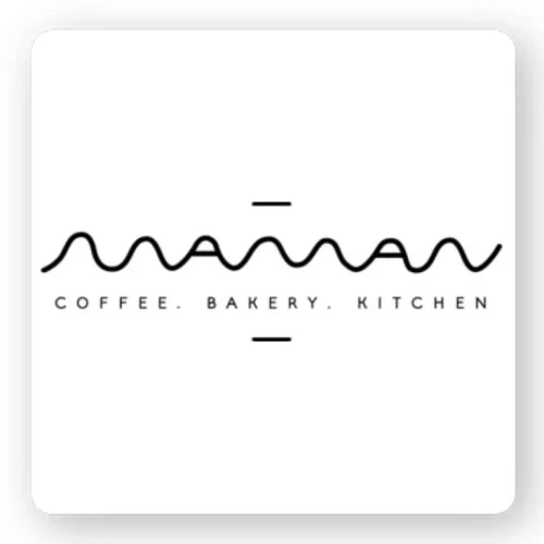
Maman started out as an independent Soho cafe but has grown into a lifestyle brand with locally sourced cafes throughout Montreal, Toronto and New York City. Offering a wide range of scones, coffees and brunches, they organize for those looking for a rustic atmosphere at home. Celebrities run to their cafes and now they host events for high-end designers and brands. Their flexible logo reflects their relaxed yet modern business.
Masseria Caffe & Bakery is a small New York City cafe that prides itself on delicious pastries, sandwiches, and beverages. While their food speaks for itself, their cafe is simple, authentic, and traditional. So they chose a logo that represents those business values. Their logo font is bold and eye-catching, letting you know that they are a traditional and trustworthy cafe/bakery.
Corner Bakery is an American coffee shop chain that specializes in sandwiches, sandwiches, cakes and lunches. What started out as a small coffee shop has since expanded to more than 129 locations across the United States. Fresh ingredients and open fire have inspired them to prepare high quality dishes for their customers. Their logo clearly shows their business values. Their logo is fresh, clean and reliable. It invites you into their cafe and just by looking at the logo, you know they’re going to give you a meal that’s worth it.
Butler is a New York City favorite with 4 locations across the city. They serve meals and baked goods, along with freshly brewed Inteltentsia espresso. The logo gives you the feeling that they offer more handmade treats and cakes. And it’s true. Butler offers more of a pastry breakfast experience, and the logo represents that. Cursive font signifies elegance and sophistication, which you can use in your bakery logo if that’s the message you want to convey.
You can also use cursive fonts in your logo to showcase the traditional and glamorous elements of your business. Fortunato Brothers Bakery has done just that. Three Italian brothers decide to open an authentic Italian pastry shop. Forty-five years later, Fortunato Brothers is a landmark in New York as they strive to provide the same quality, style and service from the start. The cursive font of their logo symbolizes reliability and tradition.
Cake shop logo
Logos of bakeries all represent the sweet side of life. Let’s look at some examples for inspiration.
From baking cupcakes in the kitchen, Lisa slowly grew her business and raised $25,000 on Indiegogo to open her pastry shop, Sister Pie. The phrase ‘sister cake’ is an informal term between Lisa and her older sister. This phrase has become a concept of women of all generations gathering together to make cakes. It’s a warm and loving story of how Sister Pie came to be, reflected in the logo. Cursive fonts bring elegance and femininity, while heart fonts bring warmth to the logo. You feel the love in this logo.
“You make memories, we make them sweet,” is what Piece of Cake Bakery is all about. Their logo uses a symbol to symbolize what their business offers and their business name is simple. In other words, you know exactly what they do just by looking at the logo. Although some businesses will use abstract icons, literal symbols will convey the message very clearly and effectively.
While many businesses opt for a modern and contemporary logo, you don’t have to. It really depends on your business theme. Make My Cake offers cakes made according to the Southern baking traditions of Mississippi and Alabama. The logo is of the family’s matriarch Josephine Smith and stands for tradition, quality and authenticity.
Film producer turned baker, founder Lisa J. Olin decided to follow her passion for cakes and pastries by starting her own business, Cake Monkey Bakery. Now, Cake Monkey is a wholesale store and wholesale store with more than 80 stores offering Cake Monkey products. The Cakes Monkey logo uses a vintage font to represent a traditional element and gives it a nostalgic feel.
Vintage logos can represent a classic and timeless element in your business. Ms. Cupcake is the UK’s first gluten-free bakery. Their logo resembles the one used in Bewitched, a ’60s American sitcom. So they incorporate a vintage font to show they’re using traditional cupcakes, just with a twist. gluten-free. So from this logo people would expect to see their favorite flavors, just gluten free.
Pastry shop
A pastry shop logo can take many forms. Let’s see some examples for your inspiration.
Milk Jar Cookies gives the idea of milk and cookies. Their homemade cookies and locally sourced milk are both beloved and their logo shows it. You can combine traditional fonts with bright colors to match the message behind your logo. In this case, they used a soft blue background color to add lightness and interest to their logo.
Ovenly is an award-winning wholesale and retail bakery in New York City. With their logo design, they express sophistication, simplicity and modernity. They focus on finding the right balance between savory and sweet in their baked goods. Their logo includes a simple font and uses a cleverly placed rolling pin icon to signify what they do as a business.
Pattycake Bakery makes classics with variations and handmade vegan and organic sweets from scratch. Their logo has a warm and inviting feel, with a smiling cupcake in the center and a cozy cursive font. Bright colors combined with fonts and icons combine beautifully to create a welcoming and family-friendly logo.
Moose is a French-Asian fusion bakery in Michigan. The head chef is originally from Taiwan and wanted to connect with his roots by opening Moose Bakery. The logo is clear and uses icons and fonts to represent what the business has to offer. A bold logo immediately attracts attention and denotes stability and safety.
Built from the ground up, Fantasy cupcakes create delicious and artistic cupcakes for everyone to enjoy. And their logo shows that very well. They use the powerful logo of a cool colored cupcake to represent what their business has to offer. In addition to their business name, they also include the phrase “baked fresh daily” at the top for more information. This isn’t necessarily necessary, but in this case, it helps them stand out from the competition.
Cravory was founded by two entrepreneurs who wanted to bring something new to the dessert world. Building on the traditional biscuits, they have created new flavor combinations that will leave their customers in awe. Their logo font is traditional, but their colors and layout give it a modern feel. Their business story is reflected in their logo.
Most of the Logos we have shown you use powerful icons or fonts. However, the bakery LBP chose to use an abstract logo with a monogram font . Monogram fonts show professionalism and elegance. Abstract logos add uniqueness to their business and can be more appealing to customers.
Many pastry shops want a vintage feel to their business. So they stick with traditional fonts and icons. The Buttercup Bake Shop is a great example of this. They chose a traditional and complex font and used a cupcake icon to represent their business. They used soft and subtle colors, giving their logo a vintage feel.
F+F (fat and flour) is a small bakery in Los Angeles, California. Owner Nicole Rucker is an award-winning cake champ and cookbook author. When she started her business, she wanted a cool and light business name – we love it! She abbreviated her business name in the logo and created her logo with a retro 70s vibe. The bright colors and overall design catch your eye and make you curious about what the business has to offer. .
Traditional Bakery Logo
If you have a traditional bakery, you want a logo that matches. Take a look at some inspiration for your logo.
In the middle of Paris, France is Farine&O. A traditional French bakery; they want to make sure that their logo represents those traditional values. They experimented with different fonts in their logo, with one font standing out from the rest. This helps to keep an eye on the name of the business before reading the rest. It’s a masculine and traditional logo that says everything you need to know about the business.
To be precise, Resch’s bakery has been around for a while, since 1920. And their logo shows it. The name of the bakery suggests it’s family run, but aside from that, the font they use suggests tradition. They added magenta to add a modern touch, which also makes the logo stand out.
Claudine Kitchen & Bakeshop is a brunch café that makes all the food and baked goods from scratch. They focus on giving a modern twist to the usual dishes. And their logo tells you everything you need to know. They use three different fonts, with the business name being the boldest. They also include their mission statement, “Simple Ingredients. Expertly crafted.” So you know what you will get and the quality of their products.
Little French Bakery is just that, a small French bakery in Redondo Beach, California. And their logo says it all. They use a combination of fonts that give the logo a French feel and of course, an iconic symbol of Paris, the Eiffel Tower. You can choose to use a symbol in your logo without making it take over your logo and this is a perfect example of that.
Flor bakery focuses on creating simple yet flavorful sandwiches and desserts. They chose to use a very simple logo with just their business name. Although it is a simple logo, it is very powerful. The font is clear and clean, with bold colors. While you don’t know what the business has to offer right away, the logo will make you curious to find out.
Pi Bakerie uses Mediterranean baking traditions from Greece and Italy, incorporating them into their own signature baked goods. The logo plays on their business name, “Pi” being the circumference of a circle.
Bread shop logo
Have a bakery and want a logo that stands out? Here are some examples of bakery logos done right.
Orwashers was founded in 1916 in New York City by a family of Hungarian immigrants. Since then, it has continued to flourish and serve the local community. This bakery has a strong logo with a smart logo. While the logo font is bold, it denotes tradition and reliability. However, they turned the letter “O” into a loaf of bread to represent their business. They did a great job keeping the logo simple but purposeful.
Bourke Street Bakery started in a small corner in Sydney, Australia. Since then, they have opened more locations around the world. So what makes their logo so special? Well, compared to the other logos on this list, it’s different. And we like different. They used a golden cursive font and a rustic loaf of bread. There is something trendy and trendy about the logo that is, at the same time, believable.
The Breads Bakery is a New York bakery known for its handcrafted breads and pastries. And their logo doesn’t play around. It’s a logo that has a presence and won’t go wrong. They use strong background colors, a clear business name that explains exactly what they offer, and a subtle powder logo. You don’t necessarily need an abstract logo; Sometimes, it’s best to stick with a simple and literal design.
Pitchou! is an upscale French bakery in Los Angeles offering artisan breads, pastries, cakes and cooked dishes. Their logo is clear, simple and easily conveys the message. The bright orange color is different from most bakery logos and helps it stand out. The French boy holding a baguette tells you exactly what they offer, and the font is bold.
La Bicyclette bakery was opened by the founder of Flo, who is a passionate French bakery. And his logo represents his story. The logo of a French man holding a baguette beside him says it all. Cursive fonts add sophistication and elegance to your business. Additionally, the logo includes the bakery’s location in Brooklyn, New York.
Craft bakery logo
Do you have a craft bakery? Well, let’s take a look at these handmade bakery icons for inspiration.
White Wolf, a Japanese pastry shop, focuses on breaking down barriers and bringing people together through food. We love it! Their logo comes with many meanings. In Japan, the white wolf is the guardian and guardian, the main symbol. For this pastry shop, this can have a special meaning. So you can create a logo that makes a lot of sense for your business.
Republique, located in Los Angeles, offers a culinary environment in a historic setting. They have a bakery, cafe and dining area with a French inspired menu. But we don’t have to tell you that. Based on the font of the logo, you can tell it’s a French bakery. See what fonts can do? This logo is bold and simple; However, it does share a story. When creating your logo, choose a font that fits your business.
Maison Landemaine is an artisan bakery that uses organic and environmentally conscious ingredients for its baked goods. Now, they decided to choose an abstract logo for their business. The logo is bright, flexible and smooth, creating an atmosphere of sophistication, elegance and respect. Their logo creates curiosity about what they have to offer.
Specializing in sourdough bread, Tivoli Bakery prides itself on using natural ingredients and traditional cooking methods for its bread. And while their logo is simple, it reflects the style of the bakery. The logo’s slim font signifies softness, femininity, and care. In contrast, the narrowness of the letters represents modernity. Using the right font can convey the message you want to say.
The French Workshop is a craft bakery in New York City. As you can see, most artisan bakeries mainly use fonts as their logos and minimize the use of icons; However, that’s just a trend – it’s not a rule. The French workshop uses one icon and different fonts to tell its story. Also, because their business name can be misinterpreted, they included the phrase “craft bakery” in their logo. You can include more details if you feel your logo is not clear.
For you
With all these bakery logos, we hope you get inspired to create your own bakery logo. To create a logo for your bakery, write down the logos that caught your attention and why you like them. Then use our logo maker to design your own logo. You have all the inspiration you need, now it’s time to bring your logo to life!

