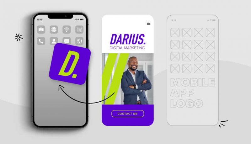
If you have taken the time to create a mobile app for your business, then you need an attractive logo to go with it. Application icons are used to distinguish between different applications, making them easy to recognize and distinguish.
Have you noticed that when browsing your phone to open an app, clean, simple icons are usually the ones you go to first? That’s because the creators have thought hard about their app logo design , because they know that a strong logo ultimately determines whether users click on their app or someone else’s.
Logos aren’t the end of the app design process; It is important that the application works stably and in accordance with the needs of the user.
However, the app logo is still important . They often reflect the level of expertise that is part of the design; an amateur logo is likely to reflect an amateur app build. And, they tell the customer who the app is for and (hopefully) why the customer should use it.
Let’s see how designing an app logo shows viewers how valuable your app really is!
Steps to design a mobile app logo
Here are some tips to help you get started with your app logo design:
Understand foundational principles
First and foremost, your app logo MUST match the required guidelines. Nothing looks more amateurish than cropping (or copying) a logo design because the final size requirements don’t really match the size of the final design.
For Google Play:
- Final size: 512px x 512px
- Format: 32-bit PNG
- Color space: sRGB
- Max file size: 1024KB
For Apple Store:
- Size: 1024px x 1024px
- Format: PNG
- Color space: Display P3 (wide-gamut color), sRGB (color), or Gray Gamma 2.2 (grayscale)
- Resolution and file size: Varies by device
It is important to design in a flat style , with no transparency. You should design a full square; The application platform will handle rounding corners and/or adding shadows when possible.
Design for the target audience
You don’t design your app logo just for anyone! You want it to particularly appeal to people who are likely to use and appreciate the app. Make sure you design with that audience in mind.
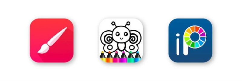
For example, check out these painting apps. They’re trying to convey the age and skill level of the user, so you instantly know if the app is right for you based on the visuals (before even reading the name):
Or, check out these fitness apps that are trying to communicate more of a male/female target audience, based on a general audience for different types of exercise:
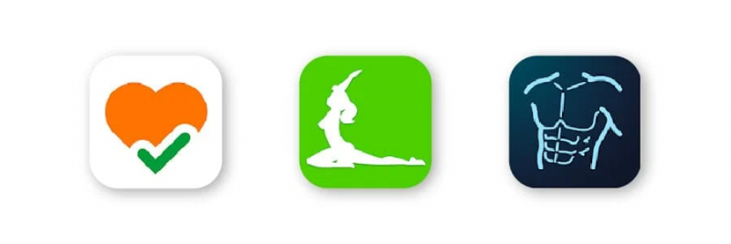
The goal here is certainly not to monopolize and push other users away; it is simply trying to be the most appealing option for your target audience.
Know the competition
You do NOT want a logo that is extremely similar to a competitor’s logo. This can confuse the brand making it difficult for users to know which app it is. It can make your logo look generic, like a copy.
You can get some inspiration from other logos, but you need your app icon to be unique, your own, to be successful.
Keep it simple
Too much detail is lost with a logo kept too small. You need your icon for “fast reading”. This means that the information should be immediately obvious from the first moment someone looks at your app logo; You only have a split second to make them really consider your app while they’re searching!
Having a minimalist logo or a clean, simple design will help you do this, because they are so easy for our brains to process and remember. (Not to mention that minimalism is all the rage in logo design right now! Just look at the Twitter, Apple, and Nike logos for reference.)
Words in app logos should be avoided as they are too small to be readable on multiple screens. If you feel text is required, keep it short or use initials. And, don’t use real photos, as these rarely look right in the app icon format and will make your design look amateurish.
Make the most of color
Color is an important part of design when you use it properly. Different colors convey different meanings and they help attract the eye.
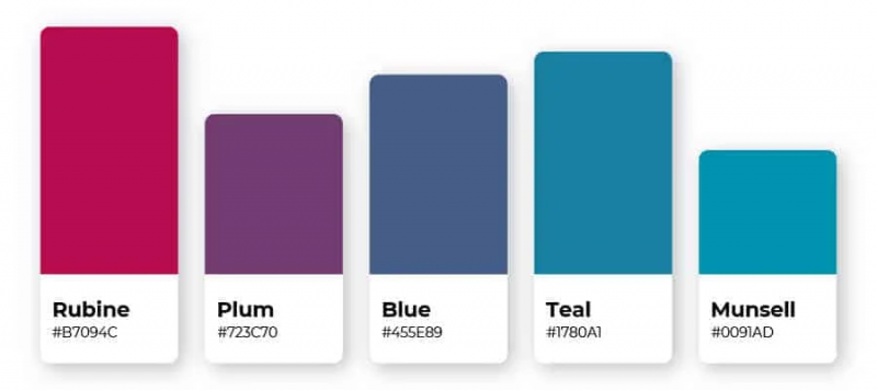
Usually, you don’t want to use a lot of color in your design, unless the rainbow design conveys a meaning or message that you consider important for the customer to understand. Most icons only use 1 or 2 good contrasting colors to convey information quickly.
Consider how colors look on different backgrounds, as users can set up any kind of wallpaper on their phone. This is another reason why a simple design with a flat, single-color logo background is helpful, to make sure your logo stands out regardless of your choice of background.
Send a message
The goal with your logo is to send an immediate message to the customer. Choose an icon that tells the app’s story and sells the unique features the app has to offer its users. Make it recognizable and easy to spot.
Example of the coolest app logo
You can use popular and successful logos to get inspiration for your own designs. Here are some of our favorite app logos.
1. Evernote
It is said that an elephant never forgets and Evernote promises to help you with your own memory.
The little dog ear page in the corner of the elephant helps customers distinguish that it’s not a nature or elephant app but a writing and listing app. The name also helps you clearly identify the purpose of the app while the icon is easier to remember, so you can easily find it after you install it on your phone.

2. 1Password
When you need to save your password for easy access, this app is ready to go. 1Password will remember all your passwords—that’s why it looks like a locked vault. Blue and gray colors reinforce an immediate sense of security to assure the user of its capabilities.

3. Hopper
Ready to jump on a flight? Hopper helps users to book flights and hotels at the best prices. The application is intuitively simple and represents names as well as movements.

4. Clash Royale
There’s a lot more going on in the Clash Royal logo, but it shows off the war side of the game using gameplay visuals.
Games that use graphics in their logos are very popular. While there are a number of different colors and gradients used here, the background is kept simple and contrasting, creating a sense of competition. Lightning adds an instant sense of division and excitement.

5. Headspace: Meditation & Sleep
This incredibly simple logo has a calming and engaging nature. The circle symbolizes harmony and unity — the connection between mind and body. The orange logo represents happy energy and the color is said to stimulate brain activity.

6. MeasureKit
This is the perfect example of using text without making small details. A one-letter logo can help users recall your brand name faster, as it gives that “starting” sound.
And, the simple gauge marks along the edge of M illustrate the idea of the measurement. With this app you can use your device camera to measure any straight line.

7. Spotify
A classic icon, Spotify is best known as a listening device. The black and green combination creates a strong, energetic vibe (towards the energy drink crowd). The sound waves make it clear that this is an application used to listen to a variety of media.

8. Amazon
Made to look like Amazon’s iconic shipping boxes, the Amazon app is easily recognizable and the unusual cardboard brown color helps it stand out.
It used to have more text with the shopping cart, but Amazon is flexing its recognizability with two colors and an arrow-shaped smirk. Initially, the ice box mark on the head resembled a certain infamous mustache, so Amazon quickly changed to another ice shape just two months later.

For you
Now that you’ve seen some effective app logos and know what the best practices are, it’s time to design your own!
Remember, in the app store, your icon helps your app stand out from the rest. The more professional and eye-catching the logo is, the more likely users are to try out the app to see if it fits their needs.
You can create your own app logo using our design service . Try it today!
If you are looking for a reputable and experienced unit to be able to design a professional and impressive logo and brand identity system , then please contact us immediately by phone. 0988 622 991, or leave your information and requirements, Malu Design ‘s consulting department will contact you right away to answer all your questions!
————————
Malu Design – Branding Identity Agency
Hotline: 0988 622 991

