Applying the UX Design Process in website/app design is an effective method to ensure that you create a product with a great experience that brings success to your business.
So what is the standard UX design process like?
And…
How does the UX process help create a good experience?
Let’s explore the 7 steps of the UX Design Process with Malu in this article to understand why it is important and trusted by businesses.
1. What is UX Design?
In a word, UX design is user experience design – In that stage will decide the overall product, website / app will have the shape, flow of movement, information presentation, similarity, etc. … to bring about positive, goal-oriented experiences.
UX design is not limited to creating drawings.
UX design also cares about the following issues:
- Is the user flow smooth, seamless, and intuitive, or confusing and difficult to use?
- Does the color and position of the button motivate users to click or make them suspicious?
- Should more details be added to the checkout process?
- Does improving a page’s content increase conversions? Improve how?
- How can website layout drive engagement and conversions?
- …
To do that, the user experience designer mainly researches to understand the characteristics of the target market and gain insight into the user.
From there, combine with business goals to design the most suitable products.
2. UX design for a better experience
User experience design (UX Design) shapes a website as a whole – it guides users and influences how they feel.
All visuals, content, structure, and navigation are logically combined to give users a memorable experience.
In it, the end-users (End-users) are the center of the user experience.
If they can easily find the information, the value they’re looking for, then they’ve accomplished their goal and can come back again and again….
The UX itself is concerned with the end user’s motives.
So, UX designers try to understand users by asking the following questions:
- Why did they decide to check out a website?
- What information are they looking for?
- And what solutions do they have to the problems they may face?
From that information proceed to design adjustments to give users what they expect in the simplest way.
And importantly, serve the purpose of the business.
UX design uses components:
- Navigation element
- Buttons
- Call to Action (CTA)
- Natural navigational elements
- …
And many other engagement drivers that take the user through a design, while also driving the completion of the conversion journey.
The end result could be:
- User fills in information
- Click the buy button
- Click the contact button
- Chat
- …
Because UX design also uses UI elements, any discussion about user experience must cover user interface design.
UI (user interface) deals with the specifics of the design, it includes all the things that can be seen, touched like:
- Font
- Interface of the buttons
- Size
- Image
- Cubes
- Link
- …
However, UX design, is not the same as user interface design.
Because the purpose of these two jobs is different, to put it simply:
- UI design impacts the visuals
- UX design impacts the overall feel and experience.
User experience designers take into account what people want from web design and build experiences in the design-to-responsive phase.
3. 4 Important Points in UX Design
3.1. User experience goes with the brand
Brand and UX have a symbiotic relationship.
Aged brands can lose credibility if they run a website with a bad user experience
In contrast, a startup company can increase brand reputation quickly if the website, application has a good user experience.
Branding and user experience are both about perception, and both must be developed together to deliver rapid, sustained success.
At the beginning of the UX design process and throughout the product development process, UX designers must keep an eye on the brand of the business and how to communicate that brand in a design.
> Invest in a professional logo design right away as an input for the UX design process, consistent in overall brand development.
3.2. Business goals are part of the UX design process
Website design, new application, or redesign must all meet your business goals.
Both the content and functionality of the website must be properly combined to create a good experience that promotes brand development.
Hence we say that business goals are part of the UX design process.
So, if you want to design products with good experiences, in addition to having good design thinking, UX designers must also deeply understand the market, business and marketing goals of the business.
3.3. UX goes with Usability
Experience (UX) comes with Usability.
UX and Usability combine to allow users to interact and use a design without a hitch. Whoever that person is.
UX provides guidelines that allow the flow of experiences to flow smoothly, instead of being complicated and frustrating.
Usability is related to Who – What – When, where:
- Who – Who is the user?
- What – What is content?
- When – Order and logic in visual design experience.
> Read more about: What is Usability ?
3.4. UX is empathizing with customers
Before starting the design process, a UX designer needs to put himself in the shoes of the end user to know the motivations and pain points the user is having.
Designers must see a web page through the eyes of the user and anticipate the best ways in which the user should navigate on it.
They need to aggregate from a lot of data to piece it together in a way that makes sense for people and understands the site as a whole.
Understand how different pages link to each other
Understand how to move from one site to another
Understand the journey and design experiences that drive goal accomplishment.
For example, this Purple Carrot website is aimed at people interested in healthy food. Therefore, they design websites that reflect the style of their target customers with simple description lines, clean, spacious negative space, and explanatory content that highlights the healthiness of their food, promote user trust.
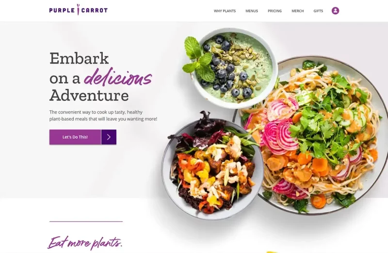
From there, create a natural bond between your brand and your target audience, providing an experience they find valuable and enjoyable as they scroll through the site.
Read more: What is Design Thinking ?
4. UX design process
Next, Malu will introduce you to the UX design process that helps ensure a good design experience that serves business goals.
Note: This is just the UX design process, part of Malu’s Web design process. Also, in the standard UX design process there are only 5 steps, but here Malu presents you 7 steps in more detail and easier to understand.
Step #1: Understanding
As the saying goes: If you have four hours to chop down a tree, spend the first three sharpening the ax.
The same goes for UX design. Before getting started with any project, it’s important to first understand two important factors:
- Enterprise
- Project requirements
Since UX design is about solving user pain points, and satisfying business goals, you need to answer the question:
- What is the business problem?
- What is the business problem?
- Why can you solve that problem?
When you understand the problems your client is facing and you can come up with the questions that need to be answered, you can create a strategy for successful design.
Second, find out how branding works with UX design.
- What are the company’s values and mission?
- How does this project contribute to that goal?
Staying true to your brand’s core mission is critical to the success of your UX design project and the overall success of your business.
Step #2: UX Research
It is important in UX design to understand the user’s problems and the journey they are on to get where they want to be.
And never “guess” the wants and needs of others.
UX Research must rely on information, visualized and reflected through statistically significant research data.
Instead of making guesses, gather actual data to decide how the site will fit together and what features should be integrated.
For example:
- List out the features and survey which features have higher priority
- Test to see if template A with a larger size attracts better clicks than template B (with a smaller size).
- Which color CTA button prompts users to take better action?
- …
Do serious analysis to get a more accurate understanding of the actual preferences and desires of your target users.
User research exposes us to users’ real challenges and expectations (sometimes they don’t even know it).
User research should be done regularly, continuously
User research for design development based on real user expectations, eliminating potential failures.
However, do not think that research is only at the beginning of the project implementation. Original research only gives you a good start and guarantees no short-term failure.
The development and change of society will gradually change their consumption habits and lead to changes in their expectations. This leads to a design that may no longer provide a good experience in the future.
A website that made users say “WOW” 5 years ago may not be effective now.
Therefore, user research needs to be ongoing to see if such a design still meets user expectations and business goals.
How can user research be done?
You can do a fusion of multiple customer research methods from:
- Interview
- Online survey
- Follow up with code
- A/B test
- …
Customer research methods in UX design are as simple as asking customers about their truths, difficulties, pain, and expectations, or seeing how they actually respond when using a website.
You’ll need to see on the journey you’re assuming the user is at, where they’re slowing down, and if there’s a way to accelerate them.
Create customer portraits
A User Persona is an approximate estimate of a target user – based on customer research.
Example: Trip Mate ‘s Customer Portrait
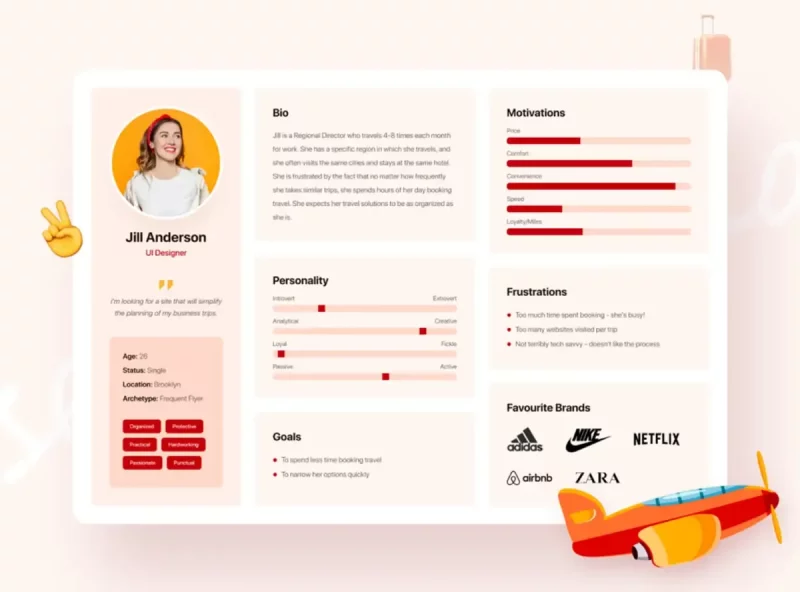
This customer profile shows all the important information about the target customer group.
Looking here you can also understand who they are, what kind of products or services they are interested in…
And what motivates them to use/stop using products and services.
… there is a lot of other useful information.
The customer profile isn’t representative of all users, but it does represent a likely portion of your customers.
Identifying the right customer persona will help you create the ultimate, personalized experience and increase brand awareness.
Step #3: Build User Flow
After researching your customers, you need to know what you want people to do and what steps they need to take by building user flows .
User Flow provides a guide, showing links as the user interacts on the landing page to other parts of the site.
It needs to illustrate the ai steps when adding products to cart and checkout or users accessing articles…
Knowing clearly the paths you want users to take is knowing how to create the site structure.
There are many tools such as user flow sketching support such as FlowMapp , Stormboard , and Whimsical .
But, you can also just need Pen and Paper.
For example, the CheerMeOn App User Flow includes the paths and actions the user will take.
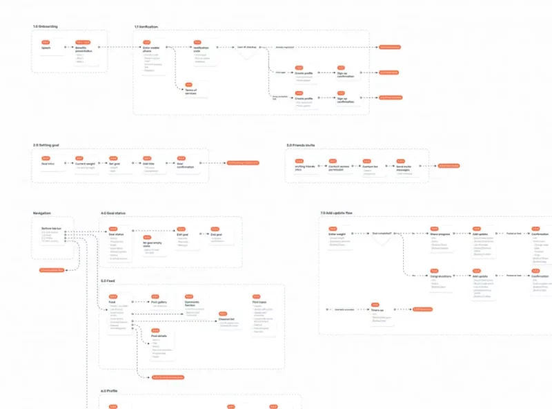
For simple projects (e.g. company website), a site map may suffice.
However, when facing complex projects, for example Web App, Social App, Ecommerce App… you need to use User flows.
Read more: How to design User flows
Step #4: Proper Information Architecture
Our brains prefer order to chaos.
Whether it’s reading a book, watching a movie or surfing the web, we all need to understand what we’re doing.
We need to understand where this is going, what the next step will be and where we are before….
To do this, we need to structure the information properly.
Take the elements of a website and arrange them in an arrangement that suits the person experiencing it.
Information architecture can be divided into the following sections:
- Define : What content do you need to tell your brand’s story? Identify every part that is necessary in communicating what you want to convey to the user.
- Categorization : Categorize content and figure out how it will be divided and organized in design.
- Map : Structure and organize ideas, showing how each concept or block of content will lead to the next.
A logical information architecture organizes content into a manageable hierarchy that presents ideas in a logical sequence.
> Read more: 10 ways Website layout helps to increase the efficiency of information architecture.
Step #5: Create Wireframes
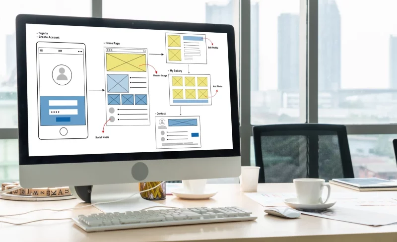
Creating Wrireframes is a blueprint for each page, with visual indicators like lines, grids, and boxes that indicate where the type of content, images, and other elements will lead the user.
Wrireframe is just a blueprint, not a final design.
It can be high resolution or it can be low resolution depending on the tool you use, it doesn’t matter.
It’s important that wireframes give your team what to follow when starting to design a detailed website.
Example: Wireframes by Earth Tribe – Global Youth Movement for Environmental Action.
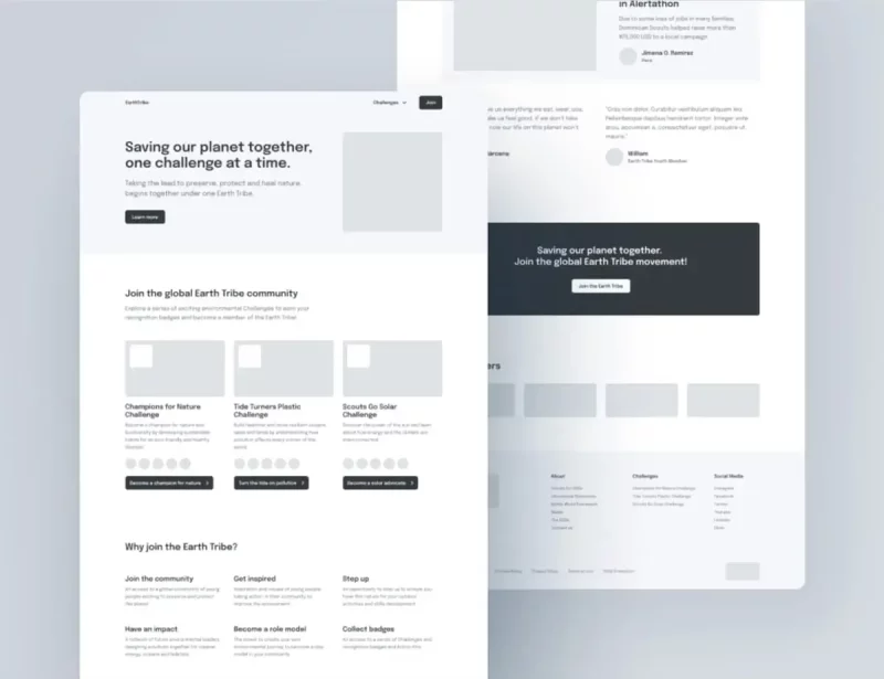
The above wrireframe shows a clear and simple way to organize the site layout.
Wireframing also serves another important function and that is communication.
The common way is to wait until a detailed web design is available before discussing and editing.
But doing so makes it difficult to evaluate the effectiveness of the design and risks starting over and over again, leading to time and effort.
Therefore, the way to do it in UX design is to build wireframes quickly so that everyone on the team has a rough design to discuss and agree on the necessary things before going to the official design.
Break down the design phases to focus on discussing the key components.
Regardless of the roles of the team members, looking at the wireframe can help understand how the web pages will be structured.
From there, know how to coordinate smoothly to push the project to completion.
Note: Steps 5 and 6 are both design steps, however, due to different tasks should be separated to promote more effective UX design process.
Step #6: Prototyping and Mockups
Some people get confused between what is wireframe, mockup or prototype. But all can have different levels of functionality.
Wireframe:
- Use to essentially communicate the layout and organization of individual pages in a design.
- Usually no interactions or decorative elements.
- Exists to show what each page should look like from a general perspective.
Mockups:
- As a step on wireframe
- Mockups take what has been set up with wireframes and present on the graphic design
- May have some functions such as navigation
- Use to see how the design will look.
If you’re using a support tool like Webflow, you won’t have to worry about this step, as you’ll have a fully functional website.
Prototype:
- Works like an almost fully realized design version.
- Navigate, interact, and use all major images and content blocks
- It is not necessary to have every component in order to have everything for the user to interact and experience
- Features like CTA buttons, animations, and other elements you want users to experience are already integrated.
Prototype is closest to the finished web design, it allows you to get needed feedback and make tweaks and corrections before moving on to the code.
With Prototype, you still have 2 types:
- Type 1: Focus on function over design
- Type 2: Closest to the final design version
Step #7: Check
After you have a prototype, it’s time to do usability testing.
This means you need to give it to someone who has never seen the design before and let them experience it freely.
This step is usually done in person or can be done remotely.
Live testing can allow you to see clear and genuine reactions as people experience your website.
When testing usability, participants need to be given specific tasks that you want them to perform.
If it’s a sales site, you need to ask them to try starting from product search to final checkout.
> Read now: 11 tips for designing a sales website to increase sales
Or ask them to find answers to common questions users will likely do with your website.
From there, see if everything is still not right.
See how easy it is to navigate the content.
All of the above data will give you information on how well your design is performing and where it needs to be changed.
Usability testing can happen at any time during the design process, but can be more valuable at an early stage. Big changes are easier to make after the build is complete.
Testing at an early stage also results in less effort when it comes to changes in structure, navigation, and information architecture.
5. Users are at the heart of the UX design process
Trending web design doesn’t have to be difficult. But trends are the most ephemeral. Instead of trying and having the best and coolest web designs, you’re better off creating a web design that can serve the end user well for many years.
Ease of use, organization, and consistency are all factors that influence user experience.
And finally, UX design must empathize with the user – ensuring the user is provided with what is needed for a positive and fulfilling experience.
6. Example of a Product development process :
| STAGE | RELATED PARTIES | WORK | RESULT |
|---|---|---|---|
| Understanding | – Team Design – Business Manager – PM/PO |
– Meet, talk, observe and understand users within their environment – Analyze requirements to understand and differentiate them – Define User Personas and use cases. |
– User Personas – User Stories – Journey Mapping – Use Cases and User Flows |
| Research (Product Research) | – Team Design – PM/PO |
– Learn about competitor approaches – Research similar features in the world – Analyze UI/UI trends, new principles and techniques – Follow experience guidelines closely In-company user experience and Design System |
– Ideas and materials to be able to start building designs in reality – User Interview |
| Sketch (Sketch) | – Team Design – PM/PO – Team Dev |
– Producing ideas and working on basic sketches – Brainstorming with stakeholders to get feedback from a technical perspective – Redrawing drafts and retesting with stakeholders |
– Sketch – Layout (Wireframe) – Paper Prototype – Mockups – User Flows |
| Design (Design) | – Team Design – PM/PO – Business Manager – Team Dev |
– User interface (UI) design – Finalize the theme, specs, guidelines to be implemented – Meeting with stakeholders to get business and technical feedback |
– Low Fidelity Design (stub) – High Fidelity Design (prototype) – Prototype – User interface design elements – Guideline for UI/UX – Design System |
| Implement (Implement) | – Team Dev – Team Design – PO/PM |
Deploy functionality from back-end and front-end interface | UI is fully built in terms of functions and experiences according to the designed themes/styles. |
| Evaluate | – Team Design – PM/PO |
– Try and evaluate the product experience – Monitor and improve the product according to user requirements. |
– User Feedback – UI test report – Mark areas for improvement -A/B testing |
Summary of the UX design process
So through this sharing, you have understood more about what UX is , the important points in UX design and the UX design process with 7 detailed steps:
- Understanding
- Study
- Building User Flows
- Information Architecture
- Building Wireframes
- Prototypes and Mockups
- Check
Hopefully the information that Malu shared above will help you somewhat orient to create a website with good UX for your business.

