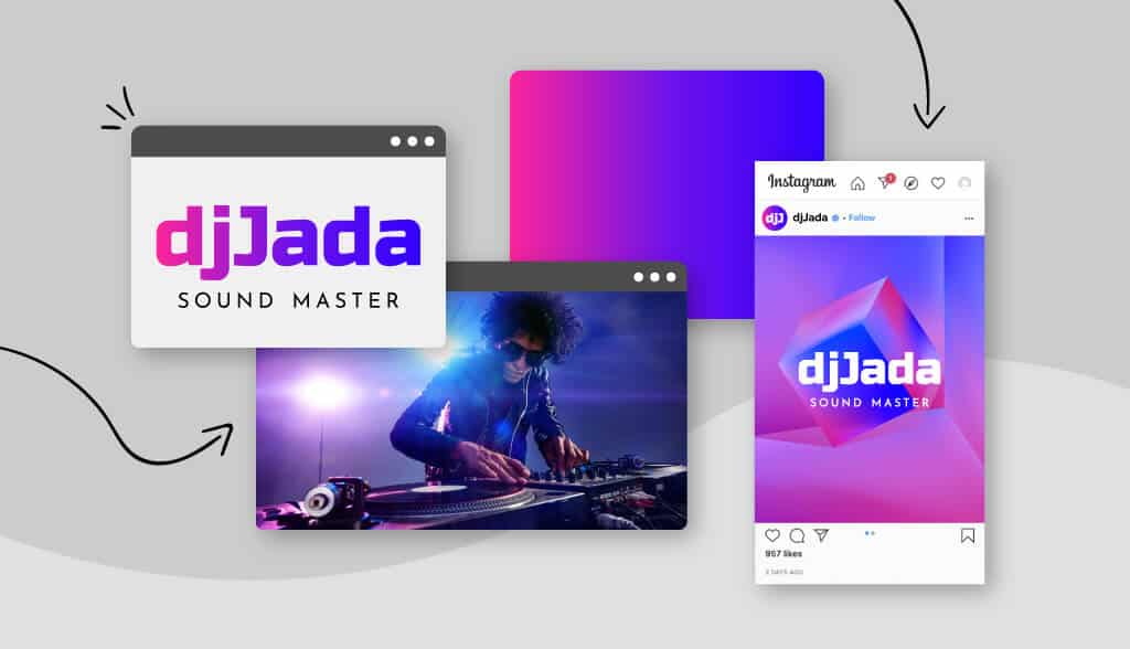
If you have any design friends, you probably know that nothing excites designers more than the theme of gradients.
Remember the olden days when people still cringe at the word; Others who are new to design may have missed that unfortunate period, and they can look at the color bands with fresh, optimistic eyes.
We are at the end of that spectrum, where, like every other design element, Malu Design believes that gradients can complement logo design well if they are used at the right time and place. fit.
While some might argue that gradients are more of a logo design trend than a standard technique, timeless logos like Instagram and Airbnb have used gradients to great success – and so should you!
But first, the question is clear:
What is gradient?
Gradation is a design element made up of colors that fade into each other. Also known as “color progression” or “color ramp,” gradients include many shades of the same color, or multiple colors that blend from one color to another.
The purpose of gradients is not necessarily to have multiple colors in a design; instead, it blends colors so that each shade transitions to the next – creating an overall cohesive effect.
There are several types of gradients commonly used in logo design:
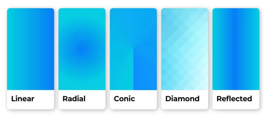
If that seems confusing, don’t worry; it’s important to know that there are many ways to shade a logo to turn it into a gradient.
Gradient logo design example
If you’ve already started brainstorming how to apply gradients to your logo, great!
But if not, that’s okay too.
There are generally 2 main types of gradient logos: Icon-based logos and text-based logos. Let’s see the difference between them, so you get some logo design inspiration
Logo gradient icon
![]()
The most popular gradient icon logos in the world tend to fall into the tech industry. One reason is that because our screens have so many colors and buttons, companies are looking for ways to make their apps stand out – and gradients are an effective way to do that!
You’ll notice that all of the logos pictured here use a color range that includes bright colors in the red spectrum, to both catch the eye and help symbolize energy and passion. Tinder uses a subtle gradient of color in its logo to look like a burning fire, where the Firefox logo features a cone-like gradient to help emphasize the fox’s movement around the globe.
Gradient letter logo
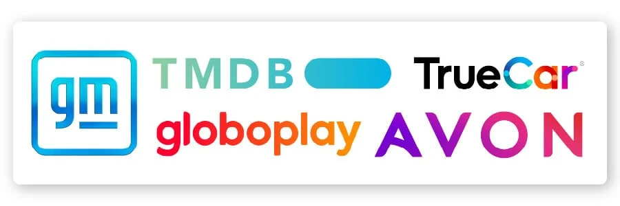
Color gradients aren’t necessarily limited to icons or icons! They can also be an effective way to highlight a specific aspect of a brand name or even to emphasize a letter that you don’t want your audience to miss.
The TrueCar logo does just that, by contrasting the dark “True” with the colorful gradient “Car.” Each letter in “car” is its own color range, and the striking colors both attract attention and indicate movement (just like you’d see from a car).
General Motors, on the other hand, has a mirror gradient, which aims to mimic a clear sky and point to the company’s “green” initiatives. In this case, their text is almost secondary to the vibrant blue color scheme.
And, you’ll notice that many of these text logos use a linear gradient to encourage the eye to move gradually along the logo name.
Now that we’ve seen several different types of gradient logos, let’s discuss when a gradient logo is the right choice for your brand!
When to use Logo Gradient

Color bands should be used to highlight a strong icon, not mask a weak one. You also don’t want your gradient to be the selling point of the logo; if so, it should be used to add a bit of flair to your design, but only as an enhancement to other elements of your business logo.
That said, here are a few other times where using a gradient can work well for your logo:
As it relates to your brand identity.

When designing a logo , it’s important to think about the kind of emotion you’re trying to give the world, and gradient design has an emotion of its own.
It implies creativity, imagination, innovation – all great things, but not necessarily aligned with your particular brand personality. For example, an attorney might not want those features to be associated with his/her litigation firm, but a band’s logo would fit right in with that overall image.
When your business is online
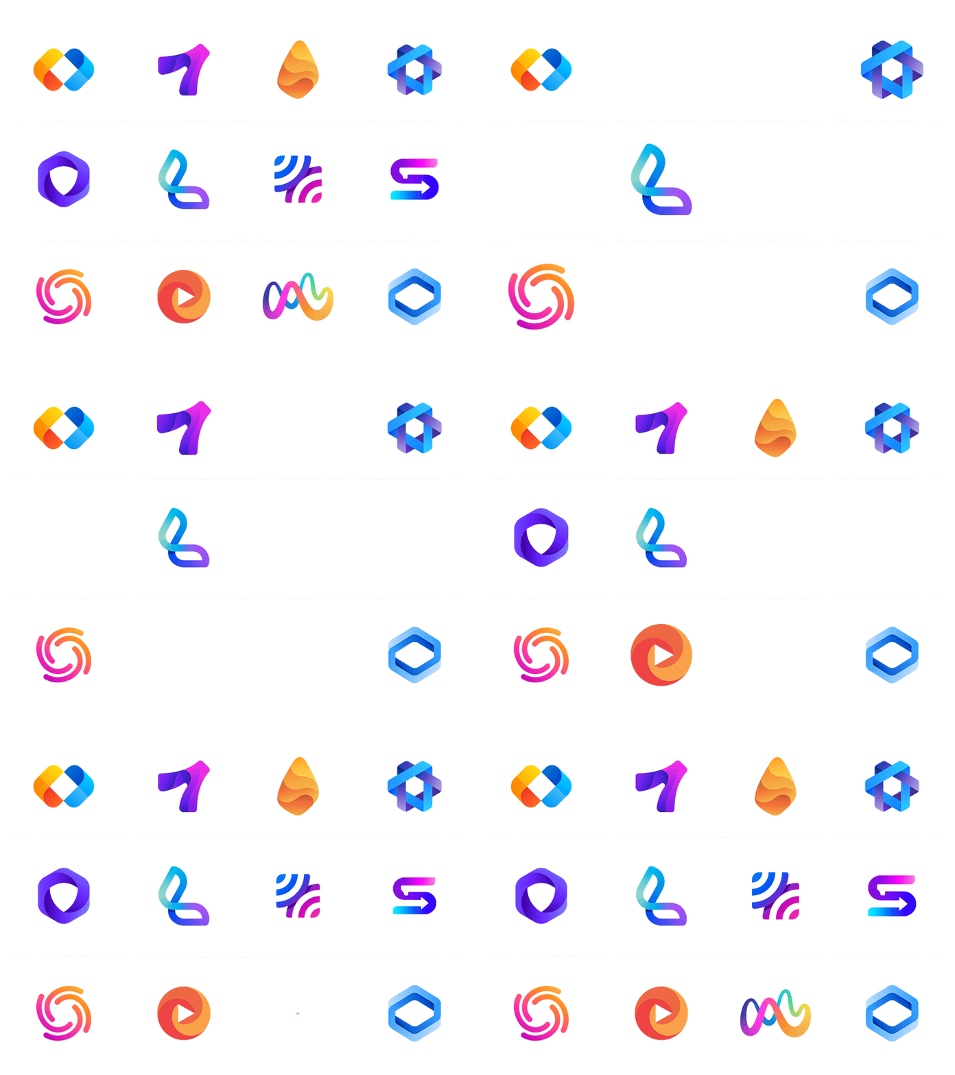
Color gradients tend to look better on screen than they do in print, so you’ll have to think twice before choosing a gradient if you’re going to be branding a lot offline.
Restaurant logos would probably work better with a flat design, because you’ll likely place your logo on menus, napkins, and storefronts. However, game logos can certainly incorporate gradients – both to set you apart from your competition and to be remembered for your unique logo.
When your logo has its own value

Like we mentioned above, gradients shouldn’t be the sole focus of your logo; it’s just there to enhance, like accenting with colors or sub-fonts.
There may be times when you need a transparent logo (a version of your logo that works on a colorful background) and in such cases your logo will have to be legible.
When your logo is easy to read
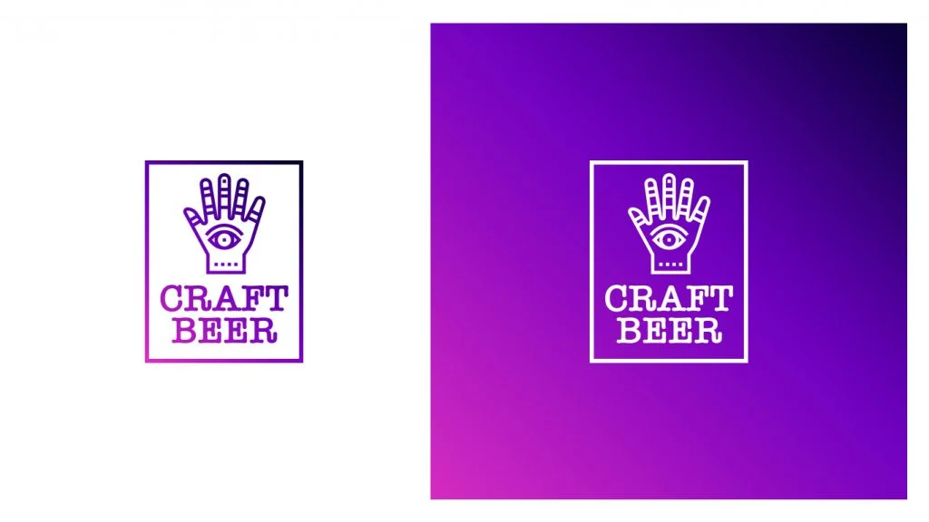
Color gradients can often distort the text of a business name or make it harder to read, depending on how much of an impact. It’s best to avoid adding gradients to wordmark logos or text-only logos (no icons or symbols) – unless the gradient is VERY subtle.
Advantages of Logo Gradient
When all is said and done, why would a business actively choose to use gradient design when it’s easier to create a flat logo? The answer is simple: It will set your logo apart from your competitors.
Among other things, the gradient logo is:
Memorable
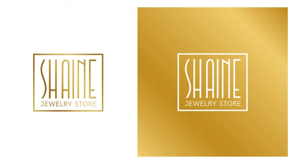
Because they’re not currently the norm in the logo design world, gradients can create a lasting impression that flat logos sometimes can’t.
We often talk about colors as if they were single entities – the sky is blue, this cherry is red – so when we see colors we don’t immediately have the language to describe them. ie, the image won’t leave quickly. our heads like the flat colored things we’re used to seeing.
Creative
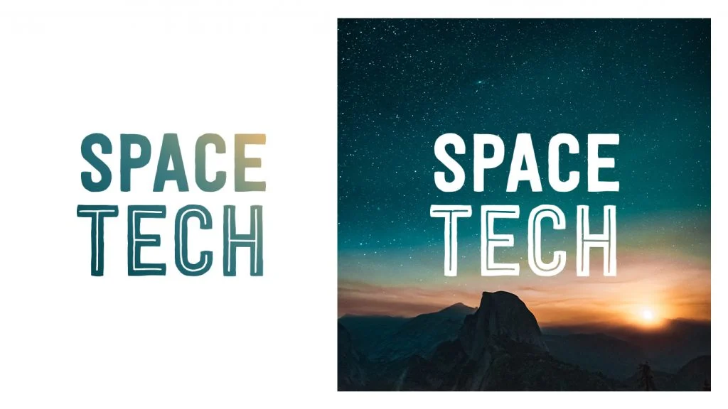
Like we mentioned above, your logo design should speak to your brand identity and gradient logos have a lot of ground to get creative with. If your business is in the arts, innovation, or simply wants to be known as a company that finds out-of-the-box solutions for their customers, then you’ll want a logo that can stand out. You can convey that creativity to your audience.
Reality

If you look around, you will notice that objects in nature are rarely characterized by a single shade of color. Trees are green, brown and orange; distinguish dirt between black, brown and red.
In other words, in everyday life, our eyes are more used to seeing gradients than flat designs, and with a gradient logo you can bring your business to life much more. in the mind of the viewer.
Happy
By using a gradient logo, you are engaging your audience in a conversation with your brand. You’re letting them know that you’re different, that you’re brave, and that you’re not afraid to make bold choices – both as a brand and as a business.
Tips to design a beautiful Gradient Logo
You probably already know the steps in the logo creation process , but you’ll want to keep these tips in mind before continuing your gradient color journey:

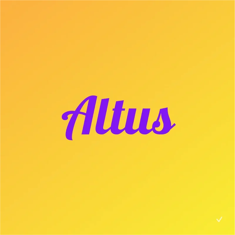
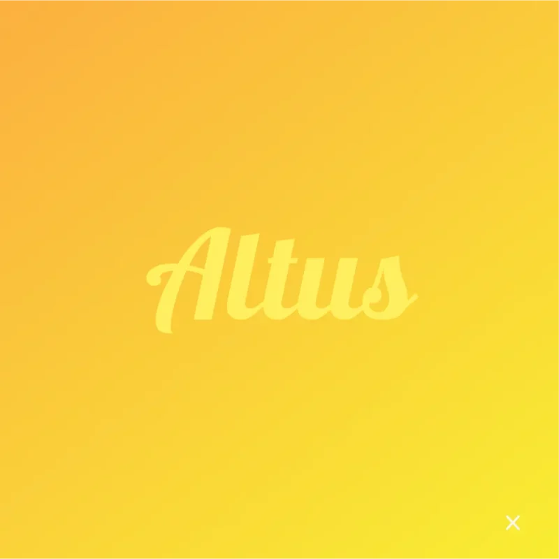
1. Prioritize Contrast
- Do: Consider contrast and accessibility when creating gradient logos.
- Don’t: Use only your own judgment to check if it’s accessible. Ask a few friends or family members to see if it’s clear and easy to read to them!
2. Choose colors carefully
- Do: Use color gamut if the color combination of your logo is well thought out and suits your brand.
- Don’t: Use a gradient that looks like it was made without thinking.


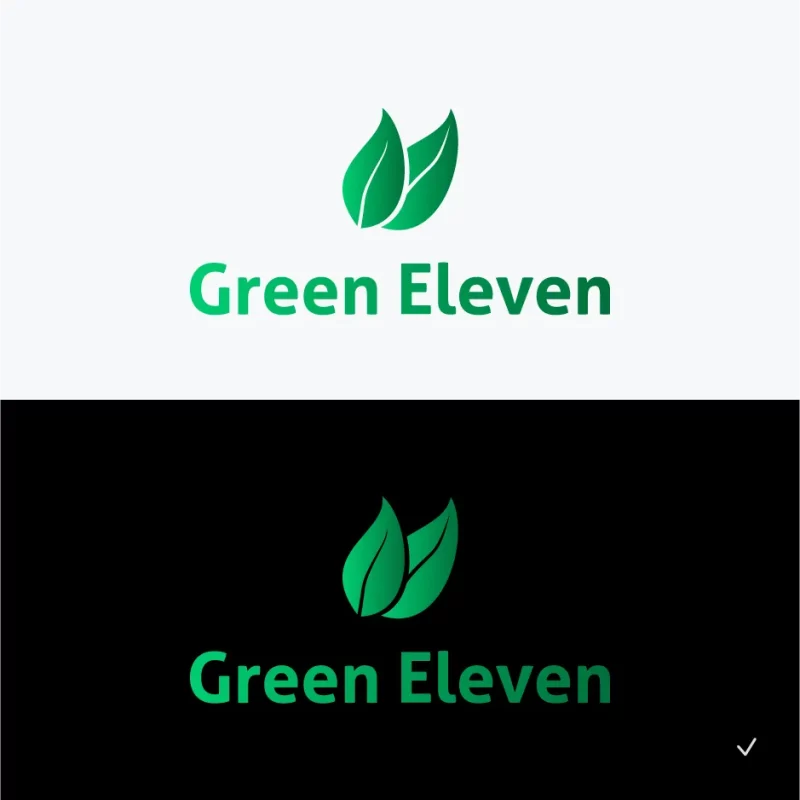
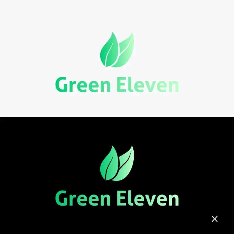
3. Experimenting on a black and white background
- Do: Optimize your gradient design for print by making sure it looks clear on a variety of backgrounds and materials (both white and black versions of the logo are recommended).
- Don’t: Ignore the importance of readability and print quality at different sizes when designing.
4. Keep it legible
- Do: Make sure punctuation and accents are clear when creating gradients. For example, is the dot on the letter “i” lost in the background?
- Don’t: Create gradient designs that don’t match the font and name style.


5. Make it Subtle
- Do: Create a solid (and simple) logo design first, then test how the gradient looks.
- Don’t: Adding gradients to your icon makes it hard to read or reproduce. Subtlety is the key!
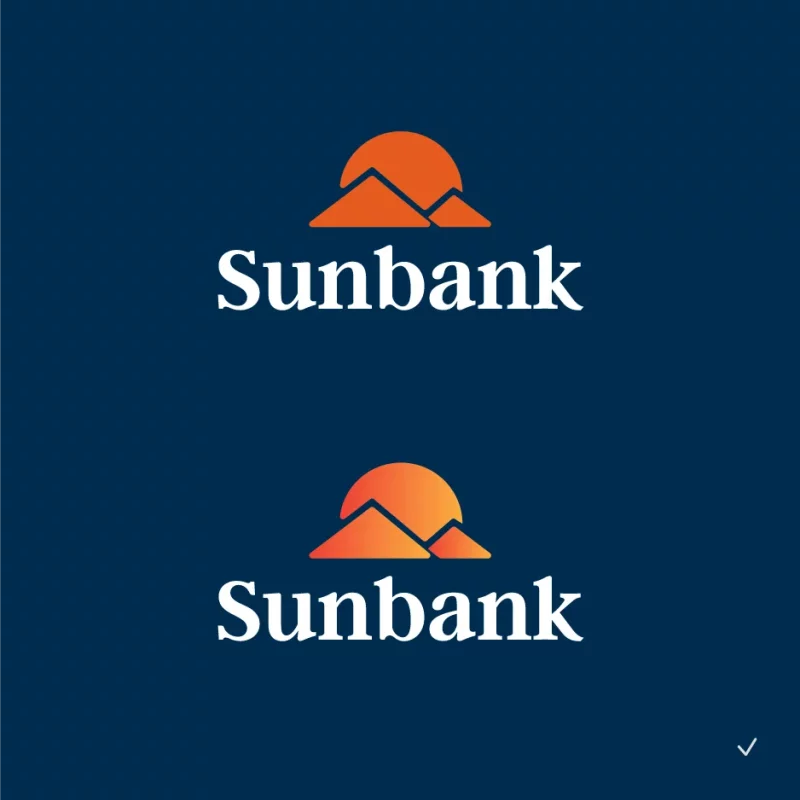
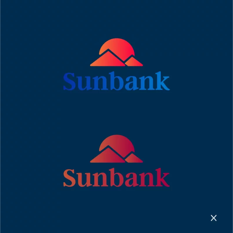
Example of a gradient logo design
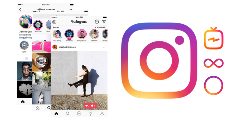
Logos with gradients have really had a resurgence in the past few years, especially in the tech industry. Brands using gradient logos: Tinder, Firefox, Guinness, Instagram, Asana, Jaguar and iTunes.
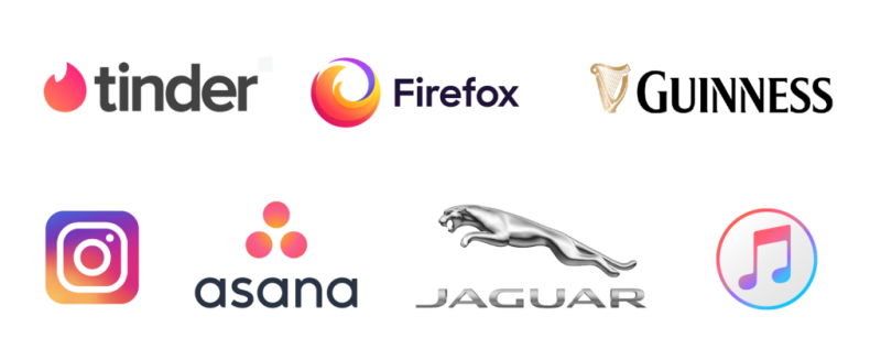
As mentioned above, it is generally recommended to use gradients on logo icons rather than the entire logo. The same goes for app icons, like Instagram and its toolkit.
The main reason to avoid using gradients on lettering (or with caution) is readability – your company name should always be clear and legible!
If you are looking for a reputable and experienced unit to be able to design a professional and impressive logo and brand identity system , then please contact us immediately by phone. 0988 622 991, or leave your information and requirements, Malu Design ‘s consulting department will contact you right away to answer all your questions!
————————
Malu Design – Branding Identity Agency
Hotline: 0988 622 991


