There are stories that, when told, you wish it would end before it even started.
Why did this happen? Most likely, the problem lies with the narrator. They don’t convince you to be interested in the story fast enough and instantly make you lose interest.
Logo monogram (Monogram) – powerful storytelling tool may be the solution you are looking for.
Simple yet inspiring, this type of logo can convey the entire brand story with just a few basic strokes created from an electronic brush. A logo helps to emphasize the name of the business it represents, as well as creating a strong connection with the brand without many words.
Mục lục bài viết
ToggleMonogram Logo – What is a Monogram?
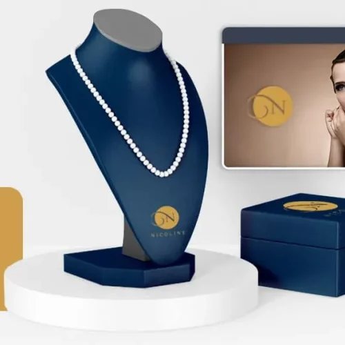
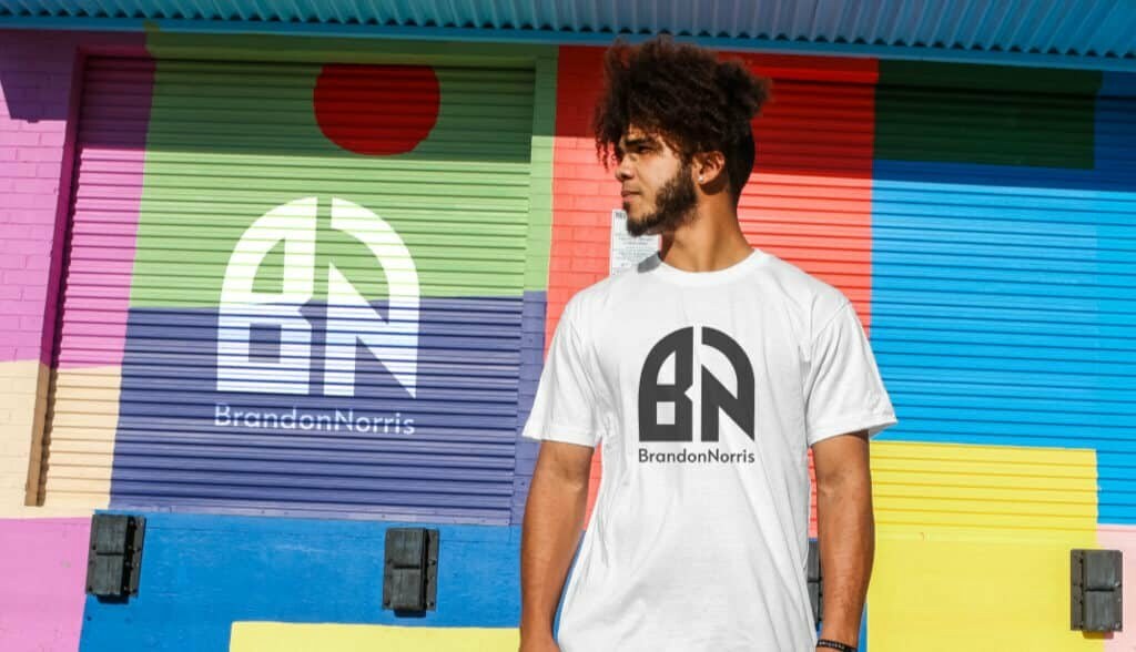
Also known roughly as “Lettermark” (a typeface-based symbol with only the initials of a brand). The Monogram logo is created entirely from Typography (the presentation and display of letters in the design). Each logo usually consists of only 2 to 3 characters, which are the first letters of the business name.
The monogram became extremely popular in the 19th century and has maintained its throne ever since. They are used in nearly everything from wedding invitations to marking intellectual property rights to art products. It can be said that Monogram is a symbol of luxury, regal, professionalism and class.
When to use monogram logos – Monogram
One of the most important things when designing a logo for a brand is: always put the customer at the center. Logos both need to meet aesthetic appeal and convey business values, because the public is the object to which those values are directed.
The Monogram logo is easy to remember because of its compactness but no less vivid and trendy. Let’s use this logo design style:
When trading in the luxury brand segment:
Branding luxury items means making customers feel pampered with the best. In this case, nothing is more effective than a personalized logo. High-income customers want everything from: towels, pillows, personalized fountain pens with the Monogram Logo. The logo reminds customers of the feeling of being “favored” and that: the brand has been very sophisticated in customer service.
A good example is the logo of Louis Vuitton. It carries with it a courtesy that flows with the brand’s evolution (which has been around for centuries). This high-end fashion brand is actually a family business, and the monogram is used to preserve the long-standing traditional values of the family, but also do not forget to add a little personal touch.
When the brand name is too “bulky”:
Because each Monogram Logo consists of only 2 to 3 letters, it can save businesses with names that are a bit long or difficult to read. Brand names that are too long also make customers lose interest. Instead, keeping only a few initials in the name stimulated more public curiosity.
Besides, businesses need a logo that can easily identify the brand name at a glance. Because the truth is that no one spends too long looking at a logo.
Bang and Olufsen may seem like a “bulky” brand name, but this Danish electronics group actually owns a very recognizable monogrammed Logo. The phrase “B&O” is easier to design and more suitable for branding than taking the entire original name.
When you want to enter the international market:
It is not easy to create a logo that appeals to a multi-national audience because of language barriers to cultural differences. Too many obstacles can be listed here, so in this case, the simplest is the best.
The initials in the name create flexibility so that customers can recognize the brand from anywhere in the world. The client does not need to decipher the names by putting them in a linguistic or population frame of reference.
Needless to say, just look at the way H&M – a large global apparel corporation is enough to understand. H&M has used the Monogram Logo very clearly and specifically, helping the public to recognize the brand in an instant, instead of using another type of illustrative logo (which is easy to confuse).
When running a family business:
Derived from the characteristic use of initials, Monogram is very popular in family companies. Wedding photos, wedding gifts to wedding supplies, have you ever wondered why newlyweds receive a lot of supplies with monogrammed logos?
That’s because people have considered Monogram as a tool to express not only the presence of the name, but also the sacred feeling when the bride and groom’s names are attached to each other. It’s like joining an extended family.
Back to the business story, the monogram logo helps to show the age-old value over many generations thereby creating a bond with sympathetic customers.
When you don’t want to be bound by limits:
This may sound a bit contradictory, because by definition, Monogram completely removes the “visual” part of the logo – limiting the brand name to letters. However, images often lead customers to associate themes that are out of the framework of the brand.
Sometimes using images is still effective, when businesses want to create emphasis on only a certain product line. But that means that the brand is self-contained and it is difficult to find a wider audience.
So assuming a business specializing in real estate consulting, wants to expand into consulting many other related branches, then trying a monogram logo will bring more or less efficiency.
Tips when using Logo monogram – Monogram:
Now that you know what a monogram logo is, here are a few tips for creating one of your own!
Research on various types of typefaces (Typeface):
As mentioned, the deciding factor on the success or failure of a monogram logo lies in the typeface. Make sure you’ve chosen the right Typeface for your brand.
If you want to express longevity, a bit of a classic, Typeface Serif (a serif font) is a reasonable choice. But if the brand emphasizes on innovation, breakthrough, modernity and creativity, it is advisable to use San Serif (a sans serif font).
Notice how the New York Yankees use a rather unusual font and overlap the letters “N” and “Y”. The necessary emphasis on New York combined with the strong, unique Typeface helps convey the message: don’t be fooled into NYY.
Michael Schumacher’s logo, on the other hand, is an example of putting a personal touch on a Monogram publication, primarily through a hand-signature imitation. If you want a similar effect, you can study Script Typeface (handwriting fonts) because their soft curves help express sophistication and elegance.

Choose a color to represent your brand:
The colors in Logo Monogram also play a crucial role in conveying the brand message. Each color is associated with a different meaning. Try combining them to create a unique brand mark.

For example, the CNN logo combines magenta and white tones. The red color symbolizes the enthusiasm and dynamism of a national news channel. Meanwhile, white softens red as well as represents integrity and trustworthiness. These are all qualities required of a news station.
When considering choosing a color , think about three things you want the public to see from your brand. Blue represents trustworthiness, prestige and sustainability, green is health, affluence, nature, etc. Try to focus on 1 to 3 main colors to create the message.
Test different layouts:
This is an often overlooked task when designing a Monogram Logo. But layout can really change the whole way the public perceives a brand.
Most traditional logos are rectangular, but a little variation with monograms will help connect with customers better. For example, the logo of Yves Saint Laurent consists of letters superimposed on each other, creating the impression of a chain. Similarly, Grant Associates – a workforce development organization – has overlapped the letters to form two people shaking hands. This helped the public feel a strong connection between them and the mission of the organization.

Flipping or inverting the letter or surrounding the border are also effective logo variations.
Take advantage of the gaps:
Once you have thought through the main elements of the logo, you can think of taking advantage of and modifying the negative space to create more power for the communication message.
For example, use spaces to create character recognition, as you can see in the logo of professional tennis player Roger Federer. This logo actually follows the same rule: pick the first letter of the name, but the spaces make all the difference. The human brain has “filled” itself in the void intentionally and decoded the logo perfectly.
Create hidden meanings:
Just 2-3 letters does not mean the logo is deprived of creativity. Many Monogram Logos actually carry a lot of hidden meanings , which should be considered carefully before proceeding with the design.
For example, LG’s logo is basically a regular monogram, but the way they transform with spacing and lettering has created a human face logo. Or FedEx with the arrow symbol “hidden” in the space between the “e” and the “x”. Arrows represent movement, meaning that packages delivered by FedEx always arrive quickly.
Observe the Typeface, colors, and layouts you have chosen and see if they are “telling” the brand story. If there are still messages missing from the logo, try the above methods until everything is in place.
Exclusively for you
Your business has a story to tell, and a monogram logo can be the best spokesperson. If you use monogram, remember that the font of the logo will help you a lot, so try to choose a font that has the same message as the brand.
Inappropriate monogram logo? Go to this blog post and try these abstract logos !

