Maybe you’re on your way to starting your own company and you hear the word “logo” everywhere . But what does it really mean? What is logo? What types of Logos are there? What type of logo is right for your business? What are the pros and cons of each type of logo?
>>> What is logo? What role does a logo play for a business?
Among the millions of factors in finding the right logo for your business (fonts, layouts, images, color palettes, etc.), we’ve put together a list of the main logo types to help with the design process. logos made easy – and more fun!
There are 2 main types of logos: Image-based or symbol-based logos and Name-based logos . In this article, Malu will give you the basic knowledge you need to master when designing a logo, let’s discover it now!
Image-Based Logos
Icon-based logos use images to send a message about the brand they represent. Take a look at the 4 different categories:
1. Trademark (Brand Mark)
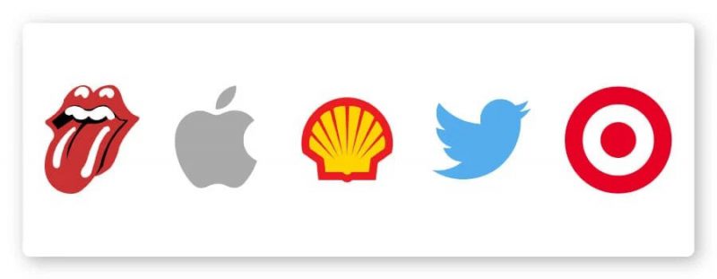
Brand mark is a type of logo that uses a certain symbol to act as an “ambassador” for that brand. The most famous examples are Apple’s apple and Twitter’s bird logo.
These are a popular type of logo, as they convey more information about a brand than just an abstract text or shape. Also, people always love pictures and images and they help us to remember them easily. It often hints at the company’s mission and makes a strong statement
Advantages of Brand Mark:
Brands need to be simple and easy to remember. If you offer a specific service, an avatar sends a quick, clear message to your customers.
Plus, the simplicity of the design converts well when resizing your logo on branding publications like business cards or letterheads.
When to use Brand Mark:
Is there anything your business is really good at? The Twitter branding is so relevant as it is a bird, which immediately reminds people that the company tweets. If your business already has some potential and/or if you specialize in a product or a service that can easily be represented by an image, then a trademark could be a great option for you.
Or, if, like Apple, your business name represents a real-world object, you can also use that same object’s trademark.
Things to consider before using Brand Mark:
Use caution if your business is new or doesn’t have many followers yet. While a brand mark is often thought of as a company symbol, you need to be reputable enough to be recognized first. Otherwise, your logo may not convey enough information about you to your audience and they will lose interest in your brand.
Also, keep in mind that if you are planning to expand your product line to a diverse audience, the logo may misrepresent what you do in the future.
Nguồn cảm hứng: The Rolling Stones, Apple, Twitter, Target, Royal Dutch Shell
>>> See more details Icon What is Logo? How to choose a logo icon?
2. Abstract Logos (Abstract Logo Marks)
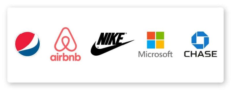
An abstract logo is a conceptual logo that visualizes the great image of a business.
Like brand marks, an abstract logo consists of only one symbol – but one designed specifically for the business.
Advantages of abstract logos:
There’s room to get creative with these designs, as you can create a logo that really conveys the values of your business or something about the brand that you want to emphasize.
Because an abstract logo isn’t limited to a real-world object or image, there’s plenty of room to say what you want about your company.
When to use abstract logos:
If you are a business with many distinct activities, a well thought out abstract logo could be the perfect logo for you! Abstract designs are great for communicating your brand values or something different you want your business to represent.
For example, the Chase logo can represent translational motion, while also representing different parts of the bank itself.
If you plan to build your brand online then a simple abstract logo is a good choice, because a simple logo will convey easily no matter the size.
Things to consider before using an abstract logo:
You should refine the logo design until you are sure that it is properly conveying your message to the world.
Attention to detail is very important for abstract logos, you don’t want your message to be misinterpreted with a logo design that is too vague or confusing. Notice how easily the Nike logo can be memorized?
Also, a logo with too much detail may not be what you expect when printed in different sizes; so consult a logo designer who understands how fonts, colors and shapes interact.
Inspiration: Airbnb, Pepsi, Microsoft, Nike, Chase
>>> See more details of 7 types of abstract logos (Abstract Logo) to help bring life to the brand
3. Mascot – Mascots
Arguably the friendliest type of logo, a mascot is an image of a character or person who acts as the visual representation of your business. Think of them as the “spokesperson” for your brand – most of your ad will focus on that mascot.
Advantages of mascot logo:
The mascot gives customers a warm and fuzzy feeling, resulting in the creation of a memorable brand. Beyond that, nothing appeals to children more than a tangible, real-life character they can remember.
Sometimes you see someone in a 2m-tall lobster suit standing outside a seafood restaurant waving to guests, you think the person wearing that suit is sweating desperately in the August heat but your kids will probably go crazy over the lobster and beg you to eat at that restaurant.
When to use mascot symbols:
This is a great choice for brands that cater to children. Many food businesses or restaurants use mascots — like KFC and Kellogg’s — as well as brands that want to make a complex idea appear more accessible, such as Mailchimp’s marketing automation platform.
So if you’re offering something “dry” or a little more confusing, like SAAS (software as a service) or plumbing services, a mascot could be a way. Great for humanizing your brand and making it more appealing to your customers.
Things to consider before using the mascot symbol:
Mascots may not be sending the right message if your company’s focus is on global innovation or light industry – or services/products not made for children.
Case in point: Camel Tobacco ran a 10-year advertising campaign based on their mascot, Joe Camel (also known as Old Joe). However, they had to withdraw the campaign in 1997 while facing a lawsuit alleging that the company used Old Joe to target children – evidenced by the fact that the revenue from the sale of cigarettes to teenagers was reduced. raised $470 million since the campaign began.
Business Ethic : If you are a tobacco company – do not try to advertise to children. Please, do not!
On the other hand, companies like Pillsbury are perfectly represented by cute, fresh mascots – all-rounder I mean.
Inspiration: KFC, Pillsbury, Kellogg’s, Mailchimp, Pringles
>>> See more details Everything You Need To Know About Mascot Logo – Mascot Logo
4. Combination Logos – Combination Marks
The name is quite easy to understand, logos incorporate both images and words into their design.
Combined brand logos include any combination of images and words that you choose; you can pair a letterform with a mascot, a monogram with an abstract image – whichever combination suits you best. (We’ll talk more about some other types of logos below.)
Advantages of the combination:
One word: Flexibility.
With a logo and lettering combination at your disposal, you can use your logo to create a clear brand message.
This combination also allows for easy rebranding like rebranding – for example, your company name combined with an image (abstract or something) will be associated into one, so that in the end your customers will only see the logo and still immediately think of your brand.
(Nike did it with their infamous “comma”; while their traditional logo is their name combined with a comma image, their clothing is often branded with just a comma – and immediately recognized.)
When to use combo symbols:
You will definitely want to consider this type of logo if you are just starting out. Combined logos will give your customers plenty of visual cues as they come into contact with your business, which helps them remember you – and what you do – over time.
They are also a great choice if you want to trademark your logo, as pairing icons with text helps you create a distinct image.
Things to consider before using conjunctions:
Versatile doesn’t mean overdoing it. Conceptualize how you want your name and logo to come together, and keep your logo design clean and true to the message.
Inspiration: Pizza Hut, Puma, Mastercard, CVS, Toblerone.
>>> View more details What is a Logo Combination Mark?
5. Emblem Logos – Emblem Logos
Even the name has an impressive, traditional feel. Icons have stood the test of time, from family crests to royal stamps of powerful kings. These logos include a typeface within a border – usually a seal or a coat of arms. Think universities and government organizations.
Advantages of icon logos:
Logos are memorable, and they convey an atmosphere of professionalism, tradition, and importance to your brand. They also give the impression that your company has been around forever and isn’t going anywhere anytime soon.
When to use the symbol symbol :
This type of logo is great for brands that want to appear authoritative or tell their audience that they uphold traditional values. Logos look especially good (prestige) when they are engraved, so can be a good choice for you if you run an organization with uniforms or garments of some kind.
Things to consider before using icons:
Again, think about scalability when you design your icons, as these tend to have a more detailed design and may not look good when resized.
Also, logos don’t give you the flexibility of standard combo logos, so be sure of your design before putting your logo to work.
Inspiration: Starbucks, Stella Artois, Perrier, BMW, Harvard
>>> See more detail Logo Emblem (Emblem logo): The most reliable design
6. Dynamic Logos – Dynamic Marks
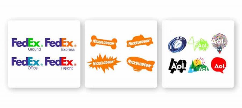
You can say the animated icon is a symbol of the new era. Unlike other logos, this type of logo adapts itself to the context in which it is used. This means that instead of having a standard font-color-text combination in your logo, these elements can change – whether on the internet or across different branding materials.
Advantages of dynamic trademarks:
You can be as creative as you want! Because there are so many mediums to build your brand (think business websites, mobile sites, blogs, digital media, merchandise, ads, etc.) so you can modify your logo to fit any situation or make a range of displays to potential customers.
Also, dynamic logos make things interesting; Your customers will be looking forward to seeing what you do next.
When to use animated icons:
This is a great choice for brands in the entertainment, media or creative industries. If your business has several different branches, such as FedEx, dynamic branding with changing colors can be a great way to differentiate those divisions from your customers.
Things to consider before using floating point:
You don’t want to lose the linking power of your logo. Some of your followers may associate your brand with your colors, others may remember the shape of your logo; If these details are constantly changing, your logo may not have the desired effect. Take note of the changes you make and again make sure to keep your logo on point.
Inspiration: Nickelodeon, AOL, FedEx
>>> View more details Dynamic Logo – What is Dynamic Logo? In What Case Should It Be Used?
Logo based on name
The following types of logos do not use images or symbols in their design and they mainly use typography and color palettes to make their mark. Let’s see!
7. Text Logos – Wordmark Logos
A text-only icon, created with the name of a business or product. Wordmark logo is considered the right decision if your business is a start-up and needs to make an impression on your name.
However, you need to make sure the name is short enough to take advantage of the design on the logo, a distinctive brand name that is able to stick in the customer’s mind.
Advantages of letter logos:
No one has to guess when they see a lettering logo – it’s pretty obvious which company the logo represents. Because all designs are lettered, letter logos are one of the most versatile logo options that can be easily delivered on any marketing material.
When to use lettering logos:
If your business name is catchy, this is the perfect way to highlight that and use it to your brand advantage. High-fashion brands like Tiffany and Co. Use lettering logos a lot, as do food brands and tech companies that want to express creativity.
The power of typeface logos lies in their fonts, which means you can choose a font with a style that reflects your brand’s personality – and your customers’ eyes are instantly focused on your logo. Friend.
Things to consider before using a lettering logo:
Does your business name say anything about what you do? If you’re not famous or your business is named after a person rather than a concept, it can be difficult to create the brand recognition you want.
Inspiration: Subway, Uber, Coca Cola, ToysRUs, Tiffany and Co.
>>> See more details Create Your Own Brand With Logo Wordmark (Text Logo)
8. Abbreviations – Monograms
Abbreviations (monogram logos) are typeface-based logos that take a company’s initials and spruce up their design a bit. Boom! You have a neat logo in no time.
Advantages of initials logos:
It seems like more than ever, the whole world loves abbreviations (thanks to the current technological era for that?). From interpersonal communication styles – LOL, BTW, OMG – to luxury car companies (BMW), acronyms are pervading the modern era.
Also, it’s important: Abbreviations turn your lengthy business name into an easy-to-remember, memorable brand identity.
When to use initials logos:
It’s relatively easy to design and use – after all, there’s not much to think about – so monograms can be a great choice if you’re a new/small business that needs to make a name for itself. theirs to the market.
Initials are also a good option for you if you have a long business name – like the New York Yankees – that is difficult to print on small objects or read at small sizes. Finally, since monograms are often associated with personalization and wealth, they can be a good choice for brands trying to appeal to an upscale crowd or offering homemade/crafted items. .
Things to consider before using an abbreviation logo:
Understand font usage . The simplicity of the logo will work in your favor, but make sure you don’t get stuck with a boring, forgettable logo design; The attraction lies in the details.
Alternatively, you may want to consider embossed the full name of your business under your logo on branding publications (such as business cards or websites) so that people can associate your logo with it. monogram and your company name.
Inspiration: HP, LG, Louis Vuitton, New York Yankees, IBM
>>> See more details Optimizing communication messages with Monogram Logo – Monogram
9. Letterforms – Letterforms
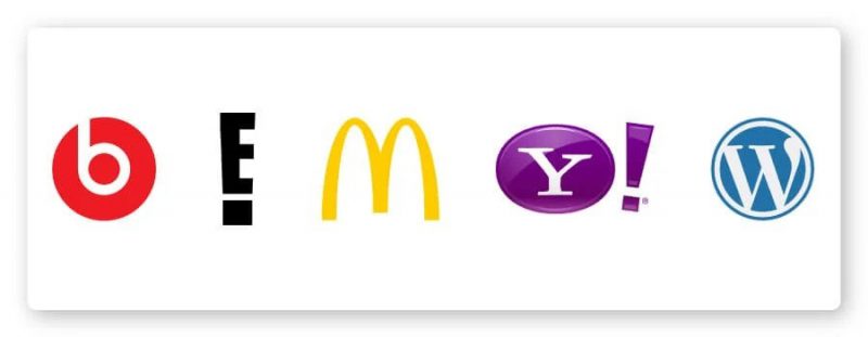
Last but not least, letterforms are brothers of monograms; they are just one letter logos . Of course, these logos have to be bold and beautiful (well designed), as a single letter can hardly convey a clear message. Think favicon (“shortcut” or website icon).
Advantages of lettering logos:
Typefaces can be easily extended. When your logo is just a letter, you can stick it anywhere and it will look just as good. And, a well-designed logotype will subconsciously recall your brand’s full name in people’s minds.
When to use letter logos:
If you have a long and complex business name, lettering logos are a good way to make your logo memorable while still hinting at your business name.
You can get creative with typography to have a letterform that matches the product/service you offer, like the iconic Beats logo for the speaker.
Things to consider before using a letter template:
Because these logos are just one letter, the design is very important; if the logo is not memorable then it is useless. This could mean it has a fun font, a dramatic backdrop, or an interesting color scheme – anything that makes the letter pop and resonate.
And, make sure that the font you use is legible. If your logo is just one letter, you want people to be able to read it.
Inspiration: Beats, McDonald’s, WordPress, Yahoo, E!
>>> See more details Creative With One-Character Logo, How To Get It Right?
For you
Now that you know about the types of logos available in the market, it’s time to create your own! Don’t worry – Malu Design’s logo design will help you.


