Logos are an integral part of a business’ brand identity. Therefore, the logo design has never been “hot”. There are many different logo design styles that have been applied, such as scandinavian, vintage, retro, etc. Among them, it is impossible not to mention the minimalism style chosen and appreciated by experts. Although it has been around for a long time, minimalism has never gotten old. Read this article to understand why!
Minimalism style “interpretation”
Minimalism is minimalism, an art movement that began to emerge in the 60s of the 20th century in New York City, USA. Minimalism here means simplifying the design in many different areas, eliminating cumbersome details, confusing colors. However, it is not for the sake of minimalism that designers are allowed to remove the messages that need to be conveyed in each of their finished products.
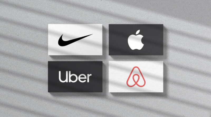
Many big brands have applied minimalism style very successfully in logo design such as: Mc. Donald, Pepsi, Nike, Amazon, …
What makes minimalism design style always popular?
Easy to attract viewers
There is one thing that we cannot deny; That is, when an art product is simpler, the more it stands out, the more it attracts the attention of the viewer. A simple, non-colorful, sophisticated logo that still shows the elegance and full meaning behind it makes people want to see and explore.
Accurately express intent and purpose
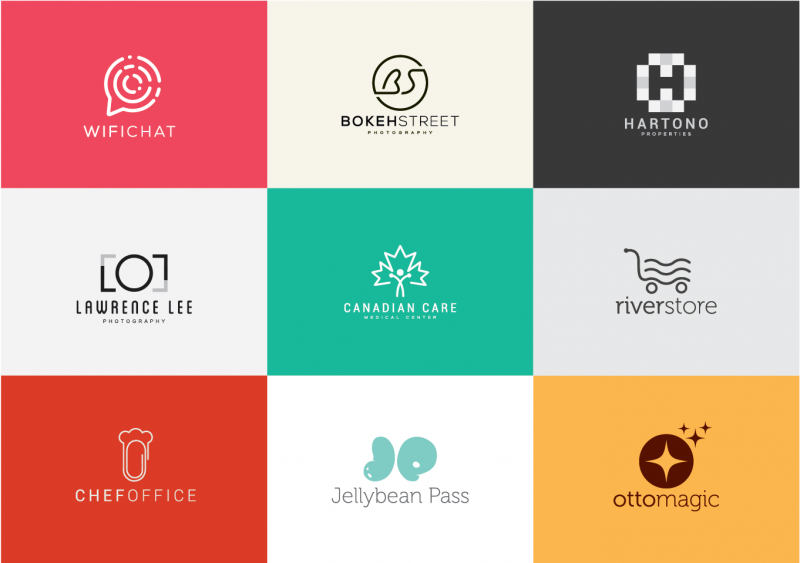
Choosing exactly what is most characteristic and outstanding helps the viewer to pay full attention to the main detail and not be distracted by the redundant details around. When applying minimalism to logo design, you are trying to carve into the mind of the viewer one and only one image, and of course that image must ensure exactly what you intend.
Save time
This is definitely an advantage of applying minimalism in logo design. Limiting redundant textures, colors, lines, etc. saves you time to focus more on the main details, promoting the quality of design products in general and logos in particular.
How to apply minimalism style in effective logo design?
The more minimalist, the more beautiful (less is more)
As mentioned above, the minimalism style in logo design needs to limit as much as possible sophisticated visual details, complex lines, and confusing colors, with the aim of bringing a logo that really has “about artistic drum”, just enough to attract the viewer, just enough to express the desired idea and content.
Limit the use of colors that are too picky
The limited use of colors in the design is a prominent feature of the minimalism style. With this style, you should not show more than 4 colors on the logo, so that it is really simple and has accents. One of the logos in the style of minimalism but considered colorful like Google still only makes use of up to 4 colors.
In addition, the background color on the logo should be neutral colors to create a sense of lightness with space, accented with 1-2 outstanding colors.
Reasonable distance
Unlike vintage or retro design styles, minimalism does not prioritize antique images. Instead, minimalism is flexibility, matching in each word, helping designers express simply and accurately their message and purpose. Depending on the size of the logo, the designer will align the distance of the details so that it is really reasonable and outstanding.
Minimalist image
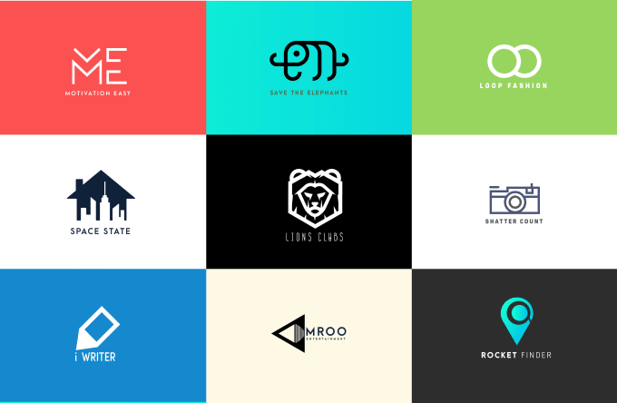
Images in the style of minimalism should not be picky, with many lines, not even vivid, colorful or too angular motifs. Instead, harmonious lines, simple shapes are the top priorities. However, that minimalism still needs to ensure full meaning, clearly expressing the message that the logo wants to convey.
Logo is the face, the first impression on your customers. Therefore, logo design is really important work and needs to invest time and effort. Logo design style 2018 has called minimalism as a trend that has been loved over time. And we firmly believe that this style will continue to grow, be popular and popular in the coming years.
You can create an attractive restaurant logo without relying on fancy images and complicated designs. Because with minimalism you get a mutable secret ingredient. Your customers will immediately recognize your restaurant’s chic personality and delicious menu.
Depending on the expertise, there could be a lot of other businesses trying to attract customers in the future. If you want to grow your lawn care business, create a distinct, minimalist lawn care logo.
If you are looking for a reputable and experienced unit to be able to design a professional and impressive logo and brand identity system , then please contact us immediately by phone. 0988 622 991, or leave your information and requirements, Malu Design ‘s consulting department will contact you right away to answer all your questions!
————————
Malu Design – Branding Identity Agency
Hotline: 0988 622 991

