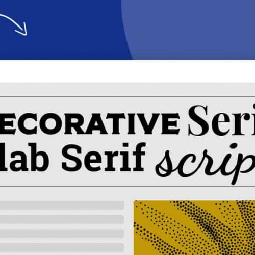
The history of typefaces stretches back to the 15th-16th centuries when writers and scholars gradually rejected gothic typefaces in favor of more classical handwriting.
If you are a graphic designer, or want to become a graphic designer in the future, here are 5 notes about Typography you should not ignore:
What story is Typeface conveying?

Typefaces are not random words tailored to personal taste. Each type of font carries its own stamp of origin and story. Fonts will convey certain messages that designers need to choose purposefully from the start. To choose the right type of font, it is necessary to focus on connecting with the public. Typeface plays a huge role in building community and brand trust.
Master the art of combining typefaces:
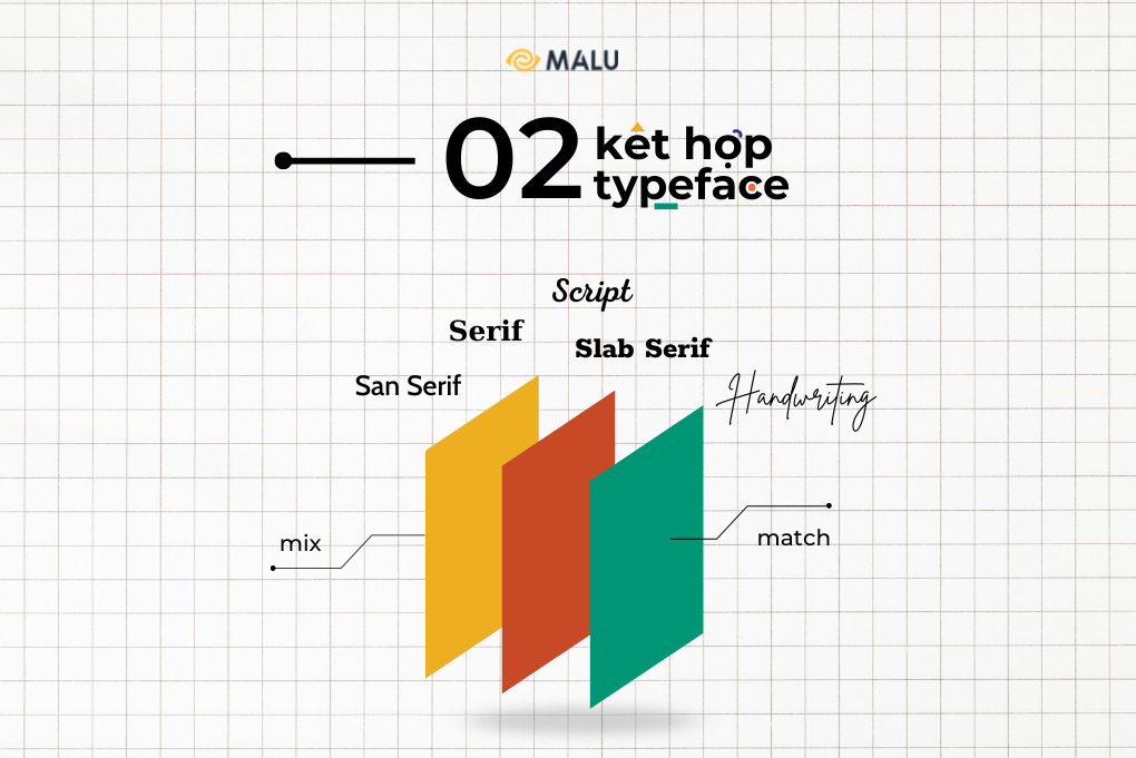
To mix typefaces together effectively is not an easy task. The “mix and match” must be based on the appropriate size, color , material, … Each type of font needs to have a specific role. You can combine large fonts with lighter tones with smaller and darker fonts to give text contrast.
Ask fundamental questions:
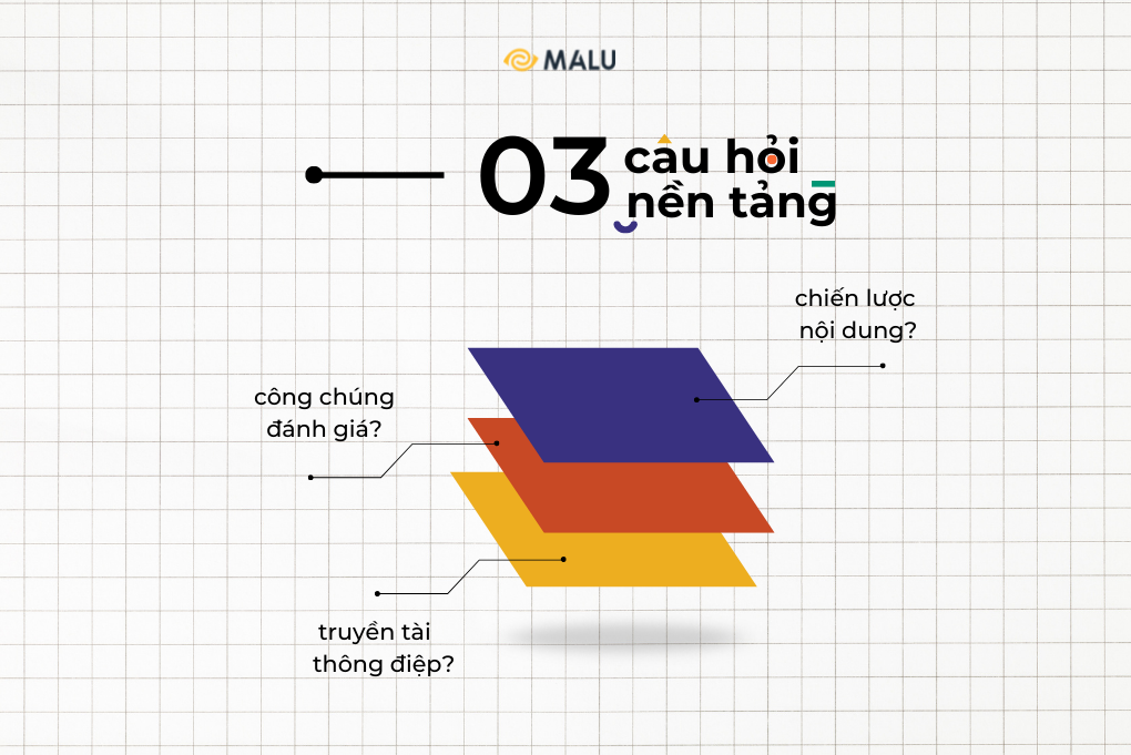
- Is typography suitable for content creation strategy?
- Did the typography convey the right message ?
- How will viewers see the overall design?
Typography is a blend of art and science . Beautiful is not synonymous with efficiency, but requires a rigorous logical calculation.
Easy-to-read, easy-to-understand content:
The first rule in typography creation is that the content must be easily readable by the public. It doesn’t make sense to choose some fancy fonts but viewers can’t interpret the content. A beautiful publication that violates the rules of reading order (e.g. right to left, top to bottom, …) can also be the reason for a drop in sales. The font used for the title can be very effective, but that does not mean that the whole body should use the same font.
Do not stretch or distort the font:
Stretching to make the font longer or wider is not necessary. Especially if to fill the white space in the design. Each font is created by meticulous and detailed technique with the aim of standard shape, size, and texture.
Hopefully, through this article, you can apply useful information and knowledge in creating your own Typography.
>>> Follow other articles at Malu’s blog


