Choosing fonts when designing is like choosing paint colors when building a house. Accurate decisions must be made because the exterior paint will shape the way people judge the people who live in that house.
Fonts when designing also have a similar role. Fonts have the ability to create a connection with a brand. Each font has its pros and cons, as well as the psychology behind it. Therefore, when choosing fonts, businesses need to carefully study these issues. Learn about fonts with Malu Design through the article below.
What is Font/Font?
A font is a complete set of characters (character) including: letters (letter), numbers, punctuation and other special characters (glyph) … in the same shape (graphics) ), format (regular, bold or italic) and size (size).
For example, with the Futura typeface, we have 12 point bold Futura as one font and 8 point lowercase Futura as another.
You may be asking the question: how should typeface and font be distinguished from each other? See more here .
There are many cases of confusion between these two concepts, but it doesn’t really matter, most people are increasingly accepting that the expression typeface or font can be used interchangeably.
The reason for this phenomenon is because “font” – derived from the French “fonte” – originally refers to the complete set of metal blocks used to type on a page during the printing period. imprinted with ancient inscriptions. They need to be identical in style and size. However, in the age of electronic technology, vector-formatted fonts can be enlarged and reduced at will, and so changing the size of a typeface is simpler than ever. Distinguishing between fonts and typefaces is no longer a necessity.
>>> Full set of 1500 beautiful Vietnamese fonts, full for graphic design
What features does the font include?
1. Weight (Bold)
Weight (weight, boldness) of the font is the thickness of the outline (outline) of a character compared to the height of that character. There are many names used to describe the weight of a font, usually in the following fixed order. A typeface can contain fonts with different weights, from ultra-thin (Ultra-light) to bold (Bold) or black (Black):
- Hairline
- Thin
- Ultra-light
- Extra-light
- Light
- Book
- Normal / regular / roman / plain
- Medium
- Demi-bold / semi-bold
- Bold
- Extra-bold / extra
- Heavy
- Black
- Extra-black
- Ultra-black / ultra
Weight is one of the bases that make up the difference between fonts. The title on a large poster needs a bold font to stand out and keep the text in place. Meanwhile, text prefers lighter and thinner fonts.
2. Slope (Tilt)
Italic fonts are more approachable to normal handwriting, because the slant direction of the text is similar to the direction of the wrist when writing and the eye reads, so italic fonts help speed up reading the text. In many sans-serifs and some serifs, only the character thickness or axis of some special characters (e.g. e, o, c… for example) is italic while others remain in the normal type. . Such cases are not counted as italic or oblique but still just a regular font chosen by the designer to increase the font’s intended use.
3. Width
Some typefaces include fonts that vary in the width of the characters, i.e. fonts that are narrower (or wider) in width than regular fonts. However, individual fonts like these are completely different from the case where a font is often interfered with in a narrower or smaller spacing (character width is roughly adjusted on illustrator). This is not good because it affects the spaces between characters and logical text alignment.
4. Size (Size)
Some professional digital typefaces including fonts optimized for certain sizes for construction or print use, for example changing thinner serifs from large to print small to avoid ink pooling on the paper…this has been common since the metal era for most typefaces. Each size will be specially customized and cut to achieve visual similarity.
Size gives the best effect on letter design. Let’s take an example: large posters usually use a font size larger than 72 points, text for display purposes is usually from 19 to 72 points, headlines (heading) from 14 to 18 points – print style bold helps readers easily receive information from a distance. Normal texts from 10 to 13 points are most appropriate, small texts (sms text messages) from 8 to 10 points or small captions 6 to 8 points. For small print documents, italic or serif fonts help speed reading.
5. Ratio
Fonts are established on a grid system to uniformize the shape, proportion, and size between characters and connect different characters in a document. This is a necessary condition to establish a font set.
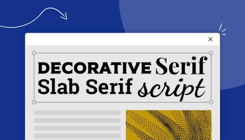
There are thousands of fonts of various designs and styles available everywhere that you can easily download with just one click. But in short, fonts can be classified into 5 common typefaces. Each typeface has its own characteristics and affects the design in different ways.
>>> 16 Website Sharing Beautiful Fonts – Free For Designers
What types of Family Fonts/Typefaces are there?
1. Serif font
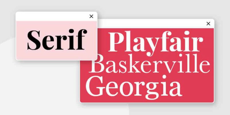
This is the oldest type of font, dating back to the 15th century. The word “serif” refers to the small “footer” at the beginning and end of each letter, inspired by the brushstrokes of ancient artists.
Font Serif can be subdivided into many other types such as: Old Style, Classical, Neo-Classical, Transitional, Clarendon, etc. Today, Font Serif is still one of the most commonly used fonts, typically like “Times” New Roman”. San Serif appears densely in books, newspapers, documents and even logo designs. This is a classic font.
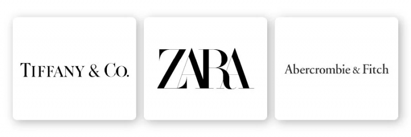
Some typical brands that use Serif fonts are: Zara, Tiffany & Co, Abercrombie & Fitch.
Decoding the psychology behind Font Serif:
Font Serif is used by businesses who want to show their elegance and sophistication. Logo using Font Serif feels:
- Faith
- Respect
- Authority
- Grave
A serif font is a good choice for more traditional brands and niches, including:
- Financial company
- Company of law
- Insurance company
- Advise
2. Sans serif font
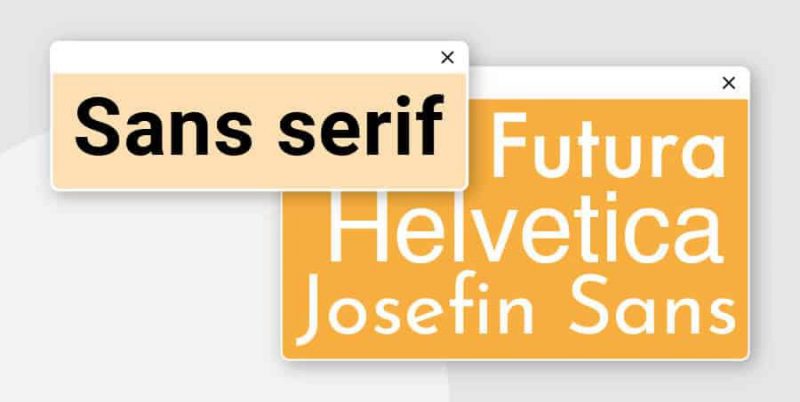
Font San Serif does not inherit its predecessors, but chooses a new and more modern approach. This also makes the serif – san serif duo very easy to combine. San Serif dates back to the 19th century and became extremely popular in the 20s and 30s. Around the middle of the 20th century, designers from Germany continued to develop this type of font. The result was a popular font set called Helvetica as it is today.
This type of font is made up of clean, simple lines. They do not have decorative details but focus on promoting legibility even in all sizes big and small.
San Serif also has sub-branches such as: Grotesque, Square, Geometric, and Humanistic, etc.
Brands that use San Serif Fonts include: LinkedIn, Calvin Klein and The Guardian.

Decipher the psychology behind Font San Serif:
These fonts are often considered cool, smooth, and modern. Due to their overwhelming presence in the technology sector, sans serif fonts are also closely associated with cutting edge and related technology.
Some of the associations and emotional reactions you can have when using sans serif fonts in your designs include:
- Clear
- Modern
- Trust
- Delicate
- Focus on technology
- Advanced
A sans serif font is the right choice for any brand that wants to feel cutting-edge, personal, and sophisticated, including:
- Technology company
- Fashion brands
- Start-up company
3. Slab Serif Fonts
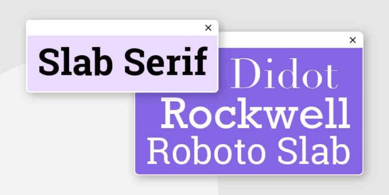
Slab Serif is a variation of the classic Serif font, which appeared around the 19th century. This type of font is usually quite bold and has a relatively large difference from the traditional style. The word “foot” is much bigger and bolder than the original Serif. (So the name “slab” – “board” was born.)
This type of font is recognized for its sturdy, strong appearance and is more suitable for modern brands than classic. Slab Serifs can be rounded or angled, and some even look like handwriting.
Brands that use Font Slab Serif include: Sony, Honda, and Volvo.

Decoding the psychology behind Font Slab Serif:
Slab Serif presents a bold image that exudes confidence, trustworthiness and creativity. Brands that want to create a big push or have a high spirit of improvement and innovation use Slab Serif font.
4. Script Fonts
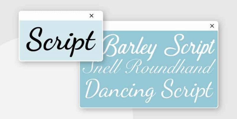
The popular Script font became popular in the 20th century. This type of font reduces the blockiness in print and emphasizes soft, natural lines. Scripts are separated into two smaller categories: formal and casual. This is a type of font that mimics the style of handwriting.
Formal script font – as the name implies, is the most flashy type of font, reminiscent of the beautiful handwriting of the masters of the 17th and 18th centuries. Basically, this font is recommended to use. should be used sparingly, because it affects the readability of the publication. The common script type feels closer, familiar and easier to apply.
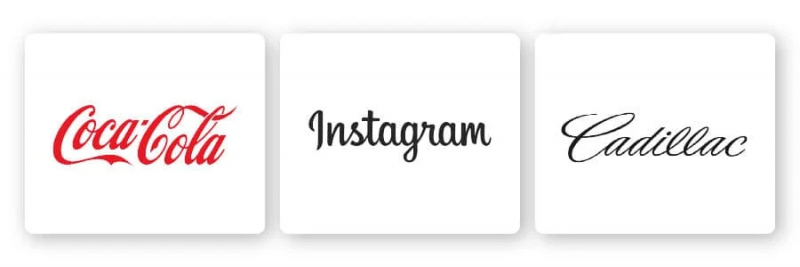
Brands that use Script Fonts include: Coca-Cola, Instagram, and Cadillac
Decoding the psychology behind Script Font:
Some of the emotional connections and reactions you can have when using scripts in your design are:
- Exquisite
- Delicate
- Attractive
- Creative
- Happy
- Traditional
- Individual
- Weird
Fonts can be a great choice for a number of brands and sectors that emphasize subtlety, difference or individuality in their designs, including:
- Food and beverage brands
- Fashion brands
- Brands focused on children
5. Decorative Fonts
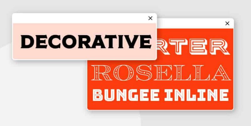
Decorative Fonts or Display Fonts are unique and eye-catching fonts. They are used in a variety of fields and needs. Decorative Fonts are rarely used in long documents but are preferable to lettermark or wordmark logos .
This type of font can sometimes be unsightly if placed on an overly intensive design. Even so, this is still a good choice when used as a logo design.
Brands that use Decorative Fonts include: Toys R’ Us, Lego, and Fanta
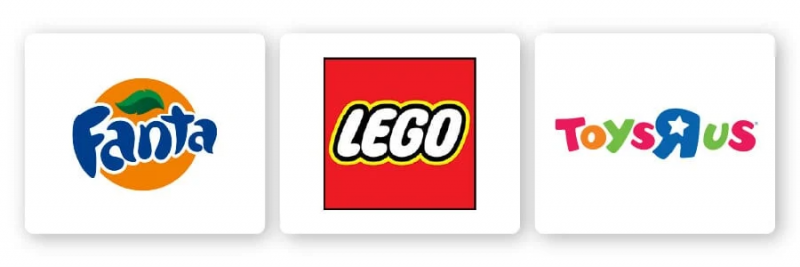
Decoding the psychology behind Decorative Font:
In general, this type of font emphasizes creativity and originality. Its versatility also helps the brand convey specific emotions by varying, combining different colors and designs. One of the common emotions is cheerfulness, mischievousness. It also shows the cultural characteristics, the mark of a certain polite period.
Examples of font psychology in practice
Once you’ve grasped the thoughts and feelings associated with each major font type, let’s take a look at some examples of font psychology in practice and how it works to elicit a response. Certain emotions in his design:
Happy
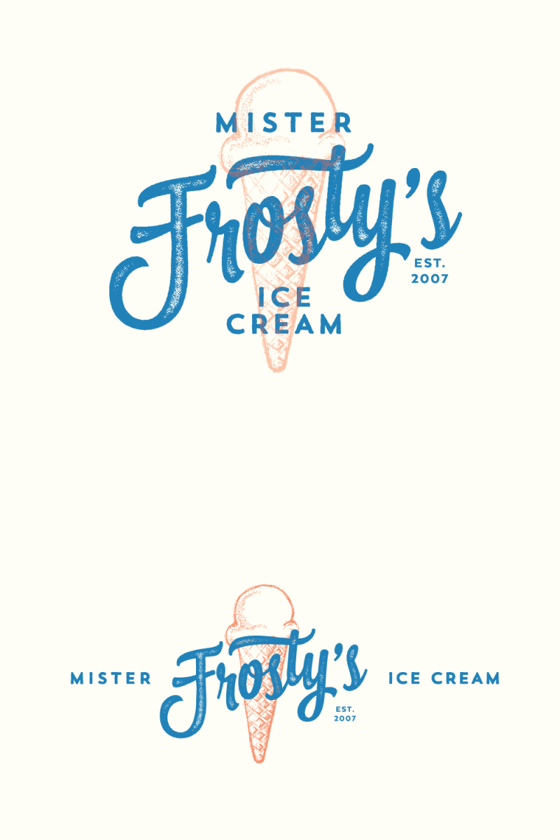
There is nothing happier than a greasy ice cream and the font used in this logo design is sure to spark happiness in anyone’s soul who wants to eat ice cream. The star of the design is the script font with an old-fashioned feel that will bring back fond memories of long summer days spent on the beach. When paired with a straight legless font, overall this design is sure to put a smile on your face.
Strong
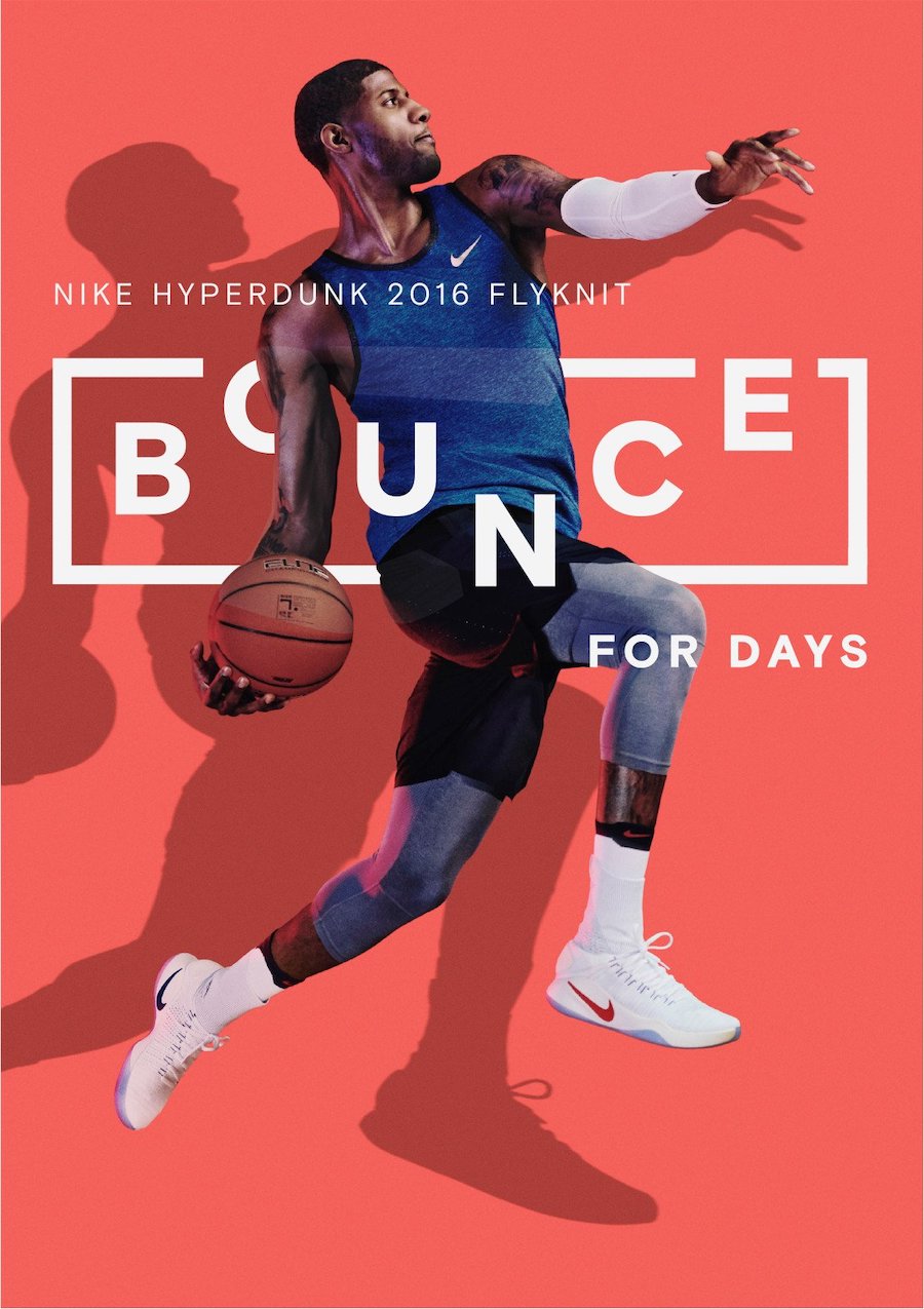
Sometimes the simple and direct fonts are the most powerful. In this Nike ad, the designer has wisely chosen key design elements – including background colors, images, and bold fonts – to create powerful visuals that appear on the screen. image and attract immediate attention.
Power
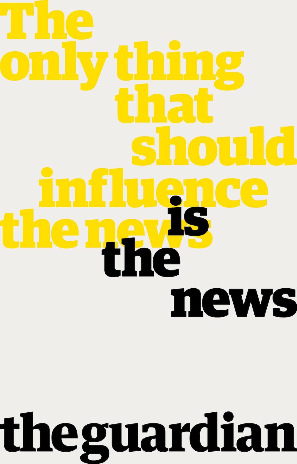
When you want your design to have impact and show authority, a traditional serif font is the best choice. As illustrated in the advertising, The Guardian conveys the clear message that when it comes to news intelligence, they do not take outside influences lightly.
Sad
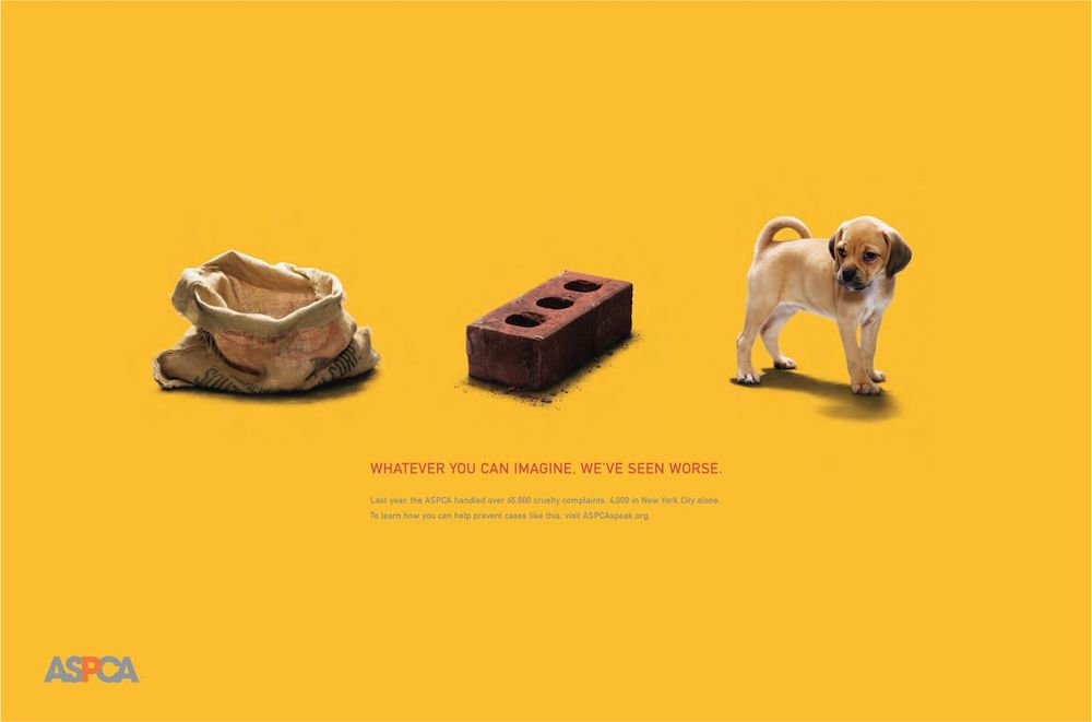
Not all designs are meant to make you feel warm inside. At times, evoking sad emotions can reinforce your message and inspire your audience. In this ad for the American Society for the Prevention of Cruelty to Animals (ASPCA), the designer chose a clean and simple sans serif font that helps create the necessary melancholy space with its message, images, and text. strong (and somber) photos.
BASIC TIP WHEN USING FONT ONLY
While the conventions for print design have been around for a long time, and have almost become the norm, fonts are almost always a topic of interest to designers. Here are some statistics that have been compiled for reference to build into Principles of using Fonts in design. Note that these rules may be popular, but are not always considered the best.
Read more: Terminology in typography
Tip 1:
For the easiest reading, we recommend using classic fonts that have been proven by time to be the easiest to read.
- Most of the classic fonts are very carefully designed with tight strokes and this font exhibits very high legibility.
- We must value and respect classic fonts.
- Practice recognizing each individual feature and feeling their beauty.
Tip 2:
Be careful not to use too many different fonts at once.
- An important purpose of using more than one font is to create emphasis or to distinguish different parts of the text.
- When using too many fonts, the page design becomes confusing and the reader cannot distinguish what is important.
Tip 3:
Don’t mix fonts that look too similar.
- When this happens, looking at the text feels like the font is faulty.
Tip 4:
Using all capital letters completely prevents reading, so use both upper and lower case letters for easy reading.
- Capital letters are difficult to read because the height and bottom are the same, there is no slope up and down, when reading the comb will be slippery and can’t be remembered.
- Stop capital letters in Headline, advertising because of the need for legibility.
- Lowercase letters give the best readability signals, as there are lines that rise and fall within the stroke.
- Using both uppercase and lowercase letters is a standard feature of typing, and it is an agreement that readers are familiar with.
Tip 5:
For text, use appropriate font size for easy reading
- Sizes from 8 to 12 points for an eye-to-text distance of 30-35 cm
- However, for different fonts, the Size is also different
Tip 6:
Avoid using too many different font sizes and strengths at the same time.
- We only use words and weights just enough to clearly identify differences in the text.
- Normally, you should not use 2 different fonts for a text: 1 for the title, 1 for the bodytext.
- Limiting the number of fonts to make the page layout easy to read and attractive.
Tip 7:
Avoid using fonts that are too heavy or too light (Depends on the line).
- The weight of the font depends on the thickness of the stroke.
- If the font is too light, it will create the feeling of being sunk into the background, making it difficult to read.
- Fonts that are too heavy create a strong contrast with the background, making the text difficult to read.
- Ideal for text posts is to use a medium-heavy font
Tip 8:
Use medium-width fonts, avoid using fonts that are too wide or too narrow.
- Breaking the text makes the font wider, or narrower by stretching on the computer, hindering the reading process, these proportions are no longer familiar to us. Instead we can use wide or narrow versions of them.
- Wide (extended) – Narrow (Condenced).
Tip 9:
For texts, the space between words and words must be tight, in order to create an even and fluent structure, not overdoing increasing the space between words and words excessively.
Tip 10:
Line length must be appropriate, too long or too short lines will interfere with the reading process.
- When lines of text are too long, reading becomes lengthy and tiring.
- When the lines of text are too long, switching to other lines will be difficult and cause a line break.
- For short lines, the human eye has to move back and forth continuously, causing eye fatigue and discomfort for the reader.
- Most suitable for each line of 10 to 12 words
Tip 11:
For Text lessons, the spacing of the lines must be appropriate so that our eyes can go from line to line easily.
- On the computer Auto = Font size + 20% size . font size = 10 – spacing = 12pt = loading normally for more openness can add from 1 to 4 pt depending on the font.
- The spacing between lines is too tight, which will slow down reading because our eyes are forced to look at many lines at the same time.
- Depending on the specific characteristics of each font, we can add from 1pt to 4pt to the default.
Tip 12:
For easy reading, we should align the text to the left.
- The default is left align because the reader’s eye is from left to right.
- The center alignment will make the eyes indent in and out except for the “poem” alignment.
- Align both sides justification: pay attention to create holes.
Although in some special cases other alignment methods such as Right, Center, Justified are also used
Tip 13:
When aligning text to one side, the loose side must be tight and rhythmic.
- Avoid ugly and weird shapes created from the line endings.
- Also avoid creating near-identical end points of lines that cause unnaturalness.
Tip 14:
Distinguish paragraphs clearly but carefully, without disrupting the carefulness and clarity of the text.
Normal segmentation:
- Indentation
- The distance between 2 paragraphs is wider
- Create bullets
- There are other ways of segmenting as well, but care should be taken to use them appropriately.
Tip 15:
Avoid widows and orphans whenever possible (Avoid windows and orphans)
- “Widow”: naturally 1 short line is left.
Last line goes through the page.
Last line goes through the page, the first line stays - Orphaned: after falling, the paragraph ends (breaks)
A single word (can bring “table” up, bring 2 words down)
– Widow: is a single dropped line in a row of the beginning or end of the text
– Orphan: A word or part of a word is cut out in a row of the end of the text
– In Quark to fix This error is used
– Both of these should be avoided whenever possible as they disrupt the continuity of the text and affect the focus of the text.
Tip 16:
Emphasize elements inside the text carefully so as not to lose fluidity
- Light colors make the layout more open.
- Never abuse this minimum implementation for maximum results
Tip 17:
Always keep the legibility of the font, avoid arbitrarily stretching by computer.
- If pressed, stretching results in loss of legibility.
- Well-designed fonts have properties that make them easy to read, letters are meticulously and carefully designed with precise proportions.
- Arbitrarily breaking distort them compromises the legibility of the font.
Tip 18:
Always align text on the baseline.
- There are some fonts the designer has calculated that this font should be placed on a horizontal line.
- When they are skewed up and down, legibility is also lost.
Tip 19:
When working with text and background, make sure that there is a contrast between the background and the text. Normally, if the background is black, choose gray text – Web applications.
- When the contrast between the background and the text is not enough, the text sinks into the background, making it difficult to read.
- Black text on white background – easiest to read
- White text on a black background – strong contrast, dizzying and difficult to read
Read more: 5 Typography Notes Every Designer Needs To Know
Message for you
Choosing the right font is a paramount requirement in building a brand identity system. The perfect font can create depth and symbolic meaning for a brand. Thereby connecting and communicating better with customers.
Make sure you choose the right font to highlight your brand image and more effectively convey your core values and mission to consumers.

