When it comes to iconic logos, people immediately think of McDonald’s, Apple, or Microsoft.
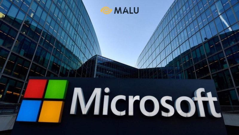
But have you wondered why McDonald’s uses the “golden gate” symbol with a stylized M, Microsoft is 4 squares put together, or Apple is a half-bite apple with well-balanced rounded lines?
The shape in the logo plays an important role in the aspect of brand awareness – brand awareness , besides fonts and color elements.
So what is the meaning of shapes in logo design ? How to choose the right shape for the brand logo? Let’s explore together with Malu in the article below.
Refer to Malu’s Logo design service .
1. The importance of shapes in logo design
There are many metrics that show the impact of logos on customers’ perceptions of brands. A study from the University of Florida (USA) in 2011 showed that: IBM’s plaid logo makes the public associate this business with new ideas and reliability in products and services.
One of the basic principles in logo design, is that shapes can be used to change the perception of a brand by customers. The reason for this is that the human brain tends to associate shapes with distinct meanings . This is the operating mechanism for humans to learn and survive.
That’s why customers often remember brand logos with unique, simple designs that contain deep meanings.
>> 6 Things That Make an Impressive Business Logo
2. The meaning of shapes in logo design
Let’s dive deep into Malu to find out the meaning of each shape in logo design:
Circle
Circles are often chosen in logo design. In fact, up to 20% of the world’s most valuable brands use circular shapes as the main theme in their logos.
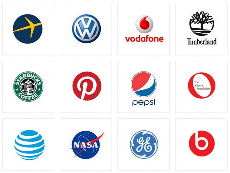
Using circles, you can convey the following messages:
- Positive message: Circles show friendliness, softer than angular blocks like triangles or rectangles.
- Solidarity and unity: The circle reminds people of a ring, which symbolizes a lasting commitment and solidarity between the parties.
- Strength: The circle represents strength and sustainable development, inseparable, indivisible.
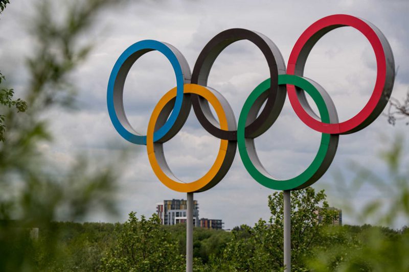
The best example of a logo that uses a circle is the Olympics symbol. The 5 rings of the Olympics represent the 5 continents. People without distinction of race or color from all over the world, gathered in a global sporting event, united towards a bright future.
Square
The square in the logo design symbolizes balance, strength, safety and professionalism.
Some of the big businesses use squares to convey the “story” behind the brand:
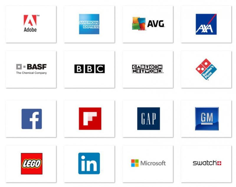
For Microsoft, the four squares represent the diversity of the technology company’s products, as well as remind customers of its most famous product: Windows.
With Lego, the red square in the logo not only helps customers associate the typical Lego building block. Further, Lego wants to convey the message: Parents can safely let their children play the puzzle without having to worry about anything.
For the BBC, the square represents strength, balance and honesty in the delivery of news.
>>> What is Brand Story? Steps to Telling a Compelling Brand Story
Triangle
Triangles are not often used in logo design. However, the triangle block can still give you many unique design ideas, such as a progressive attitude, dynamism and the spirit of breaking the limit.
The reason the triangle gives people energy is because its shape is navigating. The sense of security that you usually see in a round or square block no longer seems to be evident.

The strength with angular lines is also the point that industrial manufacturing companies need in their logos, like the three triangles in the Mitsubishi logo, the iconic golden triangle in the construction company’s design. CAT,…
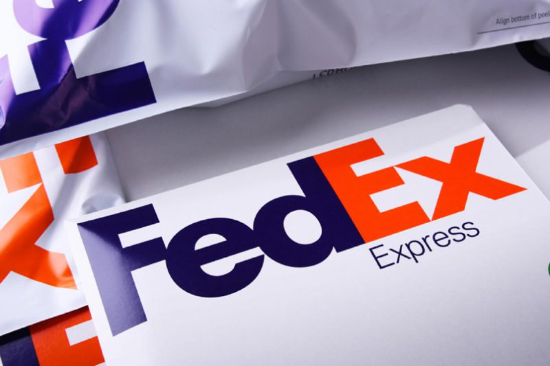
In some cases, it is not necessary for businesses to directly use the triangle in the logo. Take a case like FedEx, for example, they cleverly combine the letters “E” and “x” into a triangular “arrow” pointing up, conveying the company’s slogan: “The World on Time”.
Line
Not limited by framed shapes, many businesses choose lines to form shapes for their logo design.
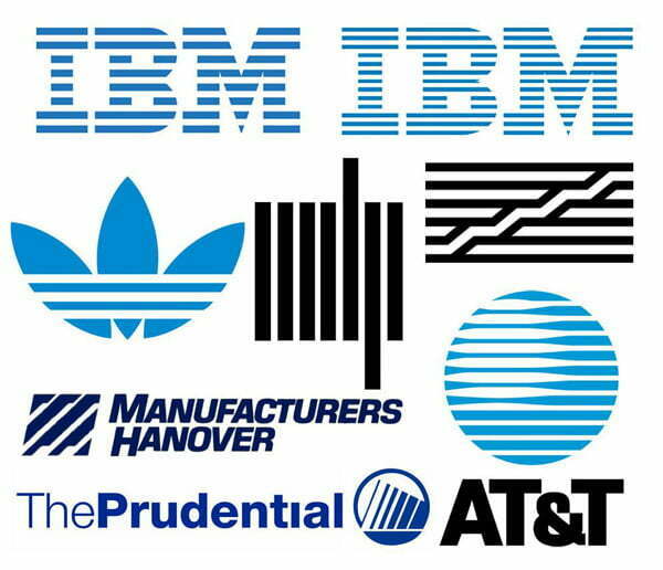
If vertical stripes make the logo slimmer and more refined, horizontal stripes evoke a feeling of relaxation and peace. Depending on the personality of the brand, you have the right choice of cubes.
Free cubes
Some unique logo designs use freeform shapes, like spirals.
The spiral shape can create the impression that this is a business that specializes in providing services on pharmaceuticals and biological products.
Besides, other free shapes give the viewer a feeling of friendliness, closeness and naturalness.
3. 6 ways to use shapes in logo design
Now that you have a basic understanding of what shapes mean to the viewer, it’s time to apply what you’ve learned to conveying core values in logo design:
Choose the right cube
As mentioned, each different type of block will give viewers different feelings, such as:
- The circle creates a sense of sustainability, longevity, cohesion and unity.
- The square gives a sense of security, strength, and discipline.
- Triangles emphasize growth, breakthrough, and challenge.
- Vertical stripes create a delicate, slim feel.
- Horizontal stripes give a feeling of peace and relaxation.
- Free-form shapes emphasize friendliness, comfort, and naturalness.
Know how to combine colors and shapes
Logo design does not stop at the choice of shapes, the combination of colors also directs the emotions of the viewer to a new level.
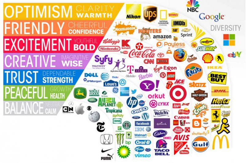
As IBM’s horizontal stripe symbol represents relaxation, the combination with blue makes the viewer feel safe and secure in using its products and services.
There are a few rules of color coordination with shapes you should keep in mind: light tones (like yellow) work well with triangles, reds go well with squares, and blues go well. with round block.
>>> 5 Must-Have Features Of A Good Logo
Choose the right shape for your business
Some shapes are especially suited to specific business lines. For example, companies providing services and education should use circular blocks in their logos, which give the viewer a sense of sustainability, friendliness and warmth.
Meanwhile, businesses in the fields of finance and business should use squares and triangles as the mainstay in logo design to show safety, trustworthiness and development.
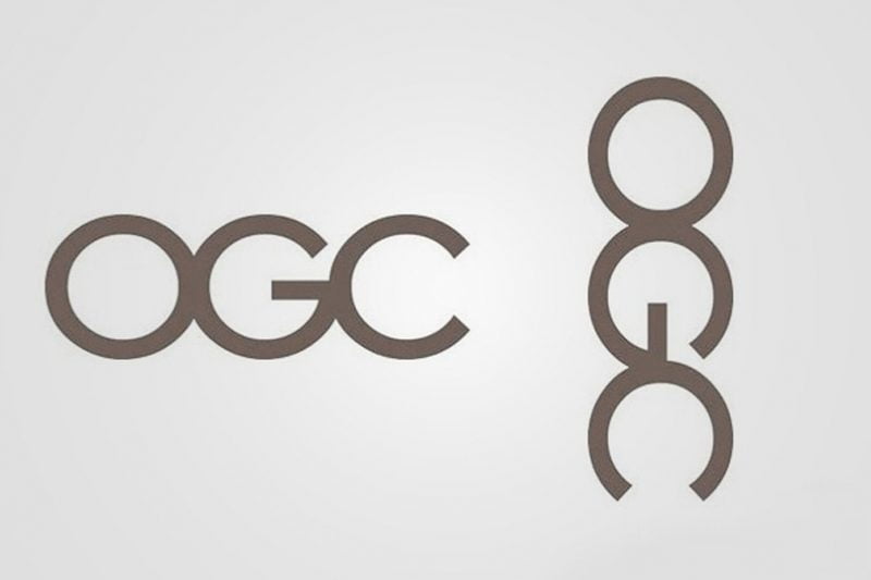
Be careful to choose the right shape
When choosing shapes in logo design, you need to consider carefully. What you want to convey is one thing, how the customer perceives that message is another.
>>> 5 Tips for Product Design, Impressive Packaging for Brands
Consider typographic element
Typography itself when combined together can create a certain shape, like a circle, a rectangle, or an arc.
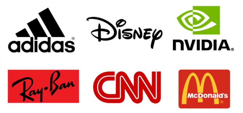
Each typeface also contains its own meanings: As thick typography often feels solid, durable, impressive; Thin typography creates a relaxed, fresh, playful feel.
Simplicity
One of the most important things in logo design, is simplicity. Simplicity not only helps you generate new ideas, follow the trendy minimalist trend, but also easily convey the message to target customers.
One of the most effective ways is to minimize shapes, that is, to turn complex shapes in real life into stylized shapes. Take a look at the process of transforming the Apple logo, you will realize how the meaning of minimalism affects the value of the brand.

Epilogue
Logo design is not as simple as you think. Many large businesses are willing to spend millions of dollars and months to design a satisfactory identity.
Intuition and idea are always two concepts that go hand in hand. If you master the meanings behind the shapes, and combine them effectively with color and typography, you can completely create a beautiful, sophisticated, simple logo design that conveys a lot. positive message.
>>> Find out more impressive articles about logos:
- 90+ Logo Templates for Finance – Banking, Investment Funds
- 100+ Logo Templates for Medical, Pharmaceutical, Health, Hospital Logos
- Collection of 80+ Beautiful, Impressive Travel Company Logo Templates
- 60+ Education Logo Templates, Beautiful School Logo Templates
- 99+ Beautiful, Professional Real Estate Company Logo Templates


