The creativity and high customizability of the pattern in the design is something that no designer can ignore. So for a brand, what applications do patterns have? Let’s find out in the article below.
If you are reading this article and are a newbie, still not clear about the concept of pattern, please refer to the article What is a Pattern? Types of patterns commonly encountered in design to better understand.
1. Why should your brand use patterns?
1.1: Pattern makes a strong impression on viewers
Our brains recognize and remember patterns more easily than other images. The use of patterns in the identity not only helps customers recognize the brand in an instant, but also helps them remember the “face” of the brand longer.
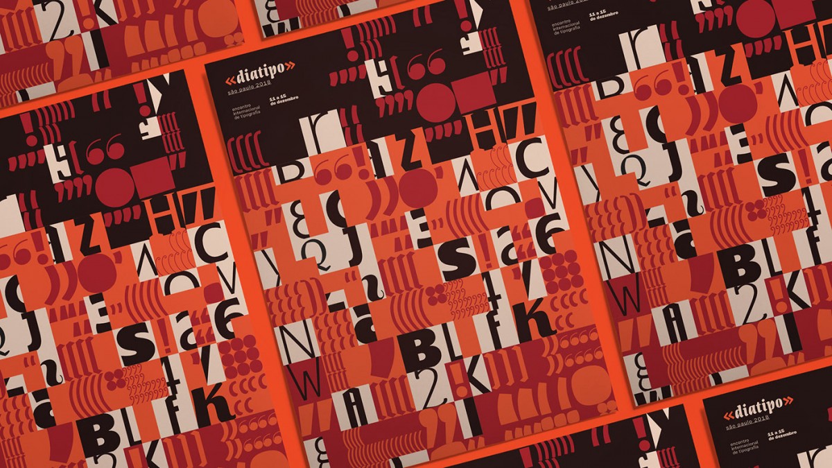 Source: Behance
1.2: Convey the message easily
Color is an incredibly powerful tool for conveying messages, but patterns can do so much more. Not only stopping at the message, the pattern also most accurately represents the brand personality and product characteristics; this will help you better “educate” your target customer about your brainchild.
For example, the plaid pattern would work well for elegant, preppy brands; pattern in art deco style is the “best friend” of brands with bold vintage breath; A personality brand will love impressive graphic patterns;…
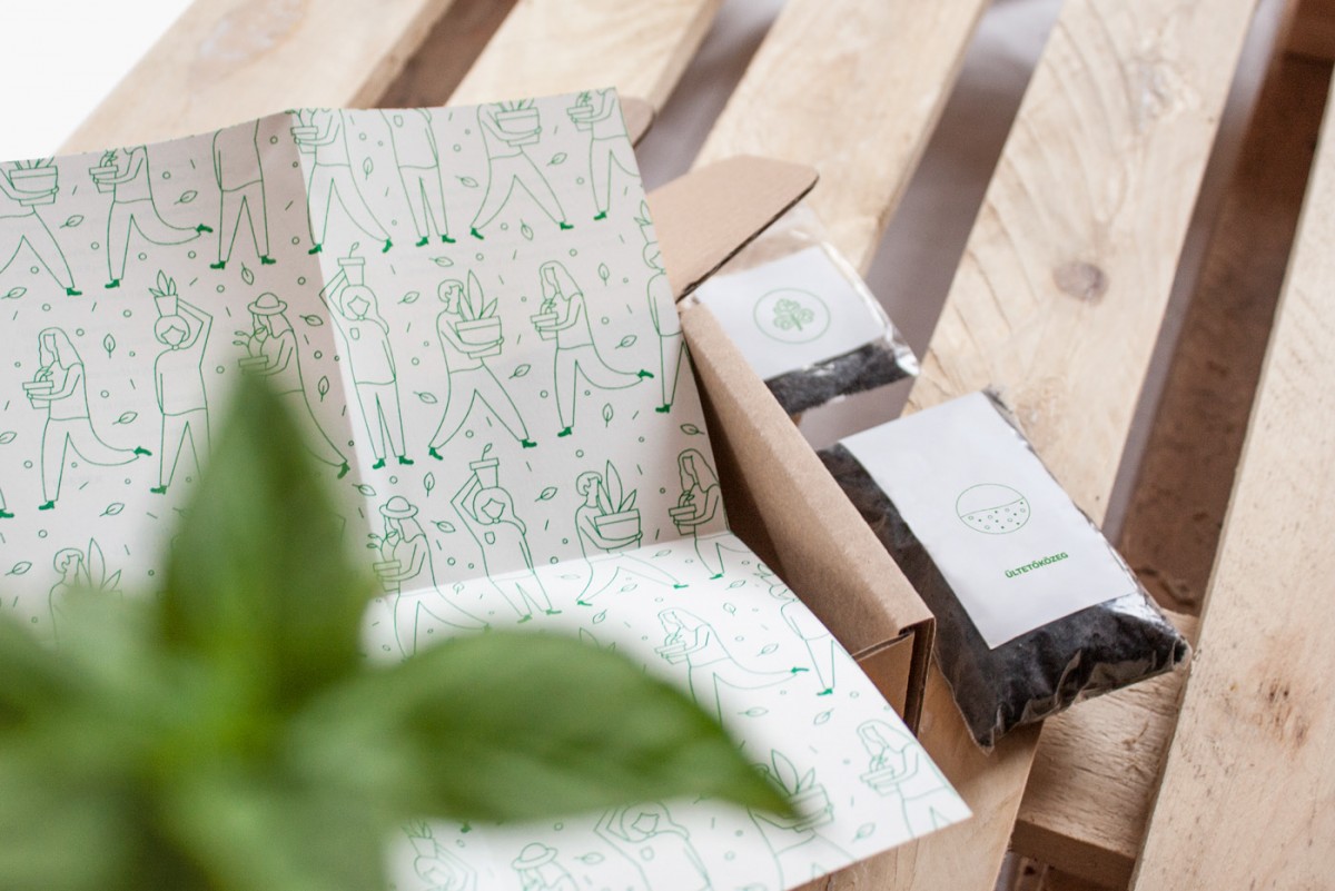 Source: Behance
1.3: Increase awareness & consistency
For a brand, a pattern will include one or more elements used in the identity (logo, color, etc.). This will increase your brand consistency, helping to increase coverage without you having to repeat boring old designs.
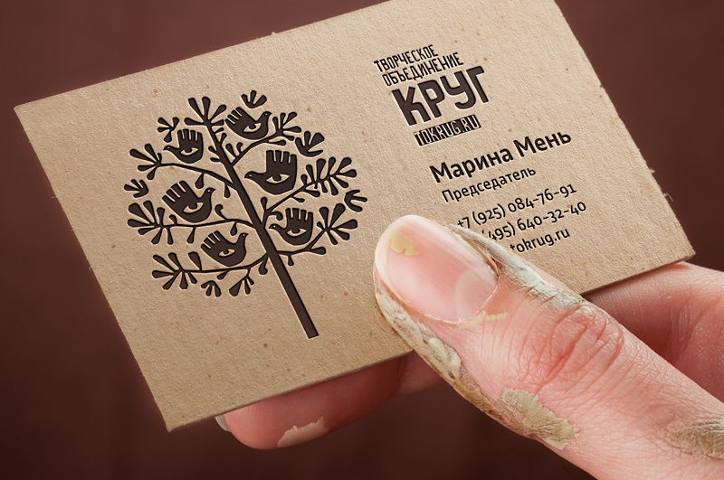 The logo of this brand…
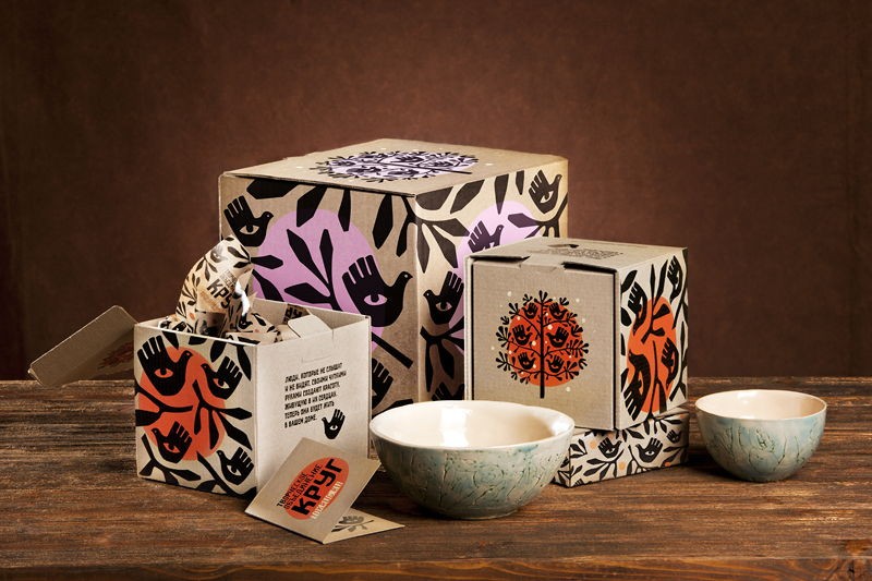 …used as the main image in their pattern (Source: 99Designs)
2. The secret to using patterns in the identity kit effectively
2.1: Pattern must be balanced with other details
Pattern when standing alone is extremely prominent because it consists of many components. Therefore, when designing an identity, you need to make sure that it does not overwhelm other important information (name, product introduction, logo, …). A small tip for designers is to limit overly cumbersome drawings and increase the distance between them to make the overall design more harmonious and balanced.
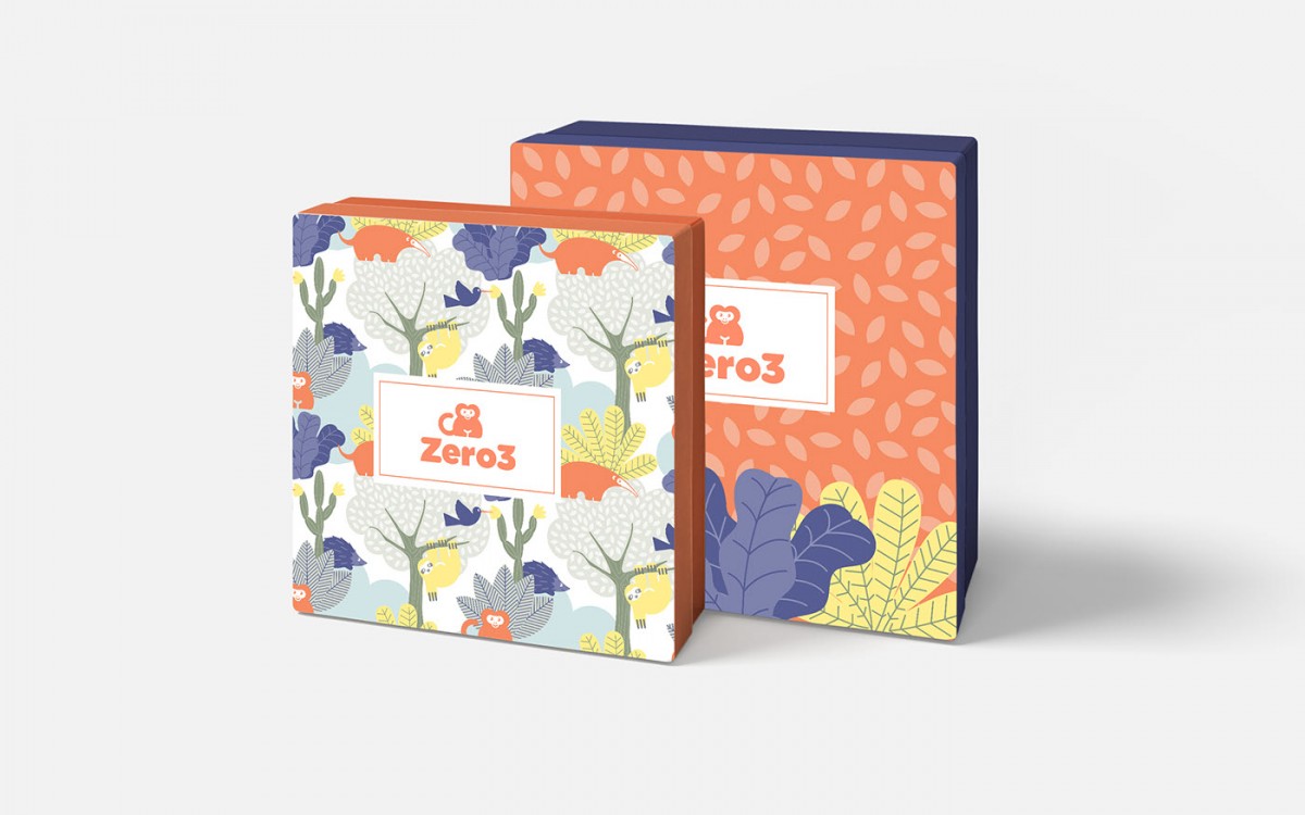 Thanks to the proper spacing and use of colors (the colors aren’t too contrasting), this pattern makes an immediate impression but doesn’t overwhelm the important information.
2.2: Pattern must match the brand
Patterns are very effective in conveying emotions to the viewer. To choose the right pattern, the designer first needs to have a clear understanding of the target audience and the message the brand wants to convey. For example, floral pattern is a common pattern in design but you cannot use it for any brand. Imagine a business card of a law office with a colorful floral pattern on it – it doesn’t make any sense, does it? However, if it is a flower shop or a cosmetic company, the floral pattern is a great choice because it evokes a feeling of femininity and lightness.
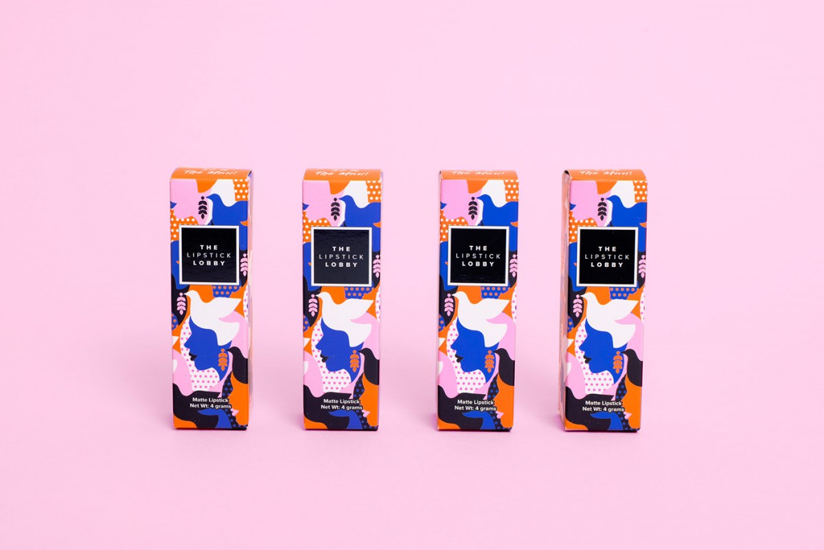 Source: Behance
2.2: Color of the pattern
When choosing a color for the pattern, we usually immediately use the color of the brand. This makes perfect sense, but you can totally add a few other tones. Make sure you know the audience your brand is targeting. Bright and vibrant colors will suit students-students; while deep tones or pastel colors will be the appropriate choice for more mature subjects. If you are targeting a modern group of people with a high standard of living, choose a minimalist color.
Your brand is still in the process of forming and you do not know which color to choose? Don’t worry too much because we have a very effective way to choose colors for brands .
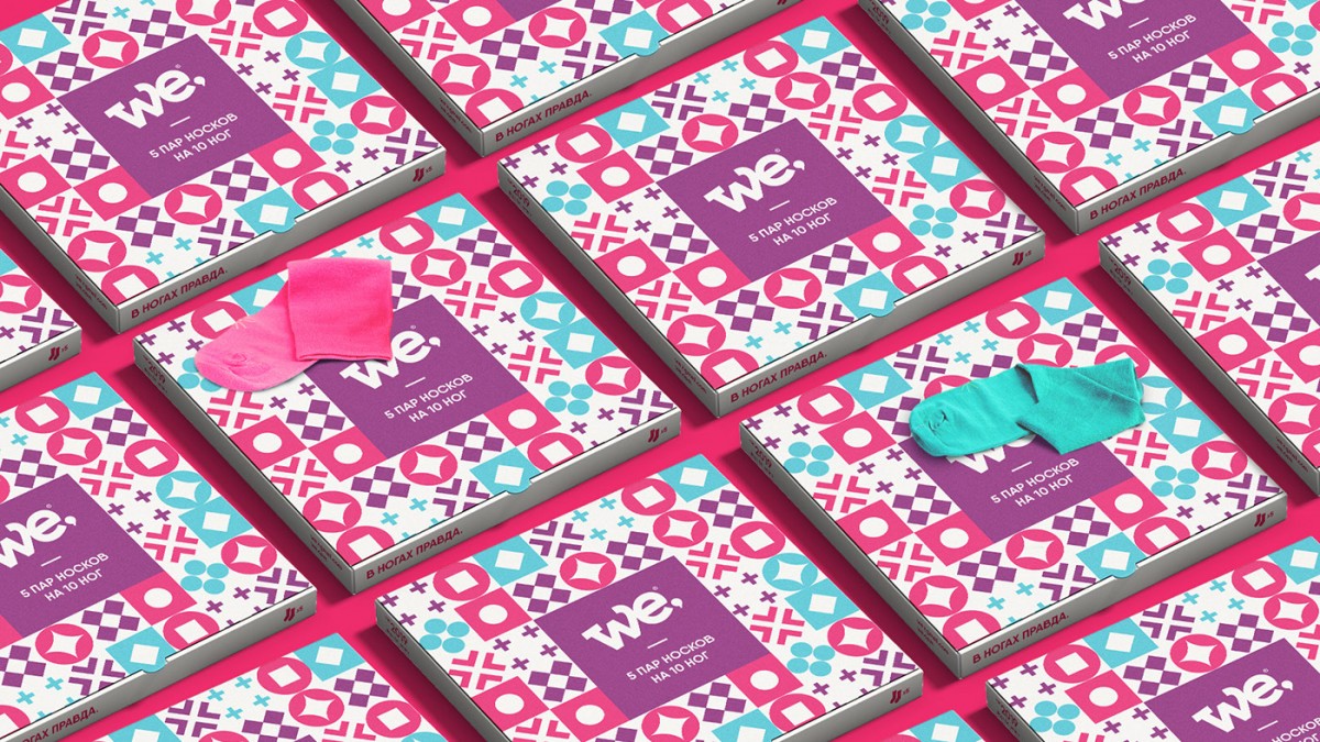 Source: Behance
3. 10 inspirational patterns
If you are looking to apply a pattern to your brand identity, check out the 10 patterns below for inspiration.
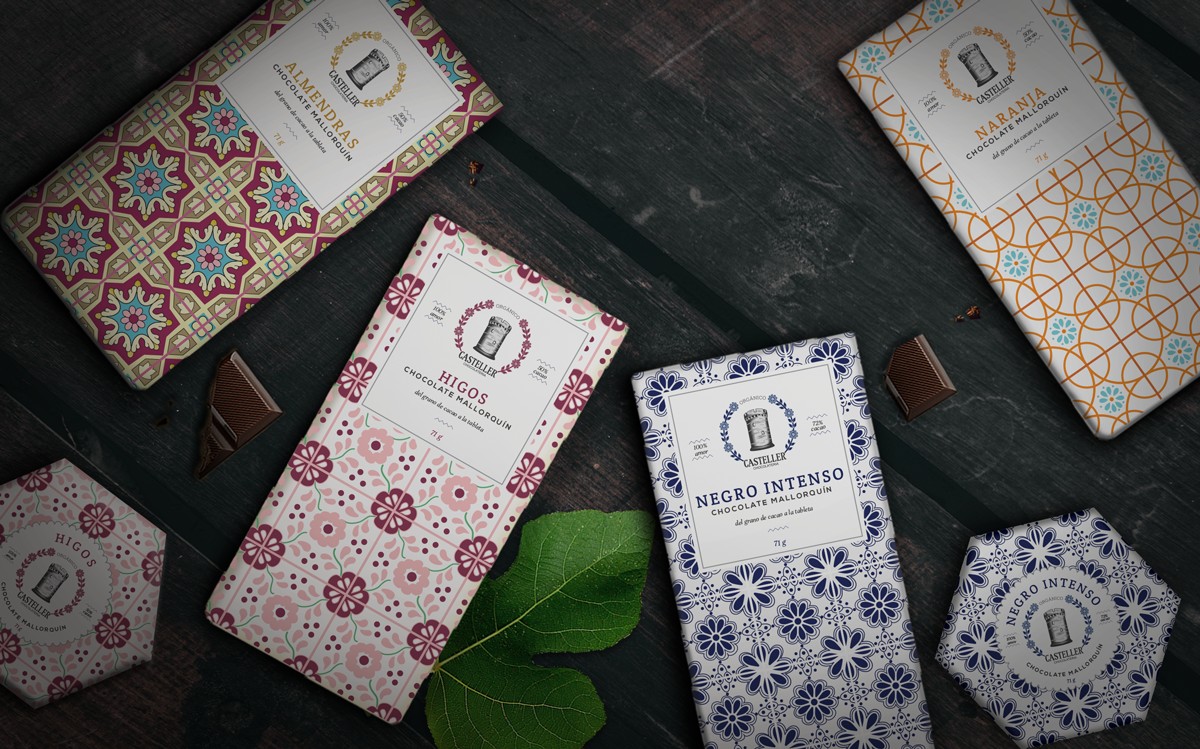
1. Product packaging design Castella Chocolateria (99Designs)
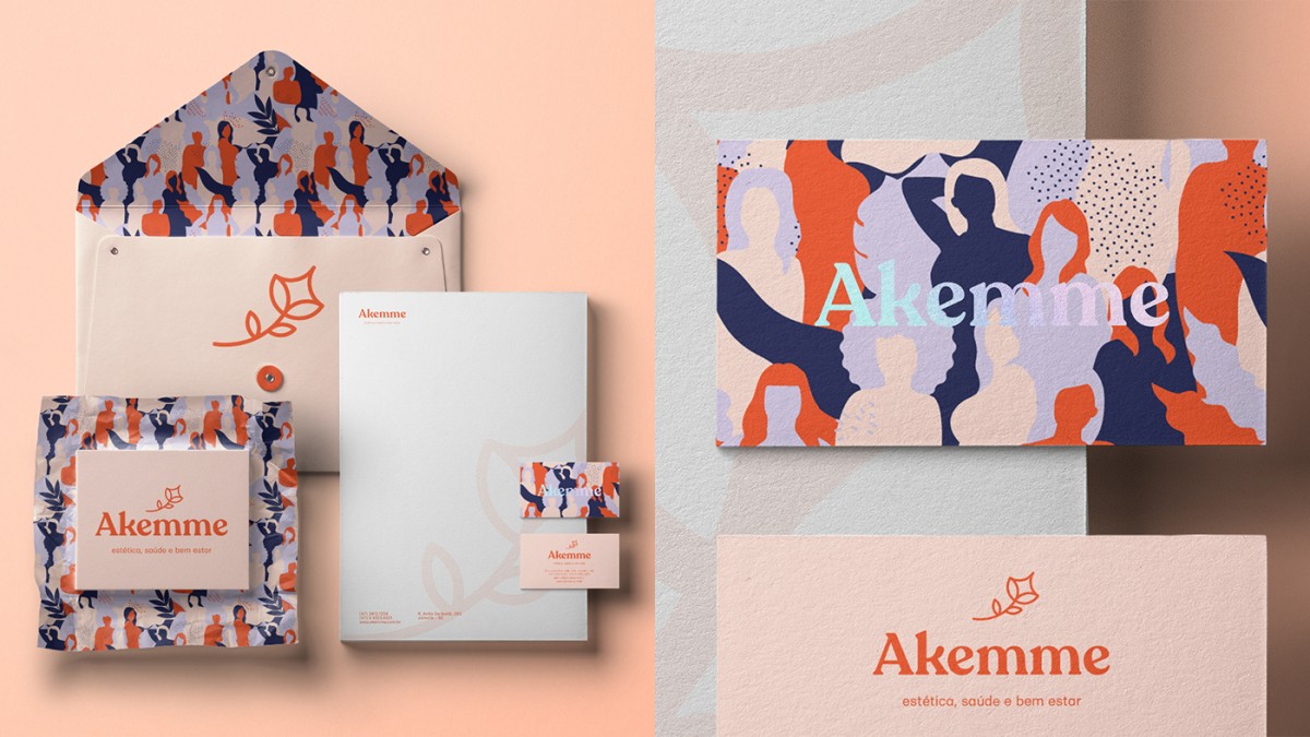
2. Akemme brand identity (Behance)
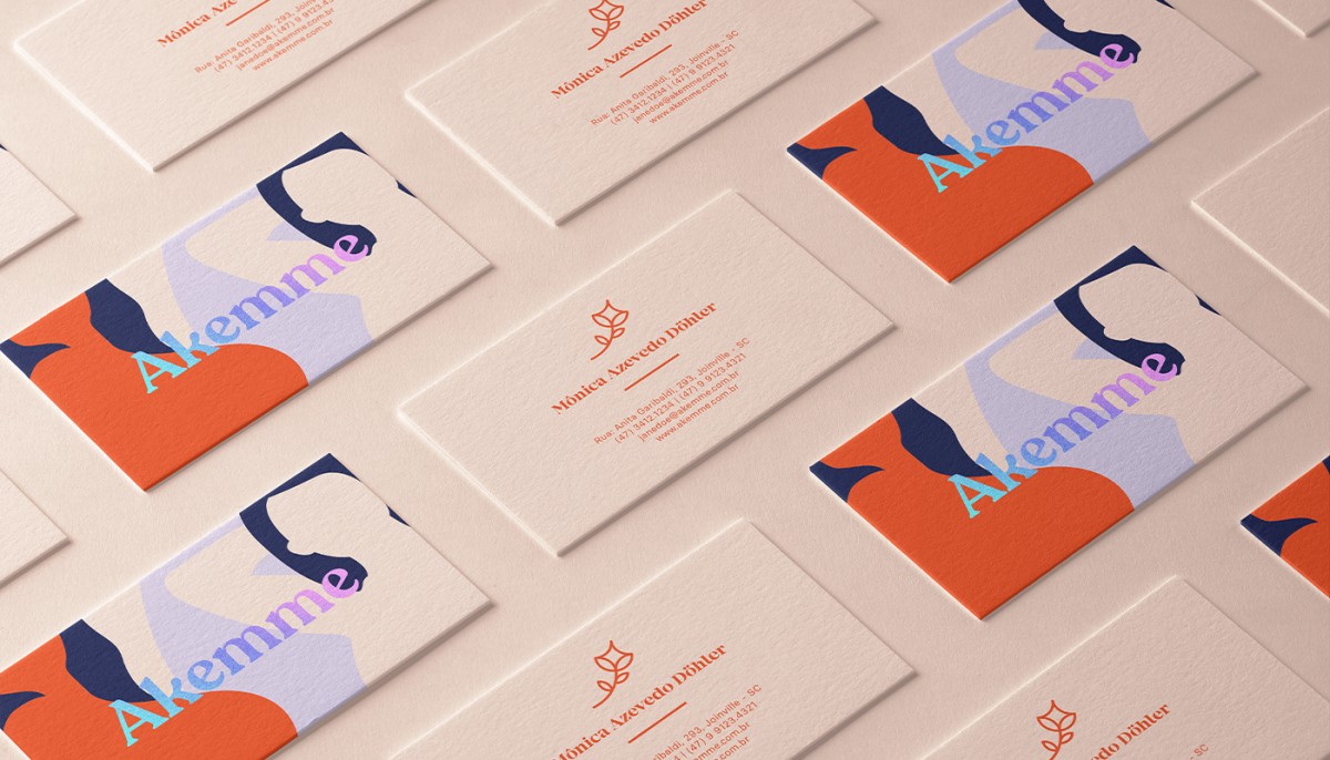
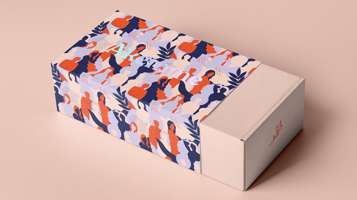
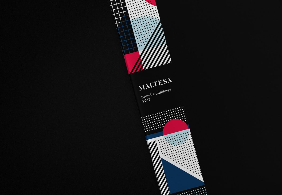
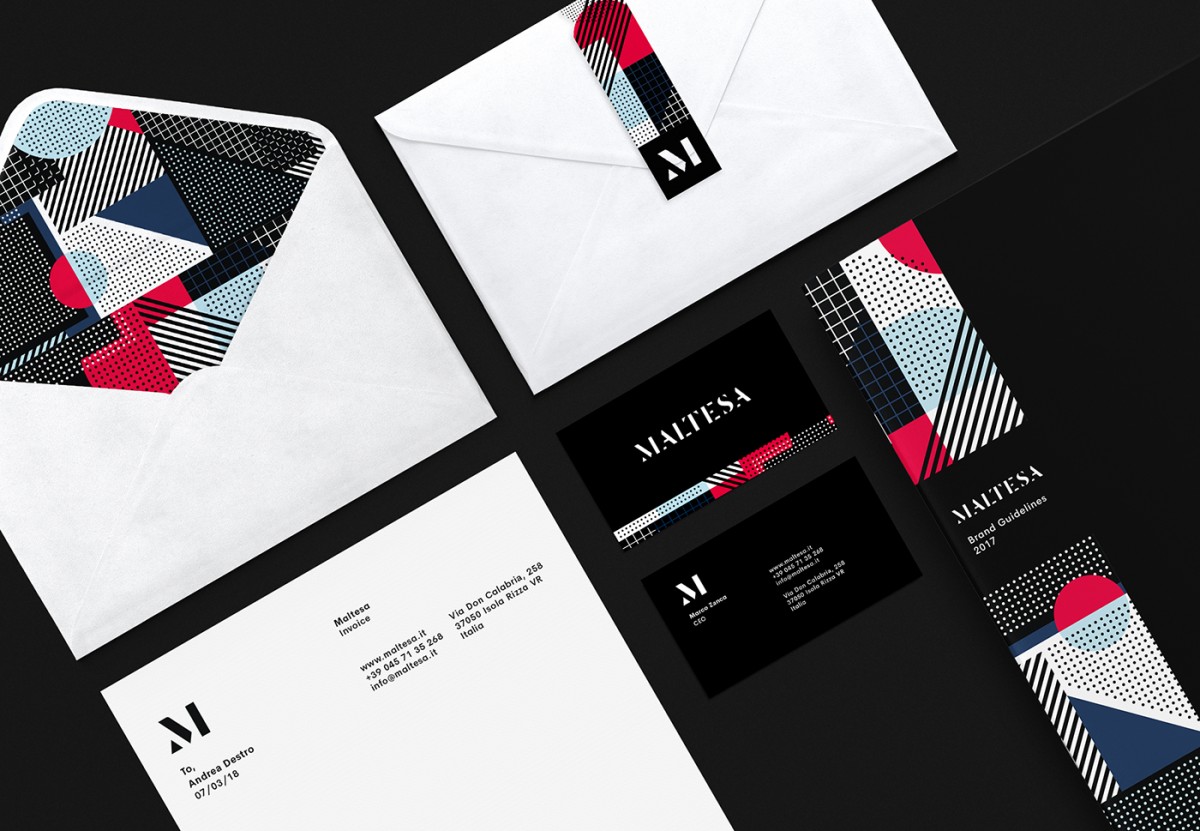
3. Maltesa brand identity (Behance)
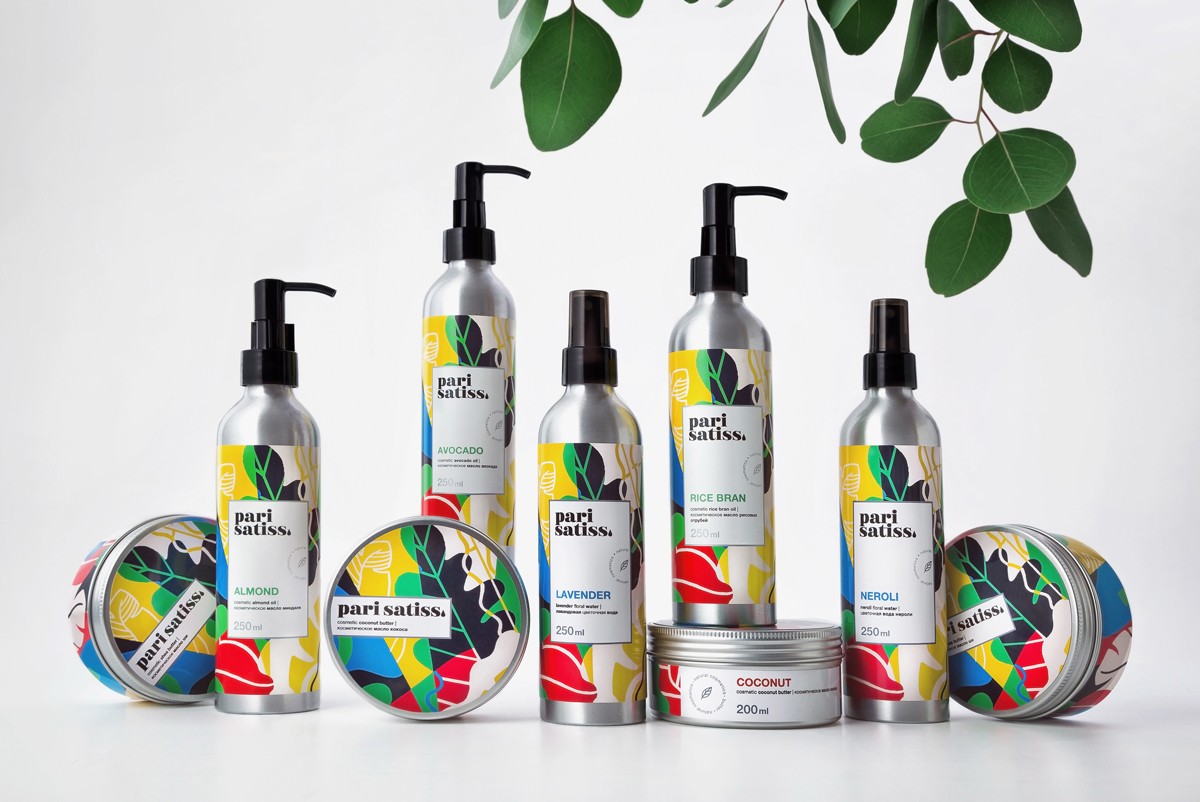
4. Pari Satiss (Behance) cosmetic line packaging
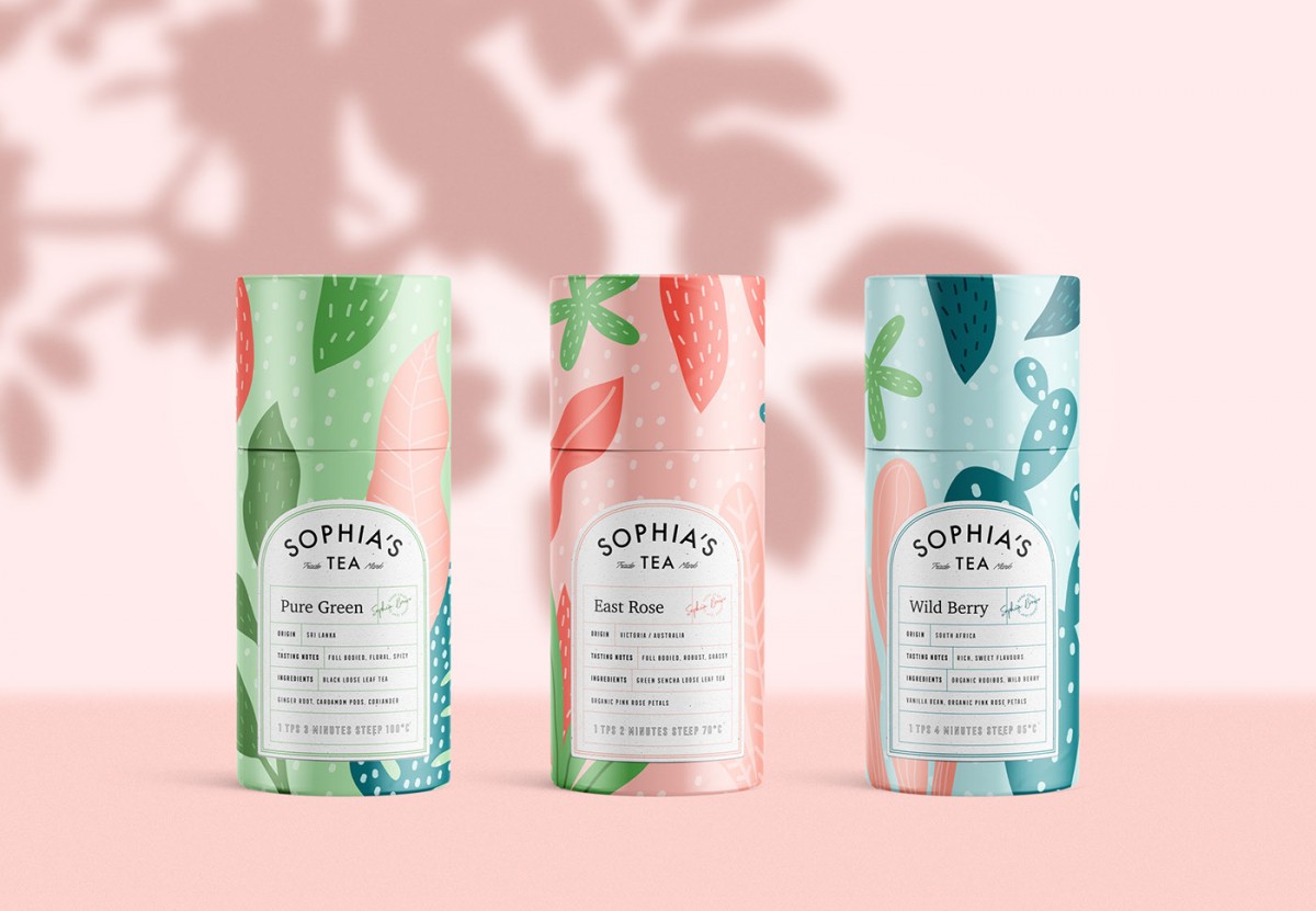
5. Sophia’s Tea (Behance) tea product packaging
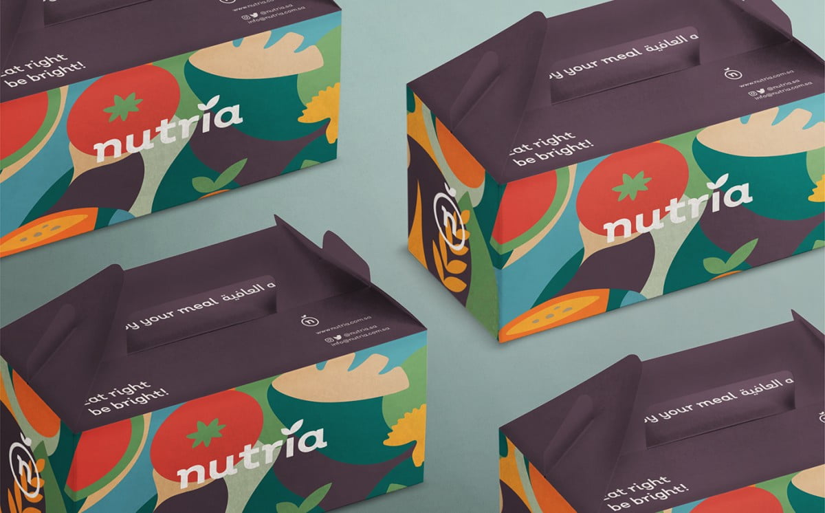
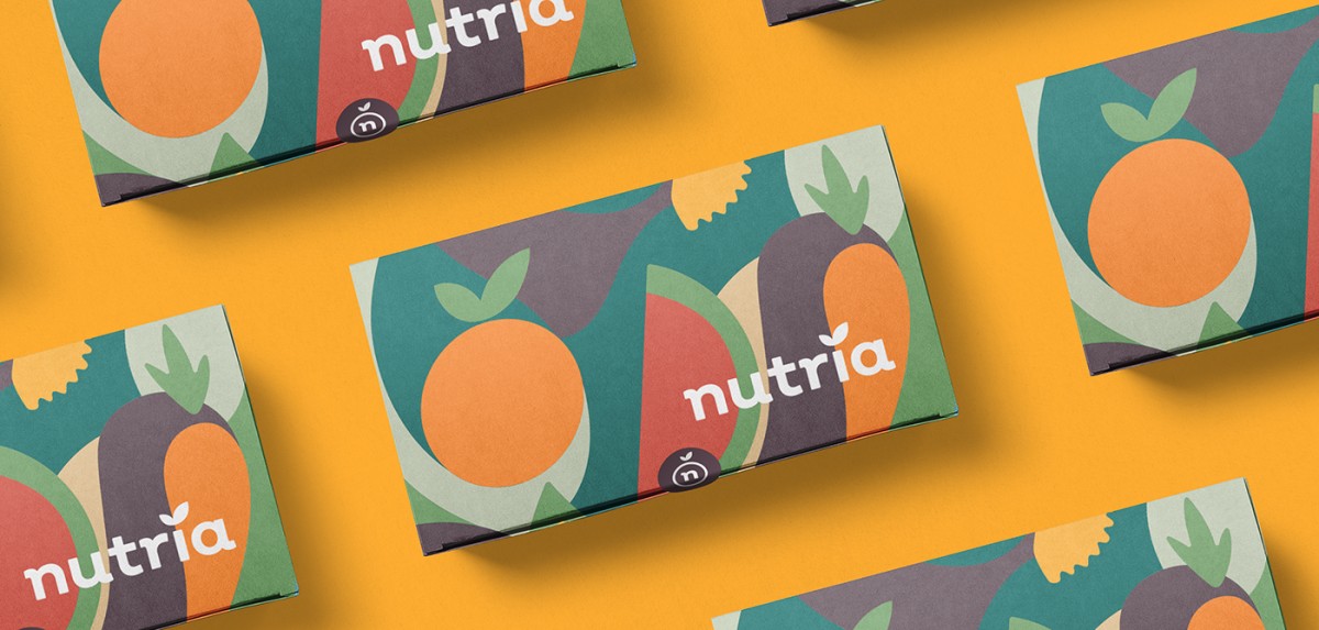
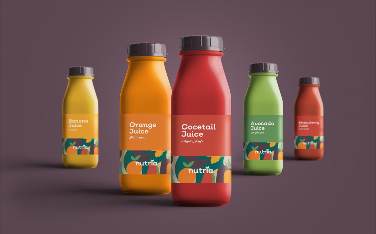
6. Nutria product packaging (Behance)

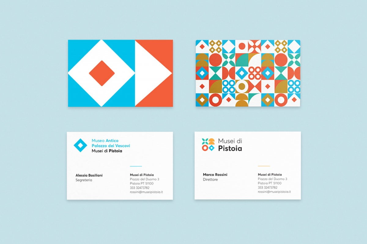
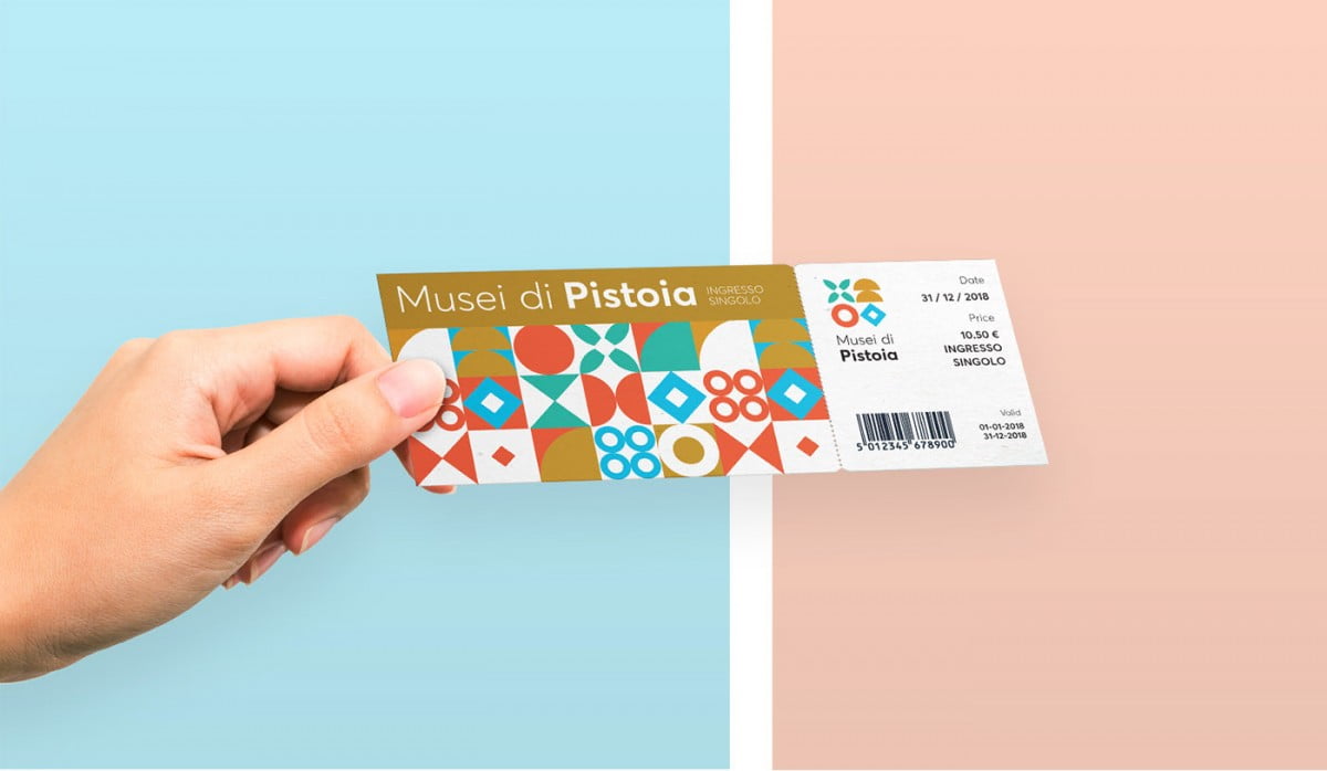
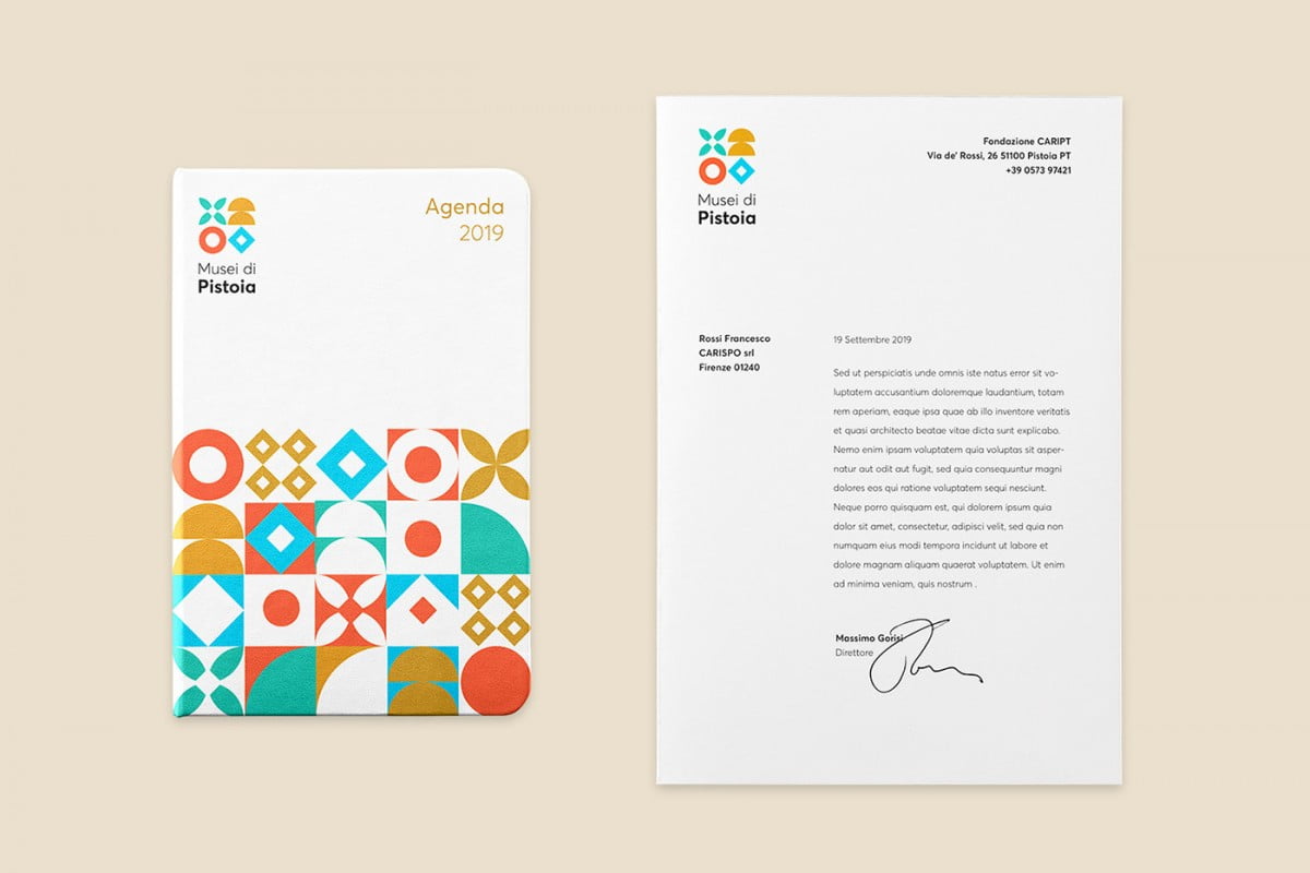
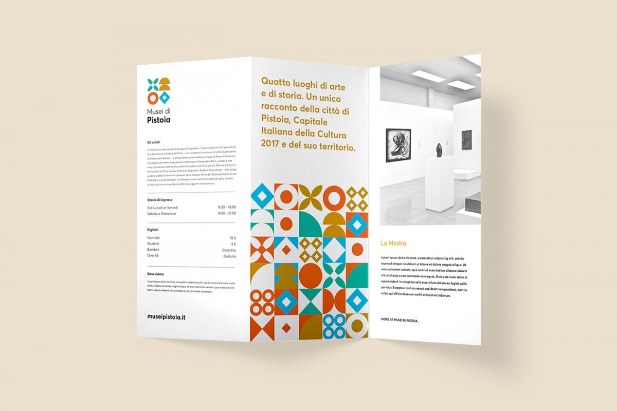
7. Event media publication Musei di Pistoia (Behance)
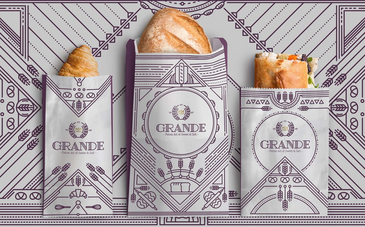
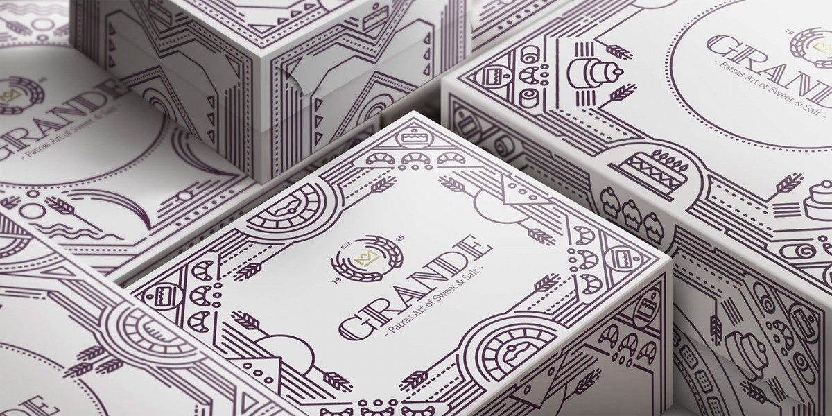
8. Product packaging GRANDE (Behance)
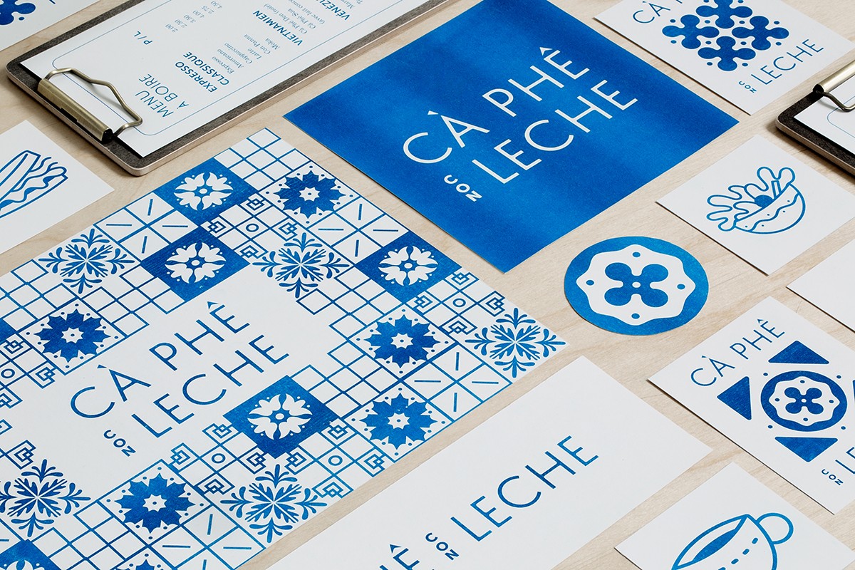
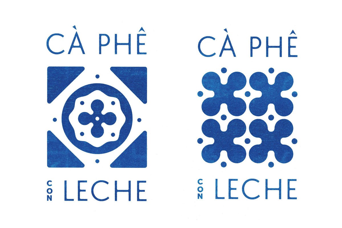
9. Con Leche Coffee Brand Identity (Behance)
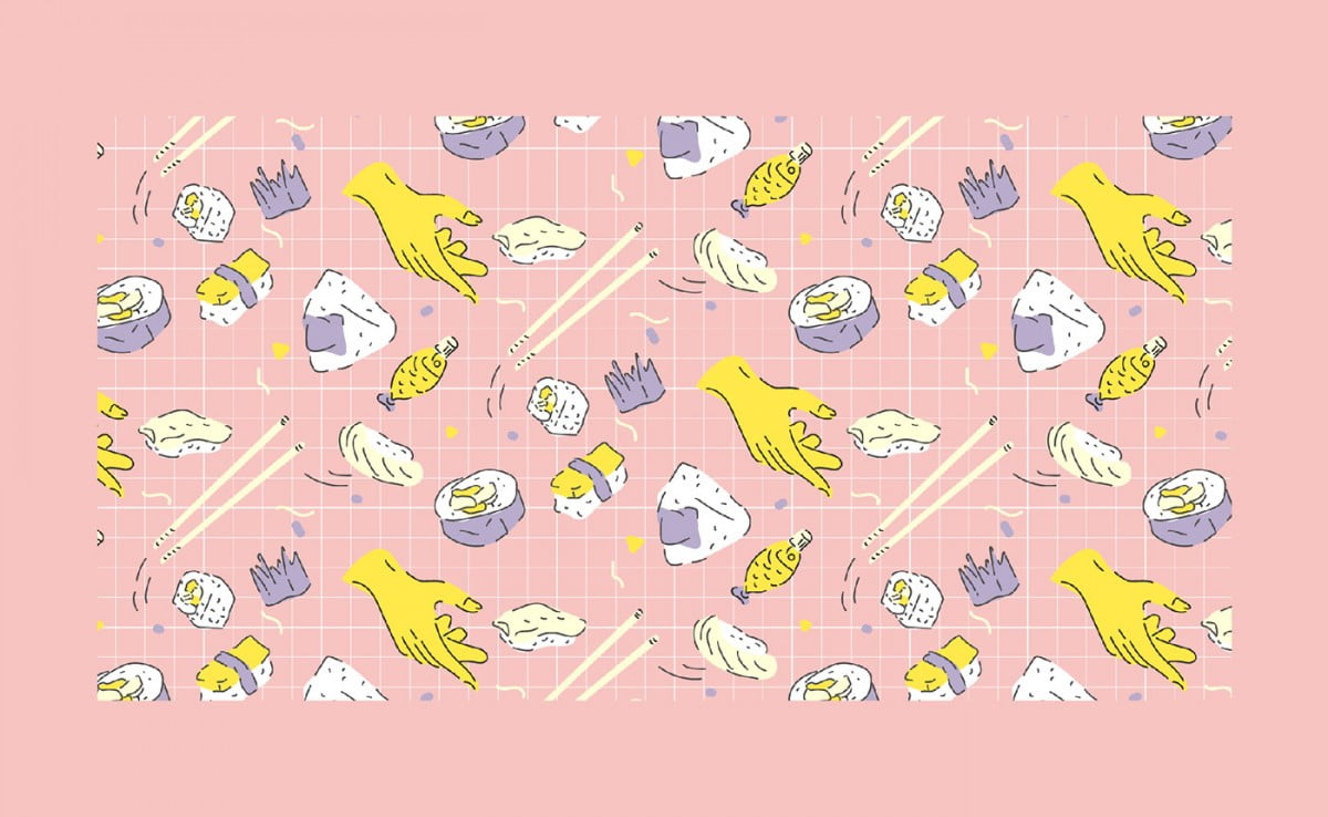
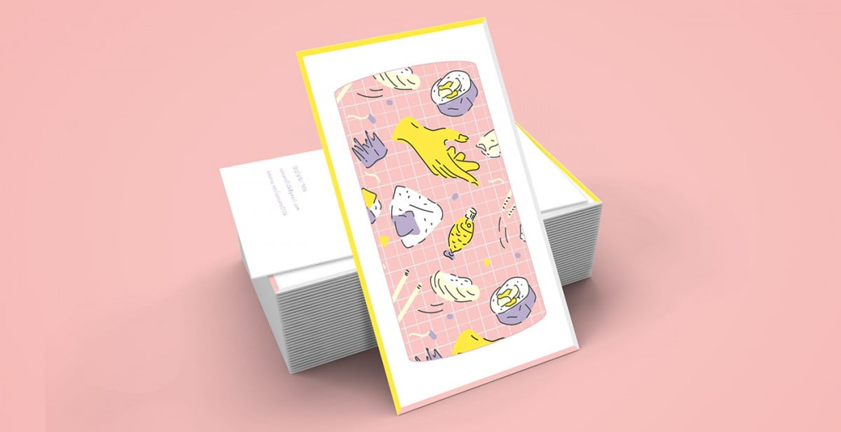
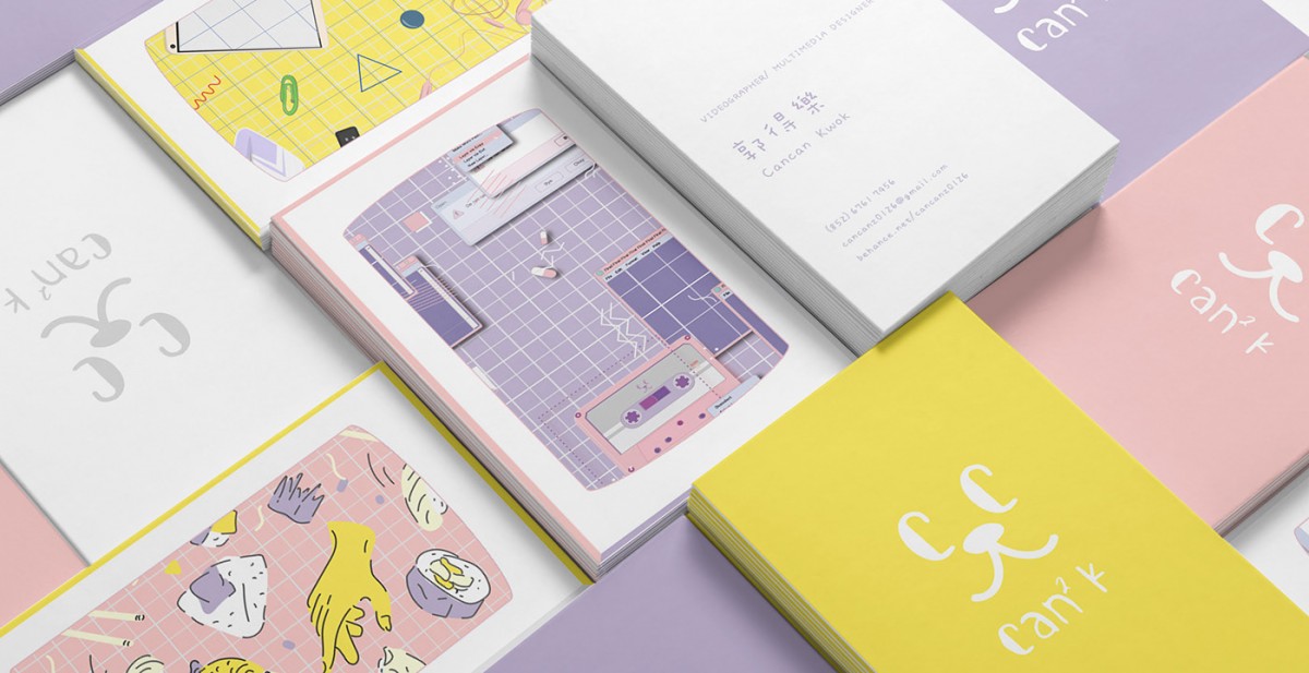
10. Personal brand identity by designer Cancan Kwok (Behance)
Epilogue,
Hopefully after this article, you have understood the application of the pattern to a brand.

