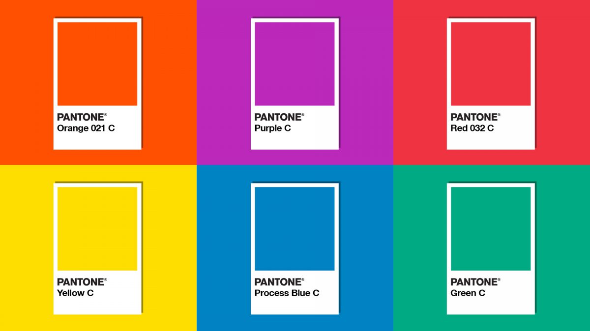
Pantone is a color system that has received a lot of support from users. Pantone plays an important role in shaping color in both the graphic, fashion, fashion and cinema industries.
What is Pantone?
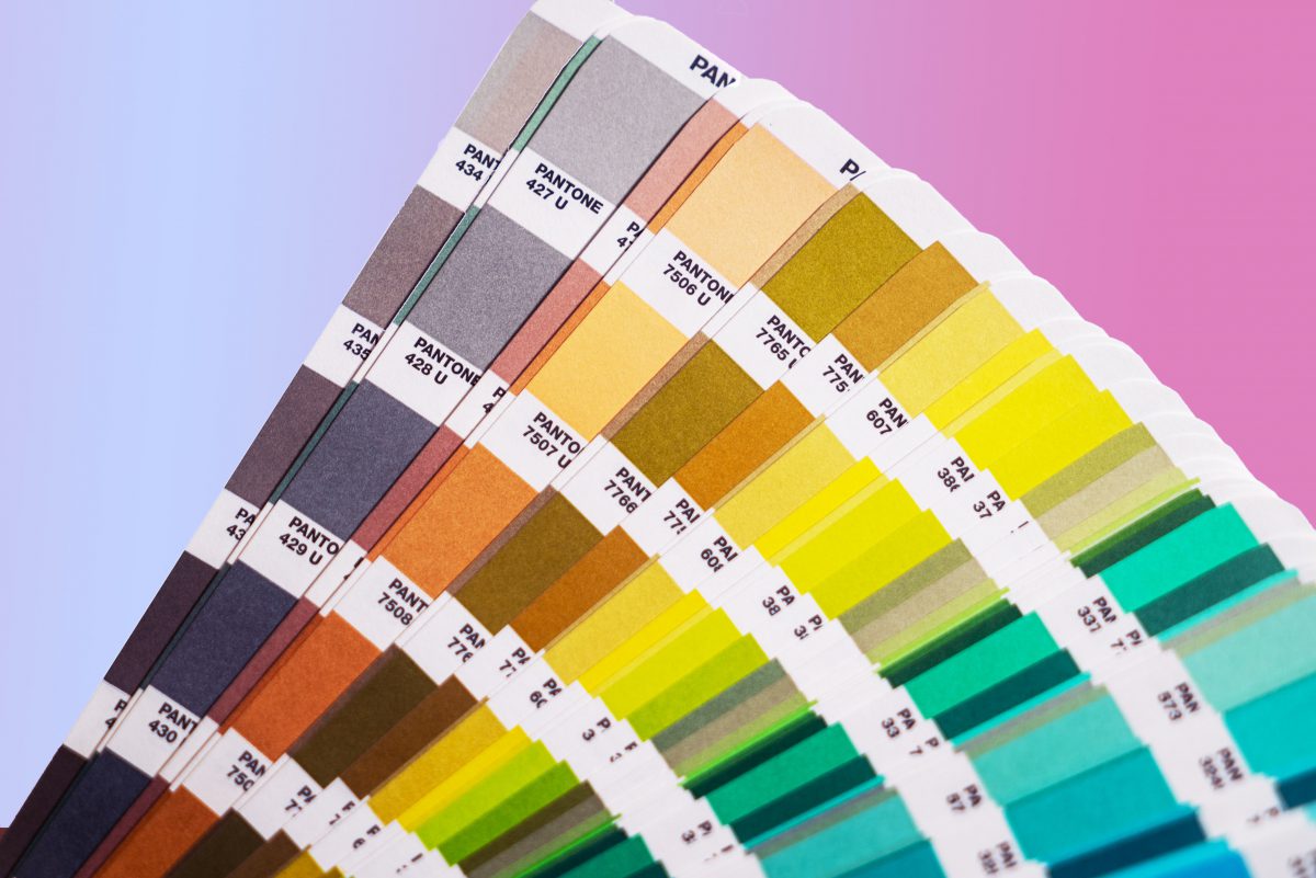
Pantone is the world’s leading authority on color research, trends and color science. Pantone owns a massive Color Matching System (CMS). Pantone is famous for its color guides and design tools. However, Pantone is more than that. It has been used in Marketing and Advertising for centuries. This is the world’s most potential color database.
Mechanism of action:
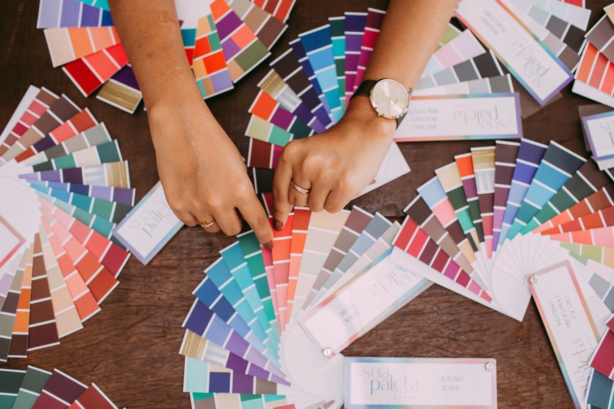
There is a group of 12 primary colors (called “Pantone families”). Each group includes 6 base colors that are customized in different shades to apply in any publication.
When applying Pantone to design, designers often combine 3 methods as follows. One is to use a solid color, which means that every part of the color has the same shade. The second is the complementary color. For example, red and blue are opposite colors. The third is analogous color. For example, yellow and green are two similar colors.
In theory, Pantone should make color matching easier. But of course it also has its own limitations. Pantone cannot give a specific shade of color. Instead, it outputs a sequence of similar colors for the user to experiment with. The color wheel will help create harmony when building a color palette based on Pantone.
Why is Pantone needed?
What does Pantone’s color of the year mean? For brands, color can be the most effective marketing tool. Color makes up the personality of a brand, even an industry.
>>>> See more articles: Choosing the Right Colors for Brands
If used correctly, color helps increase conversion rates , thereby boosting sales. Pantone has a profound influence on the design process as well as predicting trends. So knowing what colors work with which publications can help brands build better marketing projects. Plus, Pantone helps ensure that your brand colors don’t “same” as the competition.
How to find Pantone colors?
Finding the right color for the right background is no easy task. There are some notes about using color in Marketing as follows. First, the color range must have alignment. For example, product packaging colors that are not consistent with brand colors leave an impression of “out of phase”.
When considering colors for branding, coordinate with colors from the logo and packaging. If you’ve chosen a certain color for a specific promotional purpose, be sure to use it across all communication channels.
Color matching method:

Pantone provides a color scheme for businesses and designers to experiment with colors with elements, divided into many industry groups. In short, Pantone is a website with lots of color schemes and updates on the latest color trends. However, it is not possible to be 100% certain that the color scheme you have chosen is perfect. Pantone only helps to get closest to that expectation.
The most important thing is that the designer himself understands the basic principles behind each color. Each color tone will be best at a certain brightness/darkness to create the most effective communication.
Conclude:
Pantone is a great way to make publications more interesting to your audience. In addition, it also helps to direct the public to a specific theme or feeling according to the purpose of the brand. Designers can also use Pantone to build color stories that connect with brands, thereby connecting customers.
Hopefully with the recent sharing, you can already know how to optimize Pantone for your design. Follow Malu’s blog to update more useful knowledge about the industry!

