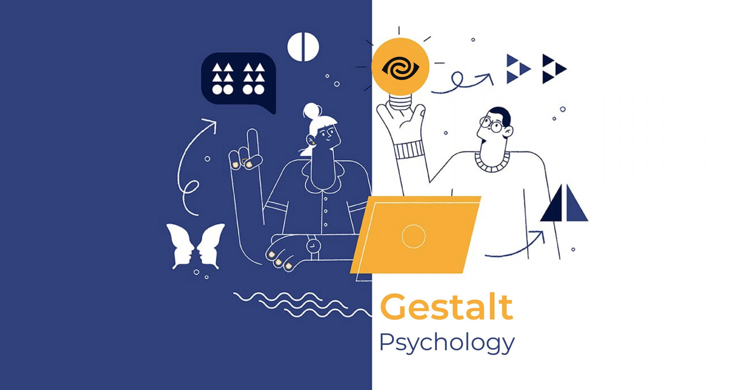
Gestalt is just a word in German, but it has a very powerful influence, especially for designers like us.
When stepping into the design industry with wet feet, some people are born with an innate talent, able to recognize what is a good design and what is a bad design. The rest of them don’t understand why they think they’re beautiful, but why do other people criticize their dark face.
But the problem is, those natural geniuses don’t know how to make the bad works more beautiful (ready-made and then give them a review), and the “selfies” “I don’t know where to fix the shortcomings in my design. Do you often wonder or worry about this issue?
Actually, the answer is very simple, that is, both groups of people are based on personal preferences and perceptions (if I find it beautiful, I like it). They really can’t find the right answer to help them improve their design work.
And that is why the Gestalt Principles were born. Society needs a common measure of aesthetics, from which we can clearly explain why one design is beautiful and the other is ugly. Only then can we confidently present our ideas in a logical and scientific manner.
Psychologist Kurt Koffka succinctly sums up the entire Gestalt principle in one sentence:
“The whole of a thing
is not a collection of
discrete parts put together.”
When the eye and brain are exposed to an image, they perceive and interpret individual details in that image in different ways. The entire structure of an object is not always made up of the elements present in it.
If we can really master the design principles of Gestalt’s law , we will know how to create visual experiences that are interesting and attract users on webstie or mobile apps.
So what exactly is Gestalt’s law about?
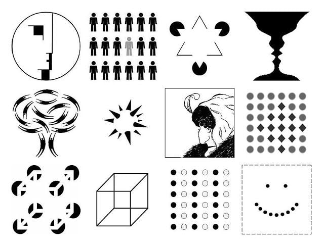
Gestalt’s laws are a set of psychological principles that explain how the human brain perceives an image.
These principles will tell us how complex shapes can be reduced to basic shapes. In particular, they also explain how people tend to capture the whole picture, rather than pay attention to independent and discrete details in an image.
In the German dictionary, “ Gestalt ” means “shape of an object” or “general view”; This law was originally discovered by psychologist Max Wertheimer (1880-1943). – then further developed by Wolfgang Köhler (1929), Kurt Koffka (1935), and Wolfgang Metzger (1936).
In this article, we will go over the following Gestalt principles :
- The principle of synchronization (Similarity)
- Proximity Principle
- Unified Connectedness
- Continuity Principle
- Prägnanz . Principle
- The principle of closure
- figure-ground principle
1. The principle of synchronization (Similarity)
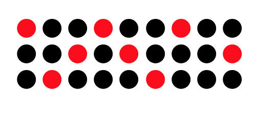
Have you noticed that our eyes tend to group objects that are similar in shape and color together?
Even when they are not next to each other, the brain still creates an invisible wire to connect those similar objects together. Then in the unconscious, we consider that there is a very close relationship between them, and “outline” the elements that are not similar to the above group. This happens very naturally, the human eye is very good at “filling in the blanks” and connecting similar elements into separate groups.
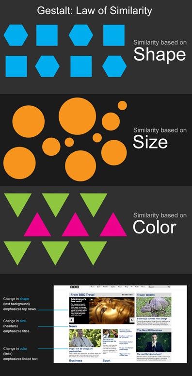
There are different types of synchronization: shapes, sizes, or colors. If you put objects with a high degree of similarity next to them, the brain automatically creates a strong connection between them.
Design needs sync
For products with user interaction (web, app), the principle of similarity applies when we need a deep correlation between elements in the design (physical or conceptual). If we understand this user behavior well, we can make it easier for them to grasp the pieces of information you want to emphasize.
User Experience (UX) will be improved, and thereby attract readers’ attention by applying the same principles to the following components:
Links (Links)
Links are familiar bridges for us to move back and forth between content items on a web page, or between one page and another. If this is the case in the text, the links must be distinct so that the reader can distinguish them.
In short, how do you do not know, but must be so that users can identify them easily and quickly. For most people, they will consider an underlined piece of blue text as a link.
When applying the principle of synchronization in menu design, or navigation, it really helps users see where information has the same hierarchy, or importance.

Content (Content)
In addition, we can also take advantage of color, font size, underline, italic, bold, … to express each different meaning of the content to the reader.
For example, quotes are often designed with a slightly larger font, and italicized for easy recognition by users. The principle of uniformity forms a common standard for almost every website in the world. Each website can be customized to make it look different, but in the end, they still come from the same rules.
Header (Header)
The header of a web page plays a major role in organizing and structuring the content to be displayed from search engine results.
We often design the header with a different font, color, size, etc. than the above mentioned content. It helps readers recognize similarities in content and control the entire usage process. It is frustrating to look at a web page or book that contains a forest of text, without any indication to the reader of the content items in it. The eye will not know where to stop for different pieces of content.

2. Proximity Principle
Grandparents say the sentence:
“First distance, second speed” is wrong,
if the elements stand next to each other
, the brain will tend to group them
into a separate group.
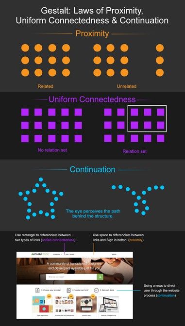
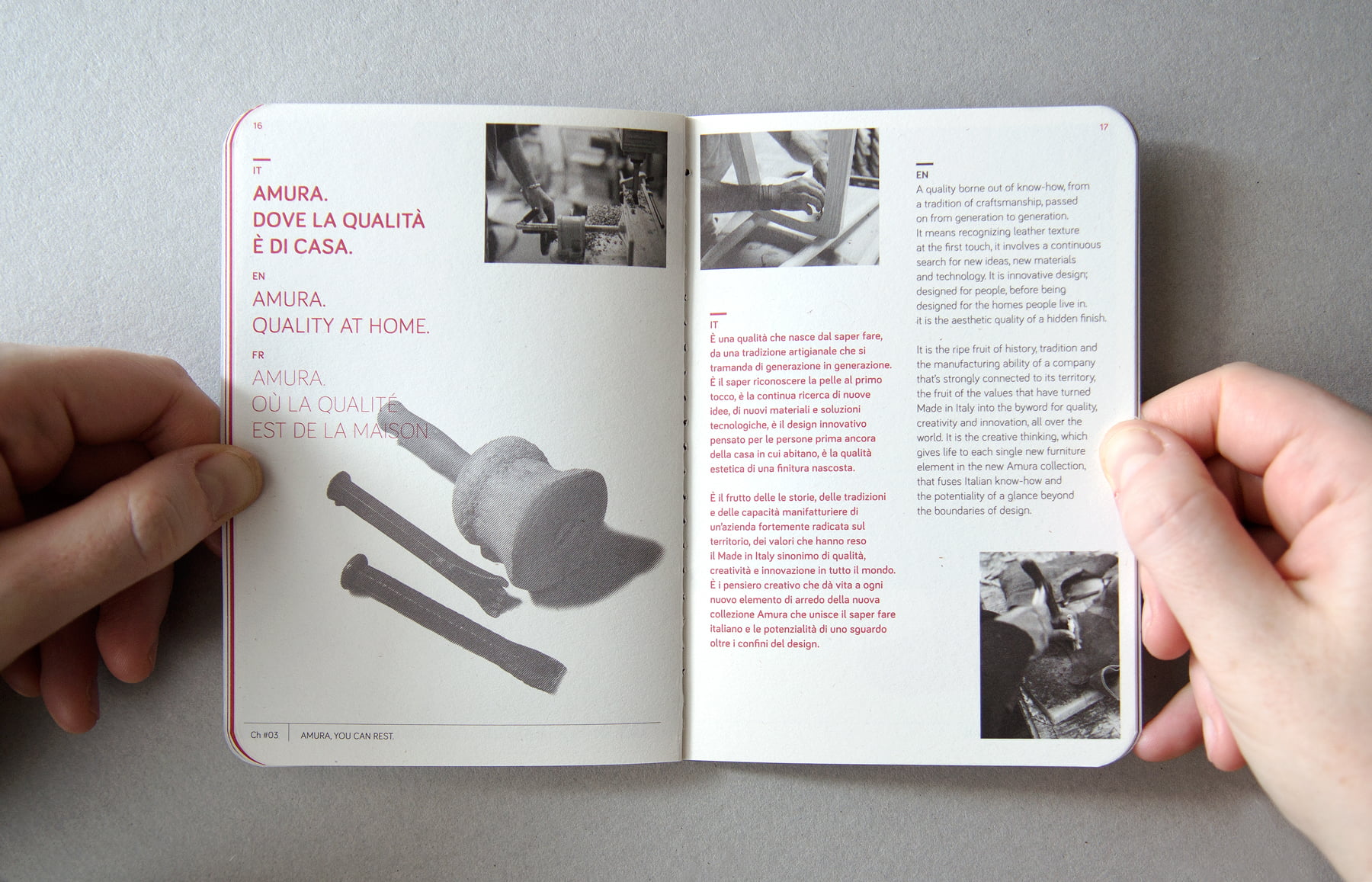
As you often see in books, newspapers, magazines, readings on websites… the text blocks are always separated at a distance (paragraph spacing), so that our eyes can easily grasp the information. believe.
That’s because each paragraph (paragraph) has the task of saying a certain content, topic or information, otherwise, the reader will feel very vague. They do not know if the information is related to each other, and is on the same topic. So in the future, every time you start a topic, or other information, create a new piece of text.
The principle of juxtaposition should be applied to make it easier for us to grasp a related idea or content, among the many words out there. Why? The layout will be a mess if the paragraphs do not have a separation, then the story of Ba Tam Ba Seven is confused with each other, reading for a while still do not know who it is talking about.
As a true designer, we should make it easy for our readers to grasp any related information or topic, so that they can know the text with a “light” glance. talking about what.
3. Unified Connectedness
Elements that have any connection
in terms of color, line,
decoration and shape
, the brain will automatically “visualize”
an intimate connection for them.
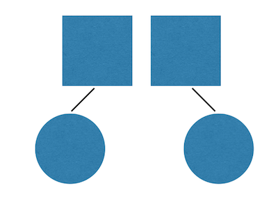
The unifying principle represents the most powerful of the principles when it comes to the connection between objects, sometimes even breaking other Gestalt principles . As in the example below, although the circle and the square do not match at all (breaking the principle of similarity), when there is a connection between them (a line), we still feel the same way. There is a strong connection between them.
In practice, applying the principle of consolidation to design is quite simple:
- Put related links, links, and buttons into a drop-down menu.
- Using the same symbols, shapes, and colors for lines of information in the same list (bullet and numbering)
- Put all the things like: login box, enter password, forget password, sign up button, etc. into one frame.

4. Continuation principle
In the unconscious mind, it always fills
the gaps between objects,
and gives them a constant movement.
Whether it is a straight line or a curved line, in our minds we always want to have a common destination between them. We are not in the habit of treating them as separate entities.
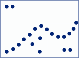
Understanding this problem, we will be more active in applying the positive space (the part where the graphic elements occupy the area) and the negative space (the remaining space) to the design work. The designs will not need to become too cumbersome, the components that are “lonely lost”, will be connected by the brain.

5. Prägnanz . Principle
The human mind is not used
to things that are messy or complicated,
and in order not to be confused
by things that are strange and unusual,
we always try to reduce them
to the most familiar,
and the most essential.
The word Prägnanz in German, roughly translates as “minimalism, brevity, inherent nature.”
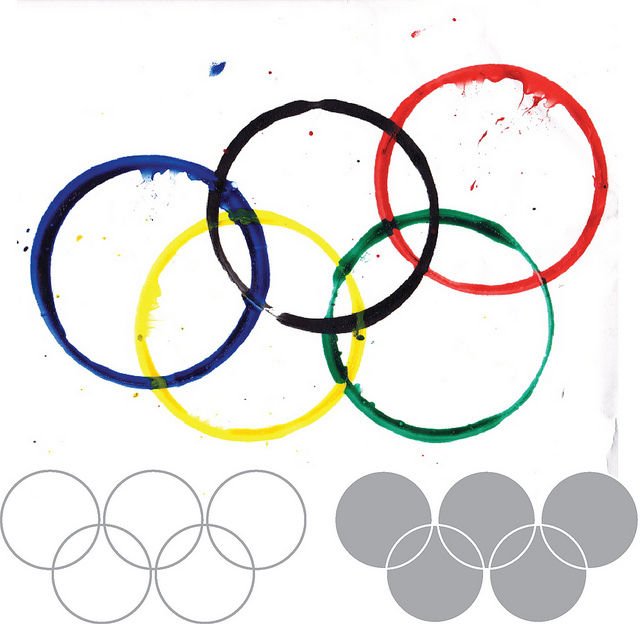
Looking at the photo above, it is easy to recognize that it is 5 circles. Although looking closely they are not perfect circles, some are broken, some are dark and light, and the ink is smeared all over. However, why can you recognize them as circles? That’s because the brain has been working silently, to reduce these complex effects, turning them into the familiar perfect circles in memory.
The Prägnanz principle can be seen
as the fundamental of
the Gestalt principles.
Humans are born with a love of simplicity, clarity, and orderliness. We always like things that are easy to grasp, and tend to stay away from things that are troublesome. This mechanism of action helps us to spend less brain and time to perceive a problem, and importantly, we are not surprised when looking at it.
This principle applies when drawing wireframes for websites. Just need simple shapes to describe the location of the content, we can imagine what the website layout is, right?

6. Closure principle
When an object has an incomplete
or incomplete shape, the human eye tends to
finish the rest
and fill in the gaps,
by imagining lines,
colors or patterns
appearing in the space. around the object.

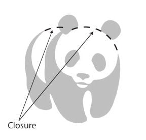
The bear in the WWF logo, was intentionally incompletely drawn, but the human eye “tried” to complete it with white space around the logo, as the closure principle explains.
Copyright: CC BY-SA 3.0
The key point of this principle, is that you only need to show enough essential properties of a subject, the remaining defective elements will be automatically added by the brain.
7. Common Fate
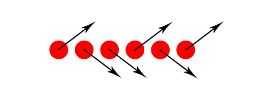
Objects will have a close relationship
if they are going in a certain direction.
Please note that you don’t have to make them actually move (like in the animation), but just have a signal, to know that they’re moving to the same destination (draw arrows as shown in Fig. examples below).

8. Figure-ground principle
By nature, the human eye has the ability to
separate what is the subject (main) and
what is the background (secondary) behind
when looking at a photo.
The degree of stability/unstable of the sub-principle, depending on how easily the object and the background are recognizable.

The image on the left is a popular example of the instability of this principle. It gives the viewer a feeling, from only one photo, but gives many different interpretations at the same time (2 faces and a lamp). As for the two photos on the right, people will quickly recognize which is the main subject and which is the secondary background.

Then later, if you want to make the main body stand out and catchy, increase the contrast between the main and the secondary. Avoid the case of “brain hacking” viewers, by making them not know what is the main-sub when looking at it.
In short
As with any psychological discipline, learning how to incorporate the principles of gestalt into your design work enhances the user experience effect. Understanding how the brain works and harnessing natural human instincts makes it easier for users to interact, even if it’s just their first visit to your site.
Gestalt principles are easy to integrate into any design and can quickly elevate a cluttered design or a struggling design to a design that has a natural interaction. , seamlessly direct the user to the action you want.
In design, visual hierarchy delineates the position and hierarchy of different elements making them more important than the rest. Gestalt principles again profoundly influence this visual hierarchy.
Gestalt theory explains how the human brain processes information about relationships and hierarchies in design and images based on criteria such as similarity, proximity, and proximity. side) and closure (the principle of closure).


