Typography is one of the most important elements of graphic design. In this article, we’ll take a look at useful typography terms to get you started in the design world. Typography terminology abounds, and some you may have never heard of before. Some terms can even be confused and misused.
A for Ascender
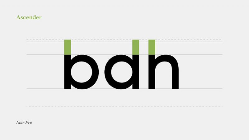
Ascender is the part of the letter above the mean line, it can be found in sets of characters such as (b, d and h, …). Ascenders help make characters recognizable to each other.
B is for Baseline
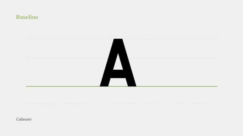
A baseline (also known as a baseline) is a line imagining it as a line connecting the footers that form on a line, and any letter that is on an origin. It is often used to measure vertical distances and help designers make decisions about distances.
C is Cap-Height
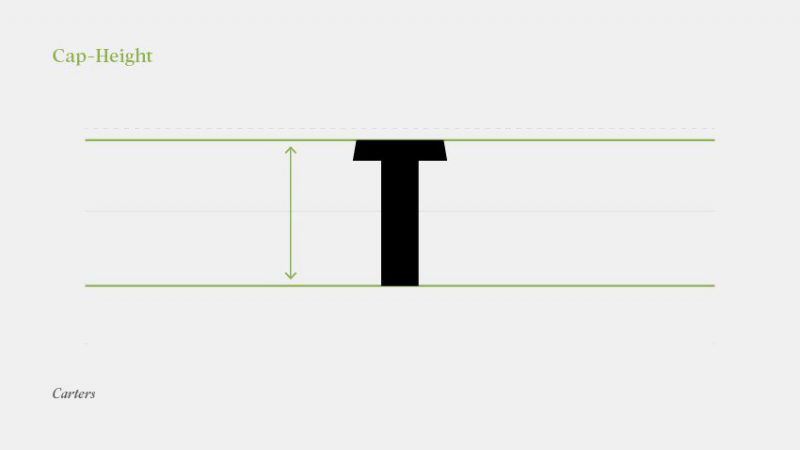
Cap-Height is the measure from the Baseline to the beginning of uppercase letters, for example M and I.
D is for Descender
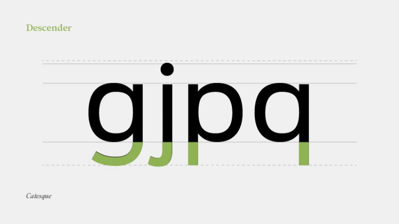
Descender is the part of the letter below the baseline that contains letters like (p,g,y,q…)
I’m Ear
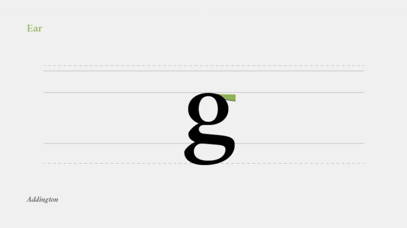
Ear the upper ear part of the lowercase g.
F is Foot
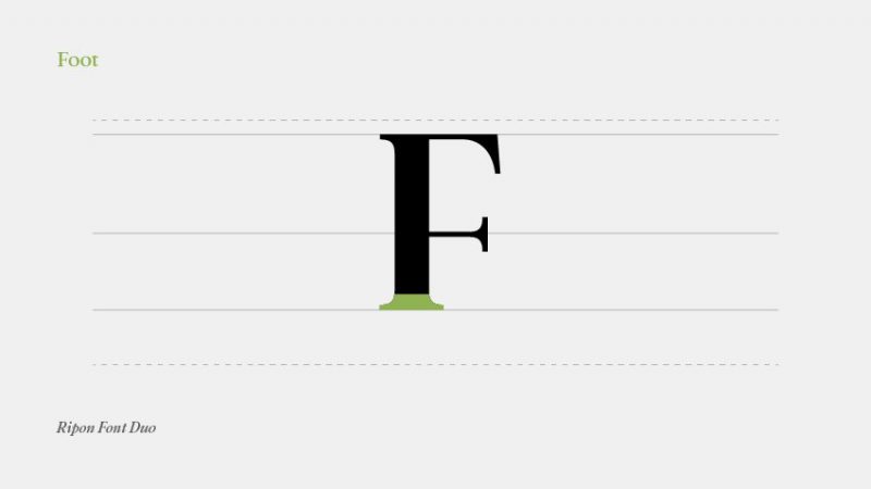
Foot is the footer of the text that is commonly found in serif fonts.
G for Gadzook
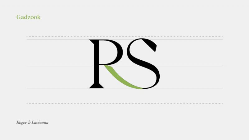
Gadzook is usually found in a ligature, which is the result of a combination of two characters. It’s the connection that ties these two characters together, it creates a sense of connection.
H is for Hook
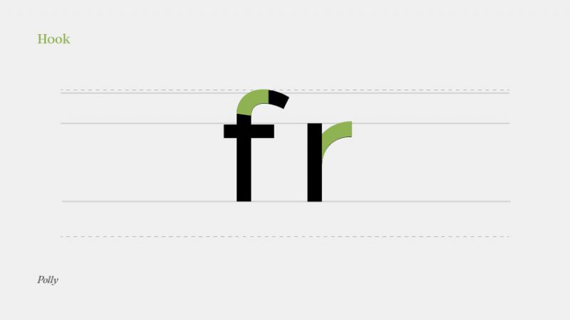
A hook is a curved stroke at the beginning of some lowercase letters like f and r. The hook will produce a curve that leads to a teardrop shape at the end or tip of a character.
I for Italic
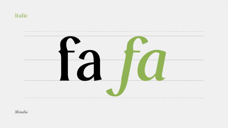
Italic is a slightly italic typeface, which is a very common term.
K for Kerning
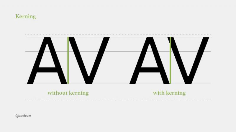
Kerning also adjusts the spacing, but the space between two letters. Placed too close together, the words cannot be read; Placed too far apart, it’s like writing word for word. Worse yet, if some letters have wider and narrower spacing, it can be frustrating for the reader because they don’t understand the message.
L is Ligature
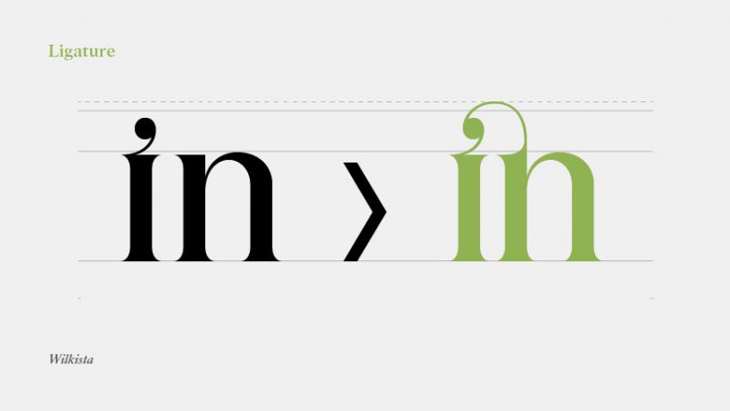
Ligature is a special character that is the result of the combination of two individual characters. Some letters can bump into each other when printed (e.g. fi, fl) and ligatures allow them to flow better with each other. Sometimes we can find three-letter ligatures — for example, ffl and ffi.
M is for Midline
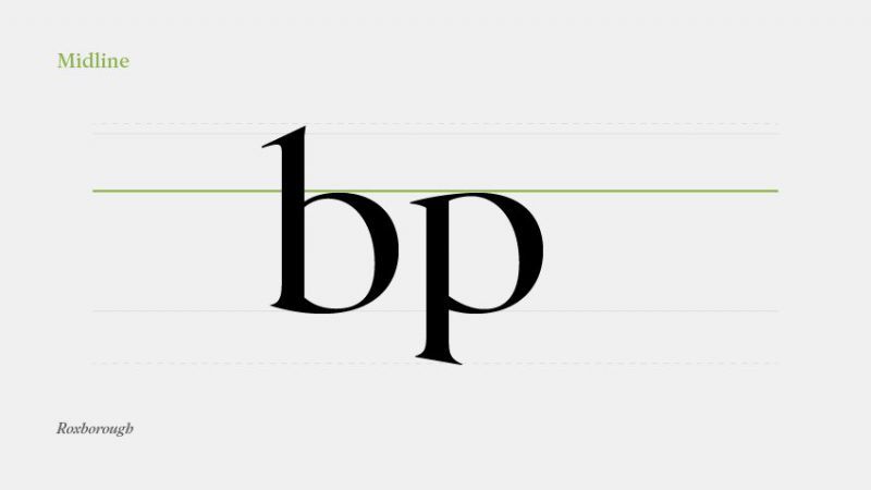
Another horizontal line used to mark the upper edge of lowercase characters is called the Mean line (or Midline). Contrary to their name, Meanline does not mean that it is always centered between the Baseline and Cap height lines.


