The most recognizable logos have one thing in common: They stand out against any background. We call it contrast.
If you are creating your own logo, you should pay attention to how you can exploit contrast in the design. It can be the thing that takes your logo to the next level.
Discover 10 ways to incorporate contrast into your design so you can create a logo that really stands out.
What is contrast in design?
You can think of contrast making dark colors blacker and bright colors whiter. However, contrast is not limited to shades and there are many ways to add contrast to a design.
In design, contrast is the comparison between two eye-catching elements. In many cases, contrast helps our brains identify an image faster.
To clarify this concept, let’s look at the opposite of contrast: What if your logo had a dark, patterned background with black text on top? If you stop and look closely, you can tell what it is, but from a distance, it’s all just a black spot.
On the other hand, think about one of the most famous logos of all time: the Nike Comma. It’s so simple, you might wonder how it got to be so iconic. However, the odd image is in stark contrast to whatever wallpaper it sits on, making the logo hard to ignore. Even if you’re not actively focusing on the symbol, your brain will subconsciously see it and “read” it right away.
10 Ways to Apply Contrast to Logo Design
Now that we’ve covered what contrast is, here are 10 different ways you can easily create a distinct logo.
1. Bright and dark color contrast
The most common type of contrast used are different shades of the logo color palette. Using dark and light colors in color combinations will give you contrast in your design. Just make sure the different elements in the logo are much darker or lighter than the background.
This doesn’t mean you need to use only black or white in your designs (although these are the most obvious and extreme forms of light and dark). Monochrome (black and white) logos have an immediate contrast advantage, but they can still be difficult to spot in the blend if the logo details are too detailed and lose contrast.
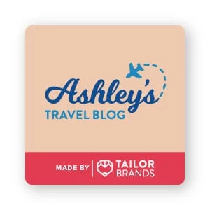
If you look at the Ashley’s Travel Blog logo, the deep blue color is darker than the tanned background color. You can see how the lighter blue has much less contrast because it has the same light value as the tan, making it take up the latter place in the design. This combination helps the business name stand out.
Not sure if the colors in your logo are contrasting enough? Here’s a helpful tip! Close your eyes and if the 2 colors almost become a blended shape, they don’t contrast strongly enough.
Another way to test value contrast is to change your full color logo to a black and white image. Removing the logo color will accentuate the contrast in your design.
Many designers do this in their design process to see if the logo layout stands alone without color. A solid design should be legible, recognizable, and memorable, even when edited into a black and white image.
2. Contrast with opposing colors
If you’ve ever seen a color wheel, you know contrasting colors (complementary colors) as those that are directly on the wheel. You can contrast 2 colors on different parts of the wheel for a more “sharper” design that catches the eye. Additional colors are:
- Violet/Yellow
- Blue/Orange
- Red/Green
You don’t have to use complementary colors to achieve contrast.
As long as you stay away from the neighboring secondary and tertiary colors on the wheel, you can find color contrasts.
For example, 2 different shades of blue or blue and teal will not provide any color contrast. Yellow combined with lime is also not a too contrasting combination.
Imagine how much less contrast the Ashley’s Travel Blog logo would be if the background was a light blue rather than a warm tan?
In the Pepsi logo, bright red is combined with a darker blue to create a range of contrasting colors. This color contrast helps draw the eye into the design.
Pro Tip : You can use color psychology to help choose colors that best communicate and connect with your target audience. In the case of Pepsi, they added the color blue just to help contrast their brand with Coca-Cola. The move from the classic red and white design to red, white and blue has helped Pepsi look fresh, brave and boldly American.
3. Contrast with Saturation

You can add gray to one of the colors in your logo to make a difference in color saturation. Saturation is the intensity of the colors in the image. As saturation increases, colors appear brighter; As the saturation decreases, the colors look more washed out.
You can create contrast by pairing a strongly saturated color with a desaturated color.
The Guardian logo is a great example of this. “The” is a light bluish-gray color, which by itself is not eye-catching. But “the” is a common word that we really don’t need to notice in the logo. The more prominent (and meaningful) the word “Guardian” is, the more saturated and immediately eye-catching.
4. Contrast with shape

Circles and squares are possibly the most classic examples of contrasting shapes. However, ovals and triangles or wavy and straight lines also contrast. You can even use the curves or lines of your chosen font to contrast the shapes in your logo.
In Ashley’s Travel Blog example, the “Ashley” font is filled with curves, while the “Travel Blog” font contains a lot of straight lines for contrast.
In the Digital Ocean logo, the square design that cuts across the circle causes a complete contrast that catches our eye right there. The icon cleverly includes contrast in the lower left corner to draw our eyes directly to the beginning of the name. This contrast works great because it’s also paired with hue contrast, value, and saturation; bright royal blue stands out against a plain white background.
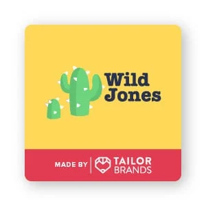
You can also contrast geometric shapes with organic shapes. Take a look at this example of the Wild Jones symbol; The organic shape of the cactus contrasts with the much brighter and sharper shape of the triangular spines. These triangles are much larger and fatter than the real-life cactus spines, and this exaggeration helps to stylize the logo.
5. Contrast with texture
Our eyes naturally compare smooth surfaces with rough surfaces. So by changing the texture, it can increase the contrast between 2 colors or shapes in your logo.
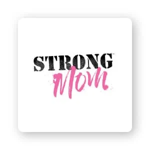
The Strong Mom logo uses the grainy texture of “strong” as opposed to the smooth, groomed look of “Mother”. You may also notice the sensational texture surrounding the “Mother”, which helps to create less contrast and tie the 2 design elements together.
While contrast is important, you still want your design to look cohesive. Sometimes, you may need to reduce contrast a bit to achieve a striking – but unified – design.
6. Contrast with font combinations
Font selection is an important part of good design. You may be tempted to choose a variety of fonts that seem interesting or interesting, but make sure that the result doesn’t have to be a cluttered and hard to read logo.
Just like with Ashley’s Travel Blog, you can use 2 very different typefaces to achieve contrast. In most cases, you’ll want to use a plain sans serif or serif font to complement a more dramatic font, like script or decorative typefaces. (Serif fonts have a line or small stroke attached to the end of the letter, while sans-serif fonts don’t have any kind of extension at the end of the letters.)
Not only does this improve readability, but the contrast of simple fonts with more complex fonts helps draw your eye into the design.
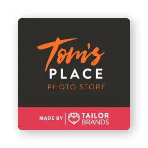
Tom’s Place uses a bold handwritten brush script (“Tom’s”) contrasted with a bold sans serif full-cap font (“Place”). “Volume” is included below in a light sans serif all-caps font, which is less eye-catching than the top 2 fonts.
This helps create a visual hierarchy — with the “Tom’s place” part of the design standing out from the “photo shop”. Visual hierarchy is the principle of arranging elements in a design to indicate order of importance. Essentially, it helps draw your eye to what’s more important than before.
7. Contrast with typography weight and kerning
You don’t have to choose significantly different fonts to create contrast. Subtle contrast can be achieved with heavier typeface weight or varying the spacing between letters (this is known as ‘kerning’).
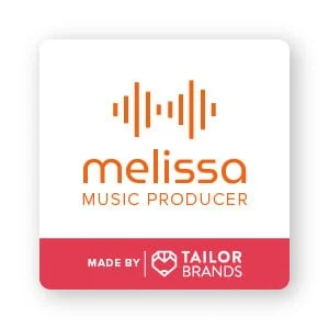
The logo design of Melissa Music Producer has 2 very similar fonts: MuseoModerno and Proxima Nova. Using Proxima Nova Light, the logo enhances the contrast between “Music Producer” and “Melissa” more boldly. Melissa is further emphasized with the thickness of the reflected line of the airborne sound waves. The sharp lines match Melissa’s “l” and “I” and contrast sharply with the other (rounded) letters.
8. Contrast with negative space
Negative space is the creative use of white space in an image to create a whole new image. It’s a great way to add depth to your logo and draw attention to certain areas.
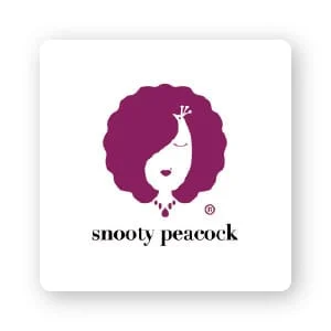
Snooty Peacock uses white space to its advantage. At first glance, you will see the outline of a woman. But take a closer look and you can see how a spread out peacock tail cleverly combined with the name of the business is a creative way. (Pretty cool, right?)
9. Contrast with scale and size
Large shapes including small details are another way to grab the attention of your target audience. The contrasting sizes also create a hierarchy of the design.
In the Snooty Peacock logo above, the details simply add to the much larger fan shape of the hair.
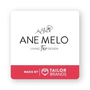
For a better understanding, check out Ane Melo’s logo. Instead of using contrasting colors or heavier fonts, design relies on proportions to grab your attention. Smaller typeface and floral border surround the Ane Melo brand name. If all 3 lines have the same line size and weight, the Ane Melo typeface will be completely lost.
10. Contrast with position and orientation


Don’t be afraid to “think outside the box”!
Experiment with your design by varying the angle to add contrast in the logo. Some logos, such as the Starbucks logo, use this concept with text scrolling around a circle containing the company’s famous logo.
Baskin Robins uses a playful font that sits on a wavy baseline for a fun branding approach. Likewise, Burger King’s logo sweeps over their logo right where the two burgers are, surrounded by a golden half-circle representing the buns on top and bottom.
The letters in the In4mation logo are not only placed at contrasting angles, they also coincide with the negative kerning in the top row. The position of the text means something. In this particular logo, the way the letters clatter together creates tension that seems to imply that it is a controversial fact-finding company or a gossip columnist, rather than a news station or helpdesk in a shopping mall.
Considering the position and orientation of the logo doesn’t just apply to the typeface. For example, Red Bull uses positioning to match the two bulls in its logo with the mirror image. The opposite pair of bulls creates an interesting contrast, adding interest to the design.
You can include illustrations or other elements in your design to add appeal through unexpected placement. The Xbox logo has 3 triangles in a circle, as if an X goes through a button. The Pepsi logo shown at the top of this list doesn’t just use color for contrast; it also features 2 fluid-like shapes in an implied circle, with wavy lines that contrast in shape and position to create a dynamic design.
For you
Contrast is a design tool you can use to add visual appeal to your logo. And now that you have several ways to add contrast to your designs, it’s time to try it out for yourself.
If you are looking for a reputable and experienced unit to be able to design a professional and impressive logo and brand identity system , then please contact us immediately by phone. 0988 622 991, or leave your information and requirements, Malu Design ‘s consulting department will contact you right away to answer all your questions!
————————
Malu Design – Branding Identity Agency
Hotline: 0988 622 991

