Suppose, you are a worker. Now your boss points to the pile of materials and says “Let’s build a house”.
- No blueprints.
- You don’t know where to start.
- Don’t know whether to build the bathroom in the back or next to the kitchen.
In website design, too, there are many ways to do it, but specifically how to do it needs to be unified:
- What pages and categories will the website have?
- How are the pages linked?
- What sections does the home page have?
- Where will this CTA button lead?
- This link will take the user to which page, created in what category?
- Click on position A to open a new page or load data right on the page?
- What are the steps to go from the homepage to the blog post?
- …
So, in order to design a website that provides a good experience, and helps departments implement design and programming effectively, you need to build user flows ( User Flows ).
What are User Flows?
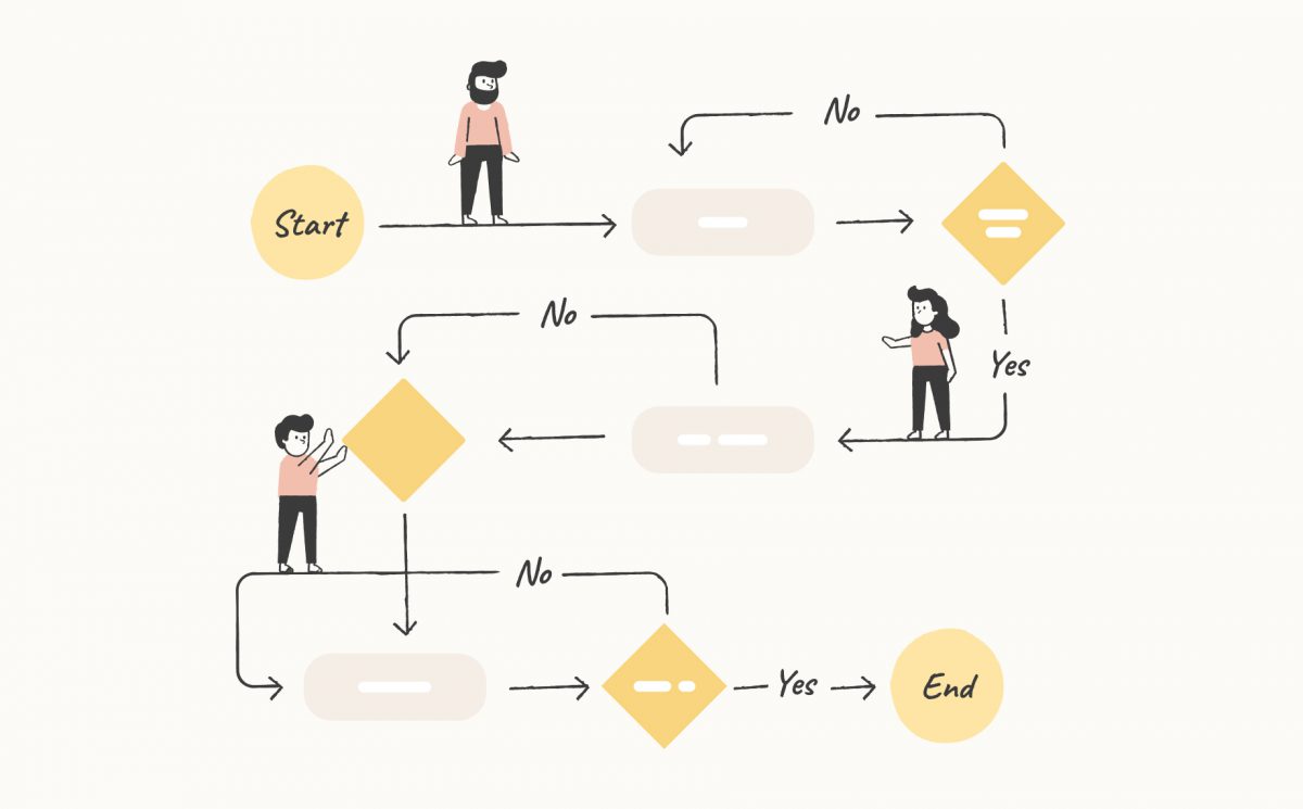
User Flows are a diagram that quickly illustrates the path your users will take through a website or application to achieve a certain goal.
You can create user flows at any stage of the design phase and this will help define the information architecture.
Depending on where you are in the design phase, the look that a user flow can take varies.
Example: Many design teams create user flows before they create UI Wireframes.
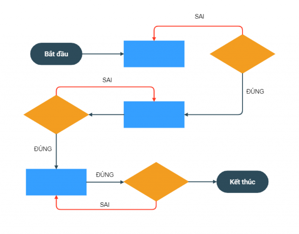
Preliminary User Flows diagrams often take the form of graphs and use blocks with different meanings, for example:
- Rectangle with 2 rounded or circular ends (Start, End)
- Rhombus (Decision)
- Rectangle (Page, screen or action)
- Forward Arrows (User Navigation)
- Square (Sometimes used for notes)
However, when the design team creates wireframes, the rectangles in User Flows will be replaced with specific pages.
This combination of User Flows and Wireframes is sometimes referred to as “wireflow” in the UX design world.
Depending on the company, many design teams continue to create user flows to the Prototype stage, where they continue to replace wireframes with prototypes.
In some cases, User Flows can also be used to improve the design or add new features to a website or application.
Why create User Flows?
There are many reasons you should consider creating User Flows, especially if you are just starting out in the design phase of your website.
Here’s how User Flows can help you design better websites:
User-centric design
User Flows help you think about how users will navigate through your site to achieve their goals.
From there you can design each component in steps to satisfy them.
With a User Flow blueprint, you can analyze the pain when users try to navigate through, as well as grasp bottlenecks and conflicts.
This forces you to consider alternative user flows or simplify the initial path before going too far wrong.
Prevent mistakes
Just changing a step in navigation or removing a feature takes designers several hours to adjust.
So, if you don’t build a standard user flow from scratch, you and your design team will lose a lot of useless hours.
Furthermore, if you discover a mistake while the project is in the programming stage, it will most likely take a few days to redesign and program in a new way.
In contrast, if you build User Flows and make adjustments on them first, it only takes a few minutes to change the structure, add features.
When the User Flows are ready, the design, programming, and testing team just deploys it.
User Flows vs User Stories
One of the things that many people (and especially newbies) tend to confuse is User Flows and User Stories.
Navigation vs Story
While User Flows focuses on mapping how a user traverses the different screens of a website to achieve a goal, the user story is one of two lines that explains the feature request in perspective. user score.
That is, the user story is what they are looking for and why they need it.
Engineering approach vs Human approach
User Flows focuses solely on the techniques and logic of how users use your website or website.
User Stories, on the other hand, briefly describe the user’s motivations and frustrations. It describes the feature they need that will make their life easier.
Small Picture vs Big Picture
User Flows are specifically related to how users perform a particular task on your website.
Behind the user story is the user map, it is the big picture, i.e. how users hear about and discover your product and the different touchpoints they can access. that product.
Finally, the stages in which you create them are also different:
- User Flows are usually built after User Persona and User Stories.
- User Stories are used when creating User Flows to meet the big picture.
User Flows vs User Journeys
User Flow and User Journey are also not the same (which is sometimes called the same thing).
Micro vs Macro
User Journeys, like User Stories, tend to look at the macro experience a user has.
Whereas your User Flows will focus more on specifics i.e. specific solutions to your user story.
The user journey is in a similar fashion to the user story map, which looks at how your users use your product and through which channels and stages.
User Flows, on the other hand, tend to be completely focused on navigation.
Decision vs Experience
Usually, the user journey design board is more concerned with the personal story and takes the user experience into account.
The user journey board can also describe the user’s thoughts throughout each step, while the user flow only describes the decisions.
How to use User Flows in the Design Stages
So how and when do you implement User Flows in the design phase?
There is no specific time that is right.
However, Malu recommends you start drawing one before you draw wireframes or design detail pages.
Here’s how:
1. User and competitor research
To build User Flows, start with user research.
Once you know who your users are and have a clearer picture of the solutions they need, you can start analyzing your competition.
User research is a big question.
How to analyze competitors?
Quite simply, you find out what website your direct competitor is running, visit it, navigate through the pages, and outline the flow of movement within it.
You can then start building your own User Flows, refer to your competitors’ User Flows and improve it better, adding your own unique touches.
2. Start with a simple User Flows
You can start with a basic User Flows diagram that contains the shapes mentioned above, such as a circle to represent the input.
Example: The login/registration step of an online learning website
- At the home page, when the user has the option to login you will lead them to the login page, the correct login will redirect to the purchased course listing page.
- When the user has the option to sign up, you will lead them to the registration page. Successful registration will lead to the account management page.
- …
Do the same for the next pages in the simplest way.
3. Create more authentic User Flows
Once you’ve defined that process, you can go on to create the final prototype for the website.
Then replace the basic shapes with more realistic pages like Wireframes, Prototype.
Taking these steps in order, you’ll always have a clearer and clearer overview of how the product is performing, helping you stay true to the design intent of the experience you want to create.
8 Best User Flows Design
When designing User Flows, there are right designs and wrong designs. There are design ways that create a confusing, confusing document that very few people can understand.
But that is not the purpose of creating User Flows.
Here are a few ways you can help you design User Flows that are easy to read and intuitive.
1. Give yourself a descriptive name
Always give yourself a self-describing, easy-to-understand name for each step in your User Flows that describes the content, the flow of the movement.
For example, you can call it “Navigation from Home to Blog Page”.
This will also help you to subdivide your streams, rather than including multiple streams into one step.
2. One-way flow
When designing user flows, focus on one-way flow.
Just think about the traffic on the road and you will understand. The scene of people walking back and forth is very chaotic and difficult to control.
A small project with a few pages is not a problem, but a project has to design several dozen pages, the flow goes back and forth, and soon you will not know what to do next.
3. One target per thread
It’s better to design streams with one goal at a time.
As a designer, you can’t maintain focus, so how do users keep them focused on completing tasks?
Never design something that interrupts when the user is trying to complete a task.
Help them achieve one goal at a time, instead of putting them in a situation of choice, distraction.
Example: When a user is trying to click the post button, don’t pop up a pop up asking them to update their profile.
4. Always have the legend key
Using a legend key makes your User Flows instantly easier to understand even for newbies, and helps them instantly understand what shapes, screens, and arrows mean.
Example: In your legend, specify the circle as the starting point, the rectangle as the screen, and the diamond to represent decisions, etc.
5. Decide on a starting point
It is very important that your User Flows start with a clear point.
If your User Flows don’t have a clear starting point (for example starting from the login screen or from the homepage) it will be very difficult to set up an end-to-end journey.
If there can be multiple starting points, make sure they are clearly specified or consider splitting them up into different streams.
The point is, make sure you know where the user is accessing the app or website from so you can start setting up the flow.
6. Clearly labelled
It’s important to clearly label each action, screen, and decision in your user flow.
This means we need to label the login screen as “Login Screen” if it is a rectangle.
Or “Login or Sign Up” if it is an action that needs to be decided.
Try to avoid long, wordy labels and unnecessary information, such as “Log in if you already have an account or register if you don’t have an account.”
If your User Flows include actual screens from Wireframes or Prototypes, you can label them or include a brief note below each screen.
7. Use color smart
If you’re going to incorporate colors into your User Flows, you’re better off describing the color clearly (as little as possible) or preferably no color at all.
For example: You can assign red for decisions, blue for screens, yellow for starting points, etc.
Remember, always be consistent and use as little as possible.
8. There is a clear solution
Always make sure your user flows are complete when the goal is reached.
Don’t let the ambiguity happen, or the purpose of creating the flow will fail.
For example:
- When a user subscribes to a newsletter, as a rule, the user must agree to the information use policy. So, don’t let them agree, it’s okay to disagree.
- Instead, you have to direct them through the policy screen, ask them to read, press OK and then register successfully.
By laying out everything clearly, you won’t miss anything or leave inconsistencies and potential pitfalls.
5 Examples of User Flows of Websites with Good UX Design
As mentioned above, to create a website with good UX, you need to create good User Flows.
Website User Flows are very similar to app User Flows, except that the site has more starting points and uses clicks instead of swipes like on a phone.
1. Student Guide Website
User Flows of this student guide site are attached to its wireframes (probably called wireflow).
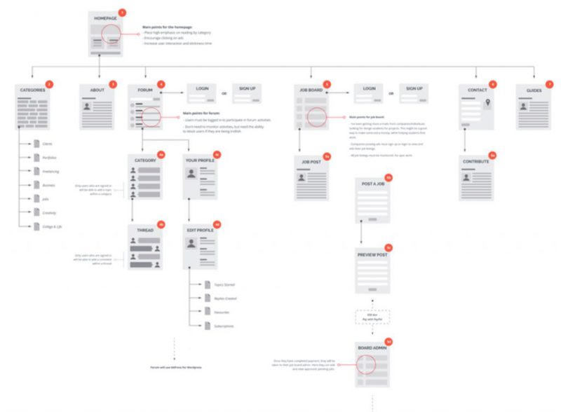
At this site, users start at the home page, then they can navigate to the categories page, then to the subcategories.
All flows follow a linear direction.
Each screen is clearly labeled and has a note that briefly describes the main purpose of the screen with a variety of options.
2. User Flows that use color
This site’s User Flows represent the goal of users to purchase and possibly receive a discount through a pop-up.
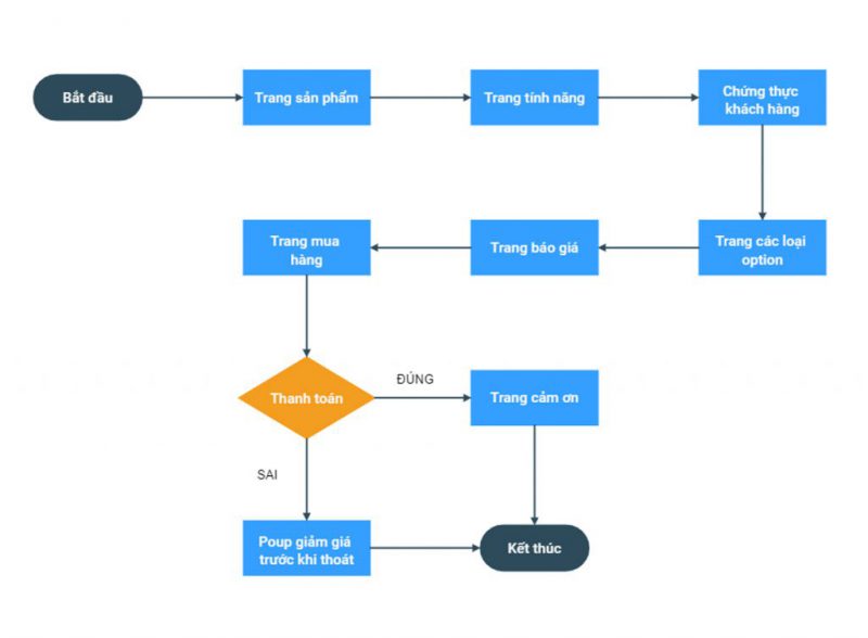
Here people have used colors to organize Userflow, where:
- Black: Starting point
- Blue: Screens (pages)
- Orange: Parts to decide
3. Sales site #1
Designing a sales website or an e-commerce website is not an easy task.
Typically, pages related to user accounts and online payments have more complex user flows.
Also, if the site has its own design features, there are a lot of flows that need to be clearly defined.
Changing the flow sometimes changes the whole design structure, maybe even the previous implementation is no longer usable.
This site’s User Flows show the process from the moment a user chooses to pay for a purchase:
- If you already have an account, you need to login
- If not, you need to create a new account
- and a few next steps to make a successful purchase.
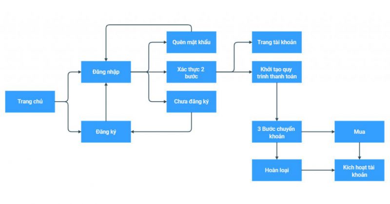
These User Flows look complicated but convey messages in a simple, clear way.
An example of another sales site’s User Flow:
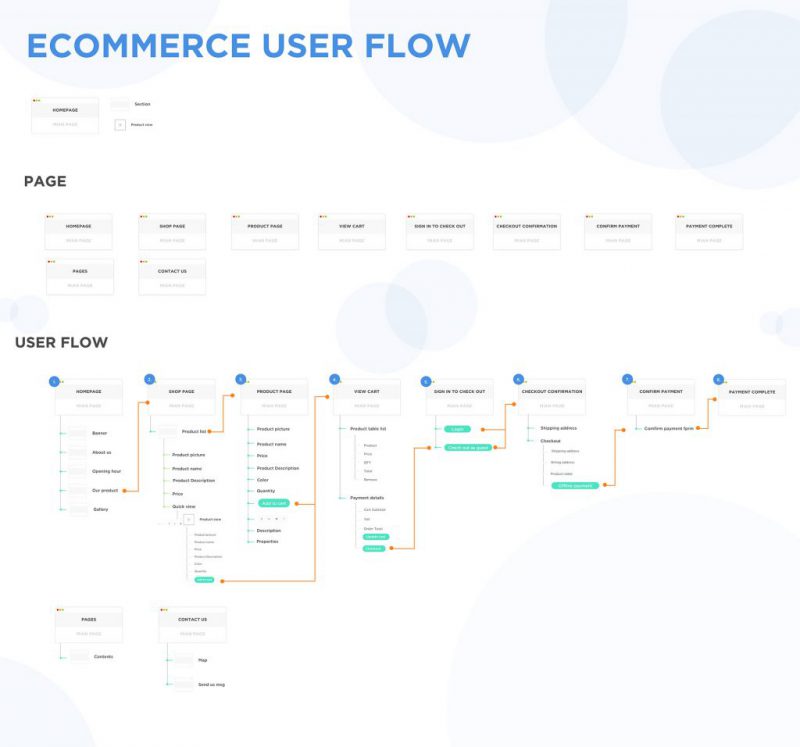
View large image on Behance
> Read more: How to design an effective sales support website
4. Use Wireflow Style
Here’s another example of a sales site User Flows, where the user starts and moves toward the goal of buying something (or arriving at the order confirmation page).
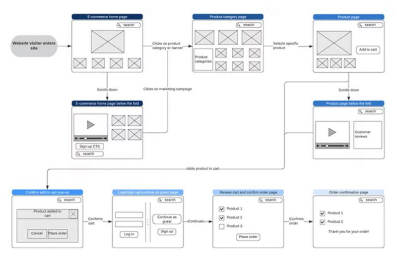
Unlike the example above, this User Flows is Wireflow , with the main layout for each screen already laid out more specifically.
The user visits the homepage and has three different options:
- Click on the Product or Category Banner
- Click on Marketing campaign
- Or scroll below the fold.
And finally, each thread will end at the order confirmation page.
Each of the different options is represented by a simple screen of wireframes. This is the platform to develop into Prototype to start testing on real users.
5. User Flows have clear annotations
This is a very good example of how to create a simple user flow using blocks and a clear color system so that everyone can understand the main functionality of the website.
It also has clear key annotations to help readers understand faster.
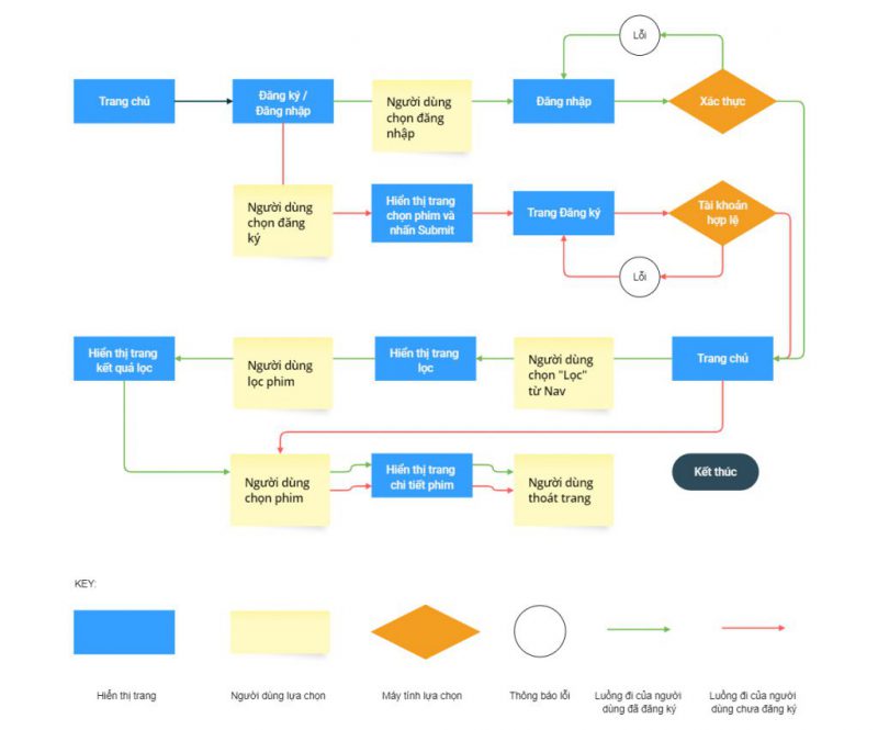
As you can see, there is a clear caption/Key below for viewers to better understand User Flows.
In there:
- Black is used when the user enters and exits the web application.
- The distinct blue and red colors indicate alternate streams that users can take depending on whether they are logged in or registered.
- Round color is error message
- The rectangle represents the screen and the action
- User decisions are clearly distinguished from computer decisions.
> Creating User Flows is an important part of Malu’s website design process .
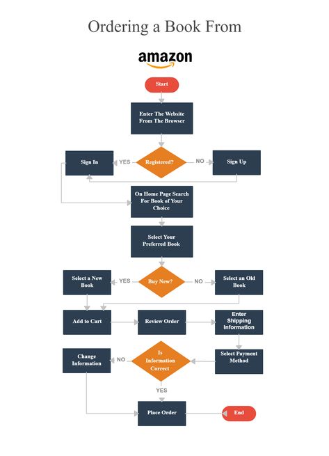
Example User Flows in Amazon’s Booking Process:
Some tools to support creating User Flows
There are many tools to help create User Flows to help you quickly outline the user flow of your website such as:
Or tools to support web design, comprehensive UX design:
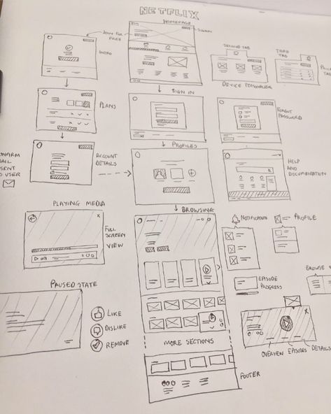
Using these tools to create User Flows is also quite simple. But if you don’t like the tool, you can totally use pen and paper.
Summary of User Flows
User Flows help us focus on user-centric design , to create a consistent user experience.
Not only that, creating User Flow also makes designing websites or applications easier, saving time and money.
User Flows help us identify any possible problems before we begin to design the details of each page and prevent redesign after work has entered the coding phase.
User Flows also force us to look at the easiest way for users to complete a task, and to research alternative flows, resulting in the best possible user experience.
In short, good User Flows design is the solution to the success of user experience design (UX design).
Start creating User Flows now if you want to design a website with a good user experience that will drive business performance for your business.

![[App Design] How to Design Software Interfaces, Professional Mobile Applications 5 thiet ke app](https://maludesign.vn/wp-content/uploads/2022/03/thiet-ke-app-500x500.jpg)

