We often see grids or grid designs in cameras, mobile photography applications or drawings in Photoshop. So in the end, what effect do these grids play, what role do they play in the design? Let’s work with Malu Design to answer these questions with you!
1. What is Grid?
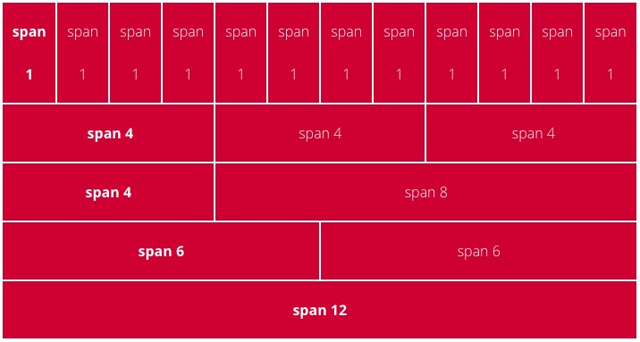
Grid (grid) or more fully grid system (grid system) is a familiar term for graphic designers. This is considered a “cabinet” tool that helps graphic designers to align, size, and divide boundaries in the design layout to create a neat, orderly, and regular whole. Grid system is considered the backbone, the framework in most designs such as layouts, websites, apps.
2. Grid categories?
When starting a product design, designers often use one or more types of grids to organize and arrange objects in a certain layout. This creates a balance in the design as well as contributes to creating a favorable eye for the viewer when looking at the design product. Despite being “constrained” in fixed mathematical formulas, in many times, grid still helps designers to create breakthroughs and uniqueness in each of their publications.
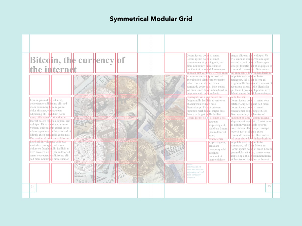
Basically, the grid system is arranged based on two schools: symmetrical or asymmetrical. Symmetrical grids will follow a centerline. Vertical and horizontal margins are designed to be equal, columns in a symmetrical layout will also have the same width, creating overall harmony. Meanwhile, in the opposite direction, an asymmetrical grid system will have different sizes of both margins and columns. Here are five basic grid categories used in many daily publications:
Manuscript Grid – manuscript grid
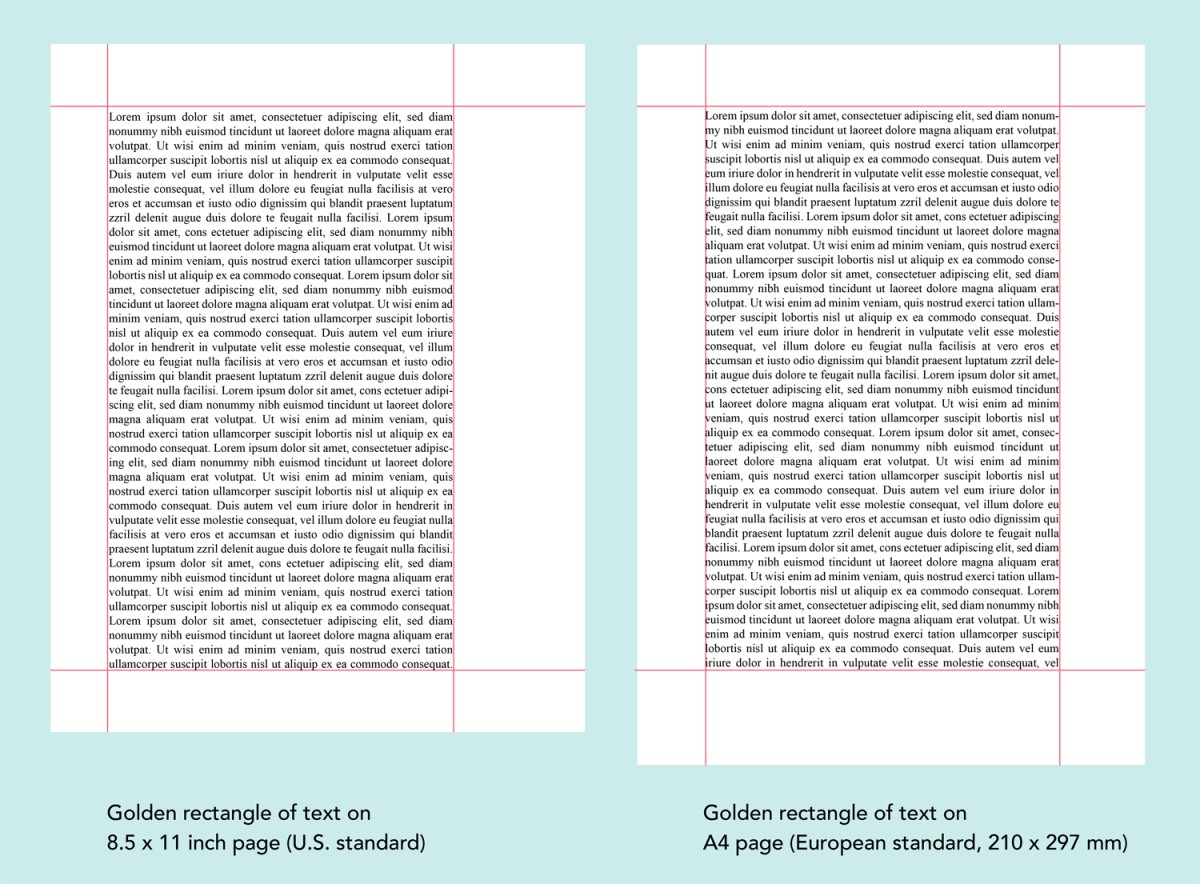
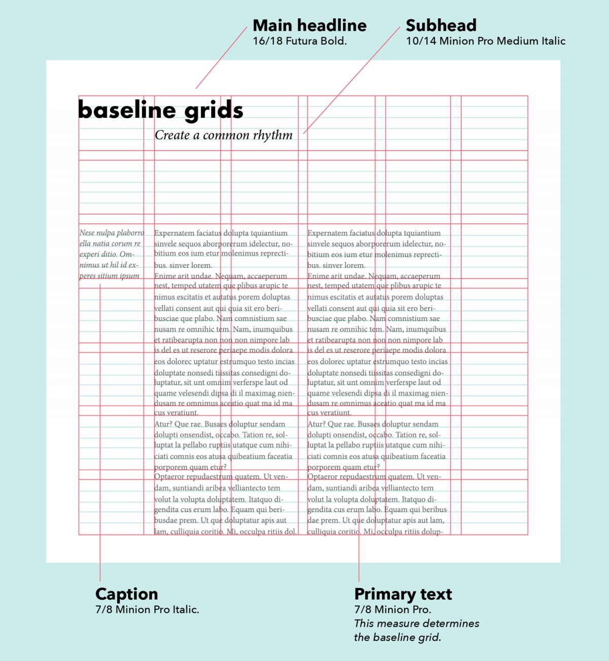
In Word documents, magazines, newspapers, and ebooks are typical examples for the use of manuscript grids. Manuscript grids are visible in a document text by separating the header, footer, and space at each edge (margin). To put it simply, the manuscript grid layout is created from a rectangle to create a bounding frame for the text.
Column Grid – column grid
The column grid is used to organize the design layout in the form of columns. Magazines often use column grids as an effective way to make texts easier to read. In addition, column grids are also commonly used on websites or online blogs. The column grid system is usually divided mainly between two and six columns. Text and images in a column grid are laid out in the vertical and flowing lines that make up the column. Images can be placed inside a column or more to create different visual layouts.

Modular Grid – Modular Grid
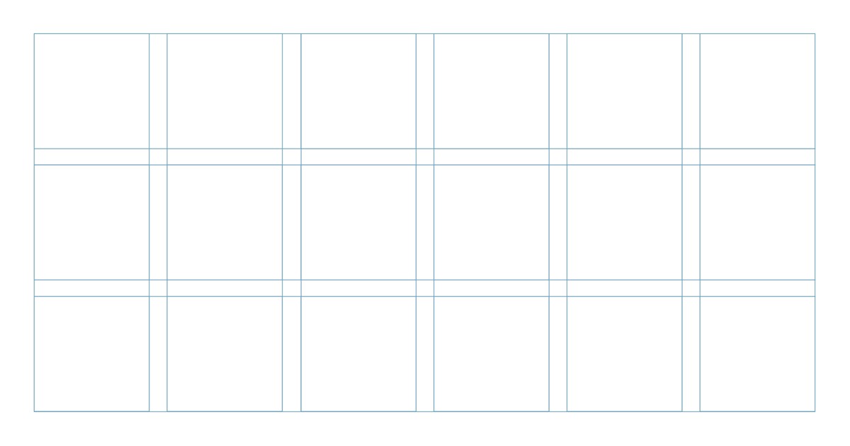
Modular grids are similar to column grids in that they have columns, but with additional rows. Modular grids have equal sized modules, which makes it easier to get creative, break the rules to use spaces in different ways.
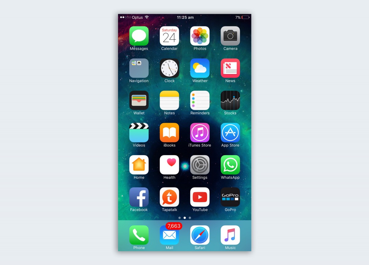
Modular grids are commonly seen in many e-commerce websites, but the most typical example of using a modular grid is the main screen of a smartphone (apps are arranged side by side in a modular grid). or Instagram also uses a modular grid to display your feed.
Hierarchical Grid – hierarchical grid
Hierarchical grids are mainly used in web design. The purpose of a hierarchical grid is to organize elements by order of importance. the “mesh” with the largest space is prioritized for the most important content. Compared to the rest of the grid types, the hierarchical grid is less commonly used and less popular.
Composite Grid – composite grid
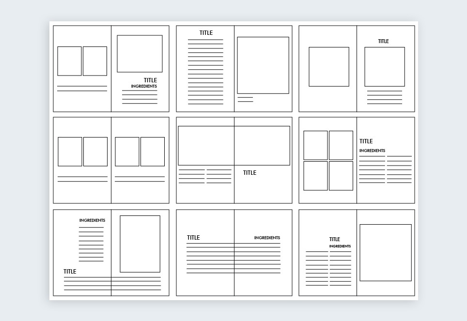
Mesh blending is a popular practice for creating more creative and engaging layout designs. A multi-page document will follow the same measurements of the manuscript grid but simultaneously appear different grids for other parts of the format. Creative use of synthetic mesh will make your design look more pleasing. However, to do this, we have to spend a lot of time to practice.
Epilogue
The above is a summary of the basics of grids and grid designs that every designer should embrace before embarking on product design. Hopefully, with this useful information, it will help you get an overview of the grid system in your design as well as find the right grid type in your own designs.


