Rebranding – Rebranding is one of the most difficult marketing strategies for brands that have been around for years, even decades, with the expectation of bringing a breath of fresh air and inspiration to people. consumption, while maintaining consistency in the core values of the business.
Is there a formula for successful rebranding strategies? Find out with Malu in the 5 Case Studies below.
5 Case Study Rebranding – Rebranding
1. Adobe Creative Cloud
In May 2020, Adobe published the article “Evolving Our Brand Identity” to explain its decision to rebrand: “We are making changes to the brand. so that customers can easily grasp the product portfolio and have a fresh view of the company.”
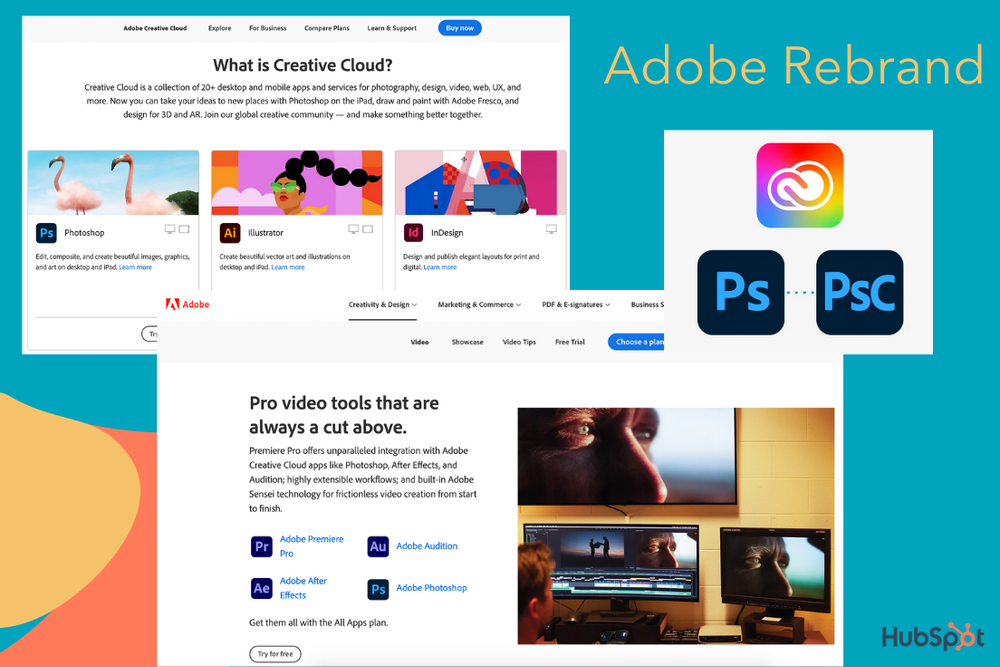
Adobe currently owns more than 50 software services that make users often “overwhelmed” when choosing the right products for their needs. Therefore, the company has redesigned some of the following icons:
- Company’s logo
- Logo Creative Cloud
- Product logos
- The corners of the logo are more rounded
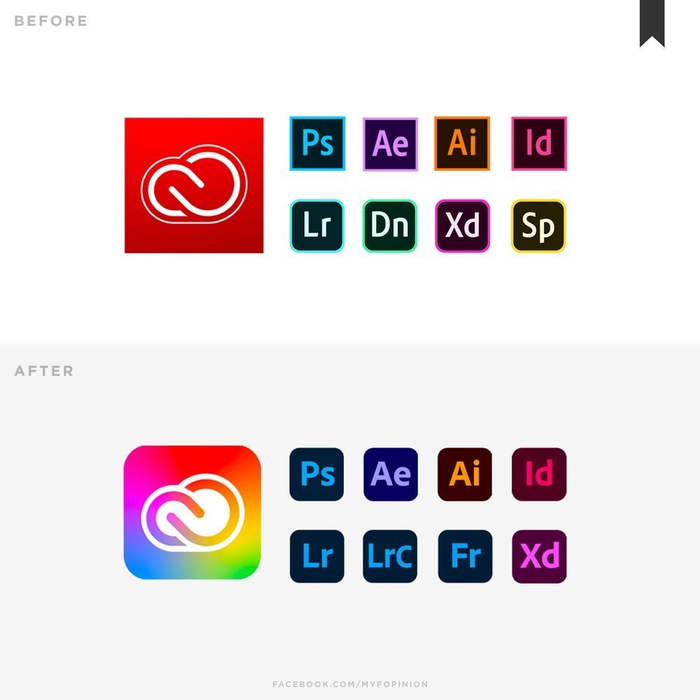
New designs have contributed to highlighting and organizing Adobe Creative Cloud’s product services more efficiently. For example, all the apps in Adobe’s Video catalog are similar in purple and blue.
2. Starbucks
Also last year, Starbucks launched the “Starbucks Creative Expression” website , detailing the elements of the brand – in tone, font and logo in an effort to create consistency across communication channels and Starbucks store.

In this way, Starbucks shapes itself as an open, innovative and modern brand. For example, in the Voice section, Starbucks describes, “We limit the delivery of competing messages to enhance the experience for our customers, helping them find exactly what they want at Starbucks.”
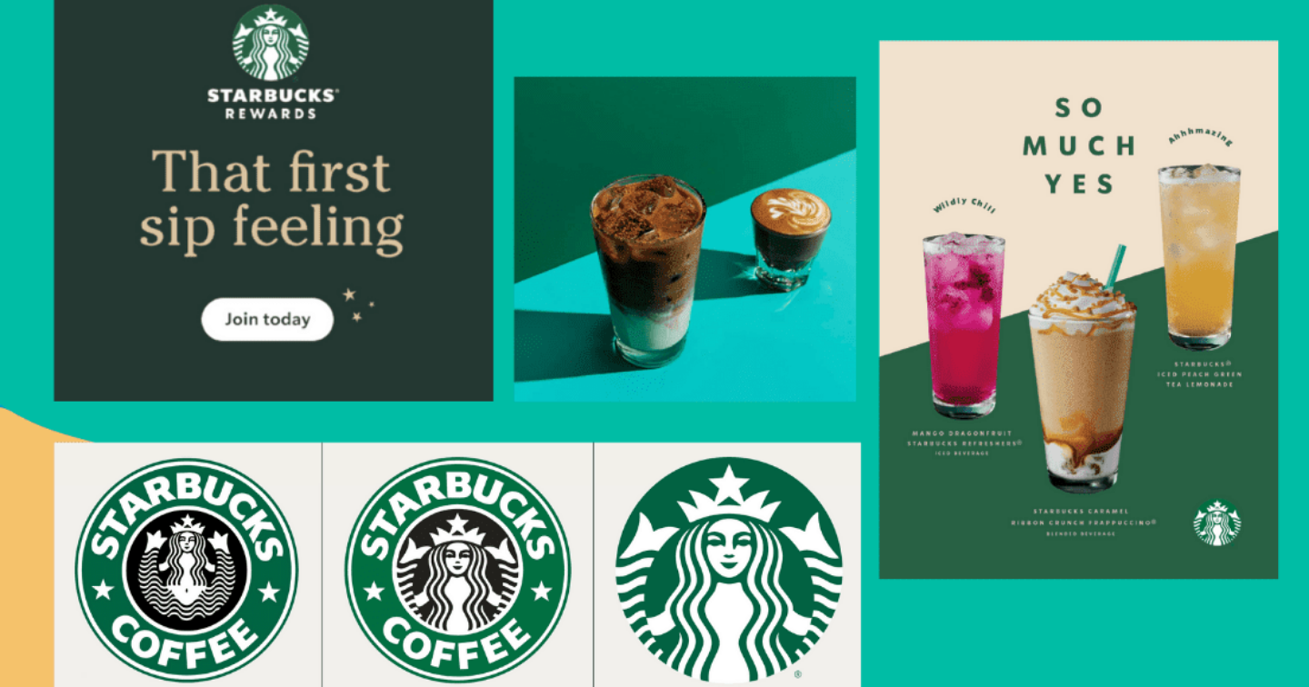
Recently, Starbucks also “refurbished” the brand’s logo, removing the words “Starbucks Coffee” and creating a highlight with the image of a mermaid – Siren. This strategy of Starbucks is considered simple and effective. Instead of taking great strides with the brand’s roots, the company stayed true to its basic vision and made small changes to continue to serve the needs and preferences of consumers.
3. Dunkin’ Donuts (now Dunkin’)
In early 2019, the world-famous coffee and cake shop legend decided to shift the business focus to the coffee sector and shorten the brand name from Dunkin’ Donuts to Dunkin’.
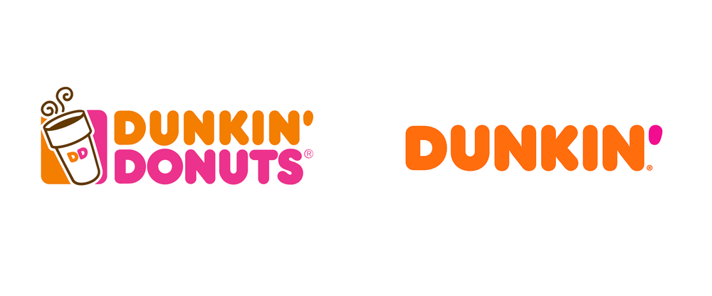
Dunkin’s restructuring strategy to meet consumer preferences, tastes and styles has changed dramatically over the past 50 years, particularly with the trend towards limiting carbohydrates and sugar in food.
4. Petco
In October 2020, Petco – a retailer of pets and pet products and services in the US officially turned its business into a company that takes care of the physical and mental health of “friends”. small”.
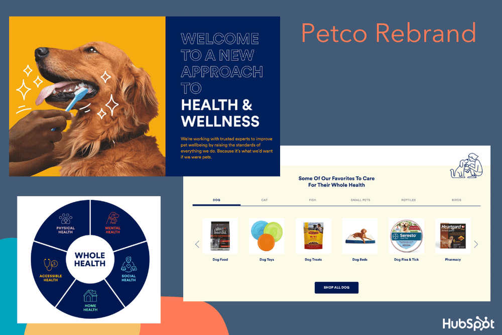
The more than 50-year-old company has redesigned its website and app to focus on pet health documents, a search engine for suitable food, and an expansion of healthcare and insurance offerings. for pets. Petco also redesigned its logo, choosing a simple blue-white design instead of the previously featured pet image.
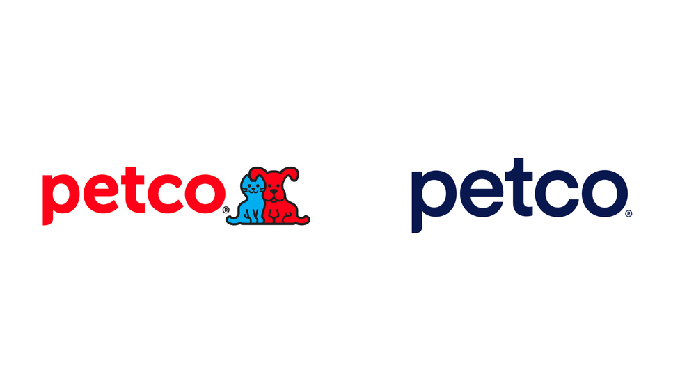
This decision of Petco stems from the tendency of many people in the US to consider pets as family members. Therefore, the company aims to build a leading brand positioning in pet health care.
5. GoDaddy
Last year, the web hosting platform GoDaddy, founded in 1997, carried out a comprehensive “reform” to accommodate its new positioning ” A new brand for a new era”. new resource), inspired by GoDaddy users – entrepreneurs.
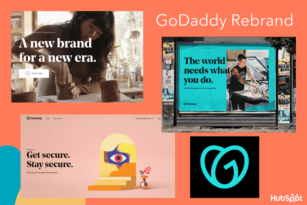
One of Godaddy’s most prominent changes is the new “GO” logo, which represents “the resilient spirit of entrepreneurs and the joy they experience everywhere.”
GoDaddy’s new design uses vibrant hand-drawn images and bold, serif fonts, aiming to position a casual, friendly, and people-focused brand. GoDaddy’s transformation reflects the modern tastes, personalities, and needs of GoDaddy users in 2020.

![[Case Study] – Muji's global branding strategy 6 jw 5d149006194433.41584320](https://maludesign.vn/wp-content/uploads/2022/08/jw-5d149006194433.41584320-500x496.jpeg)
![[Case Study] – NEM's journey to build a brand: French and Vietnamese blend 7 Cua hang NEM co mat nhieu noi](https://maludesign.vn/wp-content/uploads/2022/08/Cua-hang-NEM-co-mat-nhieu-noi-500x341.jpg)
