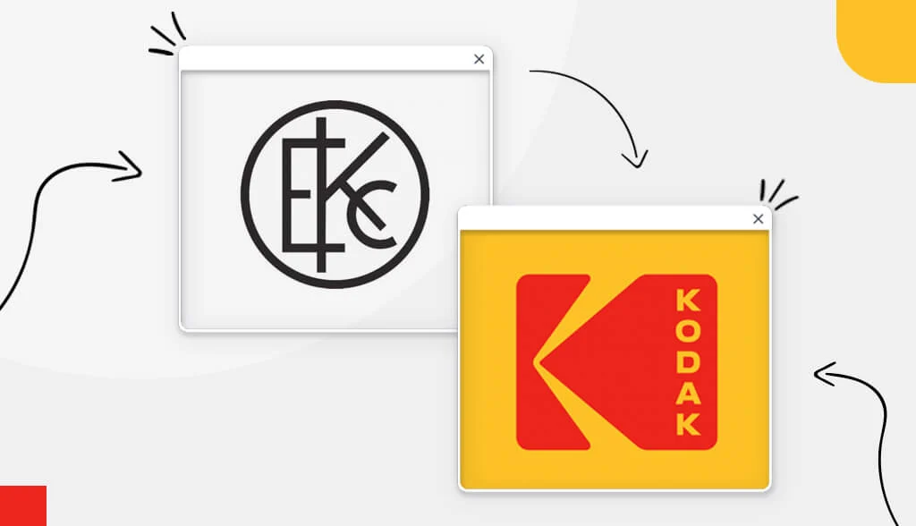
To start a successful business, you need strong focus and vision. Kodak founder George Eastman had such a vision for his company: Make photography “as convenient as a pencil.”
It can be said that Eastman’s hard work and determination paid off. Kodak heralded the modern era of consumer photography and film.
Kodak’s success lies in their picture-perfect branding, specifically their logo. In this post, we’ll take a look at how Kodak’s logo morphed over the years into an instantly recognizable, iconic symbol.
A Brief History of Kodak
Kodak started selling cameras in 1888 for $25. It was advertised with the tagline, “You push the button, we do the rest.” For the first time, the public had access to an easy-to-use and low-cost method of photography.
Interestingly, Kodak has no special meaning. Eastman says, “I love the letter ‘K’ – it sounds like a strong, edgy type of lettering.” Fair enough! In 1888, he trademarked the name “Kodak,” a nonsense word that has continued to develop its own definition.
In 1969, Kodak manufactured the Apollo 11 astronaut camera for use on the moon. And, the first picture of Earth taken from space was taken with Kodak hardware.
Despite all their inventions and successes, Kodak wasn’t focused enough on digital photography and was overtaken by other brands like Nikon and Canon. Regardless, we have to thank Kodak for paving the way for the photography and film industries.
The Evolution of the Kodak . Logo
The Kodak logo we know today was not always the same as we know it now. In fact, you probably can’t even tell it’s from the same company! Take a look at the evolution of the Kodak logo from 1907 to the present day.
1907
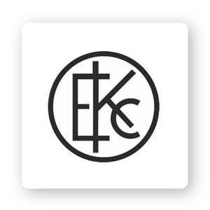
Created in 1907, Kodak’s first logo was a character with the abbreviation EKC (Eastman Kodak Company). The letters are surrounded in a circle, symbolizing power and timelessness. At the time, government stamps were circular. Kodak wanted to express the same sense of dominance in the market by using a circular design.
That being said, it’s not a great logo. The main reason is that the design is assembled without much thought or having any kind of brand concept in mind.
1935
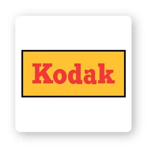
In 1935, the Kodak logo underwent major design changes. Their now iconic color palette (yellow and red) was first introduced at this time. As you probably know, colors have meanings and can stir emotions.
Red is a color that evokes feelings of energy, passion, excitement, and comfort. Another warm color, yellow represents friendliness, cheerfulness, positivity and happiness.
This color scheme is not a coincidence but a deliberate move to connect the company with their audience. People often take photos to capture happy moments, such as family reunions or graduations, and Kodak decided to use red and yellow to express those emotions.
The second thing that has changed is the shape of the logo. Kodak said goodbye to the classic circular design and opted for a horizontal shape, which was trendy at the time.
1960
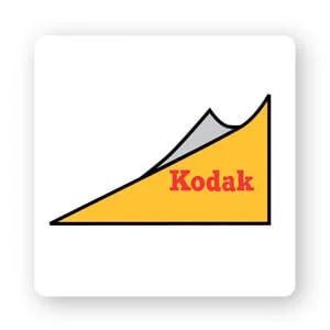
In 1960, Kodak decided to get rid of the traditional rectangle and replace it with a triangle. The new shape was meant to give the logo a new and unique look, which it certainly did! This major change in design has given the entire logo a new look.
Every logo needs a unique feature to have a good to outstanding design. That feature is a curved corner for Kodak. The curled hairstyle added a bit of depth that wouldn’t be present in the logo.
1971
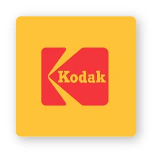
The Kodak team decided to use a different logo shape during their 70s redesign. They completely removed the triangle and replaced it with a square box, which continues to be an iconic part of the business to this day.
Different shapes can create emotional and psychological connections between brands and their target audience. By choosing a square for its logo, Kodak conveyed a sense of professionalism, strength and stability. Kodak is an established company in the photography industry in the ’70s, so their logo just helps get that message home.
If you look at the red box, you’ll notice that there’s an engraved yellow arrow that makes the image look like a Kodak’s ‘K’.
1987
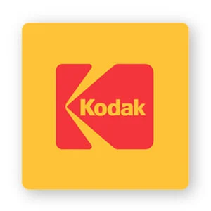
When the company changed the logo, this time they decided to make some necessary updates to their fonts. You may have noticed earlier versions used serif fonts, making the logo feel as if it was stuck in the past.
Meaningful fonts ; Serif fonts are popular with companies that want to represent traits like tradition, respect, and reliability.
Kodak decided to ditch the conservative vibes of serifs and use a sans-serif font. The entire look has been upgraded with just that change. The new Kodak logo has a modern look that speaks to the change of times.
2006
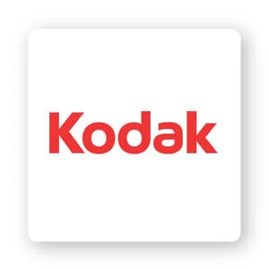
As the 2000s passed, Kodak took on a completely different look. No more rectangles or squares, the new logo features only the company name in a sans-serif font framed with 2 thin yellow lines.
The only thing that hasn’t changed is the company’s red and yellow color scheme. This logo is based on minimalist design principles by trying to express many things with the least amount of design details.
2016
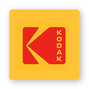
In 2016, Kodak needed to refresh its brand to increase relevance and value. The company began rolling out products that reintroduced the brand to a new generation of creators. Brands need to find a way to stay relevant in the minds of consumers.
Kodak Chief Marketing Officer Steven Overman said: “I don’t think what we’re doing is ‘bringing back’ Kodak’s iconic identity, because in people’s hearts and minds, I am. don’t think it’s really gone… .The latest iteration needs to give a fresh, classic yet harmonious feel alongside a host of logos you still see on signage and packaging on around the world. Our goal is to amplify what is already memorable and resonates around the world.”
Kodak didn’t want to replace its iconic brand with something completely foreign and instead chose to incorporate its long history into the new design. In the end, the design they used isn’t much different from the 1987 redesign – except this version of the logo is capitalized vertically.
Epilogue
Although Kodak is no longer the familiar name it used to be, there is still a lot for us to learn from the development of its logo.
When you are thinking of designing your own logo, keep in mind that there is a specific audience you are trying to reach. Finally, you may need a change if your target customers are not responding well to your business.
Also, if it’s not “broken” – don’t fix it! Check that your colors, fonts, and shapes support the message you want to send, and make sure to use your logo consistently wherever your business appears.


![[Case Study] – How Did Apple Build a Brand? 7 cach apple xay dung thuong hieu](https://maludesign.vn/wp-content/uploads/2021/03/cach-apple-xay-dung-thuong-hieu-500x500.jpg)
![[Case Study] – VPBank Rebrand – Deciphering the rebranding strategy and new communication model 8 AbjH708dSCSzsfW9A07o00SgNvGHl5GyqgernVB1](https://maludesign.vn/wp-content/uploads/2022/08/AbjH708dSCSzsfW9A07o00SgNvGHl5GyqgernVB1-500x500.jpg)